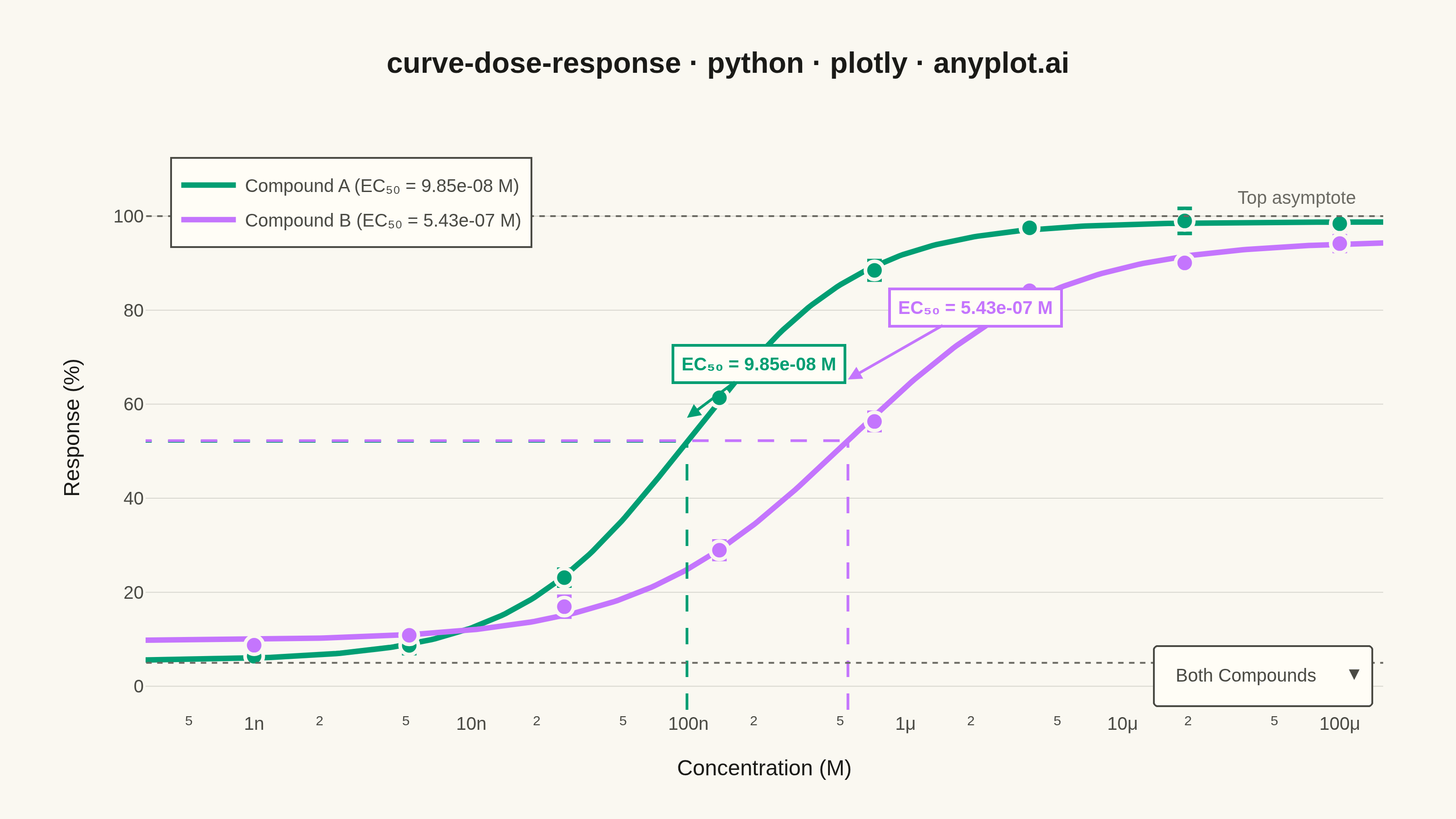
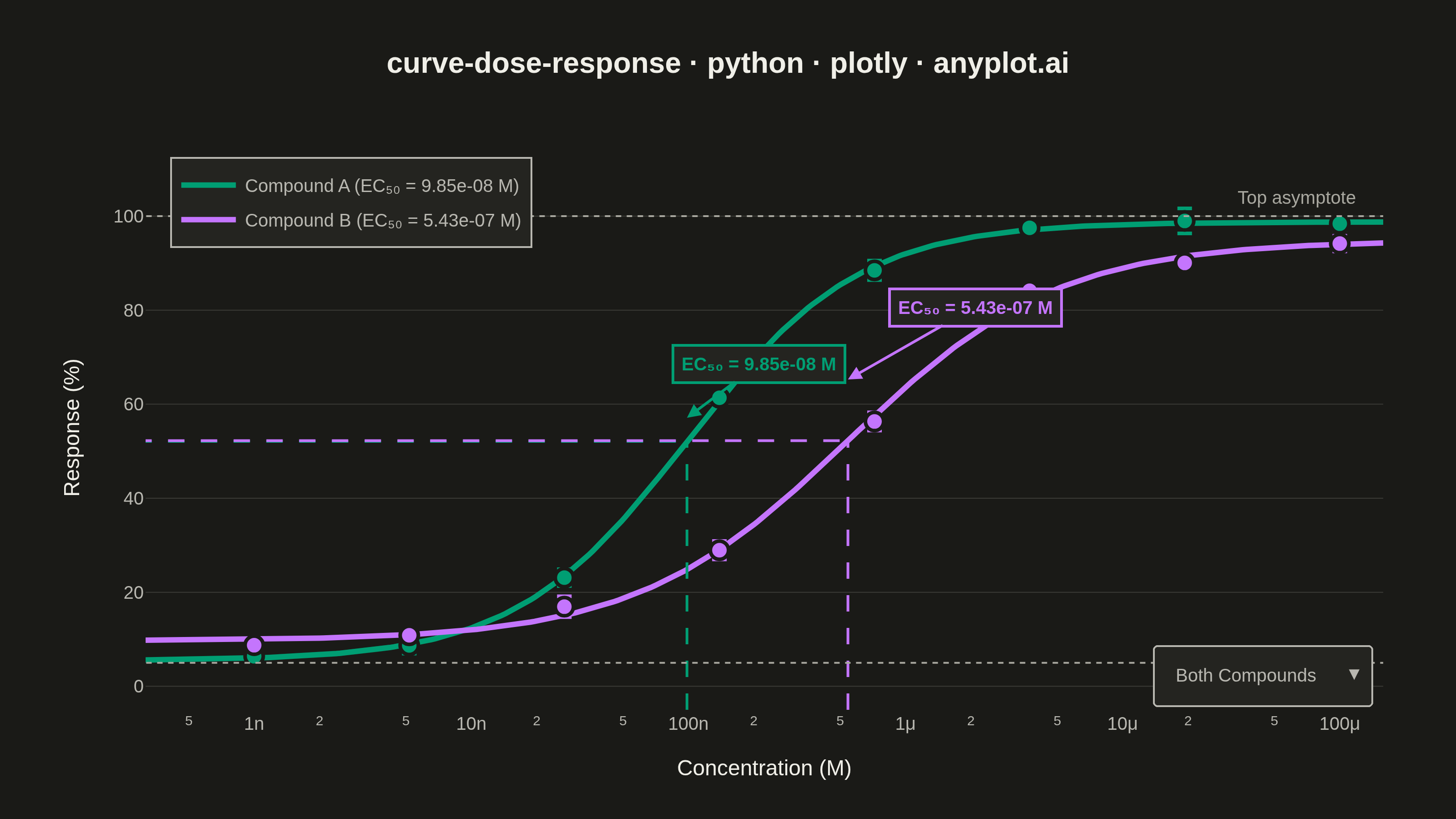
A sigmoidal dose-response curve that plots biological response against drug concentration on a logarithmic x-axis, fitted using a four-parameter logistic (4PL) model. This visualization is essential for determining drug potency metrics such as EC50 (half-maximal effective concentration) or IC50 (half-maximal inhibitory concentration), Hill slope steepness, and upper/lower response asymptotes. It enables rapid visual comparison of compound efficacy and is a standard tool in pharmacological analysis.
""" anyplot.ai
curve-dose-response: Pharmacological Dose-Response Curve
Library: plotly 6.8.0 | Python 3.13.14
Quality: 89/100 | Updated: 2026-06-24
"""

import os

import numpy as np
import plotly.graph_objects as go
from scipy.optimize import curve_fit


THEME = os.getenv("ANYPLOT_THEME", "light")

# Theme-adaptive chrome (Imprint palette)
PAGE_BG = "#FAF8F1" if THEME == "light" else "#1A1A17"
ELEVATED_BG = "#FFFDF6" if THEME == "light" else "#242420"
INK = "#1A1A17" if THEME == "light" else "#F0EFE8"
INK_SOFT = "#4A4A44" if THEME == "light" else "#B8B7B0"
INK_MUTED = "#6B6A63" if THEME == "light" else "#A8A79F"
GRID = "rgba(26,26,23,0.15)" if THEME == "light" else "rgba(240,239,232,0.15)"

# Imprint categorical palette — positions 1 and 2
COLORS = ["#009E73", "#C475FD"]

# --- Data ---
np.random.seed(42)
concentrations = np.logspace(-9, -4, 8)

compound_names = ["Compound A", "Compound B"]

ec50_true = [1e-7, 5e-7]
hill_true = [1.2, 0.9]
top_true = [100, 95]
bottom_true = [5, 10]

raw_data = {}
for i, name in enumerate(compound_names):
    responses = []
    sems = []
    for conc in concentrations:
        true_resp = bottom_true[i] + (top_true[i] - bottom_true[i]) / (1 + (ec50_true[i] / conc) ** hill_true[i])
        reps = true_resp + np.random.normal(0, 3, 3)
        responses.append(np.mean(reps))
        sems.append(np.std(reps, ddof=1) / np.sqrt(3))
    raw_data[name] = {"concentrations": concentrations, "responses": np.array(responses), "sems": np.array(sems)}


def logistic_4pl(x, bottom, top, ec50, hill):
    return bottom + (top - bottom) / (1 + (ec50 / x) ** hill)


fit_results = {}
conc_fine = np.logspace(-9.5, -3.8, 300)

for i, name in enumerate(compound_names):
    popt, pcov = curve_fit(
        logistic_4pl,
        raw_data[name]["concentrations"],
        raw_data[name]["responses"],
        p0=[bottom_true[i], top_true[i], ec50_true[i], hill_true[i]],
        maxfev=10000,
    )
    perr = np.sqrt(np.diag(pcov))
    fit_results[name] = {"popt": popt, "perr": perr}

# --- Plot ---
fig = go.Figure()

for i, name in enumerate(compound_names):
    popt = fit_results[name]["popt"]
    bottom, top, ec50, hill = popt
    color = COLORS[i]
    fitted_curve = logistic_4pl(conc_fine, *popt)

    # 95% CI band for Compound A
    if i == 0:
        perr = fit_results[name]["perr"]
        upper = logistic_4pl(conc_fine, bottom - perr[0], top + perr[1], ec50, hill)
        lower = logistic_4pl(conc_fine, bottom + perr[0], top - perr[1], ec50, hill)
        r, g, b = int(color[1:3], 16), int(color[3:5], 16), int(color[5:7], 16)
        fill_alpha = 0.18 if THEME == "light" else 0.25

        fig.add_trace(
            go.Scatter(x=conc_fine, y=upper, mode="lines", line={"width": 0}, showlegend=False, hoverinfo="skip")
        )
        fig.add_trace(
            go.Scatter(
                x=conc_fine,
                y=lower,
                mode="lines",
                line={"width": 0},
                fill="tonexty",
                fillcolor=f"rgba({r},{g},{b},{fill_alpha})",
                showlegend=False,
                hoverinfo="skip",
            )
        )

    # Fitted sigmoid curve
    fig.add_trace(
        go.Scatter(
            x=conc_fine,
            y=fitted_curve,
            mode="lines",
            name=f"{name} (EC₅₀ = {ec50:.2e} M)",
            line={"color": color, "width": 3},
            hovertemplate=(f"<b>{name}</b><br>Conc: %{{x:.2e}} M<br>Response: %{{y:.1f}}%<extra></extra>"),
        )
    )

    # Data points with SEM error bars
    fig.add_trace(
        go.Scatter(
            x=raw_data[name]["concentrations"],
            y=raw_data[name]["responses"],
            mode="markers",
            name=f"{name} data",
            marker={"size": 10, "color": color, "line": {"color": PAGE_BG, "width": 2}},
            error_y={"type": "data", "array": raw_data[name]["sems"], "visible": True, "color": color, "thickness": 2},
            showlegend=False,
            hovertemplate=(
                f"<b>{name}</b><br>Conc: %{{x:.2e}} M<br>Response: %{{y:.1f}} ± %{{error_y.array:.1f}}%<extra></extra>"
            ),
        )
    )

    # EC50 dashed crosshair reference lines
    half_response = bottom + (top - bottom) / 2
    fig.add_shape(
        type="line", x0=ec50, x1=ec50, y0=-5, y1=half_response, line={"color": color, "width": 1.5, "dash": "dash"}
    )
    fig.add_shape(
        type="line",
        x0=1e-10,
        x1=ec50,
        y0=half_response,
        y1=half_response,
        line={"color": color, "width": 1.5, "dash": "dash"},
    )

    # EC50 annotation with arrow
    fig.add_annotation(
        x=np.log10(ec50),
        y=half_response + 5 + i * 8,
        text=f"<b>EC₅₀ = {ec50:.2e} M</b>",
        showarrow=True,
        arrowhead=2,
        arrowsize=1,
        arrowwidth=1.5,
        arrowcolor=color,
        ax=40 + i * 30,
        ay=-30 - i * 10,
        font={"size": 10, "color": color},
        bordercolor=color,
        borderwidth=1.5,
        borderpad=4,
        bgcolor=ELEVATED_BG,
    )

# Top and bottom asymptote dotted reference lines
fig.add_shape(
    type="line", x0=1e-10, x1=1e-3, y0=top_true[0], y1=top_true[0], line={"color": INK_MUTED, "width": 1, "dash": "dot"}
)
fig.add_shape(
    type="line",
    x0=1e-10,
    x1=1e-3,
    y0=bottom_true[0],
    y1=bottom_true[0],
    line={"color": INK_MUTED, "width": 1, "dash": "dot"},
)

# Asymptote labels (placed within axis range)
fig.add_annotation(
    x=-4.2, y=top_true[0], text="Top asymptote", showarrow=False, font={"size": 10, "color": INK_MUTED}, yshift=10
)
fig.add_annotation(
    x=-4.2,
    y=bottom_true[0],
    text="Bottom asymptote",
    showarrow=False,
    font={"size": 10, "color": INK_MUTED},
    yshift=-12,
)

# --- Layout ---
fig.update_layout(
    autosize=False,
    width=800,
    height=450,
    margin={"l": 80, "r": 40, "t": 80, "b": 60},
    title={
        "text": "<b>curve-dose-response · python · plotly · anyplot.ai</b>",
        "font": {"size": 16, "color": INK, "family": "Arial, Helvetica, sans-serif"},
        "x": 0.5,
        "xanchor": "center",
    },
    xaxis={
        "title": {"text": "Concentration (M)", "font": {"size": 12, "color": INK}},
        "type": "log",
        "tickfont": {"size": 10, "color": INK_SOFT},
        "showgrid": False,
        "showline": False,
        "range": [-9.5, -3.8],
    },
    yaxis={
        "title": {"text": "Response (%)", "font": {"size": 12, "color": INK}},
        "tickfont": {"size": 10, "color": INK_SOFT},
        "showgrid": True,
        "gridcolor": GRID,
        "gridwidth": 0.5,
        "range": [-5, 115],
        "zeroline": False,
        "showline": False,
    },
    template="plotly_white",
    paper_bgcolor=PAGE_BG,
    plot_bgcolor=PAGE_BG,
    font={"color": INK},
    legend={
        "font": {"size": 10, "color": INK_SOFT},
        "x": 0.02,
        "y": 0.98,
        "bgcolor": ELEVATED_BG,
        "bordercolor": INK_SOFT,
        "borderwidth": 1,
        "traceorder": "normal",
    },
    updatemenus=[
        {
            "type": "dropdown",
            "direction": "down",
            "showactive": True,
            "x": 0.99,
            "xanchor": "right",
            "y": 0.01,
            "yanchor": "bottom",
            "bgcolor": ELEVATED_BG,
            "bordercolor": INK_SOFT,
            "font": {"color": INK_SOFT, "size": 10},
            "buttons": [
                {
                    "label": "Both Compounds",
                    "method": "update",
                    "args": [{"visible": [True, True, True, True, True, True]}],
                },
                {
                    "label": "Compound A only",
                    "method": "update",
                    "args": [{"visible": [True, True, True, True, False, False]}],
                },
                {
                    "label": "Compound B only",
                    "method": "update",
                    "args": [{"visible": [False, False, False, False, True, True]}],
                },
            ],
        }
    ],
)

# --- Save ---
fig.write_image(f"plot-{THEME}.png", width=800, height=450, scale=4)
fig.write_html(f"plot-{THEME}.html", include_plotlyjs="cdn")
Runnable source as JSON, for any HTTP client: https://api.anyplot.ai/specs/curve-dose-response/plotly/code. Any spec id and library id listed in llms-full.txt fit the same URL shape; every URL below is complete and callable.
{
  "spec_id": "curve-dose-response",
  "language": "python",
  "library": "plotly",
  "page": "https://anyplot.ai/curve-dose-response/python/plotly",
  "hub": "https://anyplot.ai/curve-dose-response",
  "code_json": "https://api.anyplot.ai/specs/curve-dose-response/plotly/code",
  "spec_json": "https://api.anyplot.ai/specs/curve-dose-response",
  "render_light_png": "https://storage.googleapis.com/anyplot-images/plots/curve-dose-response/python/plotly/plot-light.png",
  "render_dark_png": "https://storage.googleapis.com/anyplot-images/plots/curve-dose-response/python/plotly/plot-dark.png",
  "interactive_light_html": "https://storage.googleapis.com/anyplot-images/plots/curve-dose-response/python/plotly/plot-light.html",
  "interactive_dark_html": "https://storage.googleapis.com/anyplot-images/plots/curve-dose-response/python/plotly/plot-dark.html",
  "quality_score": 89.0,
  "license": "MIT",
  "guide": "https://anyplot.ai/llms.txt"
}
Part of Pharmacological Dose-Response Curve on anyplot.ai.