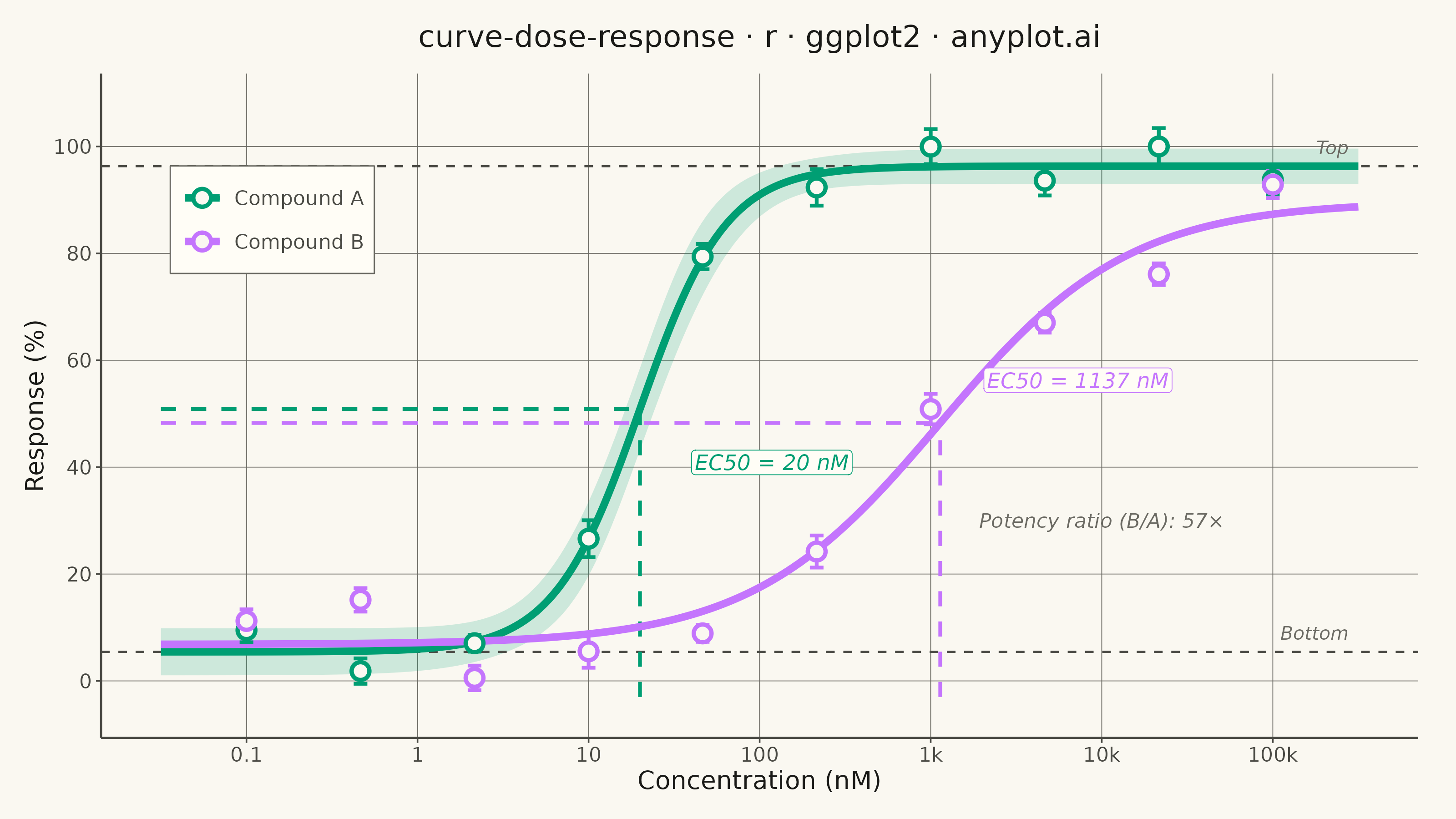
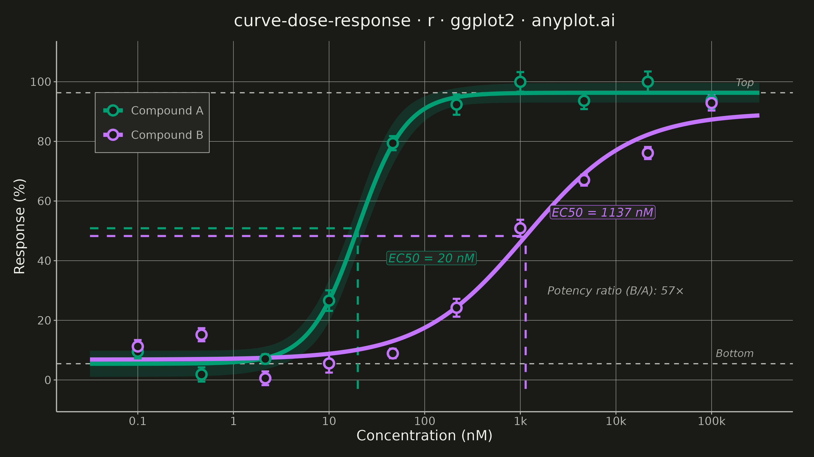
The same plot in 14 other libraries — Python: Altair, Bokeh, lets-plot, Matplotlib, Plotly, plotnine, Pygal, Seaborn; Julia: Makie.jl; JavaScript: Chart.js, D3.js, Apache ECharts, Highcharts, MUI X Charts. Compare all 15 side by side: Pharmacological Dose-Response Curve in Python, R, Julia and JavaScript.
A sigmoidal dose-response curve that plots biological response against drug concentration on a logarithmic x-axis, fitted using a four-parameter logistic (4PL) model. This visualization is essential for determining drug potency metrics such as EC50 (half-maximal effective concentration) or IC50 (half-maximal inhibitory concentration), Hill slope steepness, and upper/lower response asymptotes. It enables rapid visual comparison of compound efficacy and is a standard tool in pharmacological analysis.
#' anyplot.ai
#' curve-dose-response: Pharmacological Dose-Response Curve
#' Library: ggplot2 3.5.1 | R 4.4.1
#' Quality: 94/100 | Created: 2026-06-24

library(ggplot2)
library(dplyr)
library(tibble)
library(ragg)

set.seed(42)

# Theme tokens
THEME       <- Sys.getenv("ANYPLOT_THEME", "light")
PAGE_BG     <- if (THEME == "light") "#FAF8F1" else "#1A1A17"
ELEVATED_BG <- if (THEME == "light") "#FFFDF6" else "#242420"
INK         <- if (THEME == "light") "#1A1A17" else "#F0EFE8"
INK_SOFT    <- if (THEME == "light") "#4A4A44" else "#B8B7B0"
INK_MUTED   <- if (THEME == "light") "#6B6A63" else "#A8A79F"

IMPRINT_PALETTE <- c(
    "#009E73", "#C475FD", "#4467A3", "#BD8233",
    "#AE3030", "#2ABCCD", "#954477", "#99B314"
)

# Data — concentrations in nM, 10 points per compound spanning 6 decades
conc_obs_nM <- 10^seq(-1, 5, length.out = 10)

resp_a_true <- 4 + (94 - 4) / (1 + (20  / conc_obs_nM)^1.8)
resp_b_true <- 6 + (88 - 6) / (1 + (800 / conc_obs_nM)^1.1)

df <- tibble(
    conc     = rep(conc_obs_nM, 2),
    response = c(
        pmax(0, pmin(100, resp_a_true + rnorm(10, 0, 4))),
        pmax(0, pmin(100, resp_b_true + rnorm(10, 0, 4)))
    ),
    sem      = c(runif(10, 1.5, 3.5), runif(10, 1.5, 3.5)),
    compound = rep(c("Compound A", "Compound B"), each = 10)
)

# Fit 4PL models via nonlinear least squares
fit_a <- nls(
    response ~ Bottom + (Top - Bottom) / (1 + (EC50 / conc)^Hill),
    data  = filter(df, compound == "Compound A"),
    start = list(Bottom = 4, Top = 94, EC50 = 20, Hill = 1.5)
)

fit_b <- nls(
    response ~ Bottom + (Top - Bottom) / (1 + (EC50 / conc)^Hill),
    data  = filter(df, compound == "Compound B"),
    start = list(Bottom = 6, Top = 88, EC50 = 800, Hill = 1.0)
)

# Fine concentration grid for smooth curves
conc_fine <- 10^seq(-1.5, 5.5, length.out = 400)

coef_a <- coef(fit_a)
coef_b <- coef(fit_b)
vcov_a <- vcov(fit_a)

pred_a <- predict(fit_a, newdata = data.frame(conc = conc_fine))
pred_b <- predict(fit_b, newdata = data.frame(conc = conc_fine))

# 95% confidence band for Compound A via delta method (gradient of 4PL w.r.t. params)
se_a <- sapply(conc_fine, function(x) {
    B <- coef_a["Bottom"]; Tp <- coef_a["Top"]
    E <- coef_a["EC50"];   H  <- coef_a["Hill"]
    r <- (E / x)^H; denom <- 1 + r
    g <- c(r / denom, 1 / denom,
           -(Tp - B) * H * r / (E * denom^2),
           -(Tp - B) * r * log(E / x) / denom^2)
    sqrt(as.numeric(t(g) %*% vcov_a %*% g))
})

df_curves <- tibble(
    conc     = rep(conc_fine, 2),
    response = c(pred_a, pred_b),
    compound = rep(c("Compound A", "Compound B"), each = 400)
)

df_ci_a <- tibble(
    conc = conc_fine,
    ymin = pred_a - 1.96 * se_a,
    ymax = pred_a + 1.96 * se_a
)

# EC50 and half-response values for crosshair annotations
ec50_a <- coef_a["EC50"]
ec50_b <- coef_b["EC50"]
hmid_a <- (coef_a["Bottom"] + coef_a["Top"]) / 2
hmid_b <- (coef_b["Bottom"] + coef_b["Top"]) / 2
x_left  <- 10^(-1.5)
x_right <- 10^5.5

comp_colors <- c(
    "Compound A" = IMPRINT_PALETTE[1],
    "Compound B" = IMPRINT_PALETTE[2]
)

# Plot
p <- ggplot() +
    # 95% CI ribbon — Compound A only
    geom_ribbon(
        data  = df_ci_a,
        aes(x = conc, ymin = ymin, ymax = ymax),
        fill  = IMPRINT_PALETTE[1],
        alpha = 0.18
    ) +
    # Top and bottom asymptote dashed lines (Compound A)
    geom_hline(
        yintercept = coef_a["Top"],
        linetype = "dashed", color = INK_SOFT, linewidth = 0.4
    ) +
    geom_hline(
        yintercept = coef_a["Bottom"],
        linetype = "dashed", color = INK_SOFT, linewidth = 0.4
    ) +
    # Asymptote labels at right margin
    annotate(
        "text",
        x = x_right * 0.88, y = coef_a["Top"] + 3.5,
        label = "Top", color = INK_MUTED, size = 2.6, hjust = 1, fontface = "italic"
    ) +
    annotate(
        "text",
        x = x_right * 0.88, y = coef_a["Bottom"] + 3.5,
        label = "Bottom", color = INK_MUTED, size = 2.6, hjust = 1, fontface = "italic"
    ) +
    # EC50 crosshair — Compound A
    annotate(
        "segment",
        x = ec50_a, xend = ec50_a, y = -3, yend = hmid_a,
        linetype = "dashed", color = IMPRINT_PALETTE[1], linewidth = 0.7
    ) +
    annotate(
        "segment",
        x = x_left, xend = ec50_a, y = hmid_a, yend = hmid_a,
        linetype = "dashed", color = IMPRINT_PALETTE[1], linewidth = 0.7
    ) +
    # EC50 crosshair — Compound B
    annotate(
        "segment",
        x = ec50_b, xend = ec50_b, y = -3, yend = hmid_b,
        linetype = "dashed", color = IMPRINT_PALETTE[2], linewidth = 0.7
    ) +
    annotate(
        "segment",
        x = x_left, xend = ec50_b, y = hmid_b, yend = hmid_b,
        linetype = "dashed", color = IMPRINT_PALETTE[2], linewidth = 0.7
    ) +
    # Fitted 4PL curves
    geom_line(
        data      = df_curves,
        aes(x = conc, y = response, color = compound),
        linewidth = 1.4
    ) +
    # Observed data: error bars then points (bars behind points)
    geom_errorbar(
        data      = df,
        aes(x = conc, ymin = response - sem, ymax = response + sem, color = compound),
        width     = 0.08,
        linewidth = 0.7
    ) +
    geom_point(
        data   = df,
        aes(x = conc, y = response, color = compound),
        size   = 2.5,
        shape  = 21,
        fill   = PAGE_BG,
        stroke = 1.2
    ) +
    # EC50 label annotations with background box for visual weight
    annotate(
        "label",
        x = ec50_a * 2.0, y = hmid_a - 10,
        label        = sprintf("EC50 = %.0f nM", ec50_a),
        color        = IMPRINT_PALETTE[1],
        fill         = ELEVATED_BG,
        label.size   = 0.15,
        label.padding = unit(0.12, "lines"),
        size = 3.0, hjust = 0, fontface = "italic"
    ) +
    annotate(
        "label",
        x = ec50_b * 1.8, y = hmid_b + 8,
        label        = sprintf("EC50 = %.0f nM", ec50_b),
        color        = IMPRINT_PALETTE[2],
        fill         = ELEVATED_BG,
        label.size   = 0.15,
        label.padding = unit(0.12, "lines"),
        size = 3.0, hjust = 0, fontface = "italic"
    ) +
    # Potency ratio annotation
    annotate(
        "text",
        x = 10^4, y = 30,
        label = sprintf("Potency ratio (B/A): %.0f×", ec50_b / ec50_a),
        color = INK_MUTED, size = 2.8, hjust = 0.5, fontface = "italic"
    ) +
    # Axis scales
    scale_x_log10(
        breaks = c(0.1, 1, 10, 100, 1000, 10000, 100000),
        labels = c("0.1", "1", "10", "100", "1k", "10k", "100k"),
        limits = c(x_left, x_right),
        name   = "Concentration (nM)"
    ) +
    scale_y_continuous(
        breaks = seq(0, 100, 20),
        limits = c(-5, 108),
        name   = "Response (%)"
    ) +
    scale_color_manual(values = comp_colors, name = NULL) +
    labs(title = "curve-dose-response · r · ggplot2 · anyplot.ai") +
    theme_minimal(base_size = 8) +
    theme(
        plot.background   = element_rect(fill = PAGE_BG, color = PAGE_BG),
        panel.background  = element_rect(fill = PAGE_BG, color = NA),
        panel.grid.major  = element_line(color = INK_MUTED, linewidth = 0.15),
        panel.grid.minor  = element_blank(),
        panel.border      = element_blank(),
        axis.line.x       = element_line(color = INK_SOFT, linewidth = 0.4),
        axis.line.y       = element_line(color = INK_SOFT, linewidth = 0.4),
        axis.ticks        = element_line(color = INK_SOFT, linewidth = 0.3),
        axis.title        = element_text(color = INK,      size = 10),
        axis.text         = element_text(color = INK_SOFT, size = 8),
        plot.title        = element_text(
            color = INK, size = 12, hjust = 0.5,
            margin = margin(b = 8)
        ),
        legend.background = element_rect(
            fill = ELEVATED_BG, color = INK_MUTED, linewidth = 0.25
        ),
        legend.text       = element_text(color = INK_SOFT, size = 8),
        legend.key.size        = unit(1.2, "lines"),
        legend.position        = "inside",
        legend.position.inside = c(0.13, 0.78),
        plot.margin            = margin(t = 10, r = 15, b = 10, l = 10)
    )

# Save
ggsave(
    filename = sprintf("plot-%s.png", THEME),
    plot     = p,
    device   = ragg::agg_png,
    width    = 8,
    height   = 4.5,
    units    = "in",
    dpi      = 400
)
Runnable source as JSON, for any HTTP client: https://api.anyplot.ai/specs/curve-dose-response/ggplot2/code. Any spec id and library id listed in llms-full.txt fit the same URL shape; every URL below is complete and callable.
{
  "spec_id": "curve-dose-response",
  "language": "r",
  "library": "ggplot2",
  "page": "https://anyplot.ai/curve-dose-response/r/ggplot2",
  "hub": "https://anyplot.ai/curve-dose-response",
  "code_json": "https://api.anyplot.ai/specs/curve-dose-response/ggplot2/code",
  "spec_json": "https://api.anyplot.ai/specs/curve-dose-response",
  "render_light_png": "https://storage.googleapis.com/anyplot-images/plots/curve-dose-response/r/ggplot2/plot-light.png",
  "render_dark_png": "https://storage.googleapis.com/anyplot-images/plots/curve-dose-response/r/ggplot2/plot-dark.png",
  "quality_score": 94.0,
  "license": "MIT",
  "guide": "https://anyplot.ai/llms.txt"
}
Part of Pharmacological Dose-Response Curve on anyplot.ai.