The same plot in 14 other libraries — Python: Altair, Bokeh, lets-plot, Matplotlib, Plotly, plotnine, Pygal, Seaborn; R: ggplot2; JavaScript: Chart.js, D3.js, Apache ECharts, Highcharts, MUI X Charts. Compare all 15 side by side: Basic Donut Chart in Python, R, Julia and JavaScript.
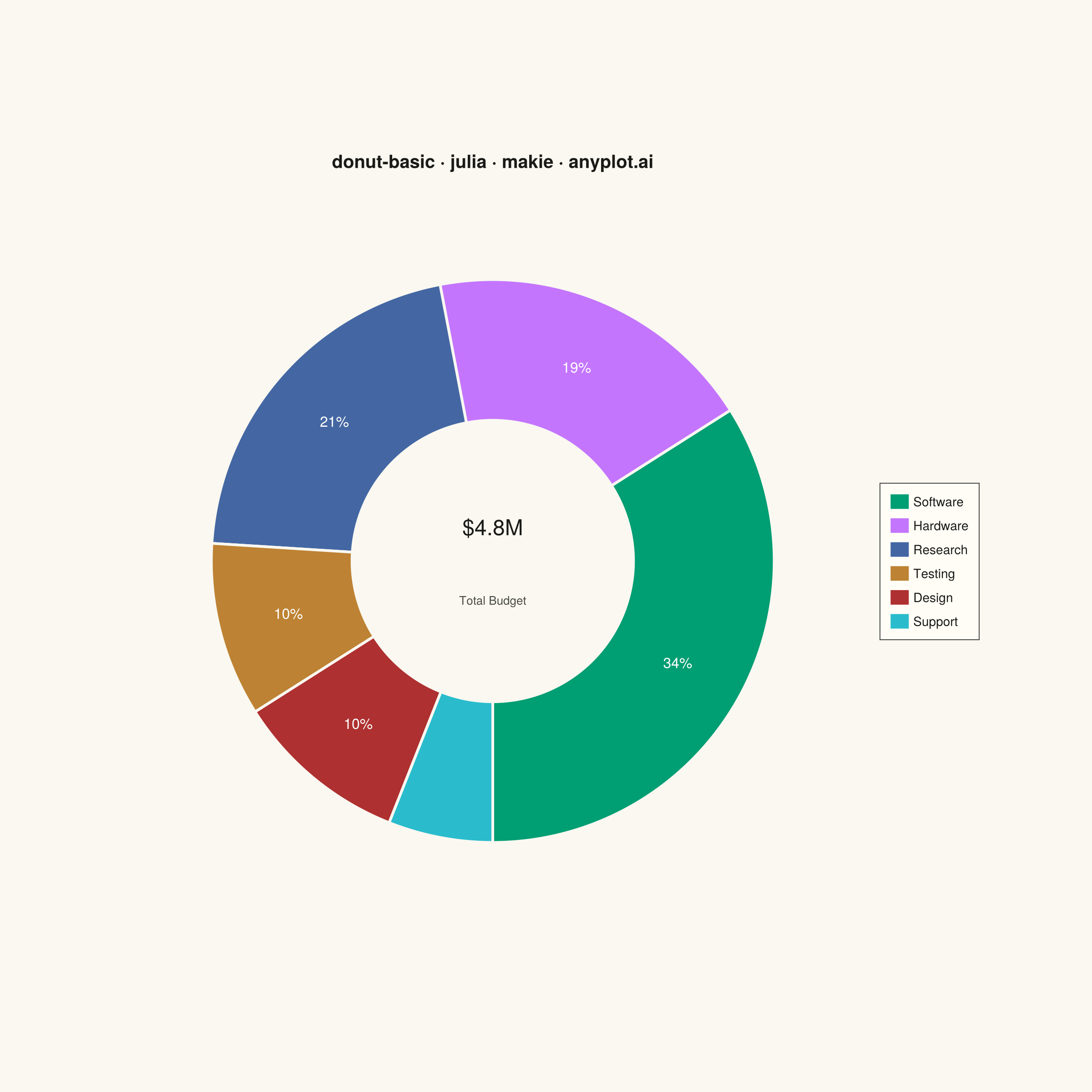
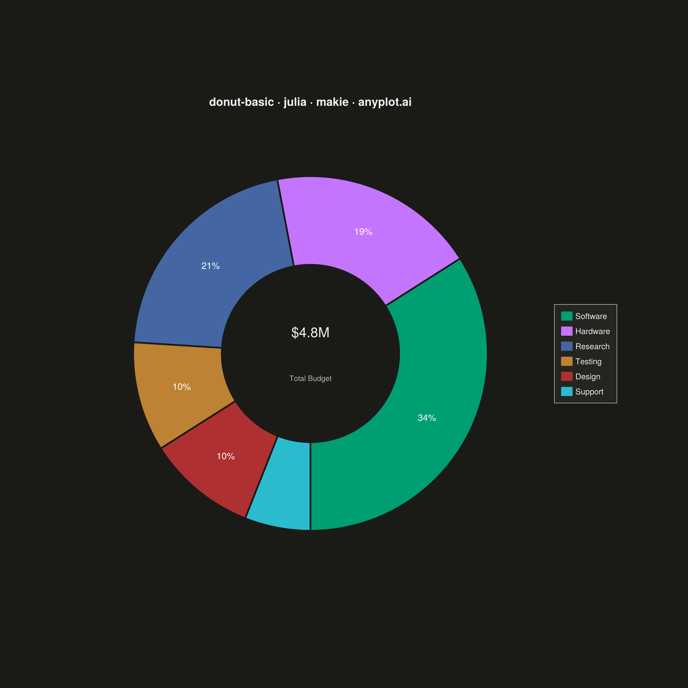
A donut chart (ring chart) showing proportions of categorical data as segments of a ring, with a hollow center. Similar to pie charts but the empty center can display summary statistics or additional information. The ring format can be easier to read when comparing segment sizes.
# anyplot.ai
# donut-basic: Basic Donut Chart
# Library: makie 0.21.9 | Julia 1.11.9
# Quality: 87/100 | Created: 2026-06-25

using CairoMakie
using Colors
using Random

Random.seed!(42)

# Theme tokens
const THEME       = get(ENV, "ANYPLOT_THEME", "light")
const PAGE_BG     = THEME == "light" ? colorant"#FAF8F1" : colorant"#1A1A17"
const ELEVATED_BG = THEME == "light" ? colorant"#FFFDF6" : colorant"#242420"
const INK         = THEME == "light" ? colorant"#1A1A17" : colorant"#F0EFE8"
const INK_SOFT    = THEME == "light" ? colorant"#4A4A44" : colorant"#B8B7B0"
const IMPRINT_PALETTE = [
    colorant"#009E73",  # 1 — brand green
    colorant"#C475FD",  # 2 — lavender
    colorant"#4467A3",  # 3 — blue
    colorant"#BD8233",  # 4 — ochre
    colorant"#AE3030",  # 5 — matte red
    colorant"#2ABCCD",  # 6 — cyan
]

# Data: annual R&D budget allocation by division
const categories = ["Software", "Hardware", "Research", "Testing", "Design", "Support"]
const values     = [34.0, 19.0, 21.0, 10.0, 10.0, 6.0]
const n          = length(categories)
const proportions = values ./ sum(values)

# Segment angles — start from top (−π/2), clockwise
const cum_props    = cumsum(proportions)
const angles_end   = cum_props .* 2π .- π/2
const angles_start = vcat(-π/2, angles_end[1:end-1])

# Figure — square canvas → 2400×2400 px (size × px_per_unit = 1200 × 2)
fig = Figure(
    size            = (1200, 1200),
    fontsize        = 14,
    backgroundcolor = PAGE_BG,
)

ax = Axis(
    fig[1, 1];
    title              = "R&D Budget Allocation · donut-basic · julia · makie · anyplot.ai",
    titlesize          = 16,
    titlecolor         = INK,
    titlegap           = 10,
    backgroundcolor    = PAGE_BG,
    aspect             = DataAspect(),
)
hidespines!(ax)
hidedecorations!(ax)
limits!(ax, -1.35, 1.35, -1.35, 1.35)

# Donut ring geometry
const OUTER_R = 1.0
const INNER_R = 0.50
const N_ARC   = 220

# Draw annular segments as polygons
for i in 1:n
    θs = range(angles_start[i], angles_end[i]; length=N_ARC)
    ox = OUTER_R .* cos.(θs)
    oy = OUTER_R .* sin.(θs)
    ix = INNER_R .* cos.(reverse(θs))
    iy = INNER_R .* sin.(reverse(θs))
    pts = Point2f.(vcat(ox, ix), vcat(oy, iy))
    poly!(ax, pts; color=IMPRINT_PALETTE[i], strokecolor=PAGE_BG, strokewidth=3.0)
end

# Percentage labels inside segments (skip very small slices)
const dominant_i = argmax(proportions)
for i in 1:n
    proportions[i] < 0.07 && continue
    θ_mid = (angles_start[i] + angles_end[i]) / 2
    r_mid = (OUTER_R + INNER_R) / 2
    pct   = round(Int, proportions[i] * 100)
    is_dominant = (i == dominant_i)
    text!(ax, "$(pct)%";
          position = Point2f(r_mid * cos(θ_mid), r_mid * sin(θ_mid)),
          align    = (:center, :center),
          fontsize = is_dominant ? 20 : 16,
          font     = is_dominant ? :bold : :regular,
          color    = RGBf(1.0, 1.0, 1.0))
end

# Center annotation — total budget and label
text!(ax, "\$4.8M";
      position = Point2f(0.0, 0.12),
      align    = (:center, :center),
      fontsize = 24,
      color    = INK)
text!(ax, "Total Budget";
      position = Point2f(0.0, -0.14),
      align    = (:center, :center),
      fontsize = 13,
      color    = INK_SOFT)

# Legend
elems = [PolyElement(color=IMPRINT_PALETTE[i], strokecolor=:transparent, strokewidth=0)
         for i in 1:n]
Legend(fig[1, 2], elems, categories;
       labelsize       = 14.0f0,
       labelcolor      = INK,
       framevisible    = false,
       framecolor      = INK_SOFT,
       backgroundcolor = ELEVATED_BG,
       patchsize       = (20.0f0, 16.0f0),
       rowgap          = 10,
       padding         = (12, 12, 12, 12))

colsize!(fig.layout, 1, Relative(0.72))
colgap!(fig.layout, 8)

save("plot-$(THEME).png", fig; px_per_unit=2)
Runnable source as JSON, for any HTTP client: https://api.anyplot.ai/specs/donut-basic/makie/code. Any spec id and library id listed in llms-full.txt fit the same URL shape; every URL below is complete and callable.
{
  "spec_id": "donut-basic",
  "language": "julia",
  "library": "makie",
  "page": "https://anyplot.ai/donut-basic/julia/makie",
  "hub": "https://anyplot.ai/donut-basic",
  "code_json": "https://api.anyplot.ai/specs/donut-basic/makie/code",
  "spec_json": "https://api.anyplot.ai/specs/donut-basic",
  "render_light_png": "https://storage.googleapis.com/anyplot-images/plots/donut-basic/julia/makie/plot-light.png",
  "render_dark_png": "https://storage.googleapis.com/anyplot-images/plots/donut-basic/julia/makie/plot-dark.png",
  "quality_score": 87.0,
  "license": "MIT",
  "guide": "https://anyplot.ai/llms.txt"
}
Part of Basic Donut Chart on anyplot.ai.