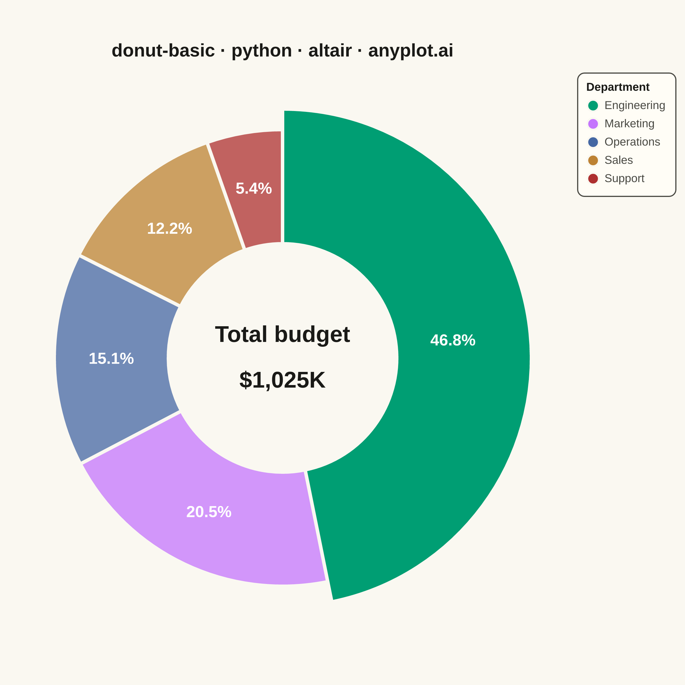
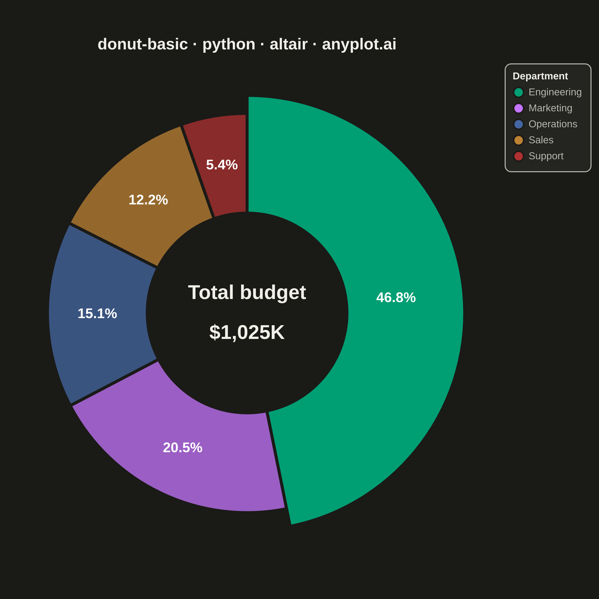
A donut chart (ring chart) showing proportions of categorical data as segments of a ring, with a hollow center. Similar to pie charts but the empty center can display summary statistics or additional information. The ring format can be easier to read when comparing segment sizes.
""" anyplot.ai
donut-basic: Basic Donut Chart
Library: altair 6.2.2 | Python 3.13.14
Quality: 91/100 | Updated: 2026-06-25
"""

import importlib
import os
import sys


# Drop script directory from sys.path so the `altair` package resolves, not this file
sys.path[:] = [p for p in sys.path if os.path.abspath(p or ".") != os.path.dirname(os.path.abspath(__file__))]
alt = importlib.import_module("altair")
pd = importlib.import_module("pandas")
from PIL import Image


THEME = os.getenv("ANYPLOT_THEME", "light")
PAGE_BG = "#FAF8F1" if THEME == "light" else "#1A1A17"
ELEVATED_BG = "#FFFDF6" if THEME == "light" else "#242420"
INK = "#1A1A17" if THEME == "light" else "#F0EFE8"
INK_SOFT = "#4A4A44" if THEME == "light" else "#B8B7B0"

# Imprint palette — positions 1-5 for 5 departments
IMPRINT = ["#009E73", "#C475FD", "#4467A3", "#BD8233", "#AE3030"]

data = pd.DataFrame(
    {"category": ["Engineering", "Marketing", "Operations", "Sales", "Support"], "value": [480, 210, 155, 125, 55]}
)

total = int(data["value"].sum())
data["percentage"] = (data["value"] / total * 100).round(1)
data["label"] = data["percentage"].astype(str) + "%"

# Hover selection: dims non-hovered segments to draw the eye (Vega-Lite interactive feature)
highlight = alt.selection_point(on="mouseover", empty=False, fields=["category"])

# Main ring — all segments at standard radius
arc = (
    alt.Chart(data)
    .mark_arc(innerRadius=100, outerRadius=200, stroke=PAGE_BG, strokeWidth=3)
    .encode(
        theta=alt.Theta(field="value", type="quantitative", stack=True),
        color=alt.Color(
            field="category",
            type="nominal",
            scale=alt.Scale(domain=list(data["category"]), range=IMPRINT),
            legend=alt.Legend(
                title="Department", titleFontSize=10, labelFontSize=10, orient="right", symbolSize=100, padding=8
            ),
        ),
        opacity=alt.condition(highlight, alt.value(1.0), alt.value(0.75)),
        order=alt.Order(field="value", sort="descending"),
        tooltip=[
            alt.Tooltip("category:N", title="Department"),
            alt.Tooltip("value:Q", title="Budget ($K)"),
            alt.Tooltip("percentage:Q", title="Share (%)", format=".1f"),
        ],
    )
    .add_params(highlight)
)

# Focal emphasis: Engineering (dominant at 46.8%) gets a wider outer ring
engineering_data = data[data["category"] == "Engineering"]
arc_emphasis = (
    alt.Chart(engineering_data)
    .mark_arc(innerRadius=100, outerRadius=218, stroke=PAGE_BG, strokeWidth=3)
    .encode(
        theta=alt.Theta(field="value", type="quantitative", stack=True),
        color=alt.Color(
            field="category", type="nominal", scale=alt.Scale(domain=list(data["category"]), range=IMPRINT), legend=None
        ),
        order=alt.Order(field="value", sort="descending"),
    )
)

labels = (
    alt.Chart(data)
    .mark_text(radius=150, fontSize=14, fontWeight="bold", color="#FFFFFF")
    .encode(
        theta=alt.Theta(field="value", type="quantitative", stack=True),
        order=alt.Order(field="value", sort="descending"),
        text=alt.Text("label:N"),
    )
)

center = (
    alt.Chart(pd.DataFrame({"line": ["Total budget", f"${total:,}K"], "y": [0.08, -0.08]}))
    .mark_text(fontSize=20, fontWeight="bold", color=INK, align="center")
    .encode(y=alt.Y("y:Q", axis=None, scale=alt.Scale(domain=[-1, 1])), text="line:N")
)

title_str = "donut-basic · python · altair · anyplot.ai"

final_chart = (
    alt.layer(arc, arc_emphasis, labels, center)
    .properties(
        width=480,
        height=500,
        background=PAGE_BG,
        title=alt.Title(text=title_str, fontSize=16, anchor="middle", color=INK, offset=10),
        padding={"left": 0, "right": 0, "top": 0, "bottom": 0},
    )
    .configure_view(fill=PAGE_BG, stroke=None)
    .configure_legend(fillColor=ELEVATED_BG, strokeColor=INK_SOFT, labelColor=INK_SOFT, titleColor=INK, cornerRadius=6)
)

final_chart.save(f"plot-{THEME}.png", scale_factor=4.0)

# Pad to exact 2400×2400 target (square — symmetric circular chart)
TW, TH = 2400, 2400
_img = Image.open(f"plot-{THEME}.png").convert("RGB")
_w, _h = _img.size
if _w > TW or _h > TH:
    raise SystemExit(
        f"altair vl-convert produced {_w}×{_h}, exceeds target {TW}×{TH}. "
        f"Shrink chart .properties(width=, height=) values and re-render."
    )
if _w < TW or _h < TH:
    _canvas = Image.new("RGB", (TW, TH), PAGE_BG)
    _canvas.paste(_img, ((TW - _w) // 2, (TH - _h) // 2))
    _canvas.save(f"plot-{THEME}.png")

final_chart.save(f"plot-{THEME}.html")
Runnable source as JSON, for any HTTP client: https://api.anyplot.ai/specs/donut-basic/altair/code. Any spec id and library id listed in llms-full.txt fit the same URL shape; every URL below is complete and callable.
{
  "spec_id": "donut-basic",
  "language": "python",
  "library": "altair",
  "page": "https://anyplot.ai/donut-basic/python/altair",
  "hub": "https://anyplot.ai/donut-basic",
  "code_json": "https://api.anyplot.ai/specs/donut-basic/altair/code",
  "spec_json": "https://api.anyplot.ai/specs/donut-basic",
  "render_light_png": "https://storage.googleapis.com/anyplot-images/plots/donut-basic/python/altair/plot-light.png",
  "render_dark_png": "https://storage.googleapis.com/anyplot-images/plots/donut-basic/python/altair/plot-dark.png",
  "interactive_light_html": "https://storage.googleapis.com/anyplot-images/plots/donut-basic/python/altair/plot-light.html",
  "interactive_dark_html": "https://storage.googleapis.com/anyplot-images/plots/donut-basic/python/altair/plot-dark.html",
  "quality_score": 91.0,
  "license": "MIT",
  "guide": "https://anyplot.ai/llms.txt"
}
Part of Basic Donut Chart on anyplot.ai.