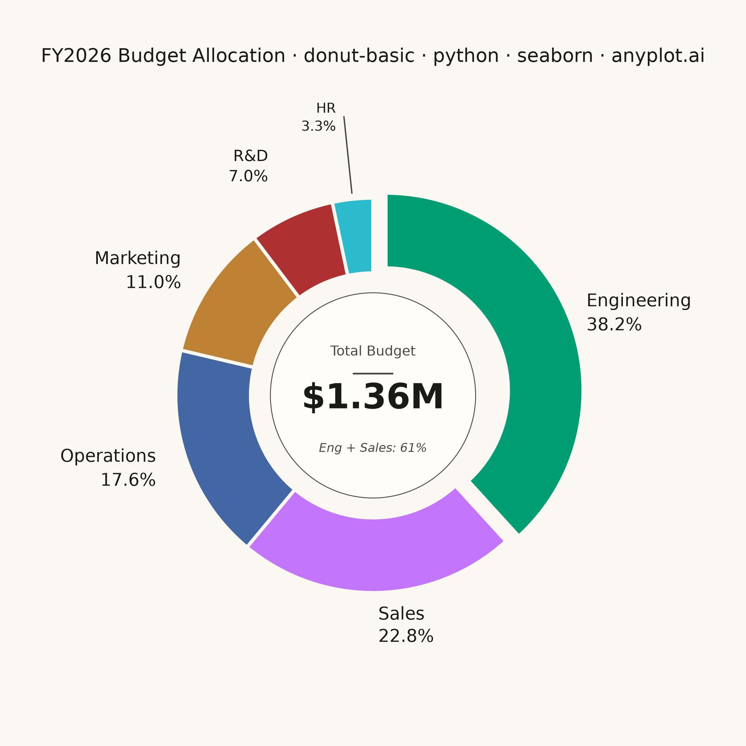
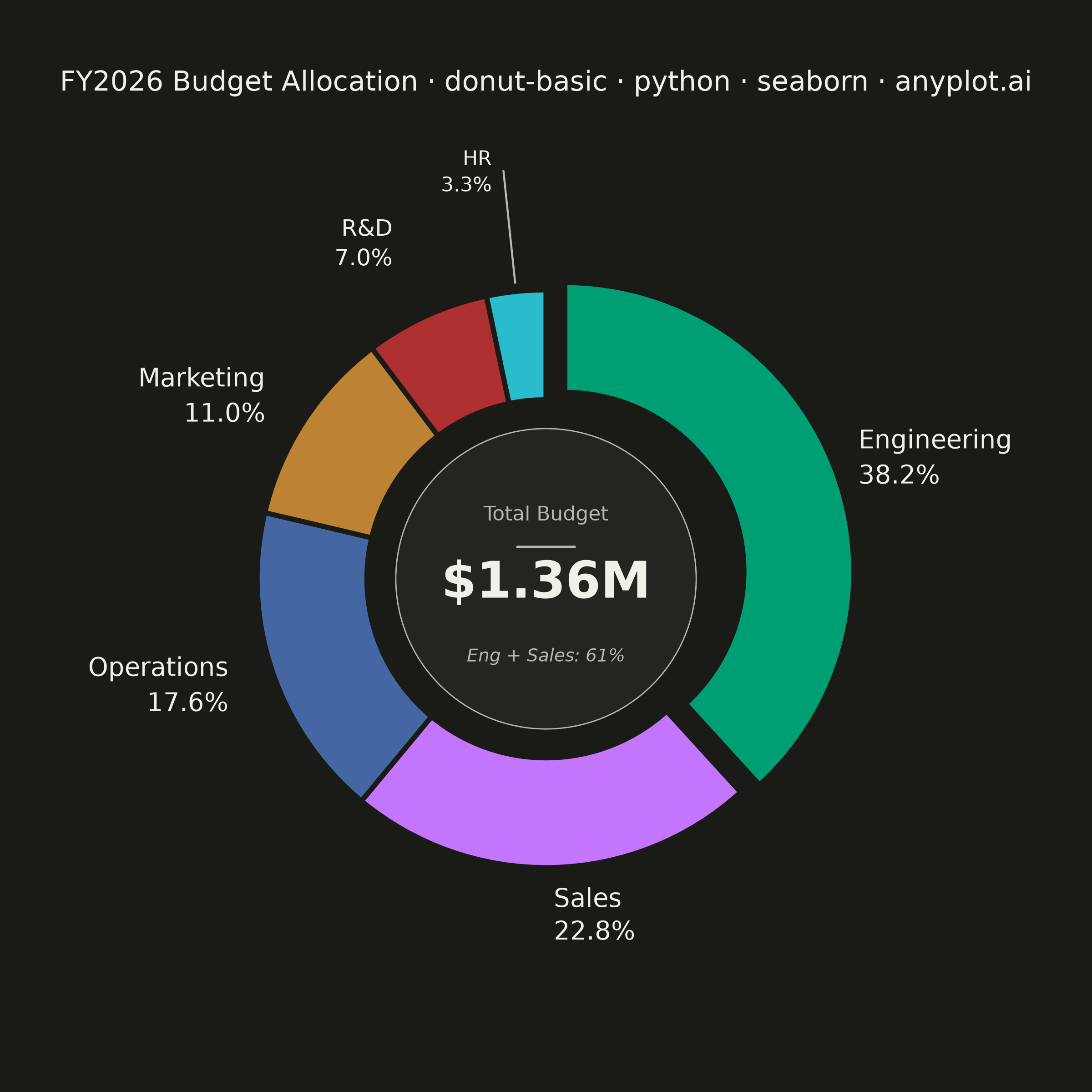
A donut chart (ring chart) showing proportions of categorical data as segments of a ring, with a hollow center. Similar to pie charts but the empty center can display summary statistics or additional information. The ring format can be easier to read when comparing segment sizes.
""" anyplot.ai
donut-basic: Basic Donut Chart
Library: seaborn 0.13.2 | Python 3.13.14
Quality: 88/100 | Updated: 2026-06-25
"""

import os
import sys


# matplotlib.py in this directory (sibling impl) shadows the real package — remove it from path.
_dir = os.path.dirname(os.path.abspath(__file__))
sys.path[:] = [p for p in sys.path if os.path.normpath(p or ".") != os.path.normpath(_dir)]

import matplotlib.patches as mpatches
import matplotlib.pyplot as plt
import numpy as np
import pandas as pd
import seaborn as sns


# Theme tokens
THEME = os.getenv("ANYPLOT_THEME", "light")
PAGE_BG = "#FAF8F1" if THEME == "light" else "#1A1A17"
ELEVATED_BG = "#FFFDF6" if THEME == "light" else "#242420"
INK = "#1A1A17" if THEME == "light" else "#F0EFE8"
INK_SOFT = "#4A4A44" if THEME == "light" else "#B8B7B0"

# Imprint palette — canonical order, first series always #009E73
IMPRINT_PALETTE = ["#009E73", "#C475FD", "#4467A3", "#BD8233", "#AE3030", "#2ABCCD"]

# Data — departmental budget allocation (ordered largest → smallest for readability)
budget = pd.DataFrame(
    {
        "department": ["Engineering", "Sales", "Operations", "Marketing", "R&D", "HR"],
        "amount": [520_000, 310_000, 240_000, 150_000, 95_000, 45_000],
    }
)
total = budget["amount"].sum()
budget["share"] = budget["amount"] / total * 100

# Theme — apply Imprint palette and background tokens via seaborn; set_context scales text proportionally
sns.set_theme(style="white", rc={"figure.facecolor": PAGE_BG, "axes.facecolor": PAGE_BG, "text.color": INK})
sns.set_context("notebook", font_scale=0.85)
wedge_colors = sns.color_palette(IMPRINT_PALETTE, n_colors=len(budget)).as_hex()

# Plot — square canvas 2400×2400 (figsize=(6, 6) @ dpi=400)
fig, ax = plt.subplots(figsize=(6, 6), dpi=400, facecolor=PAGE_BG)
ax.set_facecolor(PAGE_BG)

# Engineering segment emphasized with clearly visible explode offset
explode = [0.07 if i == 0 else 0.0 for i in range(len(budget))]

wedges, _ = ax.pie(
    budget["amount"],
    colors=wedge_colors,
    startangle=90,
    counterclock=False,
    explode=explode,
    wedgeprops={"width": 0.38, "edgecolor": PAGE_BG, "linewidth": 2},
)

# Center card — subtle filled circle contains the metric and provides visual elevation
center_circle = mpatches.Circle((0, 0), radius=0.52, facecolor=ELEVATED_BG, edgecolor=INK_SOFT, linewidth=0.5, zorder=2)
ax.add_patch(center_circle)

# External labels — staggered radii prevent crowding for small segments
for wedge, dept, share in zip(wedges, budget["department"], budget["share"], strict=True):
    angle = (wedge.theta2 + wedge.theta1) / 2
    angle_rad = np.deg2rad(angle)
    cos_a, sin_a = np.cos(angle_rad), np.sin(angle_rad)
    ha = "left" if cos_a >= 0 else "right"

    if share < 5:
        # Tiny segment: leader line + label at larger radius to clear adjacent text
        x_outer, y_outer = 1.03 * cos_a, 1.03 * sin_a
        r_label = 1.42
        x_label, y_label = r_label * cos_a, r_label * sin_a
        ax.plot([x_outer, x_label], [y_outer, y_label], color=INK_SOFT, lw=0.8, solid_capstyle="round")
        offset = 0.04 if ha == "left" else -0.04
        ax.text(
            x_label + offset,
            y_label,
            f"{dept}\n{share:.1f}%",
            ha=ha,
            va="center",
            fontsize=8,
            color=INK,
            linespacing=1.3,
        )
    elif share < 10:
        radius = 1.28
        ax.text(
            radius * cos_a,
            radius * sin_a,
            f"{dept}\n{share:.1f}%",
            ha=ha,
            va="center",
            fontsize=9,
            color=INK,
            linespacing=1.3,
        )
    else:
        radius = 1.16
        ax.text(
            radius * cos_a,
            radius * sin_a,
            f"{dept}\n{share:.1f}%",
            ha=ha,
            va="center",
            fontsize=10,
            color=INK,
            linespacing=1.3,
        )

# Center metric: label, separator, bold total, and narrative note (all zorder=3 to appear above circle)
ax.text(0, 0.22, "Total Budget", ha="center", va="center", fontsize=8, color=INK_SOFT, zorder=3)
ax.plot([-0.10, 0.10], [0.11, 0.11], color=INK_SOFT, linewidth=1.0, solid_capstyle="round", zorder=3)
ax.text(
    0,
    -0.02,
    f"${total / 1_000_000:.2f}M",
    ha="center",
    va="center",
    fontsize=20,
    fontweight="bold",
    color=INK,
    zorder=3,
)
# Narrative callout: top-2 segments dominate budget
top2_pct = budget["share"].iloc[:2].sum()
ax.text(
    0,
    -0.27,
    f"Eng + Sales: {top2_pct:.0f}%",
    ha="center",
    va="center",
    fontsize=7,
    color=INK_SOFT,
    style="italic",
    zorder=3,
)

# Title — descriptive prefix adds context; n>67 chars so fontsize scaled down
title = "FY2026 Budget Allocation · donut-basic · python · seaborn · anyplot.ai"
n = len(title)
title_fontsize = max(8, round(12 * 67 / n)) if n > 67 else 12
ax.set_title(title, fontsize=title_fontsize, fontweight="medium", color=INK, pad=16)

ax.set_aspect("equal")
ax.set_xlim(-1.55, 1.55)
ax.set_ylim(-1.55, 1.55)
sns.despine(ax=ax, top=True, bottom=True, left=True, right=True)
ax.set_axis_off()

fig.subplots_adjust(top=0.88, bottom=0.06, left=0.05, right=0.95)
plt.savefig(f"plot-{THEME}.png", dpi=400, facecolor=PAGE_BG)
Runnable source as JSON, for any HTTP client: https://api.anyplot.ai/specs/donut-basic/seaborn/code. Any spec id and library id listed in llms-full.txt fit the same URL shape; every URL below is complete and callable.
{
  "spec_id": "donut-basic",
  "language": "python",
  "library": "seaborn",
  "page": "https://anyplot.ai/donut-basic/python/seaborn",
  "hub": "https://anyplot.ai/donut-basic",
  "code_json": "https://api.anyplot.ai/specs/donut-basic/seaborn/code",
  "spec_json": "https://api.anyplot.ai/specs/donut-basic",
  "render_light_png": "https://storage.googleapis.com/anyplot-images/plots/donut-basic/python/seaborn/plot-light.png",
  "render_dark_png": "https://storage.googleapis.com/anyplot-images/plots/donut-basic/python/seaborn/plot-dark.png",
  "quality_score": 88.0,
  "license": "MIT",
  "guide": "https://anyplot.ai/llms.txt"
}
Part of Basic Donut Chart on anyplot.ai.