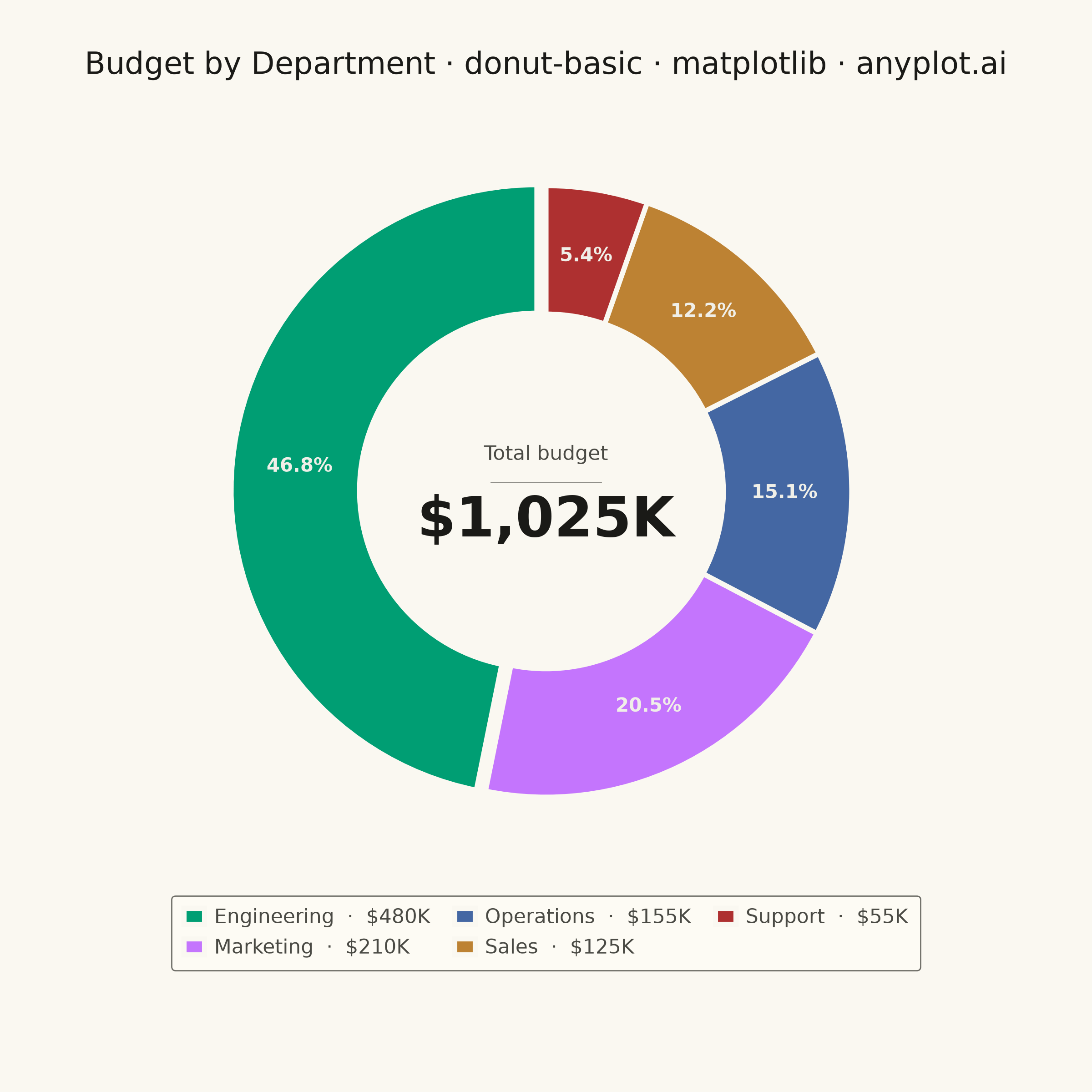
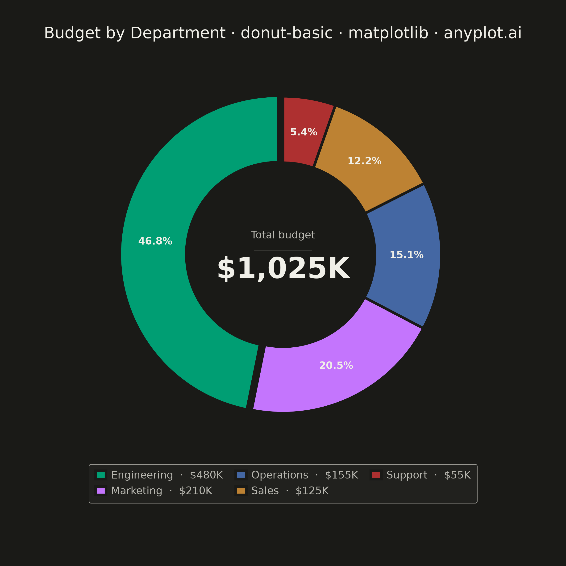
A donut chart (ring chart) showing proportions of categorical data as segments of a ring, with a hollow center. Similar to pie charts but the empty center can display summary statistics or additional information. The ring format can be easier to read when comparing segment sizes.
""" anyplot.ai
donut-basic: Basic Donut Chart
Library: matplotlib 3.11.0 | Python 3.13.14
Quality: 90/100 | Updated: 2026-06-25
"""

import os

import matplotlib.pyplot as plt


# Theme tokens
THEME = os.getenv("ANYPLOT_THEME", "light")
PAGE_BG = "#FAF8F1" if THEME == "light" else "#1A1A17"
ELEVATED_BG = "#FFFDF6" if THEME == "light" else "#242420"
INK = "#1A1A17" if THEME == "light" else "#F0EFE8"
INK_SOFT = "#4A4A44" if THEME == "light" else "#B8B7B0"
INK_MUTED = "#6B6A63" if THEME == "light" else "#A8A79F"

# Imprint palette — 8 hues, hybrid-v3 sort; first 5 positions for 5 categories
IMPRINT = ["#009E73", "#C475FD", "#4467A3", "#BD8233", "#AE3030"]

# Data — annual budget allocation by department (USD thousands)
categories = ["Engineering", "Marketing", "Operations", "Sales", "Support"]
values = [480, 210, 155, 125, 55]
total = sum(values)

# Square canvas for symmetric circular shapes: figsize=(6, 6) × dpi=400 → 2400×2400 px
fig, ax = plt.subplots(figsize=(6, 6), dpi=400, facecolor=PAGE_BG)
ax.set_facecolor(PAGE_BG)

# Slight explode on dominant Engineering segment for visual emphasis
explode = [0.03, 0, 0, 0, 0]

wedges, _, autotexts = ax.pie(
    values,
    explode=explode,
    autopct="%1.1f%%",
    startangle=90,
    colors=IMPRINT,
    wedgeprops={"width": 0.42, "edgecolor": PAGE_BG, "linewidth": 2},
    pctdistance=0.78,
)

# Percentage labels sit on colored wedges — off-white for contrast in both themes
for autotext in autotexts:
    autotext.set_fontsize(7.5)
    autotext.set_color("#F0EFE8")
    autotext.set_fontweight("bold")

# Center metric: subtitle, thin rule, bold total
ax.text(0, 0.12, "Total budget", ha="center", va="center", fontsize=8, color=INK_SOFT)
ax.plot([-0.18, 0.18], [0.03, 0.03], color=INK_SOFT, linewidth=0.5, alpha=0.6)
ax.text(0, -0.10, f"${total:,}K", ha="center", va="center", fontsize=22, fontweight="bold", color=INK)

ax.set_aspect("equal")

title = "Budget by Department · donut-basic · python · matplotlib · anyplot.ai"
ax.set_title(title, fontsize=12, fontweight="medium", color=INK, pad=14)

# Value-enriched legend: shows category names with absolute budget amounts
legend_labels = [f"{cat}  ·  ${val:,}K" for cat, val in zip(categories, values, strict=True)]
leg = ax.legend(
    wedges,
    legend_labels,
    loc="lower center",
    bbox_to_anchor=(0.5, -0.14),
    ncol=3,
    fontsize=8,
    frameon=True,
    handlelength=1.0,
    handleheight=0.85,
    handletextpad=0.5,
    columnspacing=1.2,
    borderpad=0.6,
)
leg.get_frame().set_facecolor(ELEVATED_BG)
leg.get_frame().set_edgecolor(INK_SOFT)
leg.get_frame().set_linewidth(0.5)
plt.setp(leg.get_texts(), color=INK_SOFT)

fig.subplots_adjust(left=0.05, right=0.95, top=0.9, bottom=0.2)
plt.savefig(f"plot-{THEME}.png", dpi=400, facecolor=PAGE_BG)
Runnable source as JSON, for any HTTP client: https://api.anyplot.ai/specs/donut-basic/matplotlib/code. Any spec id and library id listed in llms-full.txt fit the same URL shape; every URL below is complete and callable.
{
  "spec_id": "donut-basic",
  "language": "python",
  "library": "matplotlib",
  "page": "https://anyplot.ai/donut-basic/python/matplotlib",
  "hub": "https://anyplot.ai/donut-basic",
  "code_json": "https://api.anyplot.ai/specs/donut-basic/matplotlib/code",
  "spec_json": "https://api.anyplot.ai/specs/donut-basic",
  "render_light_png": "https://storage.googleapis.com/anyplot-images/plots/donut-basic/python/matplotlib/plot-light.png",
  "render_dark_png": "https://storage.googleapis.com/anyplot-images/plots/donut-basic/python/matplotlib/plot-dark.png",
  "quality_score": 90.0,
  "license": "MIT",
  "guide": "https://anyplot.ai/llms.txt"
}
Part of Basic Donut Chart on anyplot.ai.