The same plot in 14 other libraries — Python: Altair, Bokeh, lets-plot, Matplotlib, Plotly, plotnine, Pygal, Seaborn; Julia: Makie.jl; JavaScript: Chart.js, D3.js, Apache ECharts, Highcharts, MUI X Charts. Compare all 15 side by side: Basic Donut Chart in Python, R, Julia and JavaScript.
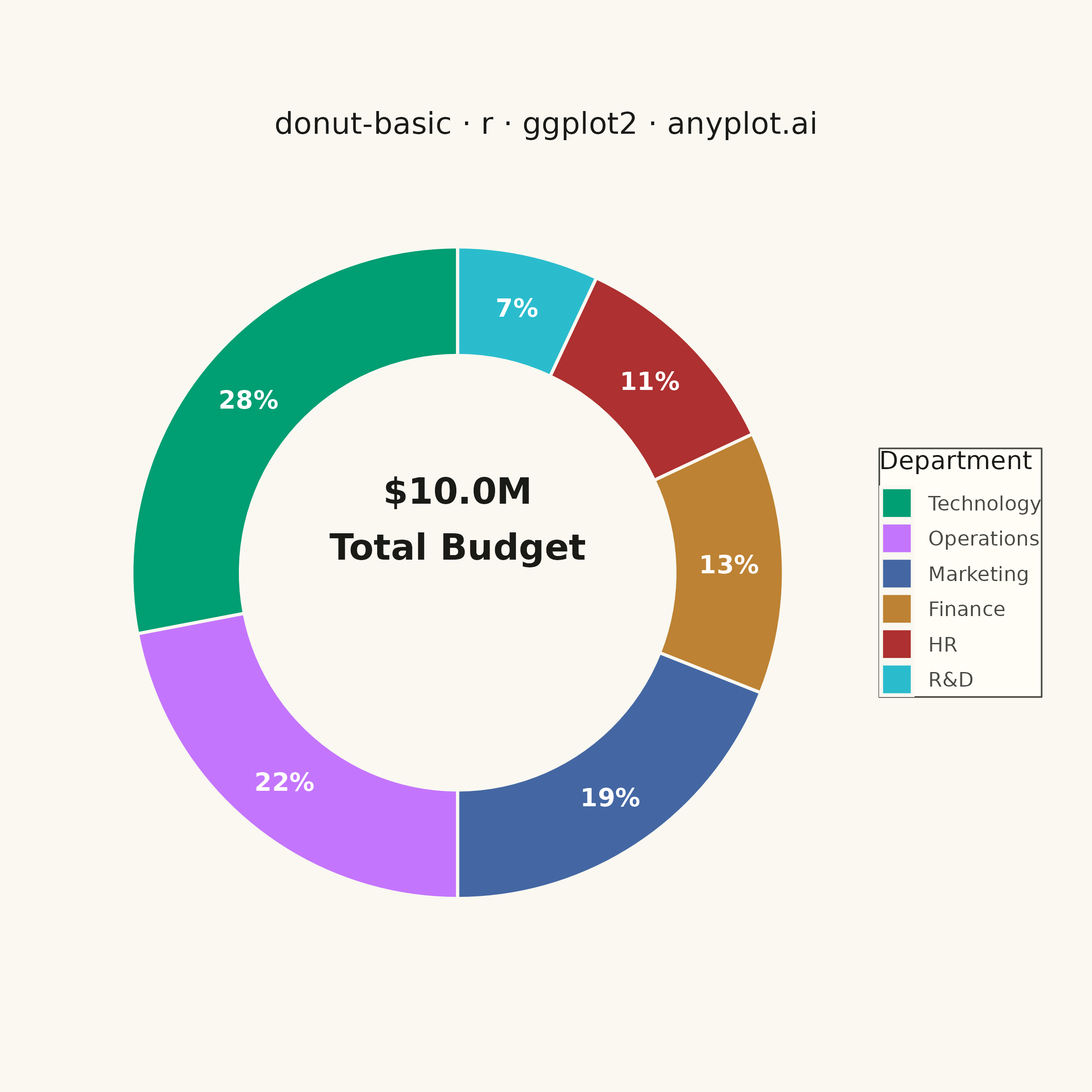
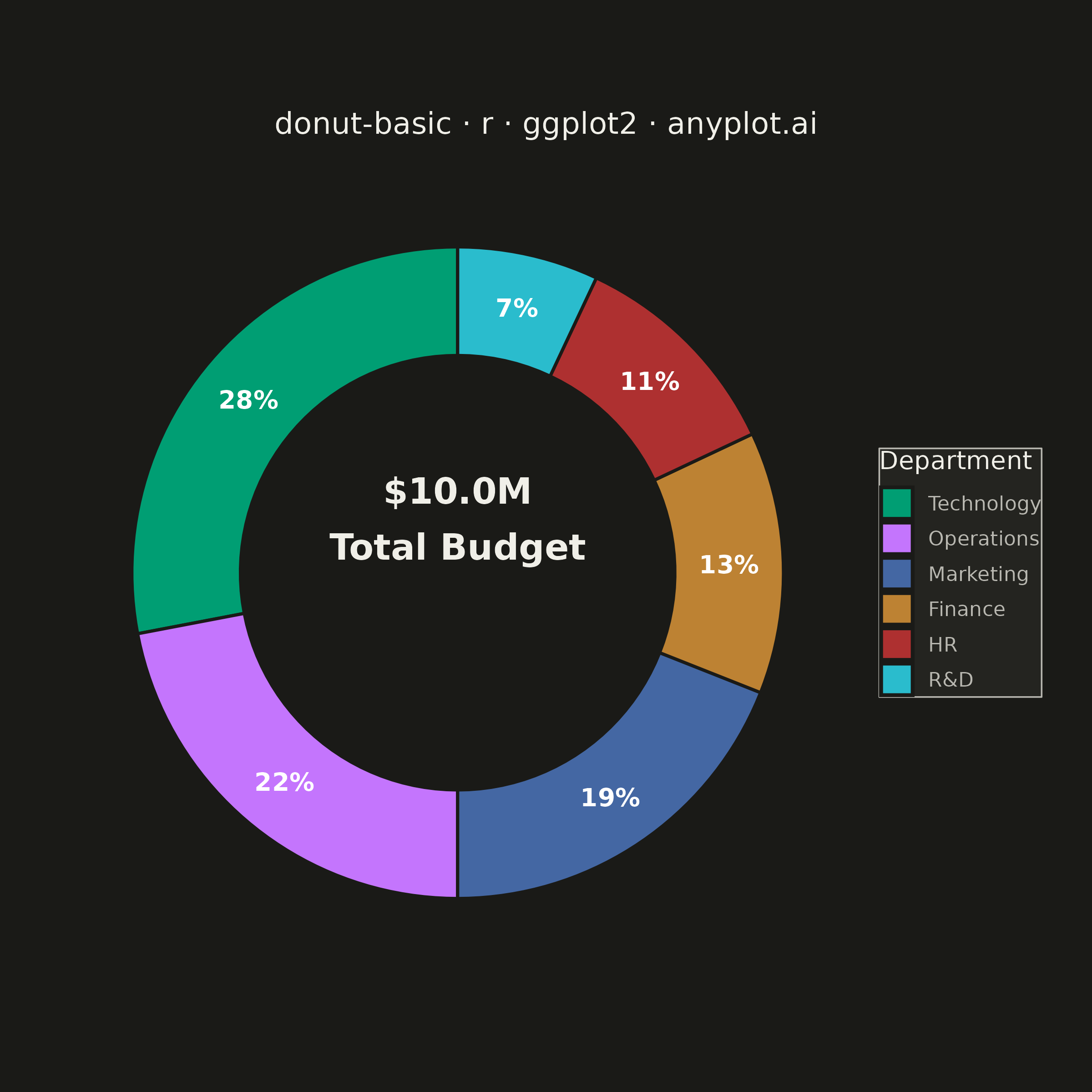
A donut chart (ring chart) showing proportions of categorical data as segments of a ring, with a hollow center. Similar to pie charts but the empty center can display summary statistics or additional information. The ring format can be easier to read when comparing segment sizes.
#' anyplot.ai
#' donut-basic: Basic Donut Chart
#' Library: ggplot2 3.5.1 | R 4.4.1
#' Quality: 87/100 | Created: 2026-06-25

library(ggplot2)
library(dplyr)
library(ragg)

set.seed(42)

# Theme tokens
THEME       <- Sys.getenv("ANYPLOT_THEME", "light")
PAGE_BG     <- if (THEME == "light") "#FAF8F1" else "#1A1A17"
ELEVATED_BG <- if (THEME == "light") "#FFFDF6" else "#242420"
INK         <- if (THEME == "light") "#1A1A17" else "#F0EFE8"
INK_SOFT    <- if (THEME == "light") "#4A4A44" else "#B8B7B0"

IMPRINT_PALETTE <- c(
  "#009E73",  # 1 — brand green
  "#C475FD",  # 2 — lavender
  "#4467A3",  # 3 — blue
  "#BD8233",  # 4 — ochre
  "#AE3030",  # 5 — matte red
  "#2ABCCD",  # 6 — cyan
  "#954477",  # 7 — rose
  "#99B314"   # 8 — lime
)

# Data — annual budget allocation by department (millions USD)
departments <- c("Technology", "Operations", "Marketing", "Finance", "HR", "R&D")
budgets     <- c(2.8, 2.2, 1.9, 1.3, 1.1, 0.7)

df <- data.frame(
  category = factor(departments, levels = departments),
  value    = budgets
) |>
  mutate(
    pct   = value / sum(value),
    label = paste0(sprintf("%.0f", pct * 100), "%")
  )

# geom_col stacks in reverse factor level order (last level first at y=0).
# Compute midpoints in the same reverse order so labels land in their segments.
df_label <- df |>
  arrange(desc(as.integer(category))) |>
  mutate(
    ymax = cumsum(pct),
    ymin = lag(ymax, default = 0),
    ymid = (ymax + ymin) / 2
  )

total_label <- paste0("$", sprintf("%.1f", sum(budgets)), "M\nTotal Budget")

# Plot
p <- ggplot(df) +
  geom_col(
    aes(x = 2, y = pct, fill = category),
    width     = 1,
    color     = PAGE_BG,
    linewidth = 0.6
  ) +
  geom_text(
    data     = df_label,
    aes(x = 2, y = ymid, label = label),
    color    = "#FFFFFF",
    size     = 3.5,
    fontface = "bold"
  ) +
  annotate(
    "text",
    x          = 0,
    y          = 0,
    label      = total_label,
    color      = INK,
    size       = 5,
    fontface   = "bold",
    hjust      = 0.5,
    vjust      = 0.5,
    lineheight = 1.3
  ) +
  coord_polar(theta = "y", start = 0) +
  scale_x_continuous(limits = c(-0.5, 2.5), expand = c(0, 0)) +
  scale_fill_manual(
    values = setNames(IMPRINT_PALETTE, departments)
  ) +
  labs(
    title = "donut-basic · r · ggplot2 · anyplot.ai",
    fill  = "Department"
  ) +
  theme_void() +
  theme(
    plot.background   = element_rect(fill = PAGE_BG, color = PAGE_BG),
    panel.background  = element_rect(fill = PAGE_BG, color = NA),
    plot.title          = element_text(
      color  = INK,
      size   = 12,
      hjust  = 0.5,
      margin = margin(b = 10)
    ),
    plot.title.position = "plot",
    legend.position   = "right",
    legend.text       = element_text(color = INK_SOFT, size = 8),
    legend.title      = element_text(color = INK, size = 10),
    legend.background = element_rect(fill = ELEVATED_BG, color = INK_SOFT, linewidth = 0.3),
    legend.key.size   = unit(14, "pt"),
    plot.margin       = margin(20, 20, 20, 20)
  )

# Save
ggsave(
  filename = sprintf("plot-%s.png", THEME),
  plot     = p,
  device   = ragg::agg_png,
  width    = 6,
  height   = 6,
  units    = "in",
  dpi      = 400
)
Runnable source as JSON, for any HTTP client: https://api.anyplot.ai/specs/donut-basic/ggplot2/code. Any spec id and library id listed in llms-full.txt fit the same URL shape; every URL below is complete and callable.
{
  "spec_id": "donut-basic",
  "language": "r",
  "library": "ggplot2",
  "page": "https://anyplot.ai/donut-basic/r/ggplot2",
  "hub": "https://anyplot.ai/donut-basic",
  "code_json": "https://api.anyplot.ai/specs/donut-basic/ggplot2/code",
  "spec_json": "https://api.anyplot.ai/specs/donut-basic",
  "render_light_png": "https://storage.googleapis.com/anyplot-images/plots/donut-basic/r/ggplot2/plot-light.png",
  "render_dark_png": "https://storage.googleapis.com/anyplot-images/plots/donut-basic/r/ggplot2/plot-dark.png",
  "quality_score": 87.0,
  "license": "MIT",
  "guide": "https://anyplot.ai/llms.txt"
}
Part of Basic Donut Chart on anyplot.ai.