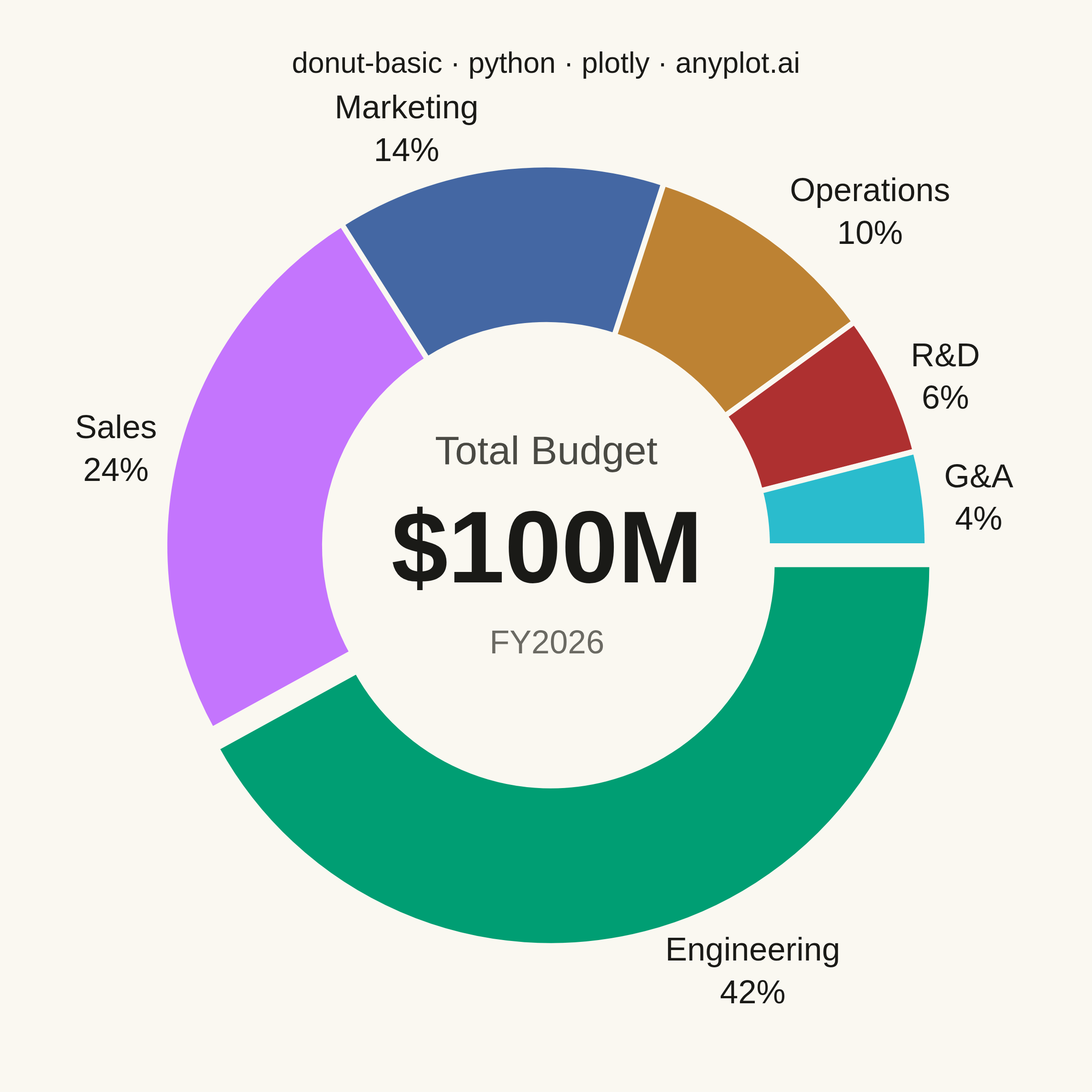
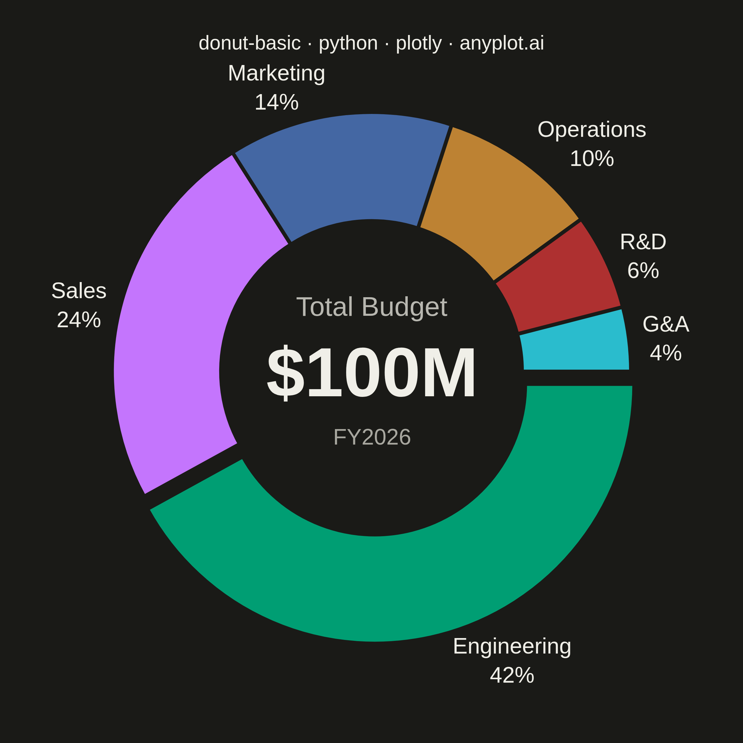
A donut chart (ring chart) showing proportions of categorical data as segments of a ring, with a hollow center. Similar to pie charts but the empty center can display summary statistics or additional information. The ring format can be easier to read when comparing segment sizes.
""" anyplot.ai
donut-basic: Basic Donut Chart
Library: plotly 6.8.0 | Python 3.13.14
Quality: 91/100 | Updated: 2026-06-25
"""

import os

import plotly.graph_objects as go


# Theme tokens
THEME = os.getenv("ANYPLOT_THEME", "light")
PAGE_BG = "#FAF8F1" if THEME == "light" else "#1A1A17"
ELEVATED_BG = "#FFFDF6" if THEME == "light" else "#242420"
INK = "#1A1A17" if THEME == "light" else "#F0EFE8"
INK_SOFT = "#4A4A44" if THEME == "light" else "#B8B7B0"
INK_MUTED = "#6B6A63" if THEME == "light" else "#A8A79F"

# Imprint categorical palette — 8 hues, hybrid-v3 sort
IMPRINT_PALETTE = ["#009E73", "#C475FD", "#4467A3", "#BD8233", "#AE3030", "#2ABCCD", "#954477", "#99B314"]

# Data — FY2026 corporate budget allocation ($100M total)
categories = ["Engineering", "Sales", "Marketing", "Operations", "R&D", "G&A"]
values = [42, 24, 14, 10, 6, 4]
total = sum(values)
colors = IMPRINT_PALETTE[: len(categories)]

# Pull dominant Engineering segment outward for visual emphasis
pull = [0.05] + [0] * (len(categories) - 1)

# Plot
fig = go.Figure(
    data=[
        go.Pie(
            labels=categories,
            values=values,
            hole=0.58,
            marker={
                "colors": colors,
                "line": {"color": PAGE_BG, "width": 3},  # theme-adaptive separator lines
            },
            textinfo="label+percent",
            textfont={"size": 18, "color": INK, "family": "Inter, Arial, sans-serif"},
            textposition="outside",
            pull=pull,
            sort=False,
            direction="clockwise",
            rotation=90,
            insidetextorientation="horizontal",
            automargin=True,
            hovertemplate="<b>%{label}</b><br>%{percent:.0%}<br>$%{value}M<extra></extra>",
        )
    ]
)

# Three-level center annotation: header / bold total / year
fig.add_annotation(
    text="Total Budget",
    x=0.5,
    y=0.62,
    font={"size": 22, "color": INK_SOFT, "family": "Inter, Arial, sans-serif"},
    showarrow=False,
)
fig.add_annotation(
    text=f"<b>${total}M</b>",
    x=0.5,
    y=0.5,
    font={"size": 56, "color": INK, "family": "Inter, Arial, sans-serif"},
    showarrow=False,
)
fig.add_annotation(
    text="FY2026",
    x=0.5,
    y=0.38,
    font={"size": 18, "color": INK_MUTED, "family": "Inter, Arial, sans-serif"},
    showarrow=False,
)

title = "donut-basic · python · plotly · anyplot.ai"
fig.update_layout(
    autosize=False,
    paper_bgcolor=PAGE_BG,
    plot_bgcolor=PAGE_BG,
    font={"color": INK, "family": "Inter, Arial, sans-serif"},
    title={"text": title, "font": {"size": 16, "color": INK}, "x": 0.5, "xanchor": "center"},
    showlegend=False,
    margin={"l": 80, "r": 80, "t": 80, "b": 80},
)

# Save — square 2400×2400 px (symmetric donut chart)
fig.write_image(f"plot-{THEME}.png", width=600, height=600, scale=4)
fig.write_html(f"plot-{THEME}.html", include_plotlyjs="cdn")
Runnable source as JSON, for any HTTP client: https://api.anyplot.ai/specs/donut-basic/plotly/code. Any spec id and library id listed in llms-full.txt fit the same URL shape; every URL below is complete and callable.
{
  "spec_id": "donut-basic",
  "language": "python",
  "library": "plotly",
  "page": "https://anyplot.ai/donut-basic/python/plotly",
  "hub": "https://anyplot.ai/donut-basic",
  "code_json": "https://api.anyplot.ai/specs/donut-basic/plotly/code",
  "spec_json": "https://api.anyplot.ai/specs/donut-basic",
  "render_light_png": "https://storage.googleapis.com/anyplot-images/plots/donut-basic/python/plotly/plot-light.png",
  "render_dark_png": "https://storage.googleapis.com/anyplot-images/plots/donut-basic/python/plotly/plot-dark.png",
  "interactive_light_html": "https://storage.googleapis.com/anyplot-images/plots/donut-basic/python/plotly/plot-light.html",
  "interactive_dark_html": "https://storage.googleapis.com/anyplot-images/plots/donut-basic/python/plotly/plot-dark.html",
  "quality_score": 91.0,
  "license": "MIT",
  "guide": "https://anyplot.ai/llms.txt"
}
Part of Basic Donut Chart on anyplot.ai.