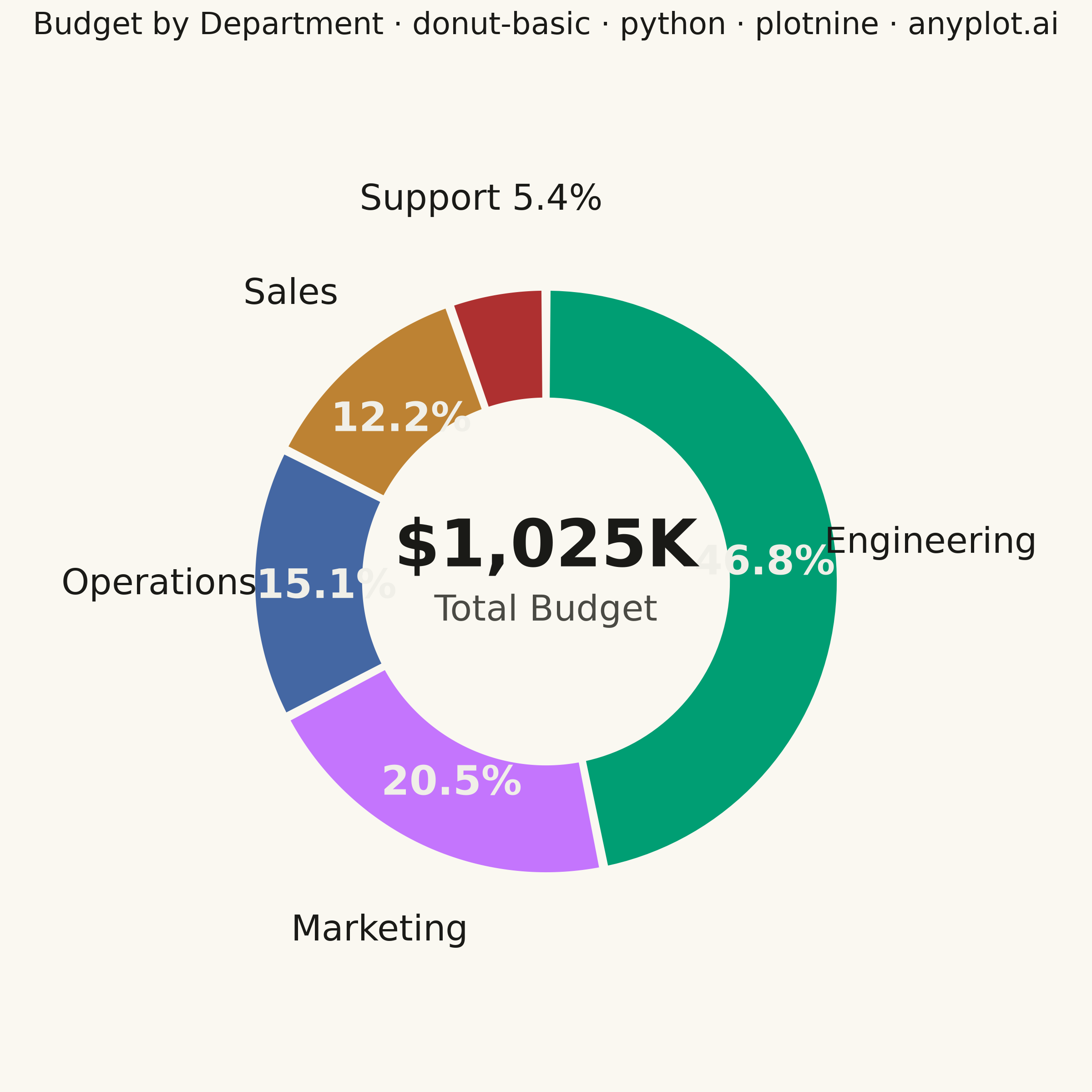
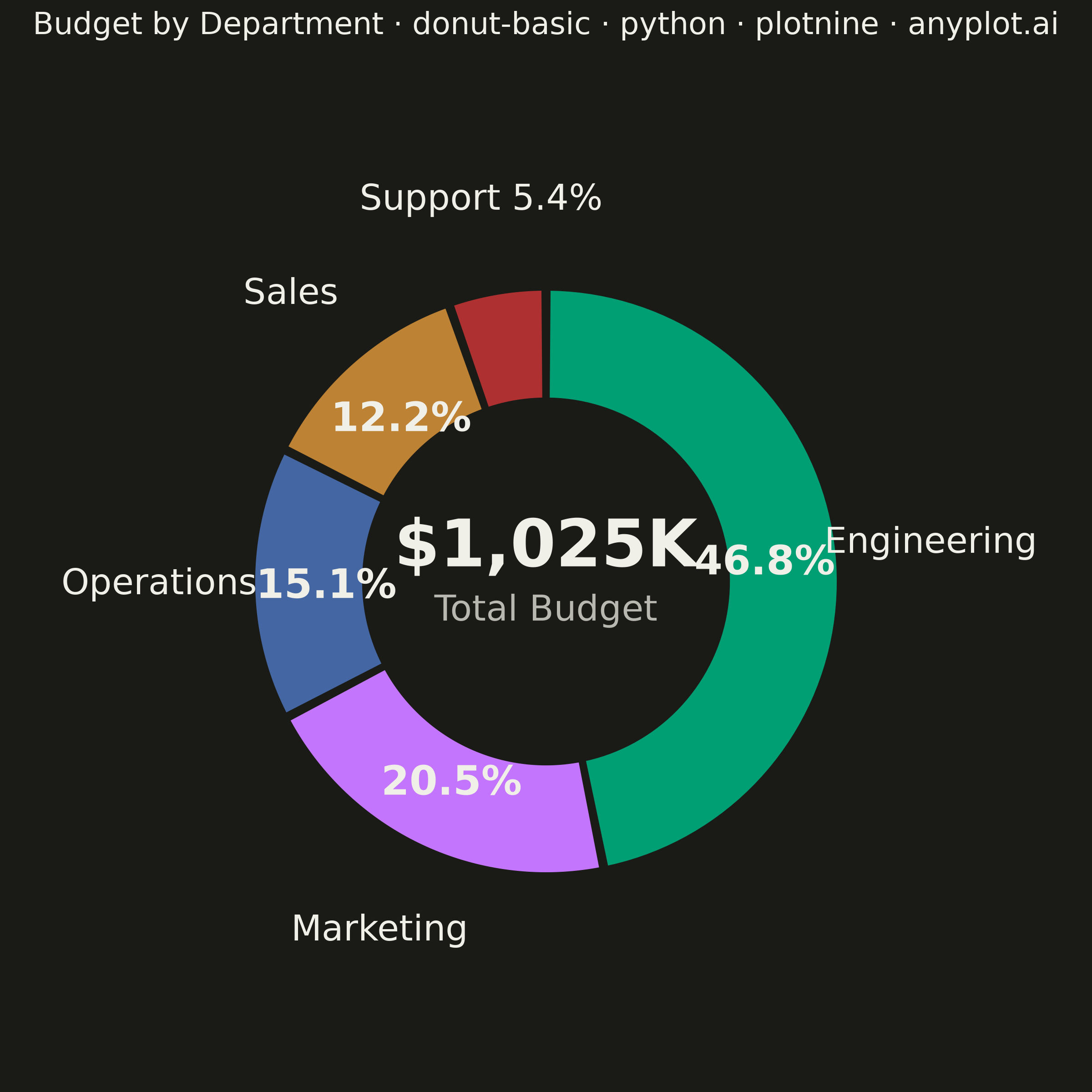
A donut chart (ring chart) showing proportions of categorical data as segments of a ring, with a hollow center. Similar to pie charts but the empty center can display summary statistics or additional information. The ring format can be easier to read when comparing segment sizes.
""" anyplot.ai
donut-basic: Basic Donut Chart
Library: plotnine 0.15.7 | Python 3.13.14
Quality: 87/100 | Updated: 2026-06-25
"""

import math
import os
import sys


# Remove script directory from path to avoid shadowing the installed plotnine package
_HERE = os.path.dirname(os.path.abspath(__file__))
sys.path = [p for p in sys.path if os.path.abspath(p) != _HERE]

import numpy as np
import pandas as pd
from plotnine import (
    aes,
    annotate,
    coord_fixed,
    element_blank,
    element_rect,
    element_text,
    geom_polygon,
    geom_text,
    ggplot,
    labs,
    scale_fill_identity,
    scale_x_continuous,
    scale_y_continuous,
    theme,
)


# Theme tokens
THEME = os.getenv("ANYPLOT_THEME", "light")
PAGE_BG = "#FAF8F1" if THEME == "light" else "#1A1A17"
INK = "#1A1A17" if THEME == "light" else "#F0EFE8"
INK_SOFT = "#4A4A44" if THEME == "light" else "#B8B7B0"

# Imprint palette — positions 1–5; brand green is always first series
IMPRINT = ["#009E73", "#C475FD", "#4467A3", "#BD8233", "#AE3030"]
LABEL_ON_WEDGE = "#F0EFE8"

# Data — annual budget allocation by department (USD thousands)
categories = ["Engineering", "Marketing", "Operations", "Sales", "Support"]
values = [480, 210, 155, 125, 55]
total = sum(values)

# Ring geometry
INNER_R = 0.62
OUTER_R = 1.00
LABEL_R = 1.32  # category labels outside ring — pushed further out to prevent overlap
PCT_R = 0.75  # pct labels slightly inside ring midpoint for better separation
SMALL_THRESHOLD = 0.08  # segments under 8%: combine pct into category label

wedge_rows = []
label_rows = []
pct_rows = []

start_angle = math.pi / 2  # Start at 12 o'clock, clockwise
for category, value, color in zip(categories, values, IMPRINT, strict=True):
    sweep = (value / total) * 2 * math.pi
    end_angle = start_angle - sweep

    gap = 0.008
    a0, a1 = end_angle + gap, start_angle - gap
    n_pts = 80
    inner_arc = np.linspace(a0, a1, n_pts)
    outer_arc = np.linspace(a1, a0, n_pts)

    points = [(INNER_R * math.cos(a), INNER_R * math.sin(a)) for a in inner_arc]
    points += [(OUTER_R * math.cos(a), OUTER_R * math.sin(a)) for a in outer_arc]

    for order, (x, y) in enumerate(points):
        wedge_rows.append({"x": x, "y": y, "segment": category, "order": order, "fill": color})

    mid = (start_angle + end_angle) / 2
    pct = value / total
    if pct < SMALL_THRESHOLD:
        label_rows.append(
            {"x": LABEL_R * math.cos(mid), "y": LABEL_R * math.sin(mid), "label": f"{category} {pct * 100:.1f}%"}
        )
    else:
        label_rows.append({"x": LABEL_R * math.cos(mid), "y": LABEL_R * math.sin(mid), "label": category})
        pct_rows.append({"x": PCT_R * math.cos(mid), "y": PCT_R * math.sin(mid), "label": f"{pct * 100:.1f}%"})

    start_angle = end_angle

wedge_df = pd.DataFrame(wedge_rows)
label_df = pd.DataFrame(label_rows)
pct_df = pd.DataFrame(pct_rows)

# Title with scaled fontsize for the mandated ~67-char title
TITLE = "Budget by Department · donut-basic · python · plotnine · anyplot.ai"
n = len(TITLE)
ratio = 67 / n if n > 67 else 1.0
title_size = max(8, round(12 * ratio))

# Plot
plot = (
    ggplot()
    + geom_polygon(aes(x="x", y="y", group="segment", fill="fill"), data=wedge_df, color=PAGE_BG, size=1.0)
    # Percentage labels inside ring — bold, on-wedge colour
    + geom_text(aes(x="x", y="y", label="label"), data=pct_df, size=16, fontweight="bold", color=LABEL_ON_WEDGE)
    # Category labels outside ring — regular weight, ink colour
    + geom_text(aes(x="x", y="y", label="label"), data=label_df, size=14, color=INK)
    # Center metric — prominent value
    + annotate("text", x=0, y=0.12, label=f"${total:,}K", size=26, fontweight="bold", color=INK, ha="center")
    # Center sub-label — softer, smaller
    + annotate("text", x=0, y=-0.10, label="Total Budget", size=14, color=INK_SOFT, ha="center")
    + scale_fill_identity()
    + coord_fixed(ratio=1)
    + scale_x_continuous(limits=(-1.65, 1.65))
    + scale_y_continuous(limits=(-1.55, 1.55))
    + labs(title=TITLE)
    + theme(
        figure_size=(6, 6),
        plot_background=element_rect(fill=PAGE_BG, color=PAGE_BG),
        panel_background=element_rect(fill=PAGE_BG, color=PAGE_BG),
        plot_title=element_text(size=title_size, color=INK, ha="center", margin={"b": 16}),
        axis_title=element_blank(),
        axis_text=element_blank(),
        axis_ticks=element_blank(),
        axis_line=element_blank(),
        panel_grid_major=element_blank(),
        panel_grid_minor=element_blank(),
        legend_position="none",
    )
)

# Save — 2400×2400 px (square format for symmetric donut chart)
plot.save(f"plot-{THEME}.png", dpi=400, width=6, height=6, units="in")
Runnable source as JSON, for any HTTP client: https://api.anyplot.ai/specs/donut-basic/plotnine/code. Any spec id and library id listed in llms-full.txt fit the same URL shape; every URL below is complete and callable.
{
  "spec_id": "donut-basic",
  "language": "python",
  "library": "plotnine",
  "page": "https://anyplot.ai/donut-basic/python/plotnine",
  "hub": "https://anyplot.ai/donut-basic",
  "code_json": "https://api.anyplot.ai/specs/donut-basic/plotnine/code",
  "spec_json": "https://api.anyplot.ai/specs/donut-basic",
  "render_light_png": "https://storage.googleapis.com/anyplot-images/plots/donut-basic/python/plotnine/plot-light.png",
  "render_dark_png": "https://storage.googleapis.com/anyplot-images/plots/donut-basic/python/plotnine/plot-dark.png",
  "quality_score": 87.0,
  "license": "MIT",
  "guide": "https://anyplot.ai/llms.txt"
}
Part of Basic Donut Chart on anyplot.ai.