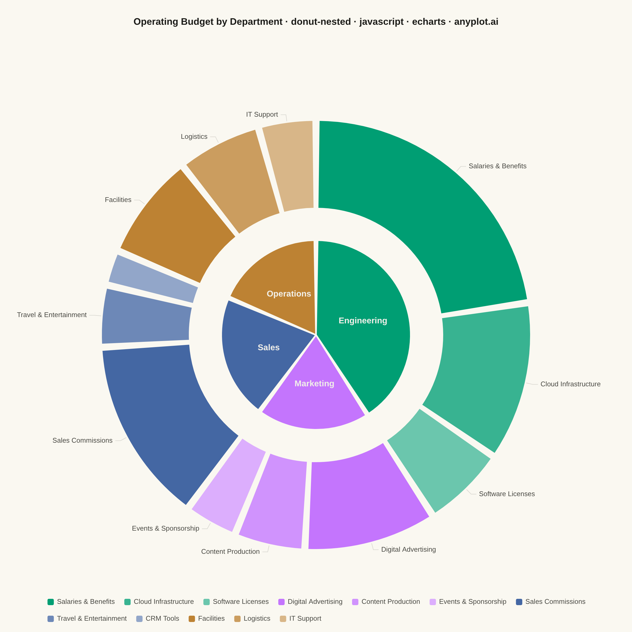
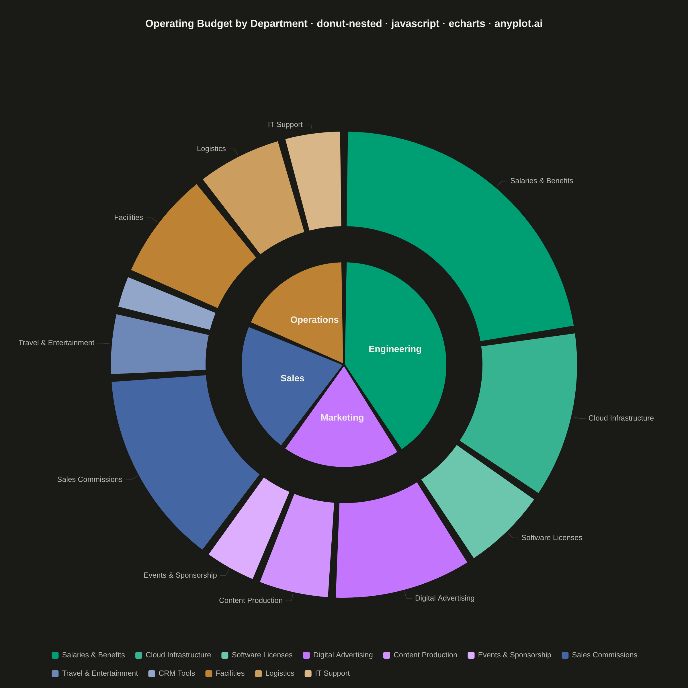
The same plot in 14 other libraries — JavaScript: Chart.js, D3.js, Highcharts, MUI X Charts; Python: Altair, Bokeh, lets-plot, Matplotlib, Plotly, plotnine, Pygal, Seaborn; R: ggplot2; Julia: Makie.jl. Compare all 15 side by side: Nested Donut Chart in Python, R, Julia and JavaScript.
A nested donut chart displays hierarchical data as multiple concentric rings, where each ring represents a level of the hierarchy. Inner rings show parent categories while outer rings show their subdivisions. This visualization effectively reveals part-to-whole relationships across multiple levels while maintaining the familiar donut format.
// anyplot.ai
// donut-nested: Nested Donut Chart
// Library: echarts 6.1.0 | JavaScript 22.23.2
// Quality: 91/100 | Created: 2026-08-18

//# anyplot-orientation: square
const t = window.ANYPLOT_TOKENS;

// --- Data (in-memory, deterministic) ----------------------------------------
// Company operating budget ($ thousands): department (inner ring) rolls up
// from expense category (outer ring). Each department's categories are
// listed largest-first so the color-family shading (below) tracks value.
const budget = [
  {
    department: "Engineering",
    categories: [
      { name: "Salaries & Benefits", value: 340 },
      { name: "Cloud Infrastructure", value: 180 },
      { name: "Software Licenses", value: 95 },
    ],
  },
  {
    department: "Marketing",
    categories: [
      { name: "Digital Advertising", value: 150 },
      { name: "Content Production", value: 80 },
      { name: "Events & Sponsorship", value: 60 },
    ],
  },
  {
    department: "Sales",
    categories: [
      { name: "Sales Commissions", value: 210 },
      { name: "Travel & Entertainment", value: 70 },
      { name: "CRM Tools", value: 40 },
    ],
  },
  {
    department: "Operations",
    categories: [
      { name: "Facilities", value: 120 },
      { name: "Logistics", value: 95 },
      { name: "IT Support", value: 65 },
    ],
  },
];

// --- Color families: same hue per department, lightness steps per category -
const LIGHTNESS_STEPS = [0, 0.22, 0.42];
const departmentColor = (i) => t.palette[i];
const categoryColor = (deptIndex, catIndex) =>
  echarts.color.lift(departmentColor(deptIndex), LIGHTNESS_STEPS[catIndex]);

// Fixed near-black / near-white label tones (not theme-driven — the data
// fill colors themselves never change with theme, so label contrast must be
// computed from the fill, not from ANYPLOT_THEME).
const LABEL_ON_LIGHT_FILL = "#1A1A17";
const LABEL_ON_DARK_FILL = "#F0EFE8";

function relativeLuminance(hex) {
  const c = hex.replace("#", "");
  const [r, g, b] = [0, 2, 4].map((i) => parseInt(c.substr(i, 2), 16) / 255);
  const lin = (v) => (v <= 0.03928 ? v / 12.92 : Math.pow((v + 0.055) / 1.055, 2.4));
  return 0.2126 * lin(r) + 0.7152 * lin(g) + 0.0722 * lin(b);
}
function labelColorFor(hex) {
  return relativeLuminance(hex) > 0.55 ? LABEL_ON_LIGHT_FILL : LABEL_ON_DARK_FILL;
}

const innerData = budget.map((d, i) => {
  const total = d.categories.reduce((sum, c) => sum + c.value, 0);
  const color = departmentColor(i);
  return {
    name: d.department,
    value: total,
    itemStyle: { color },
    label: { color: labelColorFor(color) },
  };
});

const outerData = budget.flatMap((d, di) =>
  d.categories.map((cat, ci) => {
    const color = categoryColor(di, ci);
    return { name: cat.name, value: cat.value, itemStyle: { color } };
  })
);

// --- Title (fontsize scales down if the descriptive prefix runs long) ------
const title = "Operating Budget by Department · donut-nested · javascript · echarts · anyplot.ai";
const titleFontSize = Math.round(22 * Math.min(1, 67 / title.length));

// --- Init --------------------------------------------------------------------
const chart = echarts.init(document.getElementById("container"));

// --- Option -------------------------------------------------------------------
chart.setOption({
  animation: false,
  color: t.palette,
  backgroundColor: "transparent",
  title: {
    text: title,
    left: "center",
    top: 28,
    textStyle: { color: t.ink, fontSize: titleFontSize, fontWeight: 600 },
  },
  tooltip: {
    trigger: "item",
    formatter: "{b}: ${c}k ({d}%)",
  },
  legend: {
    bottom: 12,
    left: "center",
    width: "90%",
    itemWidth: 14,
    itemHeight: 14,
    itemGap: 16,
    textStyle: { color: t.inkSoft, fontSize: 13 },
    data: outerData.map((c) => c.name),
  },
  series: [
    {
      name: "Department",
      type: "pie",
      center: ["50%", "53%"],
      radius: ["0%", "30%"],
      padAngle: 2,
      label: {
        show: true,
        position: "inside",
        formatter: "{b}",
        fontSize: 16,
        fontWeight: 600,
      },
      labelLine: { show: false },
      itemStyle: { borderColor: t.pageBg, borderWidth: 3 },
      data: innerData,
    },
    {
      name: "Expense category",
      type: "pie",
      center: ["50%", "53%"],
      radius: ["40%", "68%"],
      padAngle: 1.5,
      minShowLabelAngle: 12,
      label: {
        show: true,
        position: "outside",
        formatter: "{b}",
        fontSize: 13,
        color: t.inkSoft,
      },
      labelLine: { length: 14, length2: 10, lineStyle: { color: t.grid } },
      labelLayout: { hideOverlap: true },
      itemStyle: { borderColor: t.pageBg, borderWidth: 3 },
      data: outerData,
    },
  ],
});
Runnable source as JSON, for any HTTP client: https://api.anyplot.ai/specs/donut-nested/echarts/code. Any spec id and library id listed in llms-full.txt fit the same URL shape; every URL below is complete and callable.
{
  "spec_id": "donut-nested",
  "language": "javascript",
  "library": "echarts",
  "page": "https://anyplot.ai/donut-nested/javascript/echarts",
  "hub": "https://anyplot.ai/donut-nested",
  "code_json": "https://api.anyplot.ai/specs/donut-nested/echarts/code",
  "spec_json": "https://api.anyplot.ai/specs/donut-nested",
  "render_light_png": "https://storage.googleapis.com/anyplot-images/plots/donut-nested/javascript/echarts/plot-light.png",
  "render_dark_png": "https://storage.googleapis.com/anyplot-images/plots/donut-nested/javascript/echarts/plot-dark.png",
  "interactive_light_html": "https://storage.googleapis.com/anyplot-images/plots/donut-nested/javascript/echarts/plot-light.html",
  "interactive_dark_html": "https://storage.googleapis.com/anyplot-images/plots/donut-nested/javascript/echarts/plot-dark.html",
  "quality_score": 91.0,
  "license": "MIT",
  "guide": "https://anyplot.ai/llms.txt"
}
Part of Nested Donut Chart on anyplot.ai.