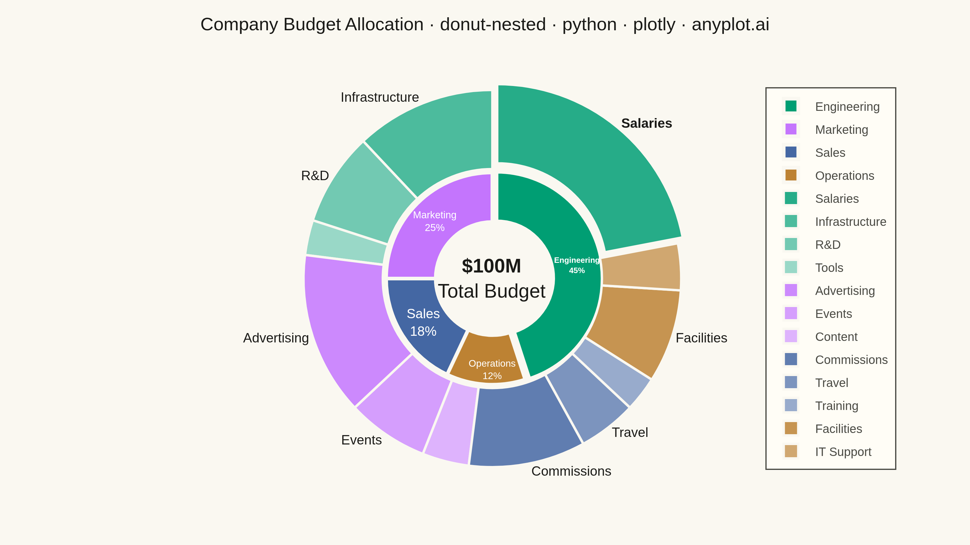
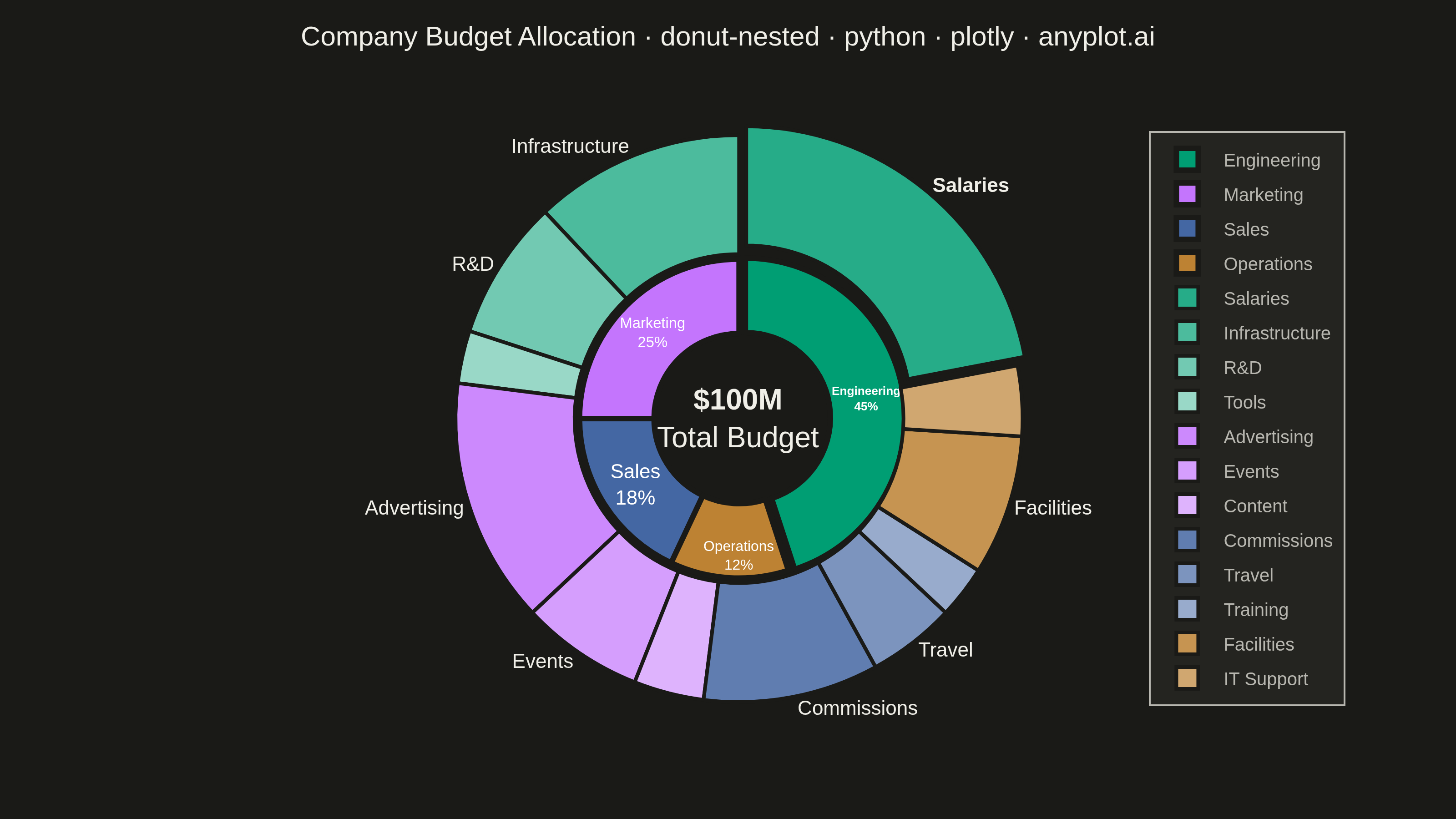
A nested donut chart displays hierarchical data as multiple concentric rings, where each ring represents a level of the hierarchy. Inner rings show parent categories while outer rings show their subdivisions. This visualization effectively reveals part-to-whole relationships across multiple levels while maintaining the familiar donut format.
""" anyplot.ai
donut-nested: Nested Donut Chart
Library: plotly 6.9.0 | Python 3.13.15
Quality: 95/100 | Updated: 2026-08-18
"""

import os

import plotly.graph_objects as go


# Theme tokens (see prompts/default-style-guide.md)
THEME = os.getenv("ANYPLOT_THEME", "light")
PAGE_BG = "#FAF8F1" if THEME == "light" else "#1A1A17"
ELEVATED_BG = "#FFFDF6" if THEME == "light" else "#242420"
INK = "#1A1A17" if THEME == "light" else "#F0EFE8"
INK_SOFT = "#4A4A44" if THEME == "light" else "#B8B7B0"

# Imprint palette (canonical order, positions 1-4 for inner ring)
IMPRINT = ["#009E73", "#C475FD", "#4467A3", "#BD8233"]

# Data - Company budget allocation by department and expense category
departments = ["Engineering", "Marketing", "Sales", "Operations"]
dept_values = [45, 25, 18, 12]  # Millions
dept_colors = IMPRINT

# Child categories (outer ring) with consistent color families (lighter shades)
categories = [
    # Engineering
    "Salaries",
    "Infrastructure",
    "R&D",
    "Tools",
    # Marketing
    "Advertising",
    "Events",
    "Content",
    # Sales
    "Commissions",
    "Travel",
    "Training",
    # Operations
    "Facilities",
    "IT Support",
]
cat_values = [
    # Engineering: 45M total
    22,
    12,
    8,
    3,
    # Marketing: 25M total
    14,
    7,
    4,
    # Sales: 18M total
    10,
    5,
    3,
    # Operations: 12M total
    8,
    4,
]

# Child colors as progressively lighter tints of their parent department's hue
# (precomputed: base blended toward white at 15/30/45/60%, one step per child)
cat_colors = [
    "#26ac88",
    "#4cbb9d",
    "#72c9b2",
    "#99d8c7",  # Engineering tints
    "#cc89fd",
    "#d59efd",
    "#deb3fd",  # Marketing tints
    "#607db0",
    "#7c94be",
    "#98abcc",  # Sales tints
    "#c69451",
    "#d0a770",  # Operations tints
]

# Only label outer segments large enough to hold text without crowding;
# smaller categories rely on the legend (per spec notes). The single largest
# category (Salaries) is bolded as the chart's focal point.
outer_label_threshold = 5
outer_labels = [
    (f"<b>{category}</b>" if category == "Salaries" else category) if value >= outer_label_threshold else ""
    for category, value in zip(categories, cat_values, strict=True)
]

# Inner-ring text: label + share of total, with the largest department
# (Engineering) bolded as the chart's focal point.
dept_total = sum(dept_values)
inner_labels = [
    f"<b>{name}<br>{value / dept_total:.0%}</b>" if name == "Engineering" else f"{name}<br>{value / dept_total:.0%}"
    for name, value in zip(departments, dept_values, strict=True)
]

# Pull the largest department/category slightly outward as a focal-point cue
inner_pull = [0.04, 0, 0, 0]
outer_pull = [0.04 if category == "Salaries" else 0 for category in categories]

# Create figure with two pie traces (inner and outer rings)
fig = go.Figure()

# Inner ring - Departments (parent categories) with both name and percentage.
# Its domain is shrunk slightly inside the [0.30, 0.58] radius band (of the
# shared full-size domain below) so a thin gap separates its outer edge from
# where the outer ring's hole starts, sharpening the two-level hierarchy read
# instead of the rings touching directly.
fig.add_trace(
    go.Pie(
        values=dept_values,
        labels=departments,
        text=inner_labels,
        hole=0.533,
        domain={"x": [0.3776, 0.6624], "y": [0.2468, 0.7532]},
        marker={"colors": dept_colors, "line": {"color": PAGE_BG, "width": 3}},
        pull=inner_pull,
        textinfo="text",
        textposition="inside",
        insidetextorientation="horizontal",
        textfont={"size": 11, "color": "white"},
        hovertemplate="<b>%{label}</b><br>$%{value}M<br>%{percent}<extra></extra>",
        name="Departments",
        sort=False,
    )
)

# Outer ring - Expense categories (child categories)
fig.add_trace(
    go.Pie(
        values=cat_values,
        labels=categories,
        text=outer_labels,
        hole=0.58,
        domain={"x": [0.16, 0.88], "y": [0.05, 0.95]},
        marker={"colors": cat_colors, "line": {"color": PAGE_BG, "width": 2}},
        pull=outer_pull,
        textinfo="text",
        textposition="outside",
        textfont={"size": 11, "color": INK},
        hovertemplate="<b>%{label}</b><br>$%{value}M<br>%{percent}<extra></extra>",
        name="Categories",
        sort=False,
    )
)

# Layout with theme-adaptive colors
fig.update_layout(
    autosize=False,
    title={
        "text": "Company Budget Allocation · donut-nested · python · plotly · anyplot.ai",
        "font": {"size": 15, "color": INK},
        "x": 0.5,
        "xanchor": "center",
    },
    showlegend=True,
    legend={
        "font": {"size": 10, "color": INK_SOFT},
        "orientation": "v",
        "x": 0.84,
        "y": 0.5,
        "yanchor": "middle",
        "bgcolor": ELEVATED_BG,
        "bordercolor": INK_SOFT,
        "borderwidth": 1,
    },
    paper_bgcolor=PAGE_BG,
    plot_bgcolor=PAGE_BG,
    font={"color": INK},
    margin={"l": 40, "r": 50, "t": 50, "b": 40},
    annotations=[
        {
            "text": "<b>$100M</b><br>Total Budget",
            "x": 0.52,
            "y": 0.5,
            "font": {"size": 16, "color": INK},
            "showarrow": False,
        }
    ],
)

# Save as PNG (3200 x 1800 px)
fig.write_image(f"plot-{THEME}.png", width=800, height=450, scale=4)

# Save interactive HTML
fig.write_html(f"plot-{THEME}.html", include_plotlyjs="cdn")
Runnable source as JSON, for any HTTP client: https://api.anyplot.ai/specs/donut-nested/plotly/code. Any spec id and library id listed in llms-full.txt fit the same URL shape; every URL below is complete and callable.
{
  "spec_id": "donut-nested",
  "language": "python",
  "library": "plotly",
  "page": "https://anyplot.ai/donut-nested/python/plotly",
  "hub": "https://anyplot.ai/donut-nested",
  "code_json": "https://api.anyplot.ai/specs/donut-nested/plotly/code",
  "spec_json": "https://api.anyplot.ai/specs/donut-nested",
  "render_light_png": "https://storage.googleapis.com/anyplot-images/plots/donut-nested/python/plotly/plot-light.png",
  "render_dark_png": "https://storage.googleapis.com/anyplot-images/plots/donut-nested/python/plotly/plot-dark.png",
  "interactive_light_html": "https://storage.googleapis.com/anyplot-images/plots/donut-nested/python/plotly/plot-light.html",
  "interactive_dark_html": "https://storage.googleapis.com/anyplot-images/plots/donut-nested/python/plotly/plot-dark.html",
  "quality_score": 95.0,
  "license": "MIT",
  "guide": "https://anyplot.ai/llms.txt"
}
Part of Nested Donut Chart on anyplot.ai.