The same plot in 14 other libraries — JavaScript: Chart.js, D3.js, Apache ECharts, MUI X Charts; Python: Altair, Bokeh, lets-plot, Matplotlib, Plotly, plotnine, Pygal, Seaborn; R: ggplot2; Julia: Makie.jl. Compare all 15 side by side: Nested Donut Chart in Python, R, Julia and JavaScript.
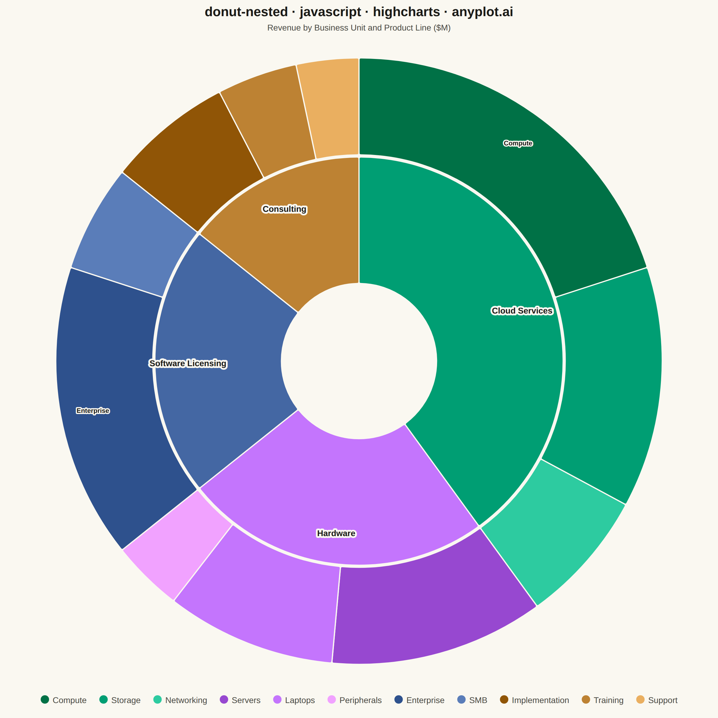
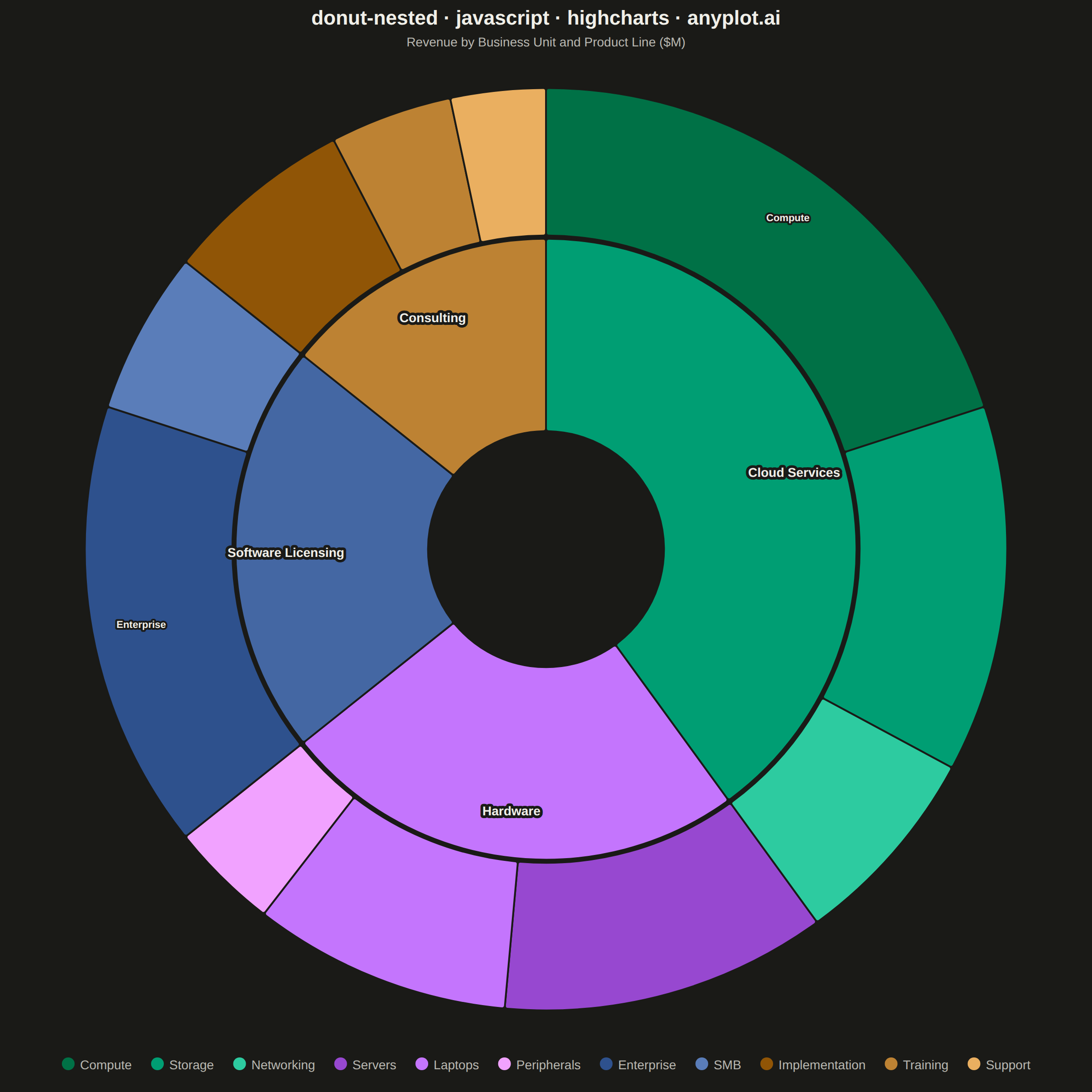
A nested donut chart displays hierarchical data as multiple concentric rings, where each ring represents a level of the hierarchy. Inner rings show parent categories while outer rings show their subdivisions. This visualization effectively reveals part-to-whole relationships across multiple levels while maintaining the familiar donut format.
// anyplot.ai
// donut-nested: Nested Donut Chart
// Library: highcharts 12.6.0 | JavaScript 22.23.2
// Quality: 91/100 | Created: 2026-08-18

//# anyplot-orientation: square
const t = window.ANYPLOT_TOKENS;

// --- Data (in-memory, deterministic) ----------------------------------------
// Annual revenue ($M) by business unit (inner ring) and product line (outer ring).
const businessUnits = [
  {
    name: "Cloud Services",
    color: t.palette[0],
    products: [
      { name: "Compute", value: 42 },
      { name: "Storage", value: 27 },
      { name: "Networking", value: 15 },
    ],
  },
  {
    name: "Hardware",
    color: t.palette[1],
    products: [
      { name: "Servers", value: 24 },
      { name: "Laptops", value: 19 },
      { name: "Peripherals", value: 8 },
    ],
  },
  {
    name: "Software Licensing",
    color: t.palette[2],
    products: [
      { name: "Enterprise", value: 33 },
      { name: "SMB", value: 12 },
    ],
  },
  {
    name: "Consulting",
    color: t.palette[3],
    products: [
      { name: "Implementation", value: 14 },
      { name: "Training", value: 9 },
      { name: "Support", value: 7 },
    ],
  },
];

// Inner ring: one slice per business unit, sized by the sum of its products.
const innerData = businessUnits.map((unit) => ({
  name: unit.name,
  y: unit.products.reduce((sum, product) => sum + product.value, 0),
  color: unit.color,
}));

// Outer ring: one slice per product, tinted around its parent's hue so the
// color family (same hue, varying lightness) reads as belonging to that unit.
// Because both rings share the same order and total, slice boundaries line up.
const outerData = businessUnits.flatMap((unit) =>
  unit.products.map((product, i) => {
    const offset = (i - (unit.products.length - 1) / 2) * 0.18;
    return {
      name: product.name,
      y: product.value,
      color: Highcharts.color(unit.color).brighten(offset).get(),
    };
  }),
);

// Only the largest product-line slices earn a direct inline label; the rest
// fall back to the legend, per the spec's "labels on larger segments" guidance.
const outerLabelThreshold = 15; // percent of the outer ring's total

// --- Chart -------------------------------------------------------------------
Highcharts.chart("container", {
  chart: {
    type: "pie",
    backgroundColor: "transparent",
    animation: false,
    style: { fontFamily: "inherit" },
  },
  credits: { enabled: false },
  colors: t.palette,
  title: {
    text: "donut-nested · javascript · highcharts · anyplot.ai",
    style: { color: t.ink, fontSize: "22px", fontWeight: "600" },
  },
  subtitle: {
    text: "Revenue by Business Unit and Product Line ($M)",
    style: { color: t.inkSoft, fontSize: "14px" },
  },
  legend: {
    itemStyle: { color: t.inkSoft, fontSize: "14px" },
    itemHoverStyle: { color: t.ink },
    align: "center",
    verticalAlign: "bottom",
    layout: "horizontal",
  },
  tooltip: {
    backgroundColor: t.elevatedBg,
    borderColor: t.grid,
    style: { color: t.ink, fontSize: "13px" },
    pointFormat: "<b>{point.name}</b>: ${point.y}M ({point.percentage:.1f}%)",
  },
  plotOptions: {
    series: { animation: false },
    pie: {
      borderWidth: 2,
      borderColor: t.pageBg,
      borderRadius: 3,
    },
  },
  series: [
    {
      name: "Business Unit",
      innerSize: "38%",
      size: "64%",
      showInLegend: false,
      data: innerData,
      dataLabels: {
        enabled: true,
        distance: -55,
        format: "{point.name}",
        style: {
          color: t.ink,
          fontSize: "14px",
          fontWeight: "600",
          textOutline: `3px ${t.pageBg}`,
        },
      },
    },
    {
      name: "Product Line",
      innerSize: "68%",
      size: "96%",
      showInLegend: true,
      data: outerData,
      dataLabels: {
        enabled: true,
        distance: -55,
        formatter() {
          return this.percentage > outerLabelThreshold ? this.point.name : null;
        },
        style: {
          color: t.ink,
          fontSize: "11px",
          fontWeight: "600",
          textOutline: `2px ${t.pageBg}`,
        },
      },
    },
  ],
});
Runnable source as JSON, for any HTTP client: https://api.anyplot.ai/specs/donut-nested/highcharts/code. Any spec id and library id listed in llms-full.txt fit the same URL shape; every URL below is complete and callable.
{
  "spec_id": "donut-nested",
  "language": "javascript",
  "library": "highcharts",
  "page": "https://anyplot.ai/donut-nested/javascript/highcharts",
  "hub": "https://anyplot.ai/donut-nested",
  "code_json": "https://api.anyplot.ai/specs/donut-nested/highcharts/code",
  "spec_json": "https://api.anyplot.ai/specs/donut-nested",
  "render_light_png": "https://storage.googleapis.com/anyplot-images/plots/donut-nested/javascript/highcharts/plot-light.png",
  "render_dark_png": "https://storage.googleapis.com/anyplot-images/plots/donut-nested/javascript/highcharts/plot-dark.png",
  "interactive_light_html": "https://storage.googleapis.com/anyplot-images/plots/donut-nested/javascript/highcharts/plot-light.html",
  "interactive_dark_html": "https://storage.googleapis.com/anyplot-images/plots/donut-nested/javascript/highcharts/plot-dark.html",
  "quality_score": 91.0,
  "license": "MIT",
  "guide": "https://anyplot.ai/llms.txt"
}
Part of Nested Donut Chart on anyplot.ai.