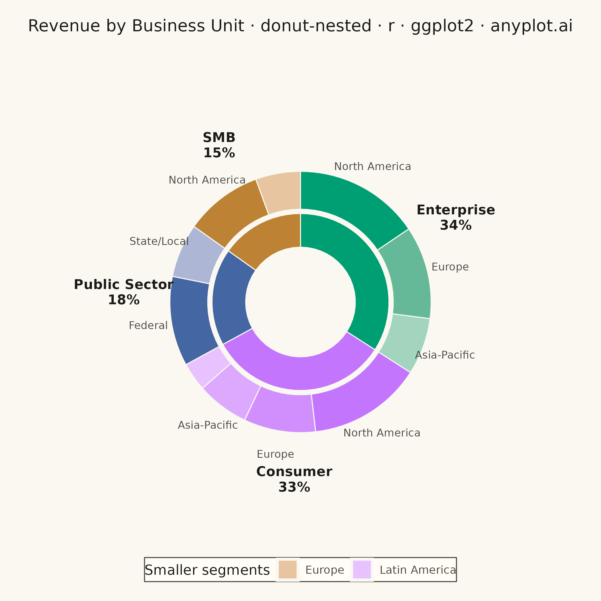
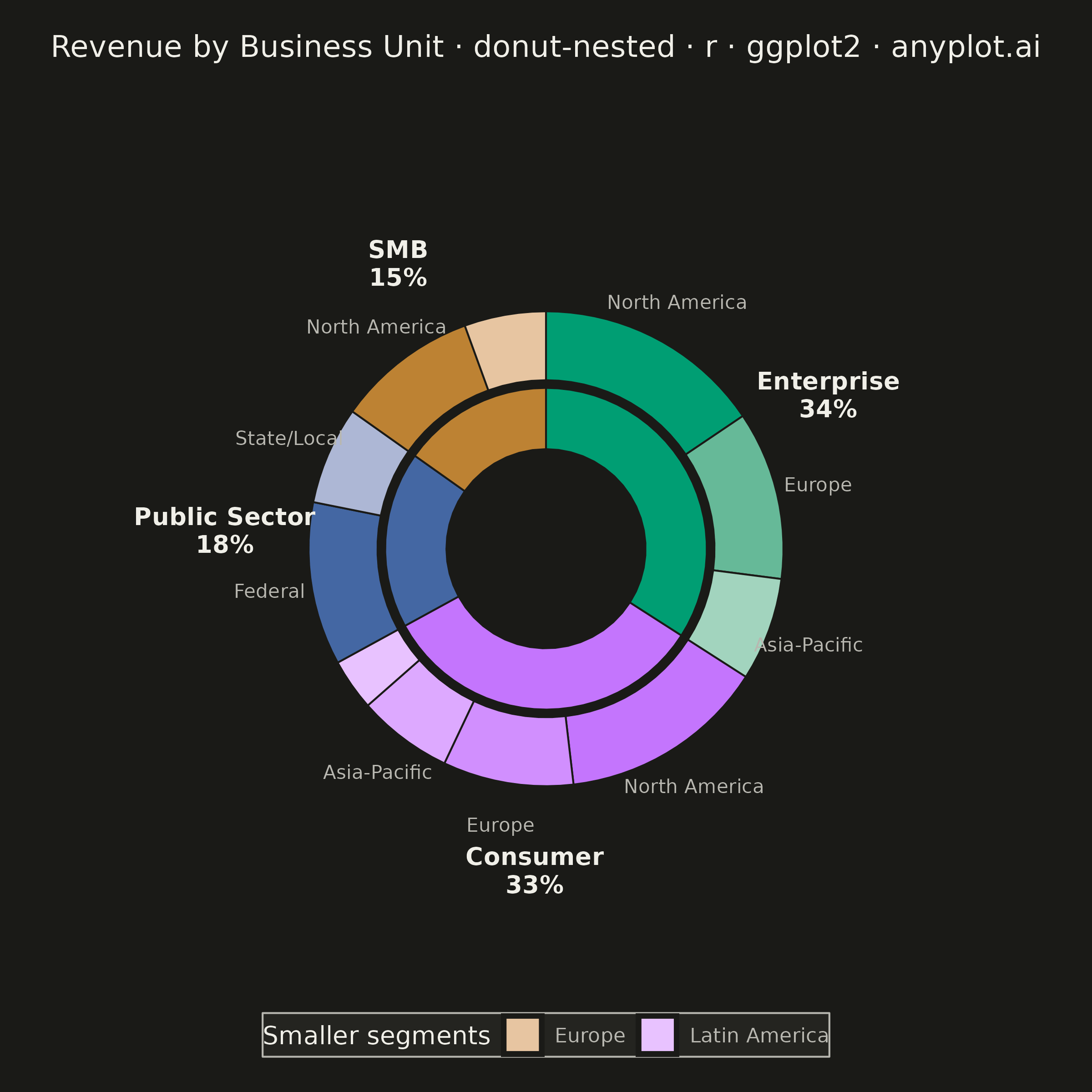
The same plot in 14 other libraries — Python: Altair, Bokeh, lets-plot, Matplotlib, Plotly, plotnine, Pygal, Seaborn; Julia: Makie.jl; JavaScript: Chart.js, D3.js, Apache ECharts, Highcharts, MUI X Charts. Compare all 15 side by side: Nested Donut Chart in Python, R, Julia and JavaScript.
A nested donut chart displays hierarchical data as multiple concentric rings, where each ring represents a level of the hierarchy. Inner rings show parent categories while outer rings show their subdivisions. This visualization effectively reveals part-to-whole relationships across multiple levels while maintaining the familiar donut format.
#' anyplot.ai
#' donut-nested: Nested Donut Chart
#' Library: ggplot2 3.5.1 | R 4.4.1
#' Quality: 88/100 | Created: 2026-08-18

library(ggplot2)
library(dplyr)
library(tibble)
library(scales)
library(ragg)

set.seed(42)

# --- Theme tokens -------------------------------------------------------------
THEME       <- Sys.getenv("ANYPLOT_THEME", "light")
PAGE_BG     <- if (THEME == "light") "#FAF8F1" else "#1A1A17"
ELEVATED_BG <- if (THEME == "light") "#FFFDF6" else "#242420"
INK         <- if (THEME == "light") "#1A1A17" else "#F0EFE8"
INK_SOFT    <- if (THEME == "light") "#4A4A44" else "#B8B7B0"

IMPRINT_PALETTE <- c("#009E73", "#C475FD", "#4467A3", "#BD8233",
                     "#AE3030", "#2ABCCD", "#954477", "#99B314")

# --- Data: quarterly revenue ($M) by business unit and customer region --------
revenue <- tribble(
  ~level_1,        ~level_2,        ~value,
  "Enterprise",    "North America", 420,
  "Enterprise",    "Europe",        310,
  "Enterprise",    "Asia-Pacific",  190,
  "Consumer",      "North America", 380,
  "Consumer",      "Europe",        240,
  "Consumer",      "Asia-Pacific",  175,
  "Consumer",      "Latin America",  95,
  "Public Sector", "Federal",       300,
  "Public Sector", "State/Local",   180,
  "SMB",           "North America", 260,
  "SMB",           "Europe",        150
)

parent_totals <- revenue %>%
  group_by(level_1) %>%
  summarise(value = sum(value), .groups = "drop") %>%
  arrange(desc(value))

revenue <- revenue %>%
  mutate(level_1 = factor(level_1, levels = parent_totals$level_1)) %>%
  arrange(level_1)

n_parents <- nrow(parent_totals)
parent_colors <- setNames(IMPRINT_PALETTE[seq_len(n_parents)], parent_totals$level_1)

# Consistent color family per parent: same hue, lighter tint for each child
tint_family <- function(base_hex, n) {
  ramp <- colour_ramp(c(base_hex, "#FFFFFF"))
  ramp(seq(0, 0.55, length.out = n))
}

total_value <- sum(revenue$value)
label_threshold <- 0.06

# --- Ring geometry (radial extents as x, cumulative value as y) ---------------
HOLE        <- 1.3
INNER_XMAX  <- HOLE + 0.8
OUTER_XMIN  <- INNER_XMAX + 0.1
OUTER_XMAX  <- OUTER_XMIN + 0.9
CHILD_LABEL_X  <- OUTER_XMAX + 0.55
PARENT_LABEL_X <- CHILD_LABEL_X + 0.85

parent_df <- parent_totals %>%
  mutate(
    color = parent_colors[level_1],
    ymax  = cumsum(value),
    ymin  = lag(ymax, default = 0),
    xmin  = HOLE,
    xmax  = INNER_XMAX,
    xmid  = PARENT_LABEL_X,
    ymid  = (ymin + ymax) / 2,
    label = sprintf("%s\n%.0f%%", level_1, 100 * value / total_value)
  )

child_df <- revenue %>%
  group_by(level_1) %>%
  mutate(color = tint_family(parent_colors[[as.character(level_1[1])]], n())) %>%
  ungroup() %>%
  mutate(
    ymax  = cumsum(value),
    ymin  = lag(ymax, default = 0),
    xmin  = OUTER_XMIN,
    xmax  = OUTER_XMAX,
    xmid  = CHILD_LABEL_X,
    ymid  = (ymin + ymax) / 2,
    share = value / total_value,
    label = ifelse(share >= label_threshold, level_2, NA_character_),
    legend_label = paste(level_1, level_2, sep = " · ")
  )

legend_df <- child_df %>% filter(is.na(label))
legend_colors <- setNames(legend_df$color, legend_df$legend_label)

# --- Plot -----------------------------------------------------------------
p <- ggplot() +
  geom_rect(
    data = parent_df,
    aes(xmin = xmin, xmax = xmax, ymin = ymin, ymax = ymax, fill = color),
    color = PAGE_BG, linewidth = 0.35
  ) +
  geom_rect(
    data = child_df,
    aes(xmin = xmin, xmax = xmax, ymin = ymin, ymax = ymax, fill = color),
    color = PAGE_BG, linewidth = 0.35
  ) +
  scale_fill_identity() +
  geom_point(
    data = legend_df, aes(x = xmid, y = ymid, color = legend_label),
    size = 0, stroke = 0, alpha = 0, na.rm = TRUE
  ) +
  scale_color_manual(name = "Smaller segments", values = legend_colors) +
  guides(color = guide_legend(override.aes = list(size = 6, shape = 15, alpha = 1))) +
  geom_text(
    data = parent_df, aes(x = xmid, y = ymid, label = label),
    color = INK, size = 3.4, lineheight = 0.95, fontface = "bold", na.rm = TRUE
  ) +
  geom_text(
    data = child_df, aes(x = xmid, y = ymid, label = label),
    color = INK_SOFT, size = 2.7, na.rm = TRUE
  ) +
  coord_polar(theta = "y") +
  scale_x_continuous(limits = c(0, PARENT_LABEL_X + 0.5)) +
  labs(title = "Revenue by Business Unit · donut-nested · r · ggplot2 · anyplot.ai") +
  theme_void(base_size = 8) +
  theme(
    plot.background    = element_rect(fill = PAGE_BG, color = PAGE_BG),
    panel.background   = element_rect(fill = PAGE_BG, color = NA),
    plot.title         = element_text(color = INK, size = 12, hjust = 0.5, margin = margin(b = 14)),
    plot.margin        = margin(14, 14, 14, 14),
    legend.position    = "bottom",
    legend.background  = element_rect(fill = ELEVATED_BG, color = INK_SOFT),
    legend.title       = element_text(color = INK, size = 10),
    legend.text        = element_text(color = INK_SOFT, size = 8)
  )

# --- Save -----------------------------------------------------------------
ggsave(
  filename = sprintf("plot-%s.png", THEME),
  plot     = p,
  device   = ragg::agg_png,
  width    = 6,
  height   = 6,
  units    = "in",
  dpi      = 400
)
Runnable source as JSON, for any HTTP client: https://api.anyplot.ai/specs/donut-nested/ggplot2/code. Any spec id and library id listed in llms-full.txt fit the same URL shape; every URL below is complete and callable.
{
  "spec_id": "donut-nested",
  "language": "r",
  "library": "ggplot2",
  "page": "https://anyplot.ai/donut-nested/r/ggplot2",
  "hub": "https://anyplot.ai/donut-nested",
  "code_json": "https://api.anyplot.ai/specs/donut-nested/ggplot2/code",
  "spec_json": "https://api.anyplot.ai/specs/donut-nested",
  "render_light_png": "https://storage.googleapis.com/anyplot-images/plots/donut-nested/r/ggplot2/plot-light.png",
  "render_dark_png": "https://storage.googleapis.com/anyplot-images/plots/donut-nested/r/ggplot2/plot-dark.png",
  "quality_score": 88.0,
  "license": "MIT",
  "guide": "https://anyplot.ai/llms.txt"
}
Part of Nested Donut Chart on anyplot.ai.