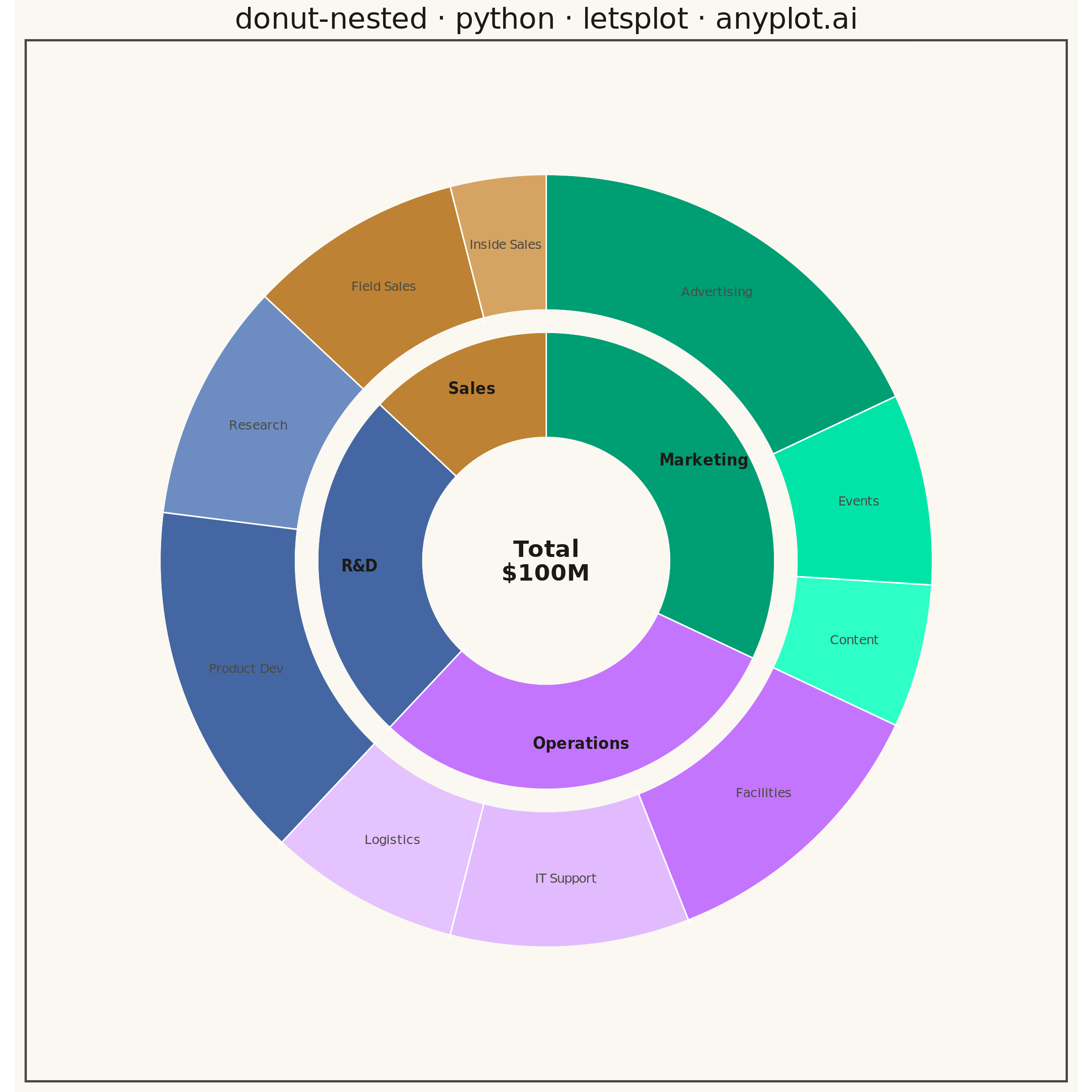
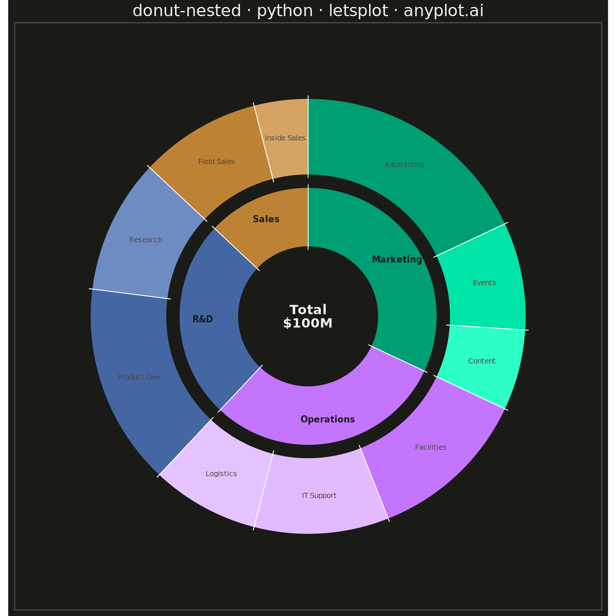
A nested donut chart displays hierarchical data as multiple concentric rings, where each ring represents a level of the hierarchy. Inner rings show parent categories while outer rings show their subdivisions. This visualization effectively reveals part-to-whole relationships across multiple levels while maintaining the familiar donut format.
""" anyplot.ai
donut-nested: Nested Donut Chart
Library: letsplot 4.11.0 | Python 3.13.15
Quality: 94/100 | Updated: 2026-08-18
"""

import colorsys
import math
import os

import pandas as pd
from lets_plot import (
    LetsPlot,
    aes,
    coord_fixed,
    element_blank,
    element_rect,
    element_text,
    geom_pie,
    geom_text,
    ggplot,
    ggsize,
    labs,
    scale_fill_manual,
    scale_x_continuous,
    scale_y_continuous,
    theme,
)
from lets_plot.export import ggsave


LetsPlot.setup_html()

# Theme tokens
THEME = os.getenv("ANYPLOT_THEME", "light")
PAGE_BG = "#FAF8F1" if THEME == "light" else "#1A1A17"
INK = "#1A1A17" if THEME == "light" else "#F0EFE8"

# Segment labels sit on top of the (theme-invariant) Imprint fill colors, not on the
# page background, so - unlike the center total label below, which does sit on the page
# background and stays theme-adaptive - they keep a fixed dark ink in both themes: every
# department/child hue here is light enough that a light, dark-theme-adaptive ink would
# lose contrast against it.
DATA_LABEL_INK = "#1A1A17"
DATA_LABEL_INK_SOFT = "#4A4A44"

# Imprint palette (first series always #009E73)
IMPRINT = ["#009E73", "#C475FD", "#4467A3", "#BD8233"]

# Data - budget allocation by department (inner ring) and expense category (outer ring)
records = [
    {"level_1": "Marketing", "level_2": "Advertising", "value": 18},
    {"level_1": "Marketing", "level_2": "Events", "value": 8},
    {"level_1": "Marketing", "level_2": "Content", "value": 6},
    {"level_1": "Operations", "level_2": "Facilities", "value": 12},
    {"level_1": "Operations", "level_2": "IT Support", "value": 10},
    {"level_1": "Operations", "level_2": "Logistics", "value": 8},
    {"level_1": "R&D", "level_2": "Product Dev", "value": 15},
    {"level_1": "R&D", "level_2": "Research", "value": 10},
    {"level_1": "Sales", "level_2": "Field Sales", "value": 9},
    {"level_1": "Sales", "level_2": "Inside Sales", "value": 4},
]
df = pd.DataFrame(records)
total_value = int(df["value"].sum())
level1_order = ["Marketing", "Operations", "R&D", "Sales"]


def lighten(hex_color, amount):
    r, g, b = (int(hex_color[i : i + 2], 16) / 255 for i in (1, 3, 5))
    h, lightness, s = colorsys.rgb_to_hls(r, g, b)
    lightness = min(0.88, lightness + amount)
    r, g, b = colorsys.hls_to_rgb(h, lightness, s)
    return "#{:02X}{:02X}{:02X}".format(round(r * 255), round(g * 255), round(b * 255))


def with_mid_angle(frame):
    frac = frame["pct"] / 100
    cum_end = frac.cumsum()
    cum_start = cum_end - frac
    mid_frac = (cum_start + cum_end) / 2
    frame["mid_angle"] = math.radians(90) - mid_frac * 2 * math.pi
    return frame


# Both rings share a single fill scale, so both "level_1" and "level_2" are cast to the
# same explicitly ordered categorical (department names first, then children grouped
# department-by-department) - a plain string column would fall back to alphabetical
# order and scramble both the wedge draw order and the color assignment.
level2_order = [r["level_2"] for r in records]
all_categories = level1_order + level2_order

# Inner ring: one wedge per department, in a fixed display order
inner_df = df.groupby("level_1", as_index=False)["value"].sum()
inner_df["level_1"] = pd.Categorical(inner_df["level_1"], categories=all_categories, ordered=True)
inner_df = inner_df.sort_values("level_1").reset_index(drop=True)
inner_df["pct"] = inner_df["value"] / total_value * 100
inner_df["x"], inner_df["y"] = 0.0, 0.0

# Outer ring: children, grouped department-by-department in the same order as the inner
# ring so that wedge boundaries between the two rings line up exactly.
outer_df = df.copy()
outer_df["level_2"] = pd.Categorical(outer_df["level_2"], categories=all_categories, ordered=True)
outer_df["x"], outer_df["y"] = 0.0, 0.0
outer_df["pct"] = outer_df["value"] / total_value * 100

# Color families: department gets the base Imprint hue, children of that department
# lighten in ranked order so the largest child stays closest to the parent hue and
# smaller children read as progressively lighter tints - a second, color-coded cue
# for the size hierarchy the wedge angles already encode.
color_by_dept = dict(zip(level1_order, IMPRINT, strict=False))
child_colors = {}
for dept in level1_order:
    dept_children = df[df["level_1"] == dept].sort_values("value", ascending=False)
    for rank, child in enumerate(dept_children["level_2"]):
        child_colors[child] = lighten(color_by_dept[dept], rank * 0.14)

# scale_fill_manual take a plain list matched positionally to all_categories - a dict
# keyed by name does not reliably resolve against a shared categorical fill scale.
all_colors = [color_by_dept[c] for c in level1_order] + [child_colors[c] for c in level2_order]

inner_df = with_mid_angle(inner_df)
outer_df = with_mid_angle(outer_df)

# Ring geometry (data units), with a gap between rings for visual separation.
# A generously sized center hole keeps the inner-ring labels clear of the total label.
r_inner_1, r_outer_1 = 20, 38
r_inner_2, r_outer_2 = 41, 64

# Biased toward the outer edge of the ring, not the midpoint: a horizontal label whose
# anchor sits at a diagonal angle can swing closer to the center than its anchor radius
# as it extends sideways, so the largest wedge needs the extra clearance from the hole.
label_r_inner = r_inner_1 + (r_outer_1 - r_inner_1) * 0.6
inner_df["label_x"] = label_r_inner * inner_df["mid_angle"].apply(math.cos)
inner_df["label_y"] = label_r_inner * inner_df["mid_angle"].apply(math.sin)

label_r_outer = (r_inner_2 + r_outer_2) / 2
outer_df["label_x"] = label_r_outer * outer_df["mid_angle"].apply(math.cos)
outer_df["label_y"] = label_r_outer * outer_df["mid_angle"].apply(math.sin)

# geom_text size is in mm, unlike element_text size (pt) - convert the intended pt sizes
MM_PER_PT = 1 / 2.845
INNER_LABEL_MM = 12 * MM_PER_PT
OUTER_LABEL_MM = 10 * MM_PER_PT
CENTER_LABEL_MM = 18 * MM_PER_PT

# Theme configuration
anyplot_theme = theme(
    plot_background=element_rect(fill=PAGE_BG, color=PAGE_BG),
    panel_background=element_rect(fill=PAGE_BG),
    plot_title=element_text(size=16, color=INK, hjust=0.5),
    axis_title=element_blank(),
    axis_text=element_blank(),
    axis_ticks=element_blank(),
    axis_line=element_blank(),
    panel_grid=element_blank(),
    legend_position="none",
)

# Plot - geom_pie (lets-plot's native pie/donut geom, with no ggplot2 equivalent) draws
# each ring; two rings sharing the same start angle and direction, with values that
# both sum to the same grand total, keep the wedge boundaries radially aligned.
plot = (
    ggplot()
    + geom_pie(
        aes(x="x", y="y", slice="value", fill="level_1"),
        data=inner_df,
        stat="identity",
        size=2 * r_outer_1,
        size_unit="x",
        hole=r_inner_1 / r_outer_1,
        start=0,
        direction=1,
        color=PAGE_BG,
        stroke=3,
    )
    + geom_pie(
        aes(x="x", y="y", slice="value", fill="level_2"),
        data=outer_df,
        stat="identity",
        size=2 * r_outer_2,
        size_unit="x",
        hole=r_inner_2 / r_outer_2,
        start=0,
        direction=1,
        color=PAGE_BG,
        stroke=3,
    )
    + geom_text(
        aes(x="label_x", y="label_y", label="level_1"),
        data=inner_df,
        size=INNER_LABEL_MM,
        color=DATA_LABEL_INK,
        fontface="bold",
    )
    + geom_text(
        aes(x="label_x", y="label_y", label="level_2"), data=outer_df, size=OUTER_LABEL_MM, color=DATA_LABEL_INK_SOFT
    )
    + geom_text(x=0, y=0, label=f"Total\n${total_value}M", size=CENTER_LABEL_MM, color=INK, fontface="bold")
    + scale_fill_manual(values=all_colors)
    + coord_fixed(ratio=1)
    + scale_x_continuous(limits=(-78, 78))
    + scale_y_continuous(limits=(-78, 78))
    + labs(title="donut-nested · python · letsplot · anyplot.ai")
    + ggsize(600, 600)
    + anyplot_theme
)

# Save
ggsave(plot, f"plot-{THEME}.png", path=".", scale=4)
ggsave(plot, f"plot-{THEME}.html", path=".")
Runnable source as JSON, for any HTTP client: https://api.anyplot.ai/specs/donut-nested/letsplot/code. Any spec id and library id listed in llms-full.txt fit the same URL shape; every URL below is complete and callable.
{
  "spec_id": "donut-nested",
  "language": "python",
  "library": "letsplot",
  "page": "https://anyplot.ai/donut-nested/python/letsplot",
  "hub": "https://anyplot.ai/donut-nested",
  "code_json": "https://api.anyplot.ai/specs/donut-nested/letsplot/code",
  "spec_json": "https://api.anyplot.ai/specs/donut-nested",
  "render_light_png": "https://storage.googleapis.com/anyplot-images/plots/donut-nested/python/letsplot/plot-light.png",
  "render_dark_png": "https://storage.googleapis.com/anyplot-images/plots/donut-nested/python/letsplot/plot-dark.png",
  "interactive_light_html": "https://storage.googleapis.com/anyplot-images/plots/donut-nested/python/letsplot/plot-light.html",
  "interactive_dark_html": "https://storage.googleapis.com/anyplot-images/plots/donut-nested/python/letsplot/plot-dark.html",
  "quality_score": 94.0,
  "license": "MIT",
  "guide": "https://anyplot.ai/llms.txt"
}
Part of Nested Donut Chart on anyplot.ai.