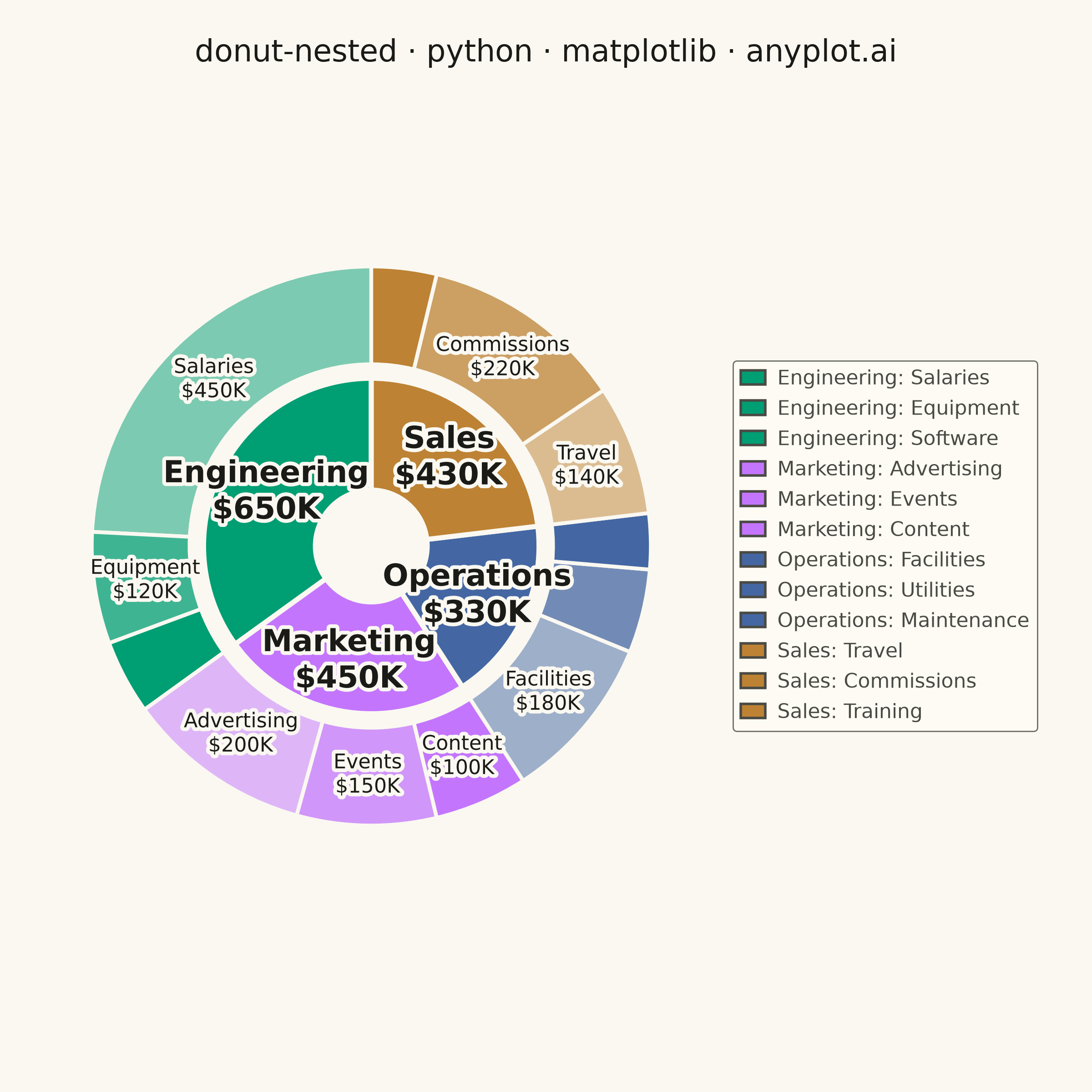
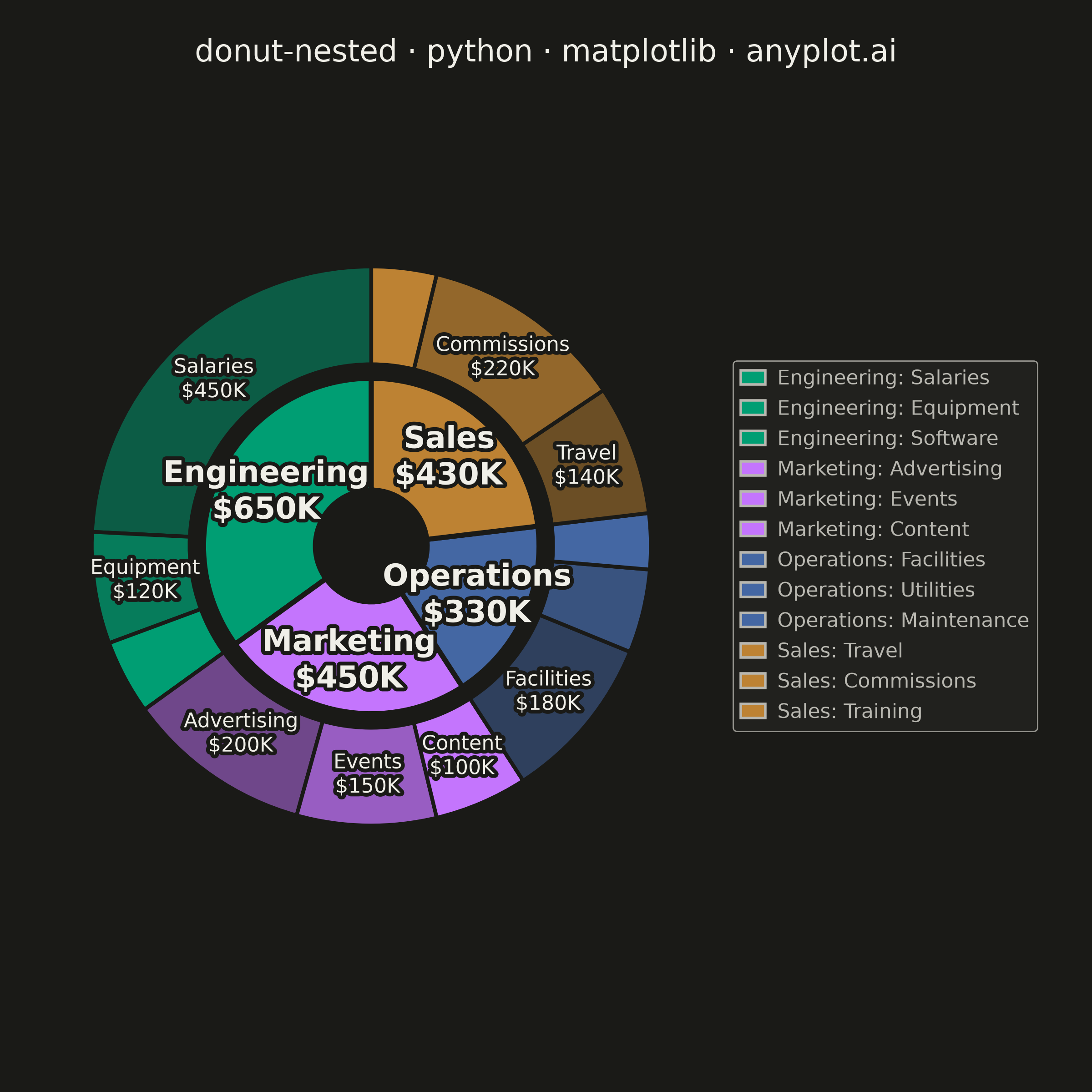
A nested donut chart displays hierarchical data as multiple concentric rings, where each ring represents a level of the hierarchy. Inner rings show parent categories while outer rings show their subdivisions. This visualization effectively reveals part-to-whole relationships across multiple levels while maintaining the familiar donut format.
""" anyplot.ai
donut-nested: Nested Donut Chart
Library: matplotlib 3.11.1 | Python 3.13.15
Quality: 90/100 | Updated: 2026-08-18
"""

import os

import matplotlib.patheffects as pe
import matplotlib.pyplot as plt
import numpy as np


# Theme tokens (see prompts/default-style-guide.md "Background" + "Theme-adaptive Chrome")
THEME = os.getenv("ANYPLOT_THEME", "light")
PAGE_BG = "#FAF8F1" if THEME == "light" else "#1A1A17"
ELEVATED_BG = "#FFFDF6" if THEME == "light" else "#242420"
INK = "#1A1A17" if THEME == "light" else "#F0EFE8"
INK_SOFT = "#4A4A44" if THEME == "light" else "#B8B7B0"

# Imprint palette (positions 1-4 for departments)
IMPRINT = ["#009E73", "#C475FD", "#4467A3", "#BD8233"]

# Data - Budget allocation: departments (inner ring) and expense categories (outer ring)
departments = ["Engineering", "Marketing", "Operations", "Sales"]
categories = {
    "Engineering": ["Salaries", "Equipment", "Software"],
    "Marketing": ["Advertising", "Events", "Content"],
    "Operations": ["Facilities", "Utilities", "Maintenance"],
    "Sales": ["Travel", "Commissions", "Training"],
}
values = {
    "Engineering": [450, 120, 80],
    "Marketing": [200, 150, 100],
    "Operations": [180, 90, 60],
    "Sales": [140, 220, 70],
}

# Department totals for the inner ring (values aggregate outer -> inner)
dept_totals = [sum(values[dept]) for dept in departments]

# Flatten outer ring data while maintaining department order
outer_labels = []
outer_values = []
for dept in departments:
    outer_labels.extend(categories[dept])
    outer_values.extend(values[dept])

inner_colors = [IMPRINT[i] for i in range(len(departments))]

# Outer ring reuses each department's hue with varying opacity per subcategory,
# so a category visually belongs to its parent while staying distinguishable.
outer_colors_with_alpha = []
for dept, color in zip(departments, inner_colors, strict=True):
    rgb = tuple(int(color[j : j + 2], 16) / 255.0 for j in (1, 3, 5))
    alphas = np.linspace(0.5, 1.0, len(categories[dept]))
    outer_colors_with_alpha.extend((*rgb, alpha) for alpha in alphas)

# Square canvas for symmetric circular shapes: figsize=(6, 6) x dpi=400 -> 2400x2400 px
fig, ax = plt.subplots(figsize=(6, 6), dpi=400, facecolor=PAGE_BG)
ax.set_facecolor(PAGE_BG)

# Inner ring (departments)
inner_wedge_props = {"width": 0.4, "edgecolor": PAGE_BG, "linewidth": 2}
wedges_inner, _ = ax.pie(dept_totals, radius=0.6, colors=inner_colors, wedgeprops=inner_wedge_props, startangle=90)

# Outer ring (categories within departments)
outer_wedge_props = {"width": 0.35, "edgecolor": PAGE_BG, "linewidth": 1.5}
wedges_outer, _ = ax.pie(
    outer_values, radius=1.0, colors=outer_colors_with_alpha, wedgeprops=outer_wedge_props, startangle=90
)

# A thin halo behind wedge labels keeps them crisp against every segment shade
halo = [pe.withStroke(linewidth=3, foreground=PAGE_BG)]

# Department labels (inner ring) - bold, the largest data-label tier
for wedge, dept, total in zip(wedges_inner, departments, dept_totals, strict=True):
    angle = np.radians((wedge.theta2 + wedge.theta1) / 2)
    x, y = 0.42 * np.cos(angle), 0.42 * np.sin(angle)
    ax.text(
        x,
        y,
        f"{dept}\n${total}K",
        ha="center",
        va="center",
        fontsize=12,
        fontweight="bold",
        color=INK,
        path_effects=halo,
    )

# Category labels (outer ring) - regular weight, larger segments only
for wedge, label, value in zip(wedges_outer, outer_labels, outer_values, strict=True):
    if value >= 100:  # only label segments >= $100K to avoid clutter
        angle = np.radians((wedge.theta2 + wedge.theta1) / 2)
        x, y = 0.82 * np.cos(angle), 0.82 * np.sin(angle)
        ax.text(x, y, f"{label}\n${value}K", ha="center", va="center", fontsize=8, color=INK, path_effects=halo)

# Custom legend: every department + category pair, colored by parent hue
legend_elements = [
    plt.Rectangle((0, 0), 1, 1, facecolor=IMPRINT[i], edgecolor=INK_SOFT, label=f"{dept}: {cat}")
    for i, dept in enumerate(departments)
    for cat in categories[dept]
]
leg = ax.legend(
    handles=legend_elements,
    loc="center left",
    bbox_to_anchor=(1.0, 0.5),
    fontsize=8,
    frameon=True,
    edgecolor=INK_SOFT,
    facecolor=ELEVATED_BG,
    handlelength=1.2,
    handletextpad=0.6,
    borderaxespad=0.6,
)
leg.get_frame().set_linewidth(0.5)
plt.setp(leg.get_texts(), color=INK_SOFT)

# fig.suptitle (not ax.set_title) so the mandated title centers on the full canvas,
# not just the donut's axes, which is shifted left to leave room for the legend.
fig.suptitle(
    "donut-nested · python · matplotlib · anyplot.ai", x=0.5, y=0.965, fontsize=12, fontweight="medium", color=INK
)

ax.set_aspect("equal")
# Reserve room on the right for the legend instead of bbox_inches="tight" (which drifts canvas size).
# Height span matches the width span (both 0.64) and is centered vertically (top/bottom margins
# both 0.18) so aspect="equal" doesn't leave an asymmetric dead zone below the donut.
fig.subplots_adjust(left=0.02, right=0.66, top=0.82, bottom=0.18)
plt.savefig(f"plot-{THEME}.png", dpi=400, facecolor=PAGE_BG)
Runnable source as JSON, for any HTTP client: https://api.anyplot.ai/specs/donut-nested/matplotlib/code. Any spec id and library id listed in llms-full.txt fit the same URL shape; every URL below is complete and callable.
{
  "spec_id": "donut-nested",
  "language": "python",
  "library": "matplotlib",
  "page": "https://anyplot.ai/donut-nested/python/matplotlib",
  "hub": "https://anyplot.ai/donut-nested",
  "code_json": "https://api.anyplot.ai/specs/donut-nested/matplotlib/code",
  "spec_json": "https://api.anyplot.ai/specs/donut-nested",
  "render_light_png": "https://storage.googleapis.com/anyplot-images/plots/donut-nested/python/matplotlib/plot-light.png",
  "render_dark_png": "https://storage.googleapis.com/anyplot-images/plots/donut-nested/python/matplotlib/plot-dark.png",
  "quality_score": 90.0,
  "license": "MIT",
  "guide": "https://anyplot.ai/llms.txt"
}
Part of Nested Donut Chart on anyplot.ai.