The same plot in 14 other libraries — JavaScript: Chart.js, D3.js, Apache ECharts, Highcharts; Python: Altair, Bokeh, lets-plot, Matplotlib, Plotly, plotnine, Pygal, Seaborn; R: ggplot2; Julia: Makie.jl. Compare all 15 side by side: Nested Donut Chart in Python, R, Julia and JavaScript.
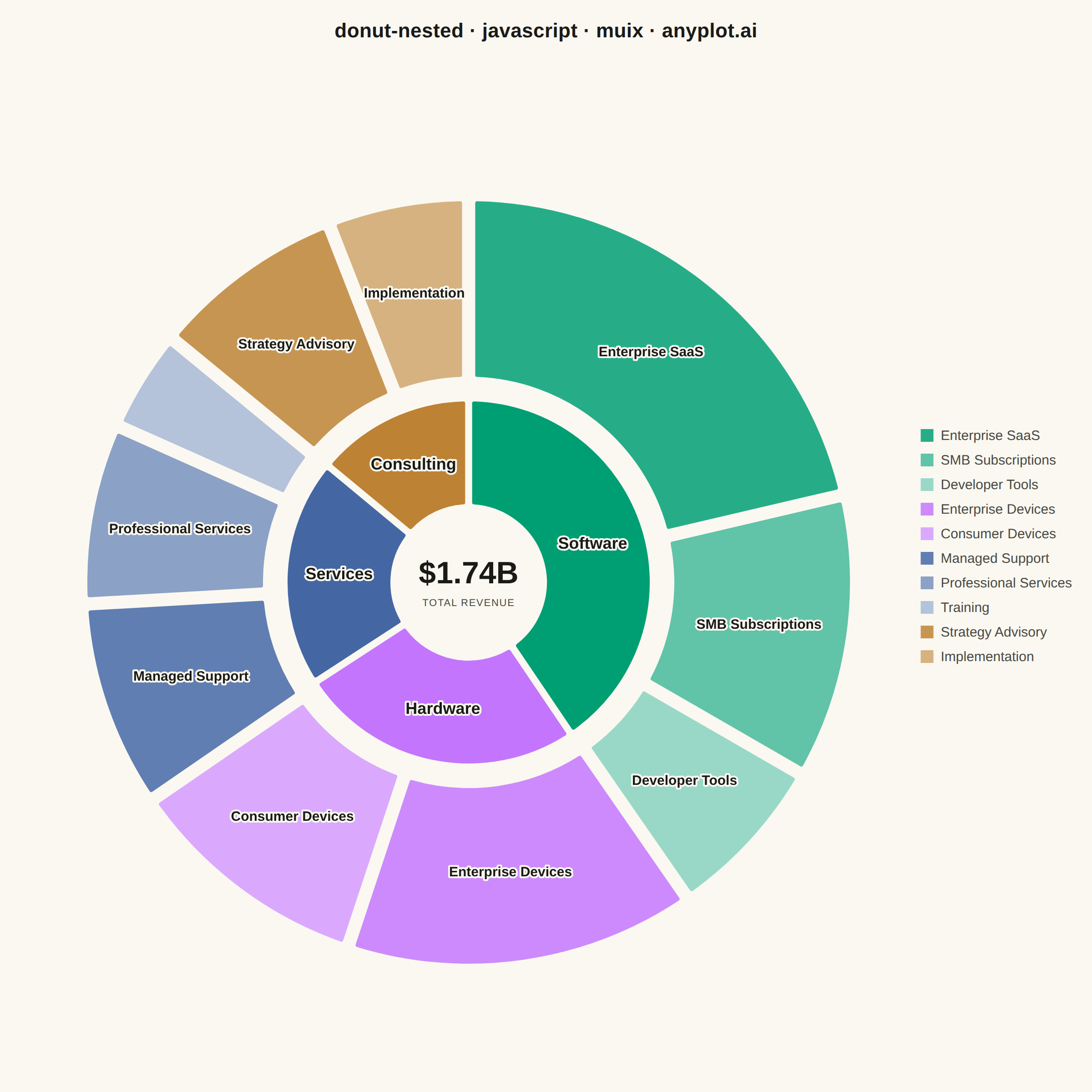
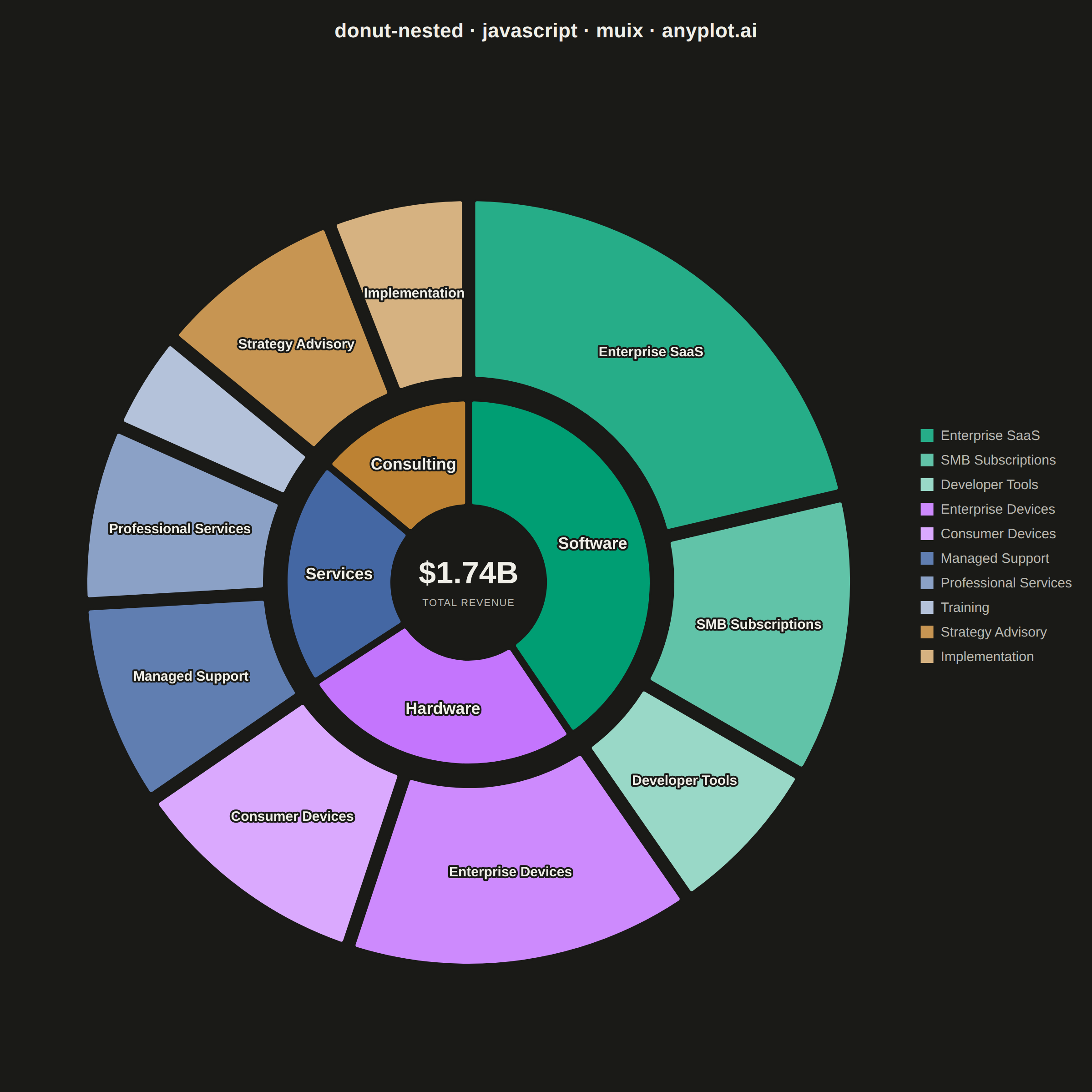
A nested donut chart displays hierarchical data as multiple concentric rings, where each ring represents a level of the hierarchy. Inner rings show parent categories while outer rings show their subdivisions. This visualization effectively reveals part-to-whole relationships across multiple levels while maintaining the familiar donut format.
// anyplot.ai
// donut-nested: Nested Donut Chart
// Library: muix 7.29.1 | JavaScript 22.23.2
// Quality: 91/100 | Created: 2026-08-18
//# anyplot-orientation: square
// anyplot.ai
// donut-nested: Nested Donut Chart
// Library: MUI X Charts | React | Node 22
// License: @mui/x-charts — MIT (community). Pro/Premium are out of scope.
// Quality: pending | Created: 2026-08-18

import { PieChart } from "@mui/x-charts/PieChart";

const t = window.ANYPLOT_TOKENS;

// Company revenue, two hierarchy levels: business unit (inner ring) ->
// customer segment (outer ring). Both rings share the same $1,740M total, so
// the d3 pie layout keeps every segment's angular span nested exactly inside
// its parent unit's wedge.
const BUSINESS_UNITS = [
  { id: "software", label: "Software", value: 710 },
  { id: "hardware", label: "Hardware", value: 440 },
  { id: "services", label: "Services", value: 350 },
  { id: "consulting", label: "Consulting", value: 240 },
];

const SEGMENTS = [
  { id: "enterprise-saas", label: "Enterprise SaaS", value: 380, unit: "software" },
  { id: "smb-subscriptions", label: "SMB Subscriptions", value: 210, unit: "software" },
  { id: "developer-tools", label: "Developer Tools", value: 120, unit: "software" },
  { id: "enterprise-devices", label: "Enterprise Devices", value: 260, unit: "hardware" },
  { id: "consumer-devices", label: "Consumer Devices", value: 180, unit: "hardware" },
  { id: "managed-support", label: "Managed Support", value: 150, unit: "services" },
  { id: "professional-services", label: "Professional Services", value: 130, unit: "services" },
  { id: "training", label: "Training", value: 70, unit: "services" },
  { id: "strategy-advisory", label: "Strategy Advisory", value: 140, unit: "consulting" },
  { id: "implementation", label: "Implementation", value: 100, unit: "consulting" },
];

// Business unit -> Imprint hue (units are abstract categories, so canonical
// palette order applies; first series is always brand green).
const UNIT_COLOR = {
  software: t.palette[0],
  hardware: t.palette[1],
  services: t.palette[2],
  consulting: t.palette[3],
};

// Same hue per unit across both rings; children step towards white by a
// fixed ratio so every color stays an identical solid hex in both themes
// (unlike alpha blending, which would shift visibly against the different
// page backgrounds) while still reading as clearly nested within its unit.
const hexToRgb = (hex) => [
  parseInt(hex.slice(1, 3), 16),
  parseInt(hex.slice(3, 5), 16),
  parseInt(hex.slice(5, 7), 16),
];
const lighten = (hex, amount) => {
  const [r, g, b] = hexToRgb(hex);
  const mix = (channel) => Math.round(channel + (255 - channel) * amount);
  return `rgb(${mix(r)}, ${mix(g)}, ${mix(b)})`;
};
const CHILD_TINTS = [0.15, 0.38, 0.6, 0.8, 0.92];

const formatRevenue = (item) => `$${item.value}M`;

const unitData = BUSINESS_UNITS.map((unit) => ({
  id: unit.id,
  value: unit.value,
  // Excluded from the legend (return undefined for 'legend') since every
  // unit is large enough to carry its own arc label; the legend is reserved
  // for the smaller outer-ring segments per the spec's labeling guidance.
  label: (location) => (location === "legend" ? undefined : unit.label),
  color: UNIT_COLOR[unit.id],
}));

const unitChildIndex = {};
const segmentData = SEGMENTS.map((segment) => {
  const index = unitChildIndex[segment.unit] ?? 0;
  unitChildIndex[segment.unit] = index + 1;
  return {
    id: segment.id,
    value: segment.value,
    label: segment.label,
    color: lighten(UNIT_COLOR[segment.unit], CHILD_TINTS[index]),
  };
});

const TITLE = "donut-nested · javascript · muix · anyplot.ai";
const MARGIN = { top: 130, bottom: 50, left: 90, right: 260 };
const TOTAL_REVENUE = BUSINESS_UNITS.reduce((sum, unit) => sum + unit.value, 0);

export default function Chart() {
  const { width, height } = window.ANYPLOT_SIZE;
  const pieCx = (MARGIN.left + width - MARGIN.right) / 2;
  const pieCy = (MARGIN.top + height - MARGIN.bottom) / 2;

  return (
    <div
      style={{
        position: "relative",
        width,
        height,
        fontFamily: "'Segoe UI', Roboto, 'Helvetica Neue', Arial, sans-serif",
      }}
    >
      {/* Title */}
      <div
        style={{
          position: "absolute",
          top: 20,
          left: 0,
          right: 0,
          textAlign: "center",
          fontSize: 22,
          fontWeight: 600,
          color: t.ink,
          letterSpacing: "0.01em",
          lineHeight: 1.3,
        }}
      >
        {TITLE}
      </div>

      {/* Nested donut — inner ring: business units, outer ring: customer
          segments. Both series total 1,740 so their arcs stay angularly
          aligned, and a radius gap between the rings gives visual separation. */}
      <PieChart
        width={width}
        height={height}
        skipAnimation
        margin={MARGIN}
        series={[
          {
            id: "business-units",
            data: unitData,
            innerRadius: 85,
            outerRadius: 200,
            paddingAngle: 1.5,
            cornerRadius: 3,
            arcLabel: "label",
            arcLabelMinAngle: 0,
            valueFormatter: formatRevenue,
          },
          {
            id: "customer-segments",
            data: segmentData,
            innerRadius: 225,
            outerRadius: 420,
            paddingAngle: 1.5,
            cornerRadius: 3,
            arcLabel: "label",
            arcLabelMinAngle: 18,
            valueFormatter: formatRevenue,
          },
        ]}
        slotProps={{
          legend: {
            direction: "column",
            position: { vertical: "middle", horizontal: "right" },
            itemMarkWidth: 14,
            itemMarkHeight: 14,
            markGap: 8,
            itemGap: 12,
            labelStyle: { fontSize: 15, fill: t.inkSoft },
          },
        }}
        sx={{
          "& .MuiPieArc-root": { stroke: t.pageBg, strokeWidth: 2 },
          "& .MuiPieArcLabel-root": {
            fill: t.ink,
            paintOrder: "stroke",
            stroke: t.pageBg,
            strokeWidth: 4,
            strokeLinejoin: "round",
          },
          "& .MuiPieArcLabel-series-business-units": { fontSize: 18, fontWeight: 700 },
          "& .MuiPieArcLabel-series-customer-segments": { fontSize: 15, fontWeight: 600 },
        }}
      />

      {/* Center overlay — total revenue across all business units */}
      <div
        style={{
          position: "absolute",
          top: pieCy,
          left: pieCx,
          transform: "translate(-50%, -50%)",
          textAlign: "center",
          pointerEvents: "none",
          lineHeight: 1.2,
        }}
      >
        <div style={{ fontSize: 34, fontWeight: 700, color: t.ink }}>
          {`$${(TOTAL_REVENUE / 1000).toFixed(2)}B`}
        </div>
        <div
          style={{
            fontSize: 11,
            color: t.inkSoft,
            marginTop: 6,
            letterSpacing: "0.08em",
            textTransform: "uppercase",
          }}
        >
          Total Revenue
        </div>
      </div>
    </div>
  );
}
Runnable source as JSON, for any HTTP client: https://api.anyplot.ai/specs/donut-nested/muix/code. Any spec id and library id listed in llms-full.txt fit the same URL shape; every URL below is complete and callable.
{
  "spec_id": "donut-nested",
  "language": "javascript",
  "library": "muix",
  "page": "https://anyplot.ai/donut-nested/javascript/muix",
  "hub": "https://anyplot.ai/donut-nested",
  "code_json": "https://api.anyplot.ai/specs/donut-nested/muix/code",
  "spec_json": "https://api.anyplot.ai/specs/donut-nested",
  "render_light_png": "https://storage.googleapis.com/anyplot-images/plots/donut-nested/javascript/muix/plot-light.png",
  "render_dark_png": "https://storage.googleapis.com/anyplot-images/plots/donut-nested/javascript/muix/plot-dark.png",
  "interactive_light_html": "https://storage.googleapis.com/anyplot-images/plots/donut-nested/javascript/muix/plot-light.html",
  "interactive_dark_html": "https://storage.googleapis.com/anyplot-images/plots/donut-nested/javascript/muix/plot-dark.html",
  "quality_score": 91.0,
  "license": "MIT",
  "guide": "https://anyplot.ai/llms.txt"
}
Part of Nested Donut Chart on anyplot.ai.