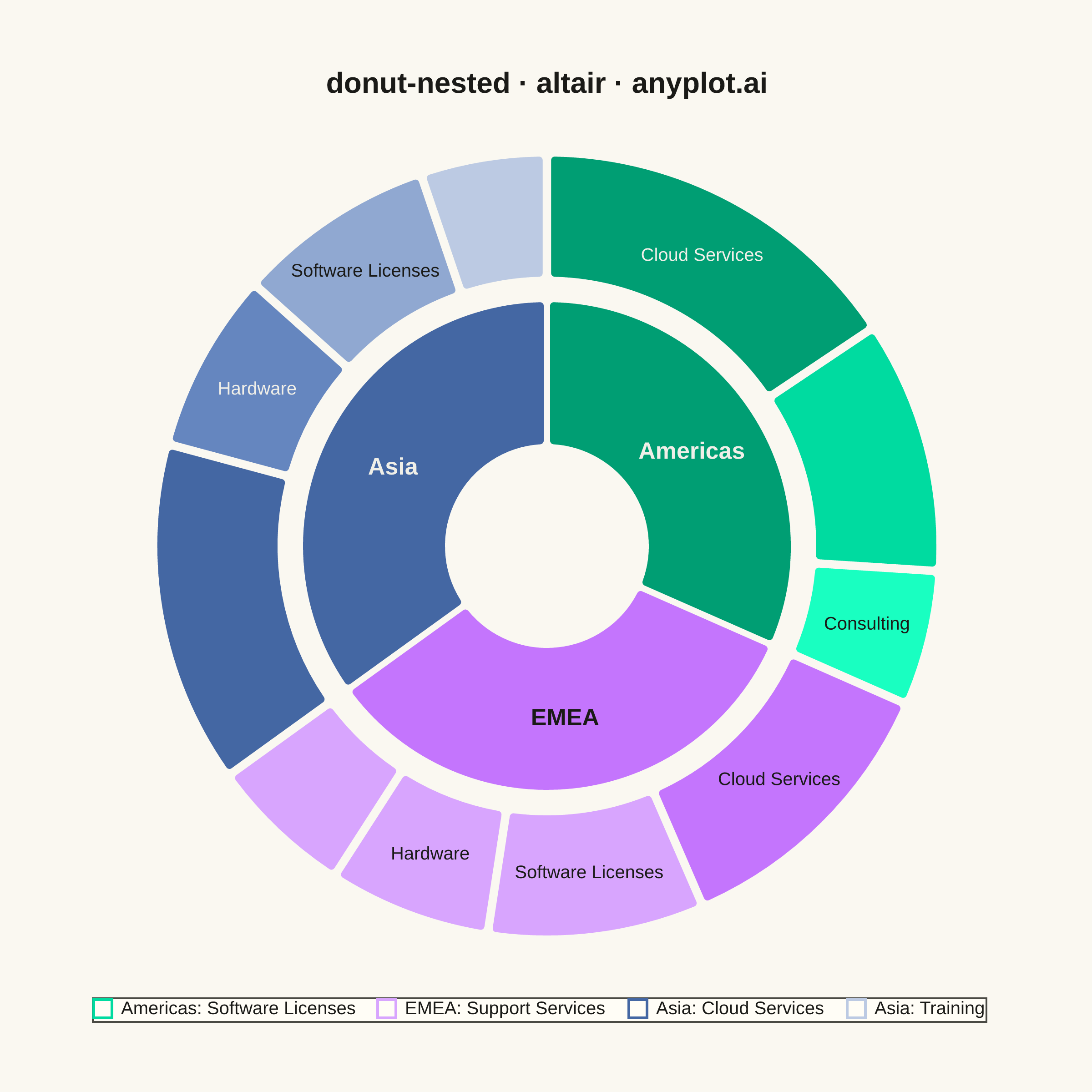
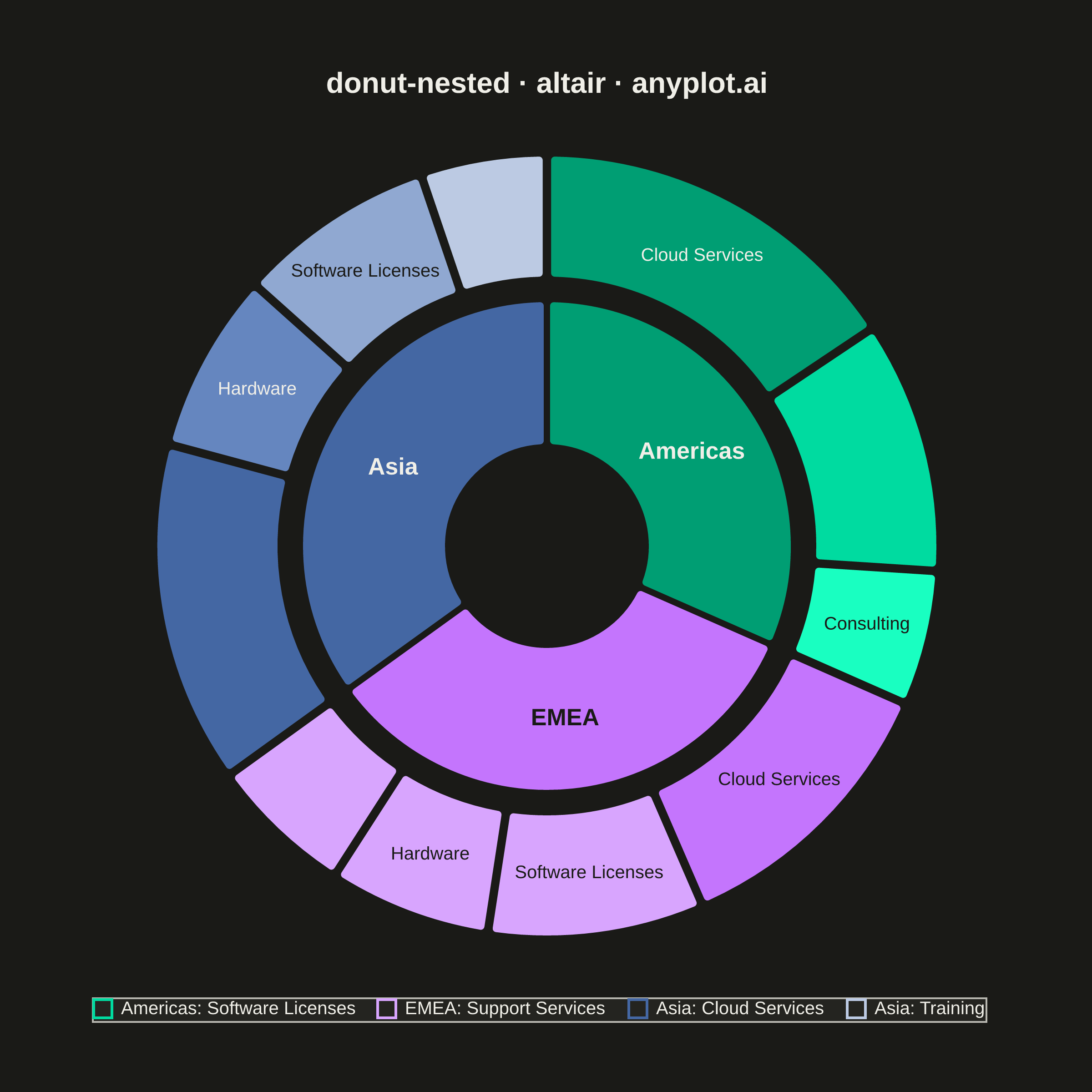
A nested donut chart displays hierarchical data as multiple concentric rings, where each ring represents a level of the hierarchy. Inner rings show parent categories while outer rings show their subdivisions. This visualization effectively reveals part-to-whole relationships across multiple levels while maintaining the familiar donut format.
""" anyplot.ai
donut-nested: Nested Donut Chart
Library: altair 6.2.2 | Python 3.13.15
Quality: 89/100 | Updated: 2026-08-18
"""

import colorsys
import math
import os

import altair as alt
import pandas as pd
from PIL import Image


# Theme tokens
THEME = os.getenv("ANYPLOT_THEME", "light")
PAGE_BG = "#FAF8F1" if THEME == "light" else "#1A1A17"
ELEVATED_BG = "#FFFDF6" if THEME == "light" else "#242420"
INK = "#1A1A17" if THEME == "light" else "#F0EFE8"
INK_SOFT = "#4A4A44" if THEME == "light" else "#B8B7B0"

# Direct-on-fill label ink - contrasted against each segment's own color, not
# the page theme, since a light pastel child segment renders identically in
# both themes and a theme-only gray fails against it (near-white on near-white)
TEXT_DARK = "#1A1A17"
TEXT_LIGHT = "#F0EFE8"

# Imprint palette (canonical order)
IMPRINT = ["#009E73", "#C475FD", "#4467A3", "#BD8233", "#AE3030", "#2ABCCD", "#954477", "#99B314"]

# Data - Market share by region (inner) and product lines within each region (outer)
data = {
    "level_1": ["Americas", "Americas", "Americas", "EMEA", "EMEA", "EMEA", "EMEA", "Asia", "Asia", "Asia", "Asia"],
    "level_2": [
        "Cloud Services",
        "Software Licenses",
        "Consulting",
        "Cloud Services",
        "Software Licenses",
        "Hardware",
        "Support Services",
        "Cloud Services",
        "Hardware",
        "Software Licenses",
        "Training",
    ],
    "value": [420, 280, 150, 320, 240, 180, 160, 380, 200, 220, 140],
}

df = pd.DataFrame(data)

# Calculate parent totals for inner ring
inner_df = df.groupby("level_1", as_index=False, sort=False)["value"].sum()
inner_df["level_2"] = inner_df["level_1"]

# Inner ring colors (Imprint palette, canonical order)
inner_color_map = {}
for i, parent in enumerate(inner_df["level_1"]):
    inner_color_map[parent] = IMPRINT[i % len(IMPRINT)]
inner_df["color"] = inner_df["level_1"].map(inner_color_map)

# Outer ring colors - same hue/saturation as the parent, stepped lightness per
# child so each color family reads as one region at a glance. Capped short of
# white so children stay legible against the page background.
color_map = {}
for i, parent in enumerate(inner_df["level_1"]):
    parent_color = IMPRINT[i % len(IMPRINT)]
    r = int(parent_color[1:3], 16) / 255
    g = int(parent_color[3:5], 16) / 255
    b = int(parent_color[5:7], 16) / 255
    hue, lightness, saturation = colorsys.rgb_to_hls(r, g, b)
    parent_children = df[df["level_1"] == parent]["level_2"].tolist()
    color_map[parent] = {}
    for j, child in enumerate(parent_children):
        child_lightness = min(0.82, lightness + j * 0.12)
        cr, cg, cb = colorsys.hls_to_rgb(hue, child_lightness, saturation)
        color_map[parent][child] = "#{:02x}{:02x}{:02x}".format(round(cr * 255), round(cg * 255), round(cb * 255))

outer_colors = []
for _, row in df.iterrows():
    outer_colors.append(color_map[row["level_1"]][row["level_2"]])
df["color"] = outer_colors

# Format values for tooltip
df["formatted_value"] = df["value"].apply(lambda x: f"${x}M")
inner_df["formatted_value"] = inner_df["value"].apply(lambda x: f"${x}M")

# Ring geometry (view units, before scale_factor) - sized to fit the 500x460
# square inner view with room left for the title above
INNER_R0, INNER_R1 = 55, 135
OUTER_R0, OUTER_R1 = 147, 215
OUTER_LABEL_R = (OUTER_R0 + OUTER_R1) / 2

# Show labels only on segments both large enough (>=150) and geometrically wide
# enough to hold the text without bleeding past the wedge's own boundary. Text
# is rendered horizontally regardless of the wedge's angular position, so a
# wedge whose mid-angle sits near the 3-o'clock/9-o'clock extremes needs far
# less horizontal offset to push the label past the outer radius than a wedge
# near 12/6-o'clock - a plain chord-width estimate misses this and was exactly
# how "Software Licenses" bled into "Consulting" in the prior review. Check
# both text ends against the wedge's true polar boundary (outer radius AND
# angular span) instead.
OUTER_LABEL_FONTSIZE = 10
AVG_CHAR_PX = 5.6  # empirical average glyph width at this font size
RADIAL_MARGIN = 2  # px of slack before the outer rim


def _label_fits(text, theta_start_deg, theta_end_deg):
    mid = math.radians((theta_start_deg + theta_end_deg) / 2)
    x0, y0 = OUTER_LABEL_R * math.sin(mid), -OUTER_LABEL_R * math.cos(mid)
    half_width = len(text) * AVG_CHAR_PX / 2
    for x in (x0 - half_width, x0 + half_width):
        if math.hypot(x, y0) > OUTER_R1 - RADIAL_MARGIN:
            return False
        angle = math.degrees(math.atan2(x, -y0)) % 360
        if not (theta_start_deg - 0.5 <= angle <= theta_end_deg + 0.5):
            return False
    return True


_total_value = df["value"].sum()
_cum_value = df["value"].cumsum() - df["value"]
df["theta_start"] = _cum_value / _total_value * 360
df["theta_end"] = (_cum_value + df["value"]) / _total_value * 360
df["label"] = df.apply(
    lambda row: (
        row["level_2"]
        if row["value"] >= 150 and _label_fits(row["level_2"], row["theta_start"], row["theta_end"])
        else ""
    ),
    axis=1,
)

# Per-segment label ink - pick dark or light text by the fill's own perceived
# luminance so labels stay legible on every family, from full-saturation
# parents to the palest children, in both themes (data colors don't change)
inner_label_colors = []
for hex_color in inner_df["color"]:
    r = int(hex_color[1:3], 16) / 255
    g = int(hex_color[3:5], 16) / 255
    b = int(hex_color[5:7], 16) / 255
    luma = 0.299 * r + 0.587 * g + 0.114 * b
    inner_label_colors.append(TEXT_DARK if luma >= 0.6 else TEXT_LIGHT)
inner_df["label_color"] = inner_label_colors

outer_label_colors = []
for hex_color in df["color"]:
    r = int(hex_color[1:3], 16) / 255
    g = int(hex_color[3:5], 16) / 255
    b = int(hex_color[5:7], 16) / 255
    luma = 0.299 * r + 0.587 * g + 0.114 * b
    outer_label_colors.append(TEXT_DARK if luma >= 0.6 else TEXT_LIGHT)
df["label_color"] = outer_label_colors

# Explicit stack order, shared by every layer below - without it, Vega-Lite is
# free to pick a different implicit sort per layer (e.g. by the "color" field
# for arcs vs. by the "text" field for labels), which rotates the arc and
# label layers out of sync and puts a name on the wrong wedge
inner_df["sort_order"] = range(len(inner_df))
df["sort_order"] = range(len(df))

# Inner ring (parent categories)
inner_ring = (
    alt.Chart(inner_df)
    .mark_arc(innerRadius=INNER_R0, outerRadius=INNER_R1, cornerRadius=3, padAngle=0.01, stroke=PAGE_BG, strokeWidth=2)
    .encode(
        theta=alt.Theta("value:Q", stack=True),
        order=alt.Order("sort_order:Q"),
        color=alt.Color("color:N", scale=None, legend=None),
        tooltip=[alt.Tooltip("level_1:N", title="Region"), alt.Tooltip("formatted_value:N", title="Total Revenue")],
    )
)

# Outer ring (child categories)
outer_ring = (
    alt.Chart(df)
    .mark_arc(innerRadius=OUTER_R0, outerRadius=OUTER_R1, cornerRadius=3, padAngle=0.01, stroke=PAGE_BG, strokeWidth=2)
    .encode(
        theta=alt.Theta("value:Q", stack=True),
        order=alt.Order("sort_order:Q"),
        color=alt.Color("color:N", scale=None, legend=None),
        tooltip=[
            alt.Tooltip("level_1:N", title="Region"),
            alt.Tooltip("level_2:N", title="Product"),
            alt.Tooltip("formatted_value:N", title="Revenue"),
        ],
    )
)

# Labels for inner ring (region names)
inner_labels = (
    alt.Chart(inner_df)
    .mark_text(radius=(INNER_R0 + INNER_R1) / 2, fontSize=13, fontWeight="bold")
    .encode(
        theta=alt.Theta("value:Q", stack=True),
        order=alt.Order("sort_order:Q"),
        text="level_1:N",
        color=alt.Color("label_color:N", scale=None, legend=None),
    )
)

# Labels for outer ring (only on segments large and wide enough to hold text -
# see _label_fits above)
outer_labels = (
    alt.Chart(df)
    .mark_text(radius=OUTER_LABEL_R, fontSize=OUTER_LABEL_FONTSIZE)
    .encode(
        theta=alt.Theta("value:Q", stack=True),
        order=alt.Order("sort_order:Q"),
        text="label:N",
        color=alt.Color("label_color:N", scale=None, legend=None),
    )
)

# Legend fallback for segments too small/narrow to carry an inline label (spec:
# "use legend for smaller ones") - an invisible mark carries a real Color scale
# so Vega-Lite draws the standard legend from its domain/range, without needing
# a visible layer of its own
layers = [inner_ring, outer_ring, inner_labels, outer_labels]
unlabeled_df = df[df["label"] == ""].copy()
if not unlabeled_df.empty:
    unlabeled_df["legend_key"] = unlabeled_df["level_1"] + ": " + unlabeled_df["level_2"]
    legend_layer = (
        alt.Chart(unlabeled_df)
        .mark_point(opacity=0)
        .encode(
            color=alt.Color(
                "legend_key:N",
                scale=alt.Scale(domain=unlabeled_df["legend_key"].tolist(), range=unlabeled_df["color"].tolist()),
                legend=alt.Legend(
                    title=None, orient="bottom", direction="horizontal", symbolType="square", labelFontSize=10
                ),
            )
        )
    )
    layers.append(legend_layer)

# Combine all layers
chart = (
    alt.layer(*layers)
    .resolve_scale(color="independent")
    .properties(
        width=500,
        height=460,
        background=PAGE_BG,
        padding={"left": 0, "right": 0, "top": 0, "bottom": 0},
        title=alt.Title("donut-nested · altair · anyplot.ai", fontSize=16, anchor="middle", offset=16, color=INK),
    )
    .configure_view(fill=PAGE_BG, stroke=None, strokeWidth=0)
    .configure_title(color=INK)
    .configure_legend(fillColor=ELEVATED_BG, strokeColor=INK_SOFT, labelColor=INK, titleColor=INK)
)

# Save
chart.save(f"plot-{THEME}.png", scale_factor=4.0)

# Pad the saved PNG up to the exact 2400x2400 canonical target - never crop,
# since cropping would clip title/label content at the edges (see
# prompts/library/altair.md "Canvas" for why vl-convert overshoots width/height)
TW, TH = 2400, 2400
_img = Image.open(f"plot-{THEME}.png").convert("RGB")
_w, _h = _img.size
if _w > TW or _h > TH:
    raise SystemExit(
        f"altair vl-convert produced {_w}x{_h}, exceeds target {TW}x{TH}. "
        f"Shrink chart .properties(width=, height=) values and re-render."
    )
if _w < TW or _h < TH:
    _canvas = Image.new("RGB", (TW, TH), PAGE_BG)
    _canvas.paste(_img, ((TW - _w) // 2, (TH - _h) // 2))
    _canvas.save(f"plot-{THEME}.png")

chart.save(f"plot-{THEME}.html")
Runnable source as JSON, for any HTTP client: https://api.anyplot.ai/specs/donut-nested/altair/code. Any spec id and library id listed in llms-full.txt fit the same URL shape; every URL below is complete and callable.
{
  "spec_id": "donut-nested",
  "language": "python",
  "library": "altair",
  "page": "https://anyplot.ai/donut-nested/python/altair",
  "hub": "https://anyplot.ai/donut-nested",
  "code_json": "https://api.anyplot.ai/specs/donut-nested/altair/code",
  "spec_json": "https://api.anyplot.ai/specs/donut-nested",
  "render_light_png": "https://storage.googleapis.com/anyplot-images/plots/donut-nested/python/altair/plot-light.png",
  "render_dark_png": "https://storage.googleapis.com/anyplot-images/plots/donut-nested/python/altair/plot-dark.png",
  "interactive_light_html": "https://storage.googleapis.com/anyplot-images/plots/donut-nested/python/altair/plot-light.html",
  "interactive_dark_html": "https://storage.googleapis.com/anyplot-images/plots/donut-nested/python/altair/plot-dark.html",
  "quality_score": 89.0,
  "license": "MIT",
  "guide": "https://anyplot.ai/llms.txt"
}
Part of Nested Donut Chart on anyplot.ai.