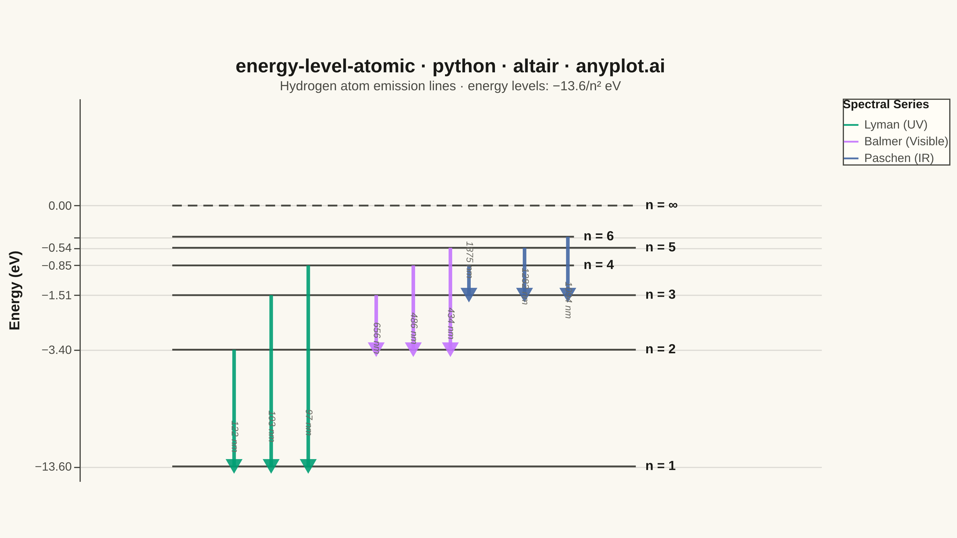
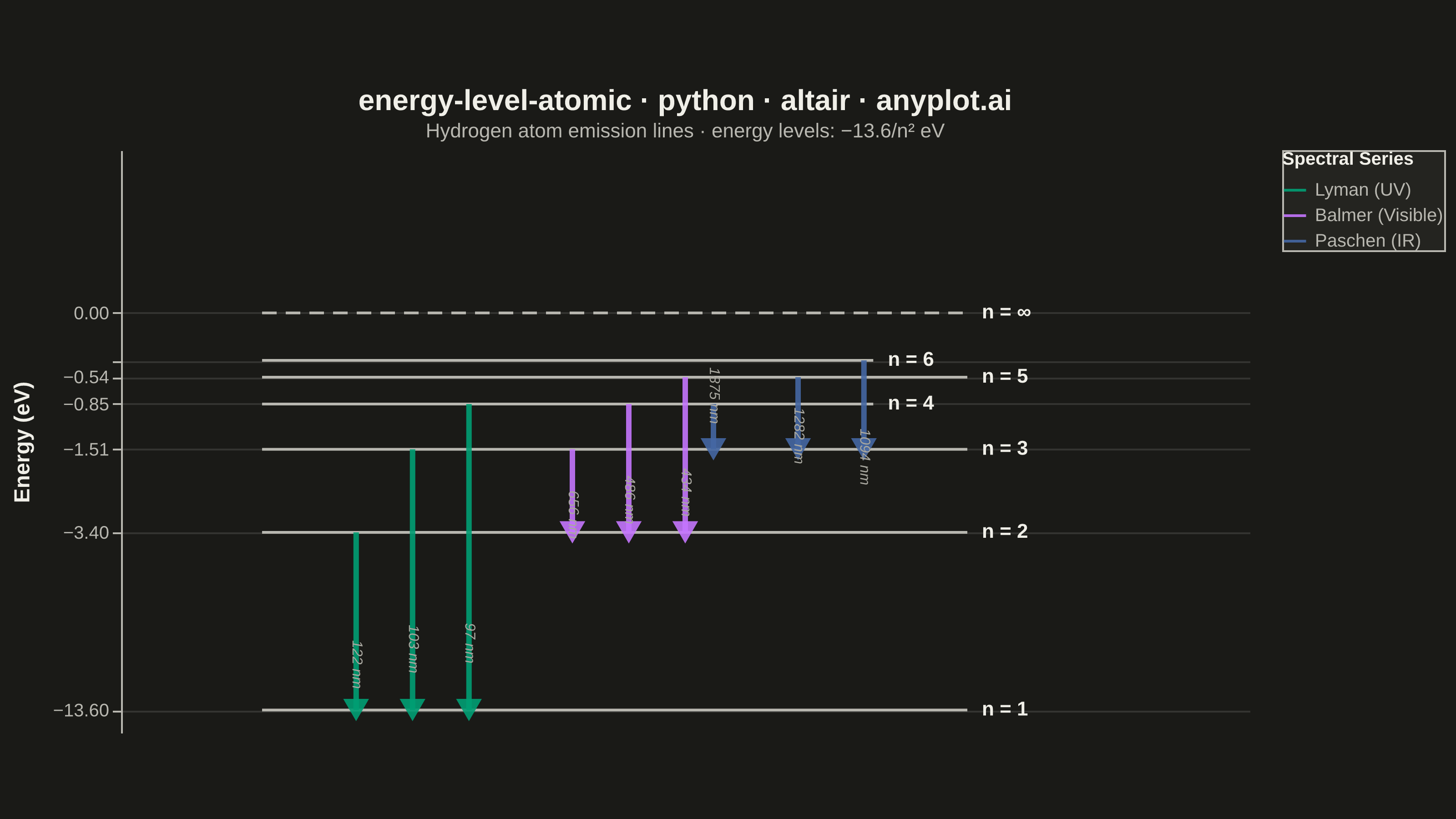
An energy level diagram displays quantized energy states as horizontal lines positioned at their respective energy values, with vertical arrows representing transitions between levels. This visualization reveals the discrete nature of atomic and molecular energy structures, making it essential for understanding spectral series, electron configurations, and quantum state transitions. It provides an intuitive way to connect abstract quantum numbers to observable spectral phenomena.
""" anyplot.ai
energy-level-atomic: Atomic Energy Level Diagram
Library: altair 6.1.0 | Python 3.13.13
Quality: 86/100 | Updated: 2026-05-30
"""

import os

import altair as alt
import pandas as pd
from PIL import Image


# Imprint palette — canonical order, theme-independent
IMPRINT = ["#009E73", "#C475FD", "#4467A3", "#BD8233", "#AE3030", "#2ABCCD", "#954477", "#99B314"]

# Theme-adaptive chrome tokens
THEME = os.getenv("ANYPLOT_THEME", "light")
PAGE_BG = "#FAF8F1" if THEME == "light" else "#1A1A17"
ELEVATED_BG = "#FFFDF6" if THEME == "light" else "#242420"
INK = "#1A1A17" if THEME == "light" else "#F0EFE8"
INK_SOFT = "#4A4A44" if THEME == "light" else "#B8B7B0"
INK_MUTED = "#6B6A63" if THEME == "light" else "#A8A79F"

# --- Data: Hydrogen atom energy levels E_n = -13.6 / n² eV ---
levels = {n: -13.6 / n**2 for n in range(1, 7)}
R_H = 1.097e7  # Rydberg constant, m⁻¹

# Stagger line endpoints so labels stay clear at converging upper levels
line_ends = {1: 9.0, 2: 9.0, 3: 9.0, 4: 8.0, 5: 9.0, 6: 8.0}

level_df = pd.DataFrame(
    [{"energy": levels[n], "x_start": 1.5, "x_end": line_ends[n], "label": f"n = {n}"} for n in range(1, 7)]
)

ionization_df = pd.DataFrame([{"energy": 0.0, "x_start": 1.5, "x_end": 9.0, "label": "n = ∞"}])
all_labels_df = pd.concat([level_df, ionization_df], ignore_index=True)

# Spectral series transitions (emission: upper → lower)
# label_dx: alternating offsets for Paschen labels to prevent crowding at converging levels
transition_data = [
    # Lyman series (UV) — transitions to n=1
    (2, 1, "Lyman (UV)", 2.5, 10),
    (3, 1, "Lyman (UV)", 3.1, 10),
    (4, 1, "Lyman (UV)", 3.7, 10),
    # Balmer series (Visible) — transitions to n=2
    (3, 2, "Balmer (Visible)", 4.8, 10),
    (4, 2, "Balmer (Visible)", 5.4, 10),
    (5, 2, "Balmer (Visible)", 6.0, 10),
    # Paschen series (IR) — wider x-spacing + graduated dx so labels fan out clearly
    (4, 3, "Paschen (IR)", 6.3, -18),
    (5, 3, "Paschen (IR)", 7.2, 10),
    (6, 3, "Paschen (IR)", 7.9, 25),
]

arrow_df = pd.DataFrame(
    [
        {
            "x": x,
            "y_upper": levels[up],
            "y_lower": levels[lo],
            "y_mid": (levels[up] + levels[lo]) / 2,
            "series": s,
            "transition": f"n={up} → n={lo}",
            "wl_label": f"{1e9 / (R_H * (1 / lo**2 - 1 / up**2)):.0f} nm",
            "label_dx": dx,
        }
        for up, lo, s, x, dx in transition_data
    ]
)

head_df = pd.DataFrame([{"x": x, "y": levels[lo], "series": s} for up, lo, s, x, dx in transition_data])

series_order = ["Lyman (UV)", "Balmer (Visible)", "Paschen (IR)"]
# Imprint palette positions 1–3: green (#009E73), lavender (#C475FD), blue (#4467A3)
series_colors = [IMPRINT[0], IMPRINT[1], IMPRINT[2]]

# Symlog scale distributes energy levels more evenly than linear,
# compressing the large n=1-to-n=2 gap while expanding upper levels
y_scale = alt.Scale(type="symlog", constant=1, domain=[-15, 1])
y_axis = alt.Axis(
    titleFontSize=12,
    labelFontSize=10,
    titlePadding=10,
    values=[-13.6, -3.4, -1.51, -0.85, -0.54, -0.38, 0],
    format=".2f",
    gridOpacity=0.12,
)

# Layer 1: Energy level lines — use INK_SOFT + thin stroke so colored arrows read as primary story
energy_lines = (
    alt.Chart(level_df)
    .mark_rule(strokeWidth=1.5, color=INK_SOFT)
    .encode(
        x=alt.X("x_start:Q", scale=alt.Scale(domain=[0, 11.5]), axis=None),
        x2="x_end:Q",
        y=alt.Y("energy:Q", title="Energy (eV)", scale=y_scale, axis=y_axis),
        tooltip=[alt.Tooltip("label:N", title="Level"), alt.Tooltip("energy:Q", title="Energy (eV)", format=".2f")],
    )
)

# Layer 2: Ionization limit (dashed reference line)
ion_line = (
    alt.Chart(ionization_df)
    .mark_rule(strokeWidth=1.5, strokeDash=[8, 5], color=INK_SOFT)
    .encode(x="x_start:Q", x2="x_end:Q", y="energy:Q")
)

# Layer 3: Quantum number labels at line endpoints
level_labels = (
    alt.Chart(all_labels_df)
    .mark_text(align="left", baseline="middle", fontSize=11, dx=8, fontWeight="bold", color=INK)
    .encode(x="x_end:Q", y="energy:Q", text="label:N")
)

# Layer 4: Transition arrow shafts — thicker than level lines to assert visual priority
arrow_shafts = (
    alt.Chart(arrow_df)
    .mark_rule(strokeWidth=3.0, opacity=0.9)
    .encode(
        x="x:Q",
        y="y_upper:Q",
        y2="y_lower:Q",
        color=alt.Color(
            "series:N",
            scale=alt.Scale(domain=series_order, range=series_colors),
            legend=alt.Legend(title="Spectral Series", titleFontSize=10, labelFontSize=10, symbolSize=150),
        ),
        tooltip=["transition:N", "series:N", alt.Tooltip("wl_label:N", title="Wavelength")],
    )
)

# Layer 5: Arrowheads (triangle-down = emission pointing downward)
arrowheads = (
    alt.Chart(head_df)
    .mark_point(shape="triangle-down", filled=True, size=200, opacity=0.9)
    .encode(
        x="x:Q",
        y="y:Q",
        color=alt.Color("series:N", scale=alt.Scale(domain=series_order, range=series_colors), legend=None),
    )
)

# Layer 6: Wavelength annotations — three sub-layers with distinct dx so each
# Paschen label fans out to a different horizontal position, preventing overlap
_wl_left = arrow_df[arrow_df["label_dx"] == -18]
_wl_mid = arrow_df[arrow_df["label_dx"] == 10]
_wl_right = arrow_df[arrow_df["label_dx"] == 25]

wl_labels_left = (
    alt.Chart(_wl_left)
    .mark_text(fontSize=8, angle=90, dx=-18, color=INK_MUTED, fontStyle="italic")
    .encode(x="x:Q", y="y_mid:Q", text="wl_label:N")
)
wl_labels_mid = (
    alt.Chart(_wl_mid)
    .mark_text(fontSize=8, angle=90, dx=10, color=INK_MUTED, fontStyle="italic")
    .encode(x="x:Q", y="y_mid:Q", text="wl_label:N")
)
wl_labels_right = (
    alt.Chart(_wl_right)
    .mark_text(fontSize=8, angle=90, dx=25, color=INK_MUTED, fontStyle="italic")
    .encode(x="x:Q", y="y_mid:Q", text="wl_label:N")
)

# Combine all layers
chart = (
    alt.layer(
        energy_lines, ion_line, level_labels, arrow_shafts, arrowheads, wl_labels_left, wl_labels_mid, wl_labels_right
    )
    .properties(
        width=620,
        height=320,
        background=PAGE_BG,
        title=alt.Title(
            "energy-level-atomic · python · altair · anyplot.ai",
            fontSize=16,
            anchor="middle",
            color=INK,
            subtitle="Hydrogen atom emission lines · energy levels: −13.6/n² eV",
            subtitleFontSize=11,
            subtitleColor=INK_SOFT,
        ),
    )
    .configure_view(strokeWidth=0, fill=PAGE_BG)
    .configure_title(color=INK)
    .configure_axis(
        domainColor=INK_SOFT, tickColor=INK_SOFT, gridColor=INK, gridOpacity=0.12, labelColor=INK_SOFT, titleColor=INK
    )
    .configure_legend(fillColor=ELEVATED_BG, strokeColor=INK_SOFT, labelColor=INK_SOFT, titleColor=INK)
)

# Save PNG then pad to exact 3200×1800 target (landscape)
TW, TH = 3200, 1800
chart.save(f"plot-{THEME}.png", scale_factor=4.0)

_img = Image.open(f"plot-{THEME}.png").convert("RGB")
_w, _h = _img.size
if _w > TW or _h > TH:
    raise SystemExit(
        f"altair vl-convert produced {_w}×{_h}, exceeds target {TW}×{TH}. "
        f"Shrink chart .properties(width=, height=) values and re-render."
    )
if _w < TW or _h < TH:
    _canvas = Image.new("RGB", (TW, TH), PAGE_BG)
    _canvas.paste(_img, ((TW - _w) // 2, (TH - _h) // 2))
    _canvas.save(f"plot-{THEME}.png")

# Save interactive HTML
chart.save(f"plot-{THEME}.html")
Runnable source as JSON, for any HTTP client: https://api.anyplot.ai/specs/energy-level-atomic/altair/code. Any spec id and library id listed in llms-full.txt fit the same URL shape; every URL below is complete and callable.
{
  "spec_id": "energy-level-atomic",
  "language": "python",
  "library": "altair",
  "page": "https://anyplot.ai/energy-level-atomic/python/altair",
  "hub": "https://anyplot.ai/energy-level-atomic",
  "code_json": "https://api.anyplot.ai/specs/energy-level-atomic/altair/code",
  "spec_json": "https://api.anyplot.ai/specs/energy-level-atomic",
  "render_light_png": "https://storage.googleapis.com/anyplot-images/plots/energy-level-atomic/python/altair/plot-light.png",
  "render_dark_png": "https://storage.googleapis.com/anyplot-images/plots/energy-level-atomic/python/altair/plot-dark.png",
  "interactive_light_html": "https://storage.googleapis.com/anyplot-images/plots/energy-level-atomic/python/altair/plot-light.html",
  "interactive_dark_html": "https://storage.googleapis.com/anyplot-images/plots/energy-level-atomic/python/altair/plot-dark.html",
  "quality_score": 86.0,
  "license": "MIT",
  "guide": "https://anyplot.ai/llms.txt"
}
Part of Atomic Energy Level Diagram on anyplot.ai.