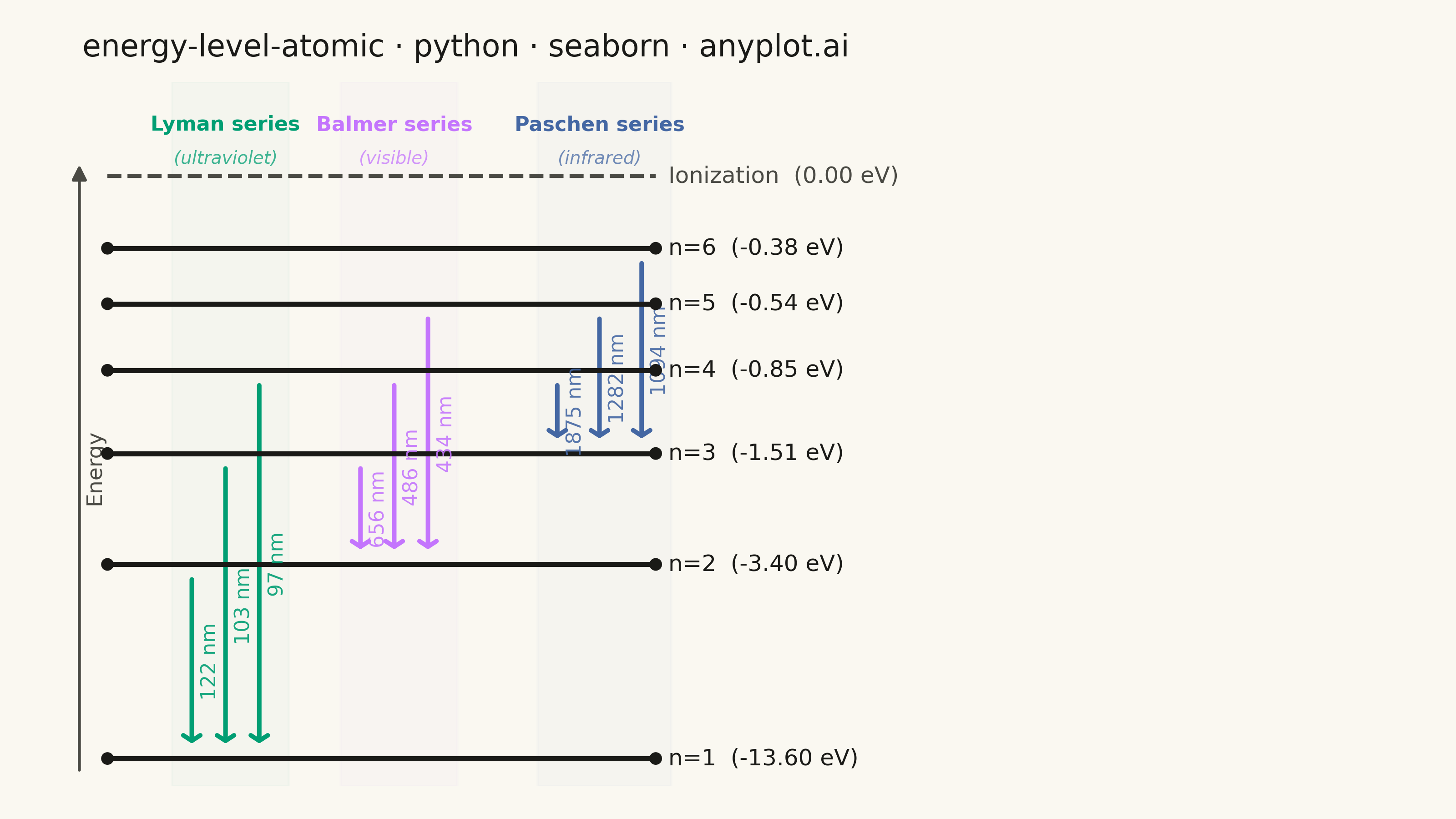
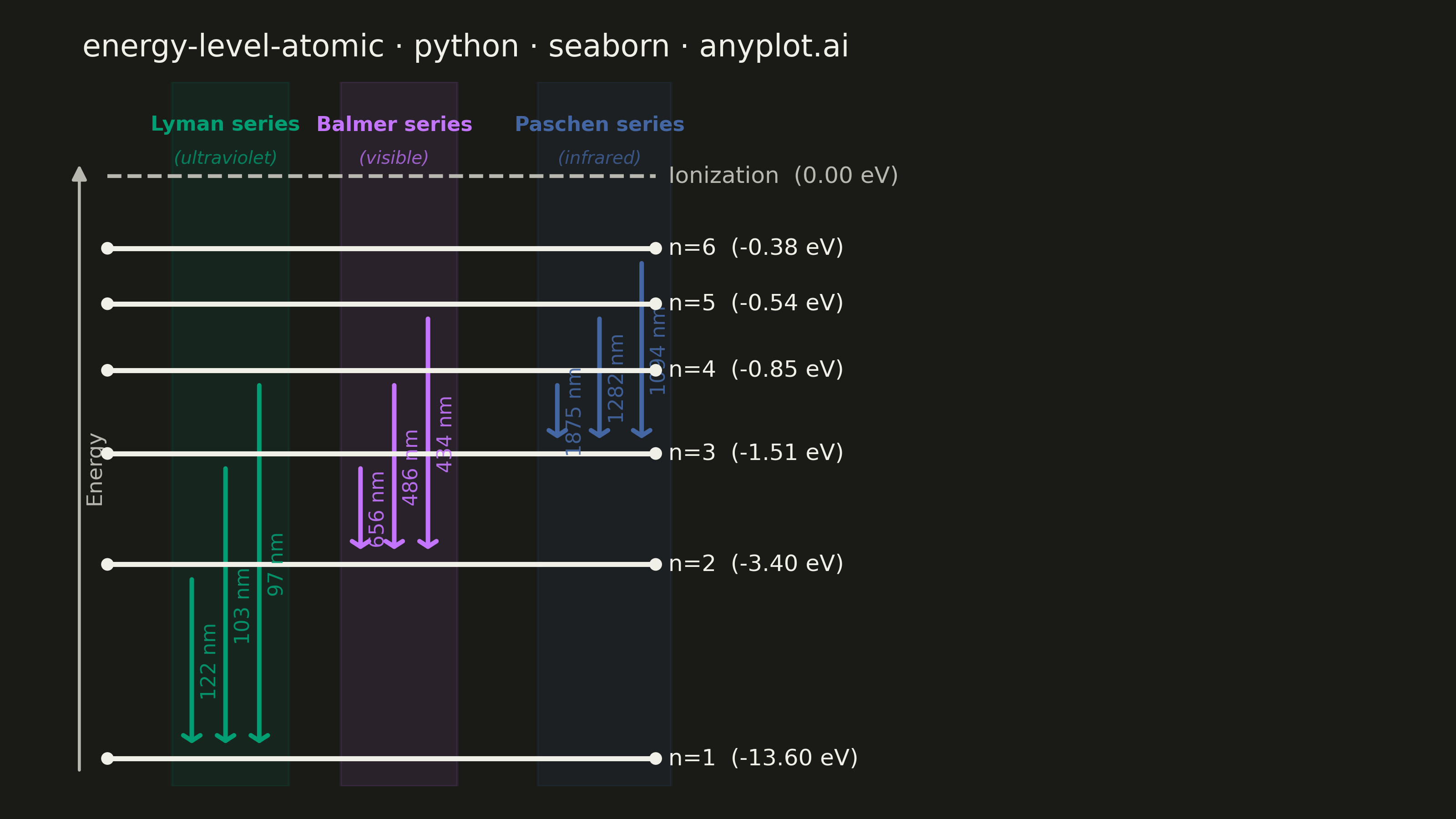
An energy level diagram displays quantized energy states as horizontal lines positioned at their respective energy values, with vertical arrows representing transitions between levels. This visualization reveals the discrete nature of atomic and molecular energy structures, making it essential for understanding spectral series, electron configurations, and quantum state transitions. It provides an intuitive way to connect abstract quantum numbers to observable spectral phenomena.
""" anyplot.ai
energy-level-atomic: Atomic Energy Level Diagram
Library: seaborn 0.13.2 | Python 3.13.13
Quality: 87/100 | Updated: 2026-05-30
"""

import os

import matplotlib.pyplot as plt
import pandas as pd
import seaborn as sns


# Theme tokens
THEME = os.getenv("ANYPLOT_THEME", "light")
PAGE_BG = "#FAF8F1" if THEME == "light" else "#1A1A17"
ELEVATED_BG = "#FFFDF6" if THEME == "light" else "#242420"
INK = "#1A1A17" if THEME == "light" else "#F0EFE8"
INK_SOFT = "#4A4A44" if THEME == "light" else "#B8B7B0"

# Imprint palette — canonical order, first series always #009E73
IMPRINT_PALETTE = ["#009E73", "#C475FD", "#4467A3", "#BD8233", "#AE3030", "#2ABCCD", "#954477", "#99B314"]

# Seaborn theme — theme-adaptive chrome
sns.set_theme(
    style="ticks",
    rc={
        "figure.facecolor": PAGE_BG,
        "axes.facecolor": PAGE_BG,
        "axes.edgecolor": INK_SOFT,
        "axes.labelcolor": INK,
        "text.color": INK,
        "xtick.color": INK_SOFT,
        "ytick.color": INK_SOFT,
        "grid.color": INK,
        "grid.alpha": 0.15,
        "legend.facecolor": ELEVATED_BG,
        "legend.edgecolor": INK_SOFT,
    },
)

# Data — hydrogen atom energy levels E_n = -13.6 / n² eV
energy_values = {"n=1": -13.60, "n=2": -3.40, "n=3": -1.51, "n=4": -0.85, "n=5": -0.54, "n=6": -0.38}

# Nonlinear visual y-positions so upper converging levels remain readable
visual_y = {"n=1": 0.0, "n=2": 3.5, "n=3": 5.5, "n=4": 7.0, "n=5": 8.2, "n=6": 9.2}
ionization_y = 10.5

# Spectral series transitions (upper → lower = emission)
transition_data = [
    ("n=2", "n=1", "Lyman", 122),
    ("n=3", "n=1", "Lyman", 103),
    ("n=4", "n=1", "Lyman", 97),
    ("n=3", "n=2", "Balmer", 656),
    ("n=4", "n=2", "Balmer", 486),
    ("n=5", "n=2", "Balmer", 434),
    ("n=4", "n=3", "Paschen", 1875),
    ("n=5", "n=3", "Paschen", 1282),
    ("n=6", "n=3", "Paschen", 1094),
]

transition_df = pd.DataFrame(transition_data, columns=["upper", "lower", "series", "wavelength_nm"])
transition_df["y_top"] = transition_df["upper"].map(visual_y)
transition_df["y_bot"] = transition_df["lower"].map(visual_y)

# Series colors from Imprint palette — CVD-safe canonical order
series_names = ["Lyman", "Balmer", "Paschen"]
series_colors = {
    "Lyman": IMPRINT_PALETTE[0],  # #009E73 — Imprint position 1
    "Balmer": IMPRINT_PALETTE[1],  # #C475FD — Imprint position 2
    "Paschen": IMPRINT_PALETTE[2],  # #4467A3 — Imprint position 3
}

# Subtle background column tints — seaborn palette functions (light/dark adaptive)
series_bg = {}
for name, color in series_colors.items():
    if THEME == "light":
        series_bg[name] = sns.light_palette(color, n_colors=8)[1]
    else:
        series_bg[name] = sns.dark_palette(color, n_colors=8, reverse=True)[1]

# X column positions; Paschen shifted right to give Balmer/Paschen headers breathing room
series_x_base = {"Lyman": 0.18, "Balmer": 0.42, "Paschen": 0.70}
col_spacing = {"Lyman": 0.048, "Balmer": 0.048, "Paschen": 0.060}

for series in series_names:
    mask = transition_df["series"] == series
    sp = col_spacing[series]
    transition_df.loc[mask, "x_pos"] = [series_x_base[series] + i * sp for i in range(mask.sum())]

# Figure — canvas: 3200 × 1800 px (16:9 landscape)
fig, ax = plt.subplots(figsize=(8, 4.5), dpi=400, facecolor=PAGE_BG)
ax.set_facecolor(PAGE_BG)
# Reserve right margin for energy value labels (clip_on=False text extends here)
fig.subplots_adjust(left=0.04, right=0.60, top=0.90, bottom=0.04)

line_xmin, line_xmax = 0.06, 0.84

# Background column tints
for series in series_names:
    x_base = series_x_base[series]
    sp = col_spacing[series]
    n_trans = (transition_df["series"] == series).sum()
    band_left = x_base - 0.028
    band_right = x_base + (n_trans - 1) * sp + 0.042
    alpha = 0.12 if THEME == "light" else 0.10
    ax.axvspan(band_left, band_right, alpha=alpha, color=series_bg[series], zorder=0)

# Energy level lines via sns.lineplot (DataFrame-driven)
level_rows = []
for label, y_pos in visual_y.items():
    level_rows += [{"x": line_xmin, "y": y_pos, "level": label}, {"x": line_xmax, "y": y_pos, "level": label}]
level_df = pd.DataFrame(level_rows)

sns.lineplot(
    data=level_df, x="x", y="y", units="level", estimator=None, color=INK, linewidth=2.0, ax=ax, legend=False, zorder=3
)

# Level endpoints via sns.scatterplot
sns.scatterplot(data=level_df, x="x", y="y", color=INK, s=25, zorder=4, ax=ax, legend=False, edgecolor="none")

# Energy value labels — clip_on=False so text extends into right margin
for label, y_pos in visual_y.items():
    energy = energy_values[label]
    ax.text(
        line_xmax + 0.018,
        y_pos,
        f"{label}  ({energy:.2f} eV)",
        fontsize=9,
        va="center",
        ha="left",
        color=INK,
        fontweight="medium",
        clip_on=False,
    )

# Ionization limit (dashed reference line)
ax.hlines(ionization_y, line_xmin, line_xmax, colors=INK_SOFT, linewidth=1.5, linestyles="dashed", zorder=3)
ax.text(
    line_xmax + 0.018,
    ionization_y,
    "Ionization  (0.00 eV)",
    fontsize=9,
    va="center",
    ha="left",
    color=INK_SOFT,
    fontweight="medium",
    clip_on=False,
)

# Transition arrows (emission: downward)
gap = 0.18
for _, row in transition_df.iterrows():
    color = series_colors[row["series"]]
    ax.annotate(
        "",
        xy=(row["x_pos"], row["y_bot"] + gap),
        xytext=(row["x_pos"], row["y_top"] - gap),
        arrowprops={"arrowstyle": "->,head_width=0.28,head_length=0.18", "color": color, "linewidth": 1.8},
        zorder=2,
    )
    mid_y = (row["y_top"] + row["y_bot"]) / 2
    ax.text(
        row["x_pos"] + 0.012,
        mid_y,
        f"{row['wavelength_nm']} nm",
        fontsize=8,
        color=color,
        va="center",
        ha="left",
        rotation=90,
        alpha=0.9,
    )

# Series labels and spectral region subtitles
spectral_regions = {"Lyman": "ultraviolet", "Balmer": "visible", "Paschen": "infrared"}
for series in series_names:
    x_base = series_x_base[series]
    sp = col_spacing[series]
    n_trans = (transition_df["series"] == series).sum()
    x_center = x_base + sp * (n_trans - 1) / 2
    color = series_colors[series]
    ax.text(x_center, ionization_y + 0.82, f"{series} series", fontsize=8, fontweight="bold", ha="center", color=color)
    ax.text(
        x_center,
        ionization_y + 0.22,
        f"({spectral_regions[series]})",
        fontsize=7,
        ha="center",
        color=color,
        alpha=0.75,
        style="italic",
    )

# Energy direction arrow (left margin indicator)
ax.annotate(
    "", xy=(0.02, 10.8), xytext=(0.02, -0.3), arrowprops={"arrowstyle": "-|>", "color": INK_SOFT, "linewidth": 1.2}
)
ax.text(0.027, 5.25, "Energy", fontsize=8.5, rotation=90, va="center", ha="left", color=INK_SOFT)

# Axes cleanup
ax.set_xlim(-0.01, 1.15)
ax.set_ylim(-0.5, 12.2)

title = "energy-level-atomic · python · seaborn · anyplot.ai"
ax.set_title(title, fontsize=12, fontweight="medium", pad=10, color=INK)
ax.set_xticks([])
ax.set_yticks([])
ax.set_xlabel("")
ax.set_ylabel("")
sns.despine(ax=ax, left=True, bottom=True)

# Save — no bbox_inches so canvas stays at exactly 3200 × 1800
plt.savefig(f"plot-{THEME}.png", dpi=400, facecolor=PAGE_BG)
Runnable source as JSON, for any HTTP client: https://api.anyplot.ai/specs/energy-level-atomic/seaborn/code. Any spec id and library id listed in llms-full.txt fit the same URL shape; every URL below is complete and callable.
{
  "spec_id": "energy-level-atomic",
  "language": "python",
  "library": "seaborn",
  "page": "https://anyplot.ai/energy-level-atomic/python/seaborn",
  "hub": "https://anyplot.ai/energy-level-atomic",
  "code_json": "https://api.anyplot.ai/specs/energy-level-atomic/seaborn/code",
  "spec_json": "https://api.anyplot.ai/specs/energy-level-atomic",
  "render_light_png": "https://storage.googleapis.com/anyplot-images/plots/energy-level-atomic/python/seaborn/plot-light.png",
  "render_dark_png": "https://storage.googleapis.com/anyplot-images/plots/energy-level-atomic/python/seaborn/plot-dark.png",
  "quality_score": 87.0,
  "license": "MIT",
  "guide": "https://anyplot.ai/llms.txt"
}
Part of Atomic Energy Level Diagram on anyplot.ai.