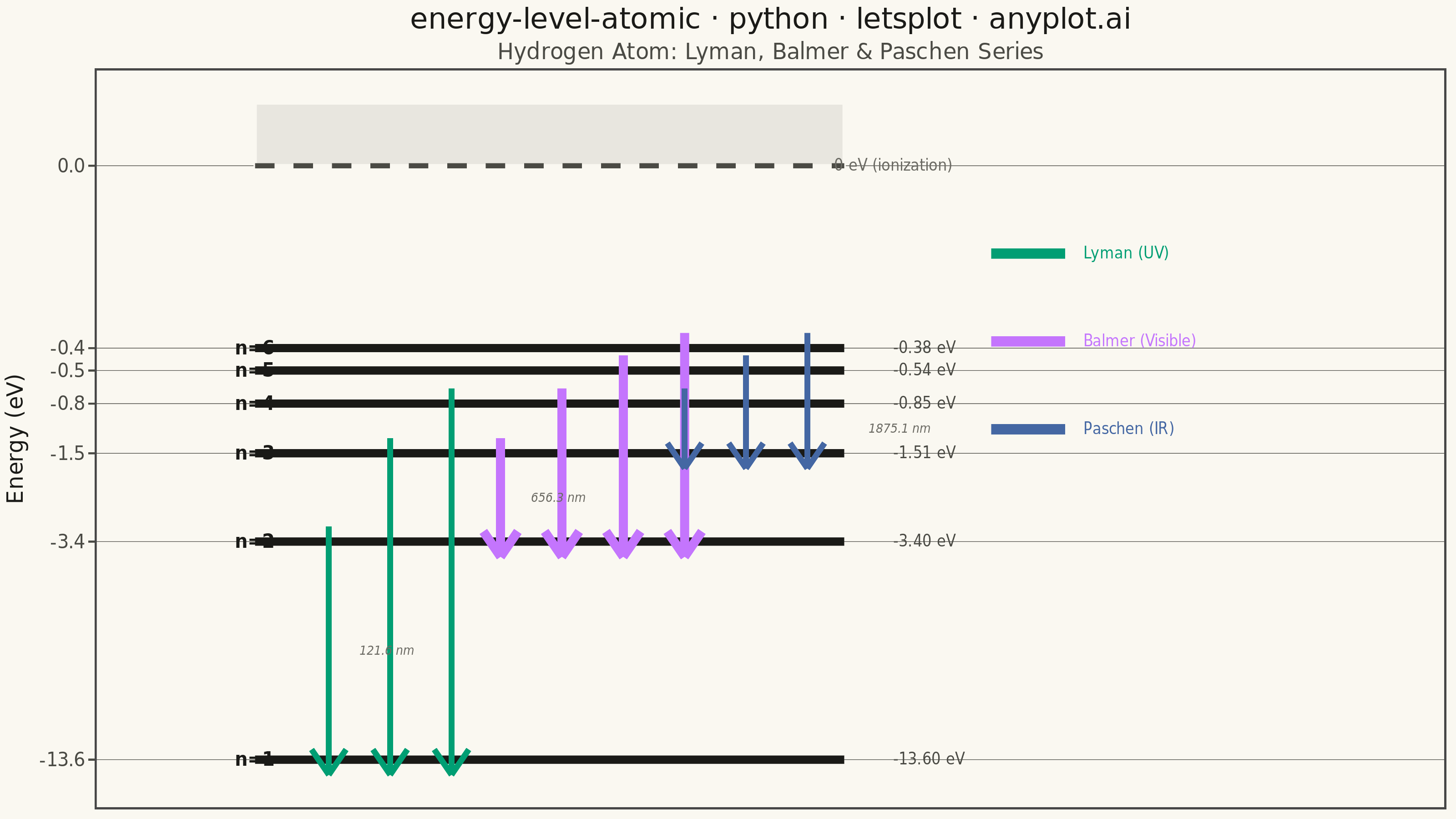
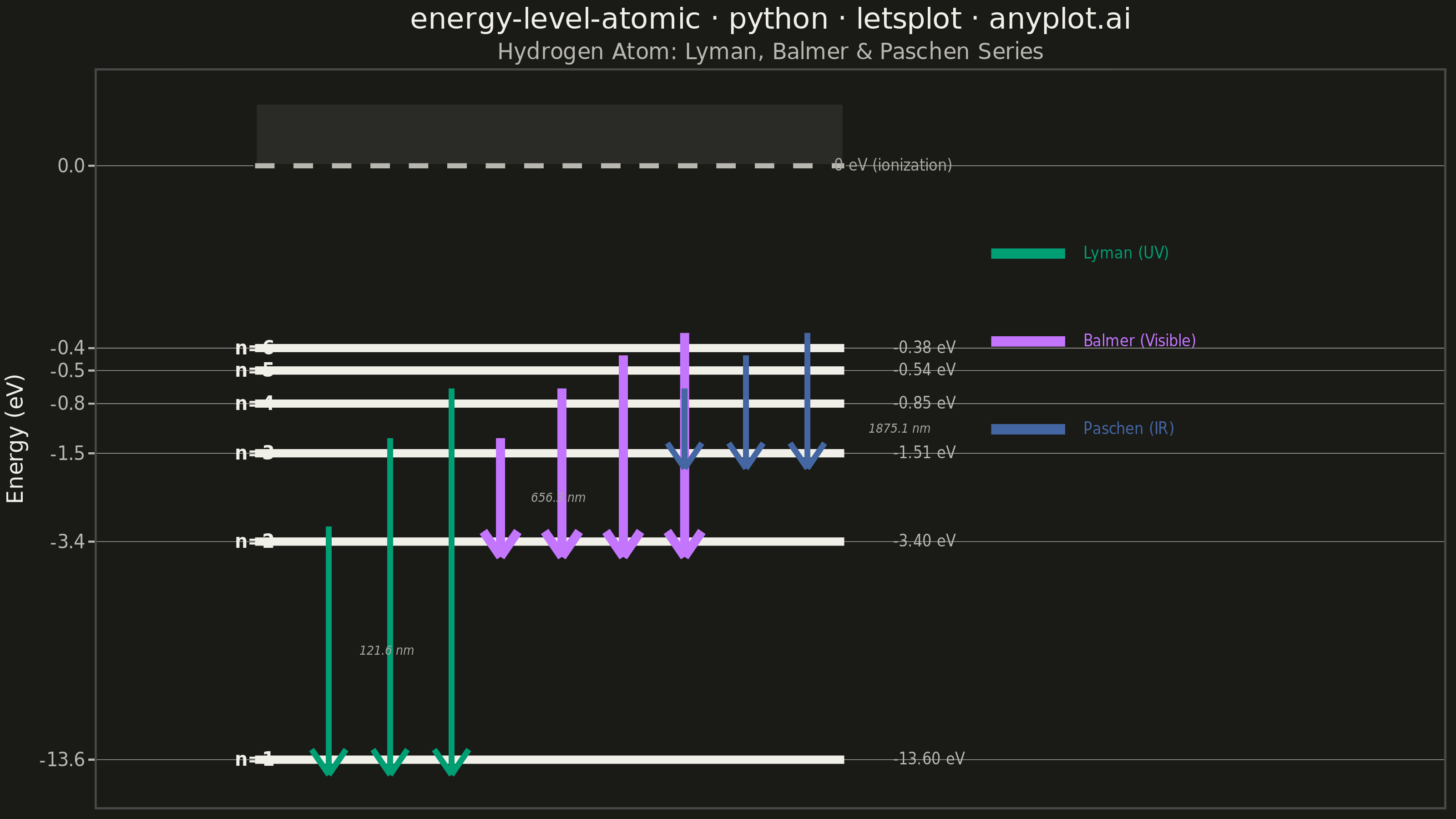
An energy level diagram displays quantized energy states as horizontal lines positioned at their respective energy values, with vertical arrows representing transitions between levels. This visualization reveals the discrete nature of atomic and molecular energy structures, making it essential for understanding spectral series, electron configurations, and quantum state transitions. It provides an intuitive way to connect abstract quantum numbers to observable spectral phenomena.
""" anyplot.ai
energy-level-atomic: Atomic Energy Level Diagram
Library: letsplot 4.10.1 | Python 3.13.13
Quality: 87/100 | Updated: 2026-05-30
"""

import os

import pandas as pd
from lets_plot import (
    LetsPlot,
    aes,
    element_blank,
    element_line,
    element_rect,
    element_text,
    geom_rect,
    geom_segment,
    geom_text,
    ggplot,
    ggsize,
    labs,
    layer_tooltips,
    scale_color_identity,
    scale_x_continuous,
    scale_y_continuous,
    theme,
)
from lets_plot.export import ggsave


LetsPlot.setup_html()

# Theme tokens — Imprint palette, theme-adaptive chrome
THEME = os.getenv("ANYPLOT_THEME", "light")
PAGE_BG = "#FAF8F1" if THEME == "light" else "#1A1A17"
INK = "#1A1A17" if THEME == "light" else "#F0EFE8"
INK_SOFT = "#4A4A44" if THEME == "light" else "#B8B7B0"
INK_MUTED = "#6B6A63" if THEME == "light" else "#A8A79F"

# Imprint categorical palette — canonical order
IMPRINT_PALETTE = ["#009E73", "#C475FD", "#4467A3", "#BD8233", "#AE3030", "#2ABCCD", "#954477", "#99B314"]
lyman_color = IMPRINT_PALETTE[0]  # brand green — Lyman series (UV)
balmer_color = IMPRINT_PALETTE[1]  # lavender — Balmer series (visible)
paschen_color = IMPRINT_PALETTE[2]  # blue — Paschen series (IR)

# Data — Hydrogen atom energy levels (E_n = -13.6/n² eV)
level_names = ["n=1", "n=2", "n=3", "n=4", "n=5", "n=6"]
energies = [-13.6, -3.4, -1.51, -0.85, -0.54, -0.38]

# Power transform on y to spread converging upper levels for legibility
y_positions = [-(abs(e) ** 0.33) for e in energies]
level_ypos = dict(zip(level_names, y_positions, strict=True))
ion_ypos = 0.0

level_df = pd.DataFrame(
    {
        "label": level_names,
        "energy": energies,
        "y": y_positions,
        "x_start": [0.08] * 6,
        "x_end": [0.56] * 6,
        "x_label_right": [0.60] * 6,
        "energy_label": [f"{e:.2f} eV" for e in energies],
    }
)

# Emission transitions with observed wavelength (nm)
transitions = [
    ("n=2", "n=1", "Lyman", lyman_color, 121.6),
    ("n=3", "n=1", "Lyman", lyman_color, 102.6),
    ("n=4", "n=1", "Lyman", lyman_color, 97.2),
    ("n=3", "n=2", "Balmer", balmer_color, 656.3),
    ("n=4", "n=2", "Balmer", balmer_color, 486.1),
    ("n=5", "n=2", "Balmer", balmer_color, 434.0),
    ("n=6", "n=2", "Balmer", balmer_color, 410.2),
    ("n=4", "n=3", "Paschen", paschen_color, 1875.1),
    ("n=5", "n=3", "Paschen", paschen_color, 1282.0),
    ("n=6", "n=3", "Paschen", paschen_color, 1093.8),
]

# Balmer arrows are thicker to emphasise the visible-spectrum series
series_cfg = {
    "Lyman": {"color": lyman_color, "size": 1.4},
    "Balmer": {"color": balmer_color, "size": 2.2},
    "Paschen": {"color": paschen_color, "size": 1.4},
}

# Stagger arrows horizontally within each series to avoid overlap
series_base_x = {"Lyman": 0.14, "Balmer": 0.28, "Paschen": 0.43}
within_series_gap = 0.05

arrow_rows = []
series_counter = {"Lyman": 0, "Balmer": 0, "Paschen": 0}
for from_lvl, to_lvl, series, color, wavelength in transitions:
    idx = series_counter[series]
    x_pos = series_base_x[series] + idx * within_series_gap
    series_counter[series] += 1
    y_top = level_ypos[from_lvl]
    y_bot = level_ypos[to_lvl]
    arrow_rows.append(
        {
            "x": x_pos,
            "y_from": y_top + 0.06,
            "y_to": y_bot - 0.06,
            "series": series,
            "color": color,
            "wavelength": f"{wavelength:.1f} nm",
            "transition": f"{from_lvl} → {to_lvl}",
            "is_alpha": idx == 0,
        }
    )

arrow_df = pd.DataFrame(arrow_rows)

# V-shape arrowheads at the bottom (emission direction)
head_len, head_width = 0.10, 0.014
head_df = pd.DataFrame(
    {
        "x_left": arrow_df["x"] - head_width,
        "x_right": arrow_df["x"] + head_width,
        "x_tip": arrow_df["x"].values,
        "y_base": arrow_df["y_to"] + head_len,
        "y_tip": arrow_df["y_to"].values,
        "color": arrow_df["color"].values,
        "series": arrow_df["series"].values,
    }
)

# Wavelength annotations on the first (α) transition of each series
alpha_arrows = arrow_df[arrow_df["is_alpha"]].copy()
alpha_arrows["y_mid"] = (alpha_arrows["y_from"] + alpha_arrows["y_to"]) / 2
alpha_arrows["x_label"] = alpha_arrows["x"] + 0.025
# Nudge Paschen α-annotation right to clear the Balmer/Paschen crossing zone near n=3
alpha_arrows.loc[alpha_arrows["series"] == "Paschen", "x_label"] = (
    alpha_arrows.loc[alpha_arrows["series"] == "Paschen", "x"] + 0.15
)

# Manual legend on the right side — anchored near upper energy levels to fill sparse area
legend_labels = ["Lyman (UV)", "Balmer (Visible)", "Paschen (IR)"]
legend_colors = [lyman_color, balmer_color, paschen_color]
legend_df = pd.DataFrame(
    {
        "x_seg": [0.68] * 3,
        "xend_seg": [0.74] * 3,
        "x_text": [0.755] * 3,
        "y": [-0.35, -0.70, -1.05],
        "label": legend_labels,
        "color": legend_colors,
    }
)

# Ionization limit line and label
ion_df = pd.DataFrame({"x": [0.08], "xend": [0.56], "y": [ion_ypos], "yend": [ion_ypos]})
ion_label_df = pd.DataFrame({"x": [0.60], "y": [ion_ypos], "label": ["0 eV (ionization)"]})

# Subtle shaded continuum band above the ionization limit
ion_band_df = pd.DataFrame({"xmin": [0.08], "xmax": [0.56], "ymin": [ion_ypos], "ymax": [ion_ypos + 0.25]})

# Y-axis ticks at actual energy values (transformed positions, eV labels)
y_breaks = y_positions + [ion_ypos]
y_labels = [f"{e:.1f}" for e in energies] + ["0.0"]

# Theme — fully adaptive chrome, no hardcoded grays
anyplot_theme = theme(
    plot_background=element_rect(fill=PAGE_BG, color=PAGE_BG),
    panel_background=element_rect(fill=PAGE_BG),
    axis_text_x=element_blank(),
    axis_ticks_x=element_blank(),
    axis_title_x=element_blank(),
    axis_line_x=element_blank(),
    axis_text_y=element_text(size=10, color=INK_SOFT),
    axis_title_y=element_text(size=12, color=INK),
    axis_line_y=element_line(color=INK_SOFT, size=0.8),
    axis_ticks_y=element_line(color=INK_SOFT),
    plot_title=element_text(size=16, hjust=0.5, color=INK),
    plot_subtitle=element_text(size=12, hjust=0.5, color=INK_SOFT),
    panel_grid_major_x=element_blank(),
    panel_grid_minor_x=element_blank(),
    panel_grid_major_y=element_line(color=INK_SOFT, size=0.3),
    panel_grid_minor_y=element_blank(),
    legend_position="none",
)

# Build plot
plot = (
    ggplot()
    # Ionization continuum — subtle band above 0 eV
    + geom_rect(
        data=ion_band_df,
        mapping=aes(xmin="xmin", xmax="xmax", ymin="ymin", ymax="ymax"),
        fill=INK_SOFT,
        alpha=0.10,
        color=PAGE_BG,
    )
    # Energy level horizontal lines
    + geom_segment(
        data=level_df,
        mapping=aes(x="x_start", xend="x_end", y="y", yend="y"),
        size=2.0,
        color=INK,
        tooltips=layer_tooltips().line("@label").line("Energy: @energy_label"),
    )
    # Quantum state labels (left of each level line)
    + geom_text(
        data=level_df, mapping=aes(x="x_start", y="y", label="label"), hjust=1.3, size=5, color=INK, fontface="bold"
    )
    # Energy value labels (right of each level line)
    + geom_text(
        data=level_df, mapping=aes(x="x_label_right", y="y", label="energy_label"), hjust=0, size=4, color=INK_SOFT
    )
    # Ionization limit dashed line
    + geom_segment(
        data=ion_df, mapping=aes(x="x", xend="xend", y="y", yend="yend"), size=1.2, color=INK_SOFT, linetype="dashed"
    )
    + geom_text(data=ion_label_df, mapping=aes(x="x", y="y", label="label"), hjust=-0.05, size=4, color=INK_MUTED)
)

# Add transition arrows and arrowheads per series
for series_name, cfg in series_cfg.items():
    s_arrows = arrow_df[arrow_df["series"] == series_name]
    s_heads = head_df[head_df["series"] == series_name]
    plot = (
        plot
        + geom_segment(
            data=s_arrows,
            mapping=aes(x="x", xend="x", y="y_from", yend="y_to", color="color"),
            size=cfg["size"],
            tooltips=layer_tooltips().line("@series series").line("@transition").line("λ = @wavelength"),
        )
        + geom_segment(
            data=s_heads,
            mapping=aes(x="x_left", xend="x_tip", y="y_base", yend="y_tip", color="color"),
            size=cfg["size"],
        )
        + geom_segment(
            data=s_heads,
            mapping=aes(x="x_right", xend="x_tip", y="y_base", yend="y_tip", color="color"),
            size=cfg["size"],
        )
    )

# Wavelength labels on the α-line of each series
plot = plot + geom_text(
    data=alpha_arrows,
    mapping=aes(x="x_label", y="y_mid", label="wavelength"),
    hjust=0,
    size=3.5,
    color=INK_MUTED,
    fontface="italic",
)

# Legend, scales, and final assembly
plot = (
    plot
    + scale_color_identity()
    + geom_segment(data=legend_df, mapping=aes(x="x_seg", xend="xend_seg", y="y", yend="y", color="color"), size=2.5)
    + geom_text(data=legend_df, mapping=aes(x="x_text", y="y", label="label", color="color"), hjust=0, size=4)
    + scale_x_continuous(limits=[-0.05, 1.05], expand=[0, 0])
    + scale_y_continuous(breaks=y_breaks, labels=y_labels)
    + labs(
        x="",
        y="Energy (eV)",
        title="energy-level-atomic · python · letsplot · anyplot.ai",
        subtitle="Hydrogen Atom: Lyman, Balmer & Paschen Series",
    )
    + ggsize(800, 450)
    + anyplot_theme
)

# Save — PNG at 3200×1800 (scale=4 × ggsize 800×450) + HTML
ggsave(plot, f"plot-{THEME}.png", path=".", scale=4)
ggsave(plot, f"plot-{THEME}.html", path=".")
Runnable source as JSON, for any HTTP client: https://api.anyplot.ai/specs/energy-level-atomic/letsplot/code. Any spec id and library id listed in llms-full.txt fit the same URL shape; every URL below is complete and callable.
{
  "spec_id": "energy-level-atomic",
  "language": "python",
  "library": "letsplot",
  "page": "https://anyplot.ai/energy-level-atomic/python/letsplot",
  "hub": "https://anyplot.ai/energy-level-atomic",
  "code_json": "https://api.anyplot.ai/specs/energy-level-atomic/letsplot/code",
  "spec_json": "https://api.anyplot.ai/specs/energy-level-atomic",
  "render_light_png": "https://storage.googleapis.com/anyplot-images/plots/energy-level-atomic/python/letsplot/plot-light.png",
  "render_dark_png": "https://storage.googleapis.com/anyplot-images/plots/energy-level-atomic/python/letsplot/plot-dark.png",
  "interactive_light_html": "https://storage.googleapis.com/anyplot-images/plots/energy-level-atomic/python/letsplot/plot-light.html",
  "interactive_dark_html": "https://storage.googleapis.com/anyplot-images/plots/energy-level-atomic/python/letsplot/plot-dark.html",
  "quality_score": 87.0,
  "license": "MIT",
  "guide": "https://anyplot.ai/llms.txt"
}
Part of Atomic Energy Level Diagram on anyplot.ai.