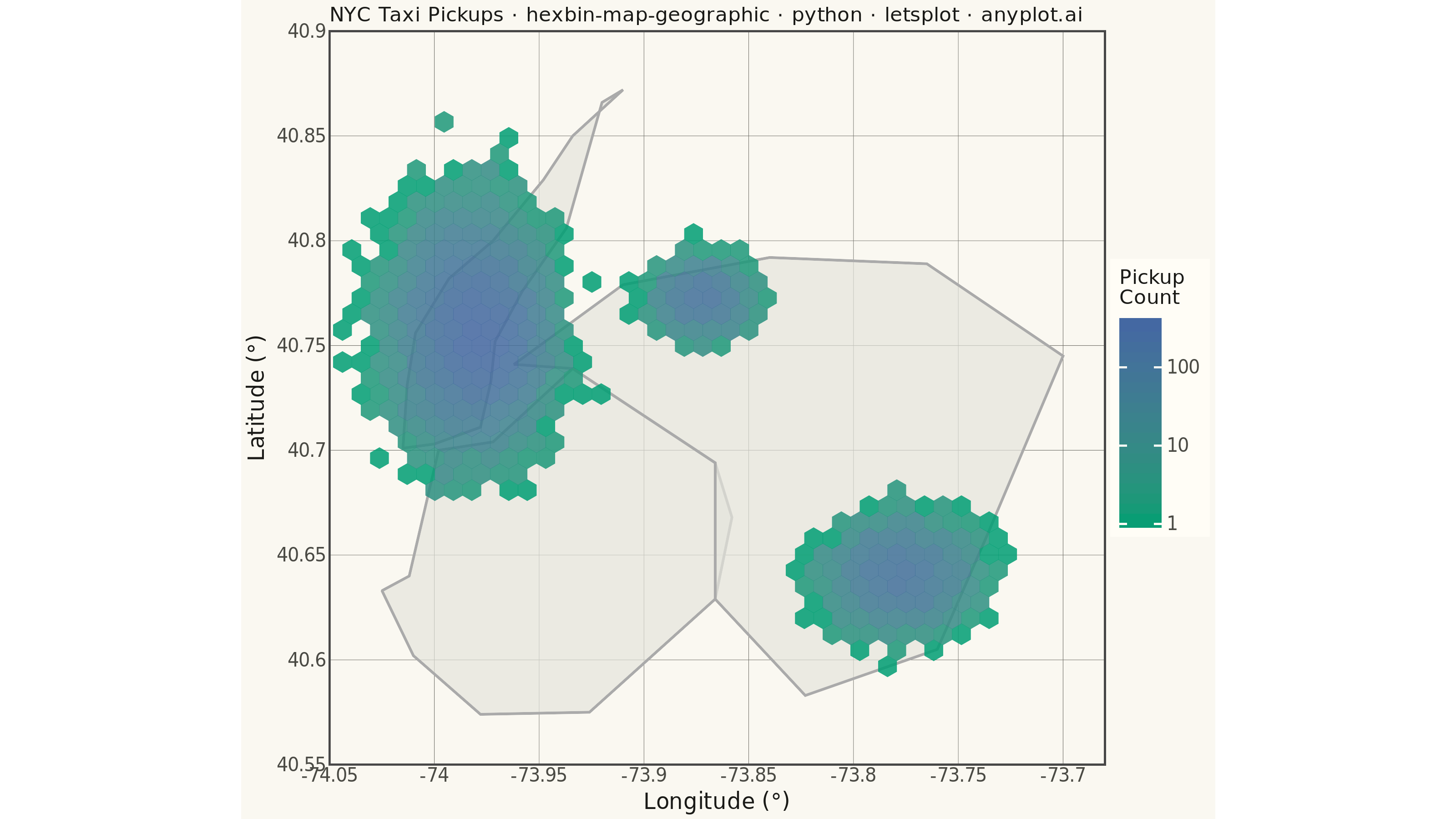
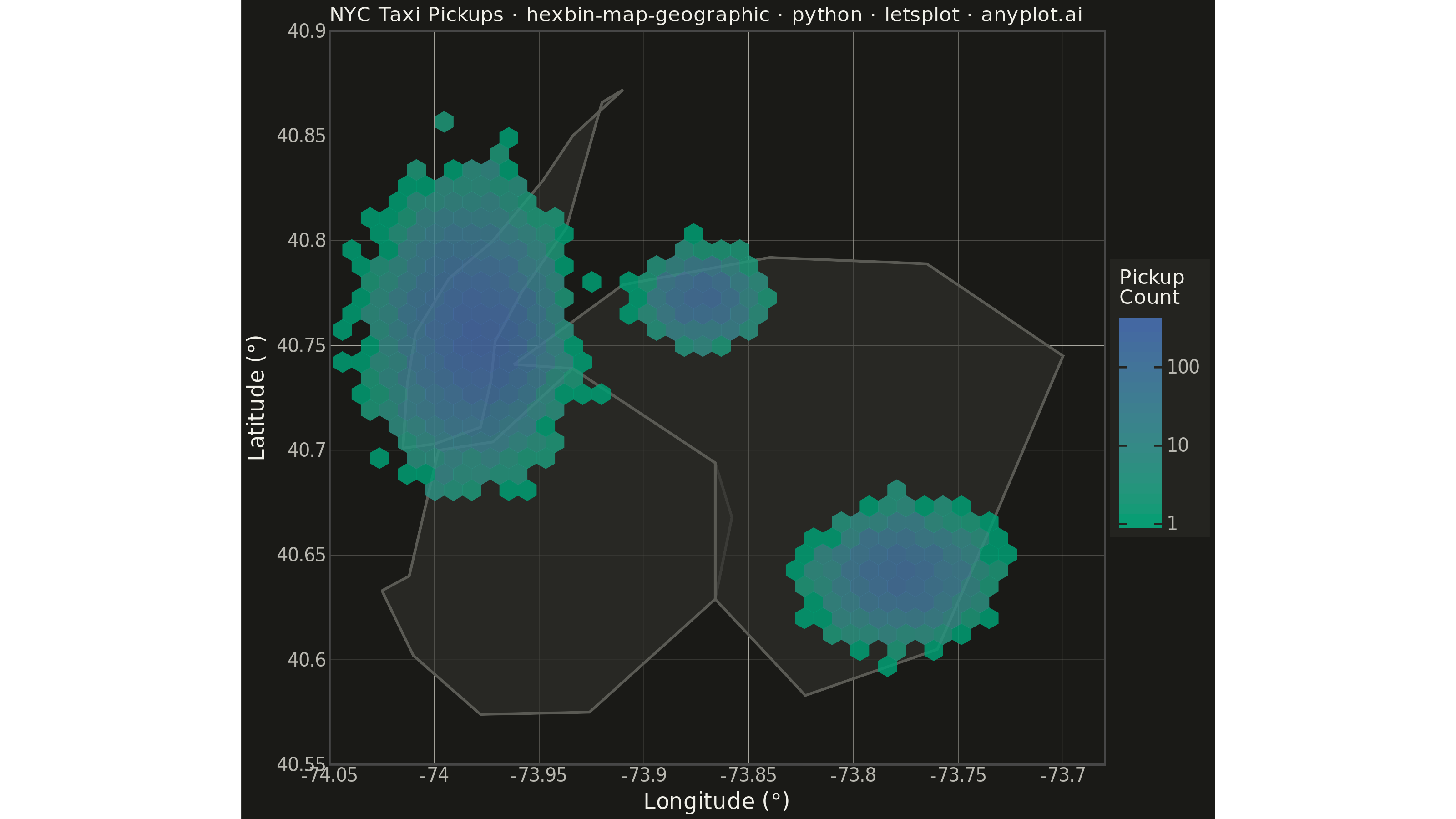
A geographic map visualization that aggregates point data into hexagonal cells, displaying density or aggregated values per cell using color intensity. Unlike continuous heatmaps that use kernel density estimation, hexbin maps provide discrete binning that clearly shows data aggregation boundaries. The hexagonal grid is superior to square grids due to isotropy (equal distance to neighboring cells) and better visual continuity, making it ideal for spatial statistics and urban data analysis.
""" anyplot.ai
hexbin-map-geographic: Hexagonal Binning Map
Library: letsplot 4.10.1 | Python 3.13.13
Quality: 88/100 | Updated: 2026-06-16
"""

import os

import numpy as np
import pandas as pd
from lets_plot import (
    LetsPlot,
    aes,
    coord_fixed,
    element_blank,
    element_line,
    element_rect,
    element_text,
    geom_hex,
    geom_polygon,
    ggplot,
    ggsize,
    labs,
    layer_tooltips,
    scale_fill_gradient,
    theme,
    theme_minimal,
)
from lets_plot.export import ggsave


LetsPlot.setup_html()

# Theme tokens
THEME = os.getenv("ANYPLOT_THEME", "light")
PAGE_BG = "#FAF8F1" if THEME == "light" else "#1A1A17"
ELEVATED_BG = "#FFFDF6" if THEME == "light" else "#242420"
INK = "#1A1A17" if THEME == "light" else "#F0EFE8"
INK_SOFT = "#4A4A44" if THEME == "light" else "#B8B7B0"
INK_MUTED = "#6B6A63" if THEME == "light" else "#A8A79F"
BASEMAP_FILL = "#E4E4DC" if THEME == "light" else "#2E2E2A"
BASEMAP_COLOR = "#AAAAAA" if THEME == "light" else "#5A5A54"

# Data: Simulated taxi pickup locations in New York City area
np.random.seed(42)
n_points = 15000

manhattan_lat = np.random.normal(40.758, 0.025, n_points // 2)
manhattan_lon = np.random.normal(-73.985, 0.015, n_points // 2)

midtown_lat = np.random.normal(40.752, 0.018, n_points // 4)
midtown_lon = np.random.normal(-73.972, 0.012, n_points // 4)

jfk_lat = np.random.normal(40.641, 0.012, n_points // 6)
jfk_lon = np.random.normal(-73.778, 0.015, n_points // 6)

lga_lat = np.random.normal(40.773, 0.008, n_points // 12)
lga_lon = np.random.normal(-73.872, 0.010, n_points // 12)

latitude = np.concatenate([manhattan_lat, midtown_lat, jfk_lat, lga_lat])
longitude = np.concatenate([manhattan_lon, midtown_lon, jfk_lon, lga_lon])

df = pd.DataFrame({"lat": latitude, "lon": longitude})

# Simplified basemap: faithful NYC borough outlines for geographic context.
# Vertices trace the real coastlines of each borough (narrow Manhattan island,
# Brooklyn's south/west waterfront, Queens' large NE landmass) so the clusters
# sit plausibly inside their nominal borough.
manhattan_lon_outline = [
    -74.015,
    -74.013,
    -74.009,
    -73.993,
    -73.972,
    -73.948,
    -73.934,
    -73.910,
    -73.920,
    -73.929,
    -73.937,
    -73.958,
    -73.971,
    -73.973,
    -73.978,
    -74.000,
    -74.015,
]
manhattan_lat_outline = [
    40.701,
    40.731,
    40.756,
    40.782,
    40.800,
    40.829,
    40.850,
    40.872,
    40.866,
    40.834,
    40.806,
    40.776,
    40.752,
    40.733,
    40.711,
    40.703,
    40.701,
]
manhattan_outline = pd.DataFrame(
    {
        "lon": manhattan_lon_outline,
        "lat": manhattan_lat_outline,
        "borough": ["Manhattan"] * len(manhattan_lon_outline),
        "order": list(range(len(manhattan_lon_outline))),
    }
)

brooklyn_lon_outline = [
    -74.025,
    -74.012,
    -73.998,
    -73.972,
    -73.934,
    -73.866,
    -73.858,
    -73.866,
    -73.926,
    -73.978,
    -74.010,
    -74.025,
]
brooklyn_lat_outline = [40.633, 40.640, 40.700, 40.704, 40.739, 40.694, 40.668, 40.629, 40.575, 40.574, 40.602, 40.633]
brooklyn_outline = pd.DataFrame(
    {
        "lon": brooklyn_lon_outline,
        "lat": brooklyn_lat_outline,
        "borough": ["Brooklyn"] * len(brooklyn_lon_outline),
        "order": list(range(len(brooklyn_lon_outline))),
    }
)

queens_lon_outline = [
    -73.962,
    -73.910,
    -73.840,
    -73.765,
    -73.700,
    -73.736,
    -73.760,
    -73.823,
    -73.866,
    -73.866,
    -73.934,
    -73.962,
]
queens_lat_outline = [40.741, 40.779, 40.792, 40.789, 40.745, 40.660, 40.605, 40.583, 40.629, 40.694, 40.739, 40.741]
queens_outline = pd.DataFrame(
    {
        "lon": queens_lon_outline,
        "lat": queens_lat_outline,
        "borough": ["Queens"] * len(queens_lon_outline),
        "order": list(range(len(queens_lon_outline))),
    }
)

df_boroughs = pd.concat([manhattan_outline, brooklyn_outline, queens_outline], ignore_index=True)

# Title — scale fontsize for length; kept compact so the full string (incl.
# "anyplot.ai") sits inside the panel width and renders at uniform contrast.
title = "NYC Taxi Pickups · hexbin-map-geographic · python · letsplot · anyplot.ai"
title_size = max(11, round(13 * 60 / len(title)))

anyplot_theme = theme(
    plot_background=element_rect(fill=PAGE_BG, color=PAGE_BG),
    panel_background=element_rect(fill=PAGE_BG),
    panel_grid_major=element_line(color=INK_MUTED, size=0.2),
    panel_grid_minor=element_blank(),
    axis_title=element_text(color=INK, size=12),
    axis_text=element_text(color=INK_SOFT, size=10),
    plot_title=element_text(color=INK, size=title_size),
    legend_background=element_rect(fill=ELEVATED_BG, color=INK_SOFT),
    legend_text=element_text(color=INK_SOFT, size=10),
    legend_title=element_text(color=INK, size=11),
    legend_position="right",
)

plot = (
    ggplot()
    + geom_polygon(
        aes(x="lon", y="lat", group="borough"),
        data=df_boroughs,
        fill=BASEMAP_FILL,
        color=BASEMAP_COLOR,
        size=0.6,
        alpha=0.7,
    )
    + geom_hex(
        aes(x="lon", y="lat"), data=df, bins=[40, 40], alpha=0.85, tooltips=layer_tooltips().line("Pickups|@..count..")
    )
    + scale_fill_gradient(low="#009E73", high="#4467A3", name="Pickup\nCount", trans="log10")
    + labs(x="Longitude (°)", y="Latitude (°)", title=title)
    + coord_fixed(ratio=1.0, xlim=[-74.05, -73.68], ylim=[40.55, 40.90])
    + ggsize(800, 450)
    + theme_minimal()
    + anyplot_theme
)

ggsave(plot, f"plot-{THEME}.png", path=".", scale=4)
ggsave(plot, f"plot-{THEME}.html", path=".")
Runnable source as JSON, for any HTTP client: https://api.anyplot.ai/specs/hexbin-map-geographic/letsplot/code. Any spec id and library id listed in llms-full.txt fit the same URL shape; every URL below is complete and callable.
{
  "spec_id": "hexbin-map-geographic",
  "language": "python",
  "library": "letsplot",
  "page": "https://anyplot.ai/hexbin-map-geographic/python/letsplot",
  "hub": "https://anyplot.ai/hexbin-map-geographic",
  "code_json": "https://api.anyplot.ai/specs/hexbin-map-geographic/letsplot/code",
  "spec_json": "https://api.anyplot.ai/specs/hexbin-map-geographic",
  "render_light_png": "https://storage.googleapis.com/anyplot-images/plots/hexbin-map-geographic/python/letsplot/plot-light.png",
  "render_dark_png": "https://storage.googleapis.com/anyplot-images/plots/hexbin-map-geographic/python/letsplot/plot-dark.png",
  "interactive_light_html": "https://storage.googleapis.com/anyplot-images/plots/hexbin-map-geographic/python/letsplot/plot-light.html",
  "interactive_dark_html": "https://storage.googleapis.com/anyplot-images/plots/hexbin-map-geographic/python/letsplot/plot-dark.html",
  "quality_score": 88.0,
  "license": "MIT",
  "guide": "https://anyplot.ai/llms.txt"
}
Part of Hexagonal Binning Map on anyplot.ai.