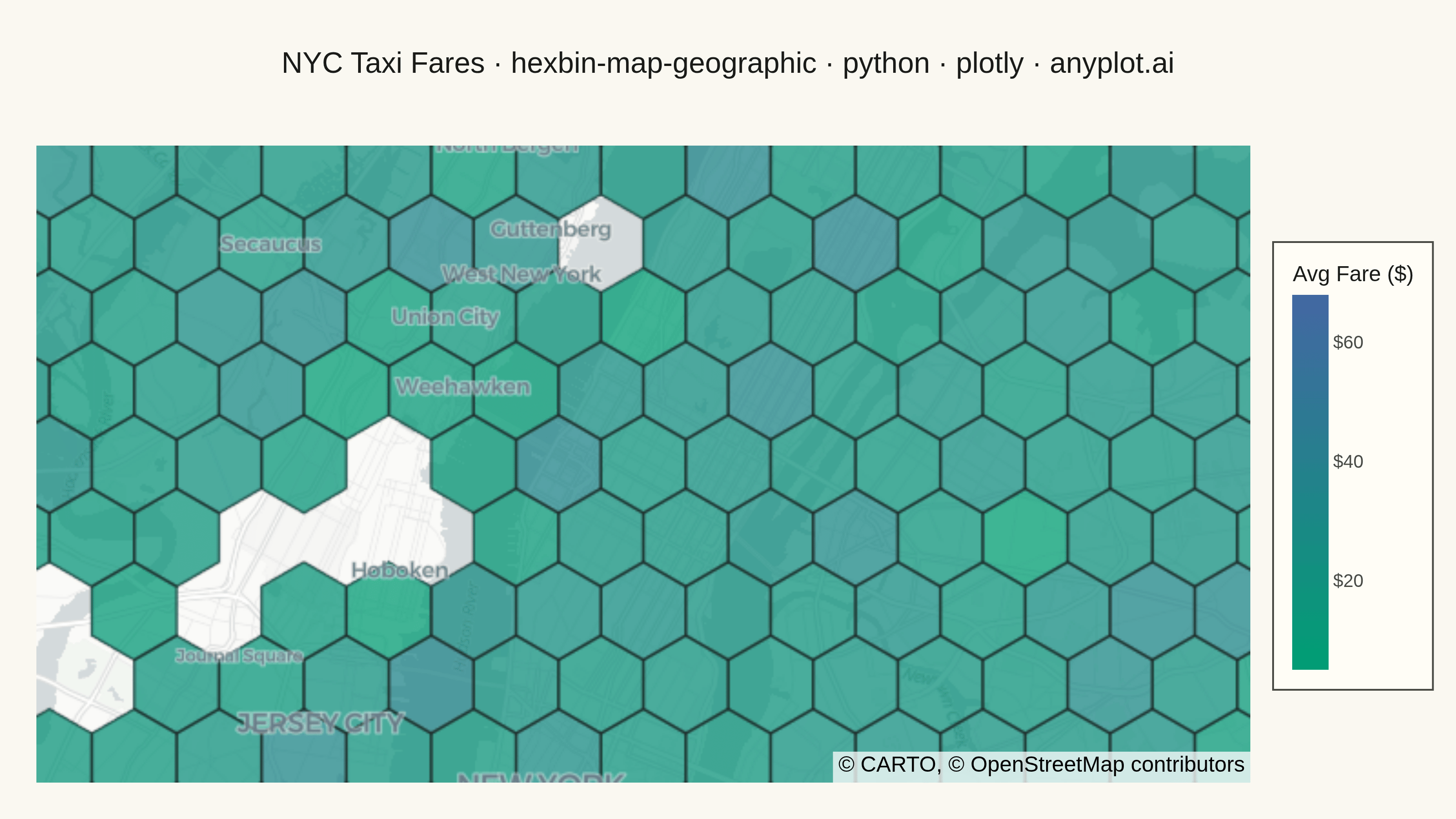
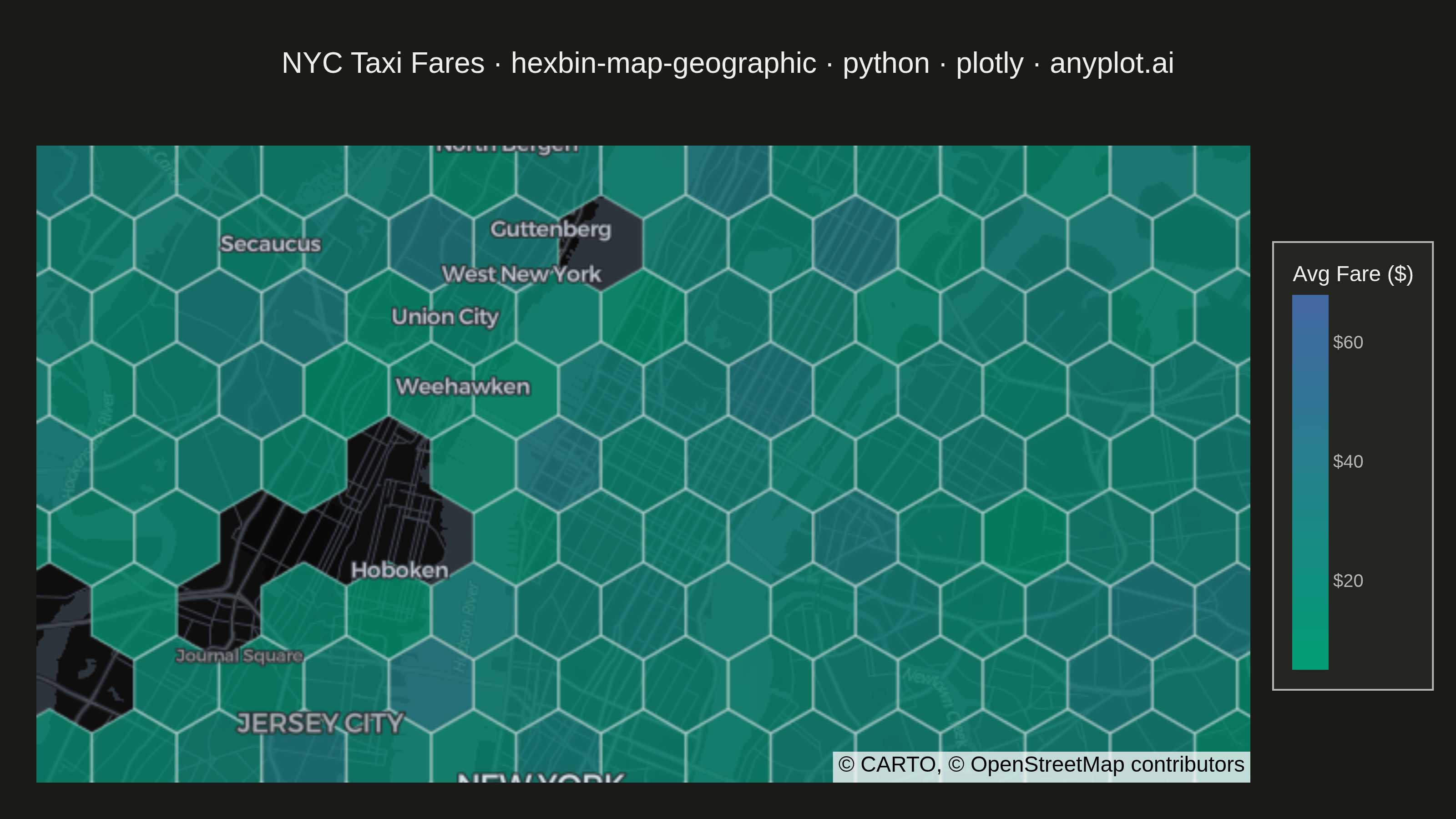
A geographic map visualization that aggregates point data into hexagonal cells, displaying density or aggregated values per cell using color intensity. Unlike continuous heatmaps that use kernel density estimation, hexbin maps provide discrete binning that clearly shows data aggregation boundaries. The hexagonal grid is superior to square grids due to isotropy (equal distance to neighboring cells) and better visual continuity, making it ideal for spatial statistics and urban data analysis.
""" anyplot.ai
hexbin-map-geographic: Hexagonal Binning Map
Library: plotly 6.7.0 | Python 3.13.13
Quality: 92/100 | Updated: 2026-05-27
"""

import os

import numpy as np
import pandas as pd
import plotly.express as px


# Theme tokens
THEME = os.getenv("ANYPLOT_THEME", "light")
PAGE_BG = "#FAF8F1" if THEME == "light" else "#1A1A17"
ELEVATED_BG = "#FFFDF6" if THEME == "light" else "#242420"
INK = "#1A1A17" if THEME == "light" else "#F0EFE8"
INK_SOFT = "#4A4A44" if THEME == "light" else "#B8B7B0"
MAP_STYLE = "carto-positron" if THEME == "light" else "carto-darkmatter"
HEX_BORDER = "rgba(30,30,30,0.7)" if THEME == "light" else "rgba(220,220,220,0.5)"

# imprint_seq — the only allowed sequential colormap
imprint_seq = [[0.0, "#009E73"], [1.0, "#4467A3"]]

# Data: NYC taxi pickup locations with fare values
np.random.seed(42)
n_points = 5000
lat0, lon0 = 40.7580, -73.9855

cluster_lats = lat0 + np.random.uniform(-0.08, 0.08, 8)
cluster_lons = lon0 + np.random.uniform(-0.10, 0.10, 8)
assignments = np.random.choice(8, n_points, p=np.random.dirichlet(np.ones(8)))
lats = cluster_lats[assignments] + np.random.normal(0, 0.015, n_points)
lons = cluster_lons[assignments] + np.random.normal(0, 0.020, n_points)
fares = np.random.exponential(15, n_points) + 5

df = pd.DataFrame({"lat": lats, "lon": lons, "fare": fares})

# Hexagonal binning: pointy-top hexagons using axial coordinate system
cos_lat = np.cos(np.radians(lat0))
hex_size = 0.007  # local-degree units (~0.5 km cells at NYC latitude)
sqrt3 = np.sqrt(3)

# Project to flat local coords (lon adjusted for latitude compression)
xs = (df["lon"].values - lon0) * cos_lat
ys = df["lat"].values - lat0

# Convert to axial (q, r) — pointy-top hex
q_frac = (xs * sqrt3 / 3 - ys / 3) / hex_size
r_frac = ys * 2 / 3 / hex_size
s_frac = -q_frac - r_frac

# Cube rounding to nearest hex cell
rq = np.round(q_frac).astype(int)
rr = np.round(r_frac).astype(int)
rs = np.round(s_frac).astype(int)

dq = np.abs(rq - q_frac)
dr = np.abs(rr - r_frac)
ds = np.abs(rs - s_frac)

mask_q = (dq > dr) & (dq > ds)
mask_r = (~mask_q) & (dr > ds)
rq[mask_q] = -rr[mask_q] - rs[mask_q]
rr[mask_r] = -rq[mask_r] - rs[mask_r]

df["hex_id"] = [f"{q}_{r}" for q, r in zip(rq, rr, strict=False)]

# Aggregate by hex cell: count, sum, and mean of fares
hex_agg = (
    df.groupby("hex_id")
    .agg(count=("fare", "size"), total_fare=("fare", "sum"), mean_fare=("fare", "mean"))
    .reset_index()
)
hex_agg[["q", "r"]] = hex_agg["hex_id"].str.split("_", n=1, expand=True).astype(int)

# Vectorized GeoJSON polygon construction (no function definitions)
q_vals = hex_agg["q"].values
r_vals = hex_agg["r"].values

# Hex centers in flat local coords
cx_vals = hex_size * (sqrt3 * q_vals + sqrt3 / 2 * r_vals)
cy_vals = hex_size * 1.5 * r_vals

# 6 corner angles for pointy-top hexagon (30°, 90°, 150°, 210°, 270°, 330°)
corner_angles = np.radians(30 + 60 * np.arange(6))
corner_dx = hex_size * np.cos(corner_angles)
corner_dy = hex_size * np.sin(corner_angles)

# Shape: (n_hex, 6) → lon/lat for each corner
corner_lons = lon0 + (cx_vals[:, None] + corner_dx[None, :]) / cos_lat
corner_lats = lat0 + cy_vals[:, None] + corner_dy[None, :]

# Close the polygon ring: (n_hex, 7, 2)
ring_lons = np.concatenate([corner_lons, corner_lons[:, :1]], axis=1)
ring_lats = np.concatenate([corner_lats, corner_lats[:, :1]], axis=1)
rings = np.stack([ring_lons, ring_lats], axis=-1)

geojson = {
    "type": "FeatureCollection",
    "features": [
        {
            "type": "Feature",
            "id": hex_agg["hex_id"].iloc[i],
            "properties": {},
            "geometry": {"type": "Polygon", "coordinates": [rings[i].tolist()]},
        }
        for i in range(len(hex_agg))
    ],
}

# Title with length-aware font scaling
title = "NYC Taxi Fares · hexbin-map-geographic · python · plotly · anyplot.ai"
n_chars = len(title)
title_fontsize = max(11, round(16 * 67 / n_chars)) if n_chars > 67 else 16

# Plot
fig = px.choropleth_map(
    hex_agg,
    geojson=geojson,
    locations="hex_id",
    color="mean_fare",
    color_continuous_scale=imprint_seq,
    opacity=0.75,
    center={"lat": lat0, "lon": lon0},
    zoom=11,
    map_style=MAP_STYLE,
    hover_data={"hex_id": False, "count": ":,", "mean_fare": ":$.2f", "total_fare": ":$,.0f"},
)

fig.update_traces(marker_line_width=1.5, marker_line_color=HEX_BORDER)

fig.update_layout(
    autosize=False,
    paper_bgcolor=PAGE_BG,
    font={"color": INK},
    title={"text": title, "font": {"size": title_fontsize, "color": INK}, "x": 0.5, "xanchor": "center"},
    coloraxis_colorbar={
        "title": {"text": "Avg Fare ($)", "font": {"size": 12, "color": INK}},
        "tickfont": {"size": 10, "color": INK_SOFT},
        "tickprefix": "$",
        "len": 0.7,
        "thickness": 20,
        "bgcolor": ELEVATED_BG,
        "bordercolor": INK_SOFT,
        "borderwidth": 1,
    },
    margin={"l": 20, "r": 40, "t": 80, "b": 20},
)

# Save
fig.write_image(f"plot-{THEME}.png", width=800, height=450, scale=4)
fig.write_html(f"plot-{THEME}.html", include_plotlyjs="cdn")
Runnable source as JSON, for any HTTP client: https://api.anyplot.ai/specs/hexbin-map-geographic/plotly/code. Any spec id and library id listed in llms-full.txt fit the same URL shape; every URL below is complete and callable.
{
  "spec_id": "hexbin-map-geographic",
  "language": "python",
  "library": "plotly",
  "page": "https://anyplot.ai/hexbin-map-geographic/python/plotly",
  "hub": "https://anyplot.ai/hexbin-map-geographic",
  "code_json": "https://api.anyplot.ai/specs/hexbin-map-geographic/plotly/code",
  "spec_json": "https://api.anyplot.ai/specs/hexbin-map-geographic",
  "render_light_png": "https://storage.googleapis.com/anyplot-images/plots/hexbin-map-geographic/python/plotly/plot-light.png",
  "render_dark_png": "https://storage.googleapis.com/anyplot-images/plots/hexbin-map-geographic/python/plotly/plot-dark.png",
  "interactive_light_html": "https://storage.googleapis.com/anyplot-images/plots/hexbin-map-geographic/python/plotly/plot-light.html",
  "interactive_dark_html": "https://storage.googleapis.com/anyplot-images/plots/hexbin-map-geographic/python/plotly/plot-dark.html",
  "quality_score": 92.0,
  "license": "MIT",
  "guide": "https://anyplot.ai/llms.txt"
}
Part of Hexagonal Binning Map on anyplot.ai.