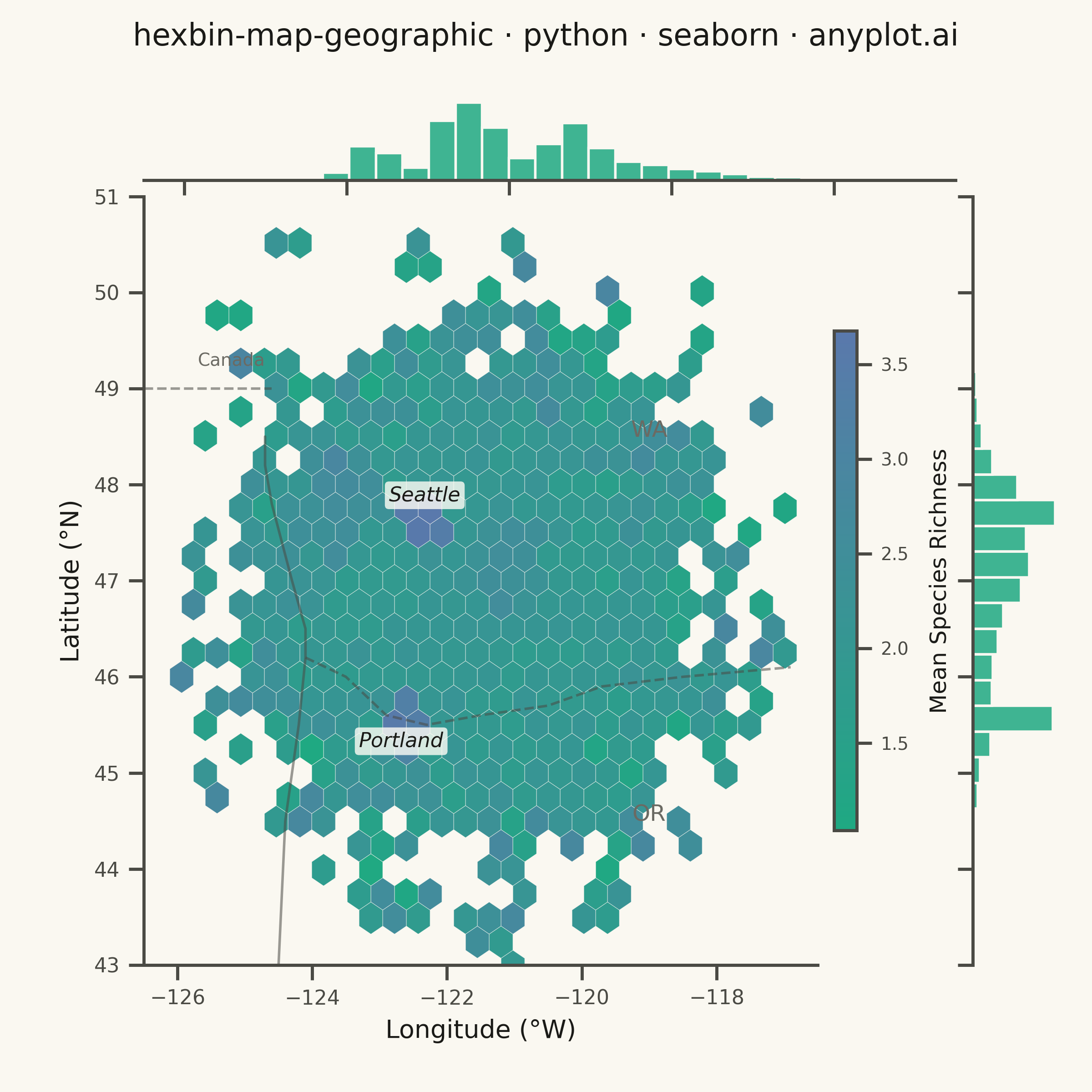
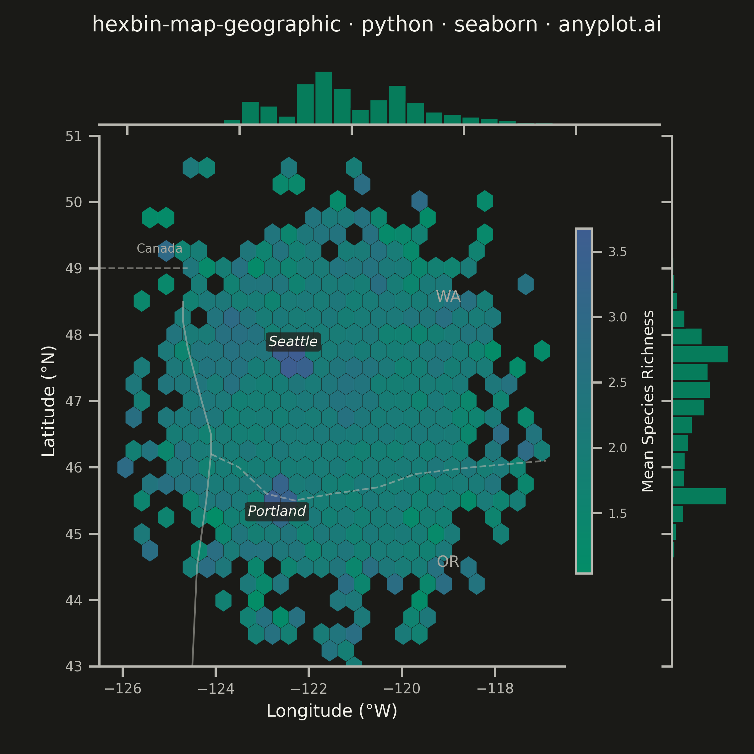
A geographic map visualization that aggregates point data into hexagonal cells, displaying density or aggregated values per cell using color intensity. Unlike continuous heatmaps that use kernel density estimation, hexbin maps provide discrete binning that clearly shows data aggregation boundaries. The hexagonal grid is superior to square grids due to isotropy (equal distance to neighboring cells) and better visual continuity, making it ideal for spatial statistics and urban data analysis.
""" anyplot.ai
hexbin-map-geographic: Hexagonal Binning Map
Library: seaborn 0.13.2 | Python 3.13.13
Quality: 87/100 | Updated: 2026-05-27
"""

import os

import matplotlib.pyplot as plt
import numpy as np
import pandas as pd
import seaborn as sns
from matplotlib.colors import LinearSegmentedColormap


# Theme tokens
THEME = os.getenv("ANYPLOT_THEME", "light")
PAGE_BG = "#FAF8F1" if THEME == "light" else "#1A1A17"
ELEVATED_BG = "#FFFDF6" if THEME == "light" else "#242420"
INK = "#1A1A17" if THEME == "light" else "#F0EFE8"
INK_SOFT = "#4A4A44" if THEME == "light" else "#B8B7B0"
INK_MUTED = "#6B6A63" if THEME == "light" else "#A8A79F"

sns.set_theme(
    style="ticks",
    rc={
        "figure.facecolor": PAGE_BG,
        "axes.facecolor": PAGE_BG,
        "axes.edgecolor": INK_SOFT,
        "axes.labelcolor": INK,
        "text.color": INK,
        "xtick.color": INK_SOFT,
        "ytick.color": INK_SOFT,
        "grid.color": INK,
        "grid.alpha": 0.15,
        "legend.facecolor": ELEVATED_BG,
        "legend.edgecolor": INK_SOFT,
    },
)

# Data: Simulated bird species observation locations in Pacific Northwest
np.random.seed(42)
n_points = 7000
center_lon, center_lat = -121.5, 46.8
lon = np.random.normal(center_lon, 1.4, n_points)
lat = np.random.normal(center_lat, 1.1, n_points)

# Seattle urban birding hotspot (highest observer density)
idx1 = np.where(np.random.random(n_points) < 0.22)[0]
lon[idx1] = np.random.normal(-122.33, 0.10, len(idx1))
lat[idx1] = np.random.normal(47.61, 0.08, len(idx1))

# Portland urban birding area
idx2 = np.where(np.random.random(n_points) < 0.18)[0]
lon[idx2] = np.random.normal(-122.68, 0.09, len(idx2))
lat[idx2] = np.random.normal(45.52, 0.07, len(idx2))

# Cascade Range wilderness cluster
idx3 = np.where(np.random.random(n_points) < 0.13)[0]
lon[idx3] = np.random.normal(-121.2, 0.20, len(idx3))
lat[idx3] = np.random.normal(47.1, 0.20, len(idx3))

# Olympic Peninsula coastal hotspot
idx4 = np.where(np.random.random(n_points) < 0.10)[0]
lon[idx4] = np.random.normal(-123.7, 0.18, len(idx4))
lat[idx4] = np.random.normal(47.9, 0.20, len(idx4))

# Species richness score per observation (1–5); higher near urban birding hotspots.
# Demonstrates mean aggregation — switch reduce_C_function=np.sum for sum aggregation.
richness = np.random.uniform(1.0, 3.0, n_points)
richness[idx1] += np.random.uniform(1.5, 2.0, len(idx1))  # Seattle: high richness
richness[idx2] += np.random.uniform(1.0, 1.5, len(idx2))  # Portland: moderate-high
richness = np.clip(richness, 1.0, 5.0)

df = pd.DataFrame({"Longitude": lon, "Latitude": lat, "Richness": richness})

# imprint_seq: green (low richness) → blue (high richness) — anyplot sequential colormap
imprint_seq = LinearSegmentedColormap.from_list("imprint_seq", ["#009E73", "#4467A3"])

# Plot — seaborn jointplot; square canvas: height=6, dpi=400 → 2400×2400 px
# Mean aggregation per hexbin cell (count: omit C/reduce_C_function; sum: np.sum)
g = sns.jointplot(
    data=df,
    x="Longitude",
    y="Latitude",
    kind="hex",
    cmap=imprint_seq,
    mincnt=1,
    gridsize=28,
    marginal_kws={"bins": 30, "color": "#009E73", "edgecolor": PAGE_BG, "alpha": 0.75},
    joint_kws={
        "C": df["Richness"].values,
        "reduce_C_function": np.mean,
        "alpha": 0.88,
        "edgecolors": PAGE_BG,
        "linewidths": 0.15,
    },
    height=6,
    ratio=8,
)
g.figure.set_dpi(400)

# Theme backgrounds
g.figure.patch.set_facecolor(PAGE_BG)
ax = g.ax_joint
ax.set_facecolor(PAGE_BG)
g.ax_marg_x.set_facecolor(PAGE_BG)
g.ax_marg_y.set_facecolor(PAGE_BG)

# Explicit geographic bounds covering Pacific Northwest
ax.set_xlim(-126.5, -116.5)
ax.set_ylim(43.0, 51.0)

# --- Simplified Pacific NW geographic reference layer ---
geo_kw = {"color": INK_SOFT, "alpha": 0.55, "lw": 1.0, "zorder": 3, "solid_capstyle": "round"}

# Pacific Coastline (approximate, south to north)
coast_lon = [-124.5, -124.4, -124.2, -124.1, -124.1, -124.3, -124.6, -124.7, -124.7]
coast_lat = [43.0, 44.5, 45.5, 46.2, 46.5, 47.0, 47.8, 48.2, 48.5]
ax.plot(coast_lon, coast_lat, **geo_kw)

# US-Canada border (49°N)
ax.plot([-126.5, -124.6], [49.0, 49.0], linestyle="--", **geo_kw)
ax.text(-125.2, 49.2, "Canada", fontsize=7, color=INK_MUTED, ha="center", va="bottom")

# WA-OR border (Columbia River, simplified west to east)
wa_or_lon = [-124.1, -123.5, -122.9, -122.3, -121.5, -120.5, -119.7, -118.5, -116.9]
wa_or_lat = [46.2, 46.0, 45.6, 45.5, 45.6, 45.7, 45.9, 46.0, 46.1]
ax.plot(wa_or_lon, wa_or_lat, linestyle="--", **geo_kw)

# State labels (in sparse-data areas east of main cluster)
ax.text(-119.0, 48.5, "WA", fontsize=9, color=INK_MUTED, ha="center", fontweight="medium")
ax.text(-119.0, 44.5, "OR", fontsize=9, color=INK_MUTED, ha="center", fontweight="medium")

# Spines
ax.spines["top"].set_visible(False)
ax.spines["right"].set_visible(False)
for spine in ("left", "bottom"):
    ax.spines[spine].set_color(INK_SOFT)

# Axis labels and ticks
ax.set_xlabel("Longitude (°W)", fontsize=10, color=INK)
ax.set_ylabel("Latitude (°N)", fontsize=10, color=INK)
ax.tick_params(axis="both", labelsize=8, colors=INK_SOFT)

# Colorbar
cbar = plt.colorbar(ax.collections[0], ax=ax, shrink=0.65, pad=0.02, aspect=22)
cbar.set_label("Mean Species Richness", fontsize=9, color=INK, labelpad=8)
cbar.ax.tick_params(labelsize=7, colors=INK_SOFT)
cbar.outline.set_edgecolor(INK_SOFT)

# City labels with ELEVATED_BG background for readability over hexbins
bbox_props = {"boxstyle": "round,pad=0.2", "facecolor": ELEVATED_BG, "edgecolor": "none", "alpha": 0.80}
ax.text(-122.33, 47.83, "Seattle", fontsize=8, color=INK, ha="center", fontstyle="italic", bbox=bbox_props, zorder=10)
ax.text(-122.68, 45.27, "Portland", fontsize=8, color=INK, ha="center", fontstyle="italic", bbox=bbox_props, zorder=10)

# Title
title = "hexbin-map-geographic · python · seaborn · anyplot.ai"
n = len(title)
title_fontsize = max(8, round(12 * (67 / n if n > 67 else 1.0)))
g.figure.suptitle(title, fontsize=title_fontsize, color=INK, fontweight="medium")
g.figure.subplots_adjust(top=0.91)

plt.savefig(f"plot-{THEME}.png", dpi=400, facecolor=PAGE_BG)
Runnable source as JSON, for any HTTP client: https://api.anyplot.ai/specs/hexbin-map-geographic/seaborn/code. Any spec id and library id listed in llms-full.txt fit the same URL shape; every URL below is complete and callable.
{
  "spec_id": "hexbin-map-geographic",
  "language": "python",
  "library": "seaborn",
  "page": "https://anyplot.ai/hexbin-map-geographic/python/seaborn",
  "hub": "https://anyplot.ai/hexbin-map-geographic",
  "code_json": "https://api.anyplot.ai/specs/hexbin-map-geographic/seaborn/code",
  "spec_json": "https://api.anyplot.ai/specs/hexbin-map-geographic",
  "render_light_png": "https://storage.googleapis.com/anyplot-images/plots/hexbin-map-geographic/python/seaborn/plot-light.png",
  "render_dark_png": "https://storage.googleapis.com/anyplot-images/plots/hexbin-map-geographic/python/seaborn/plot-dark.png",
  "quality_score": 87.0,
  "license": "MIT",
  "guide": "https://anyplot.ai/llms.txt"
}
Part of Hexagonal Binning Map on anyplot.ai.