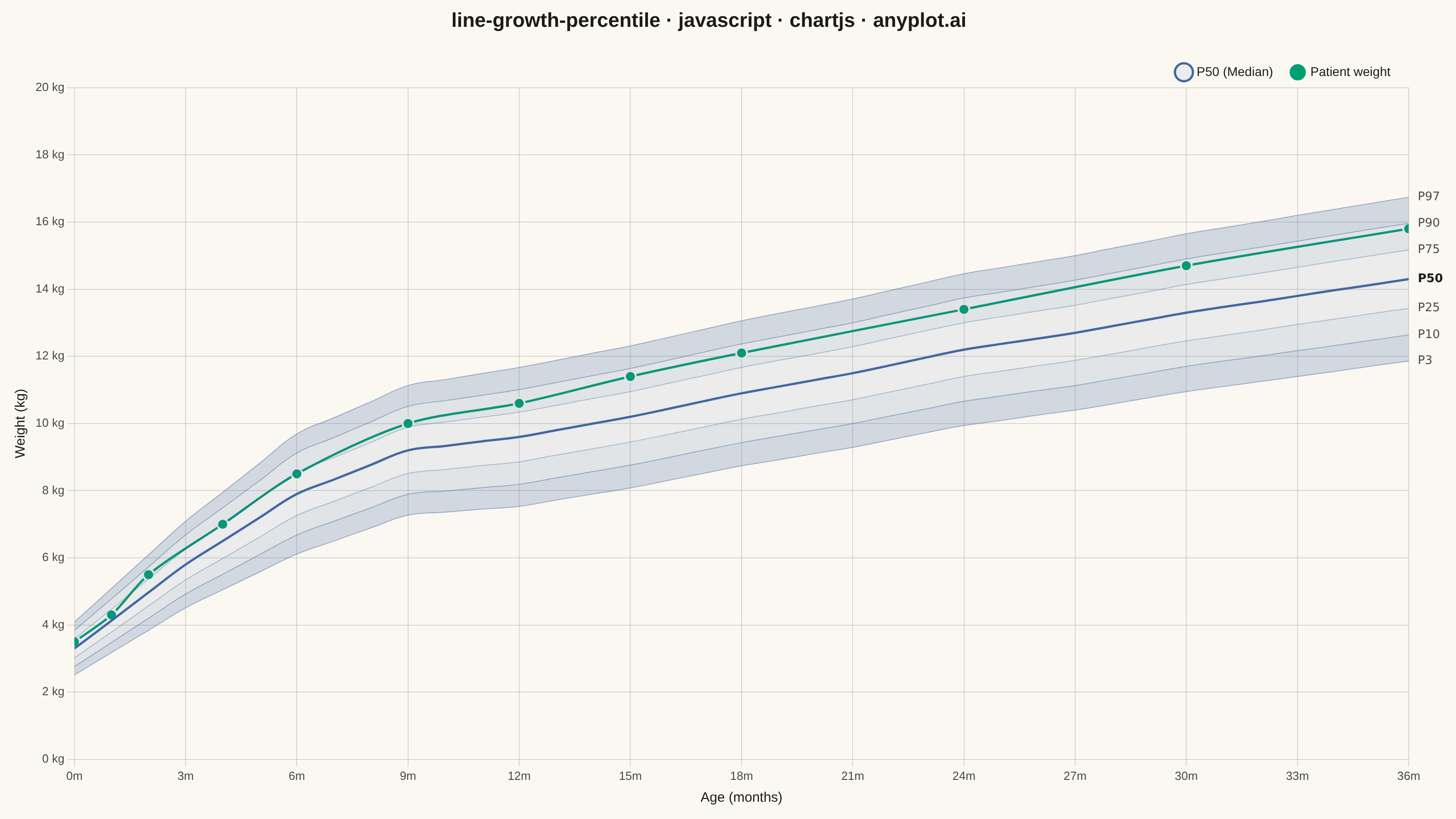
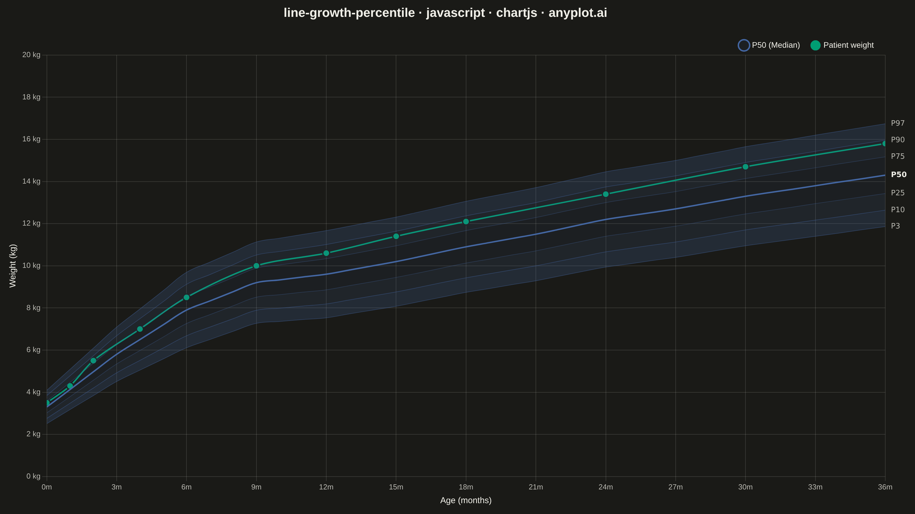
A WHO/CDC-style growth chart displaying smooth percentile curves (3rd, 10th, 25th, 50th, 75th, 90th, 97th) as colored bands, with individual patient data points overlaid and connected by a line. This chart is a standard clinical tool for monitoring child development metrics such as height, weight, or BMI across age. It enables quick visual assessment of whether a child's growth trajectory falls within expected population ranges.
// anyplot.ai
// line-growth-percentile: Pediatric Growth Chart with Percentile Curves
// Library: chartjs 4.4.7 | JavaScript 22.22.3
// Quality: 91/100 | Created: 2026-06-20

const t = window.ANYPLOT_TOKENS;

// WHO-approximate weight-for-age reference curves for boys, 0–36 months
// Piecewise-linear interpolation of WHO Child Growth Standards medians + SDs
const medianKnots = [
  [0,3.3],[3,5.8],[6,7.9],[9,9.2],[12,9.6],
  [15,10.2],[18,10.9],[21,11.5],[24,12.2],
  [27,12.7],[30,13.3],[33,13.8],[36,14.3],
];
const sdKnots = [[0,0.42],[6,0.95],[12,1.10],[24,1.20],[36,1.30]];

const lerp    = (x, x0, y0, x1, y1) => y0 + (y1 - y0) * (x - x0) / (x1 - x0);
const interp  = (month, knots) => {
  for (let i = 0; i < knots.length - 1; i++) {
    if (month >= knots[i][0] && month <= knots[i + 1][0]) {
      return lerp(month, knots[i][0], knots[i][1], knots[i + 1][0], knots[i + 1][1]);
    }
  }
  return knots[knots.length - 1][1];
};
const refCurve = (month, z) =>
  +(interp(month, medianKnots) + z * interp(month, sdKnots)).toFixed(2);

const ages = Array.from({ length: 37 }, (_, i) => i);   // 0..36 months

const Z   = { p3: -1.88, p10: -1.28, p25: -0.67, p50: 0, p75: 0.67, p90: 1.28, p97: 1.88 };
const p3  = ages.map(m => refCurve(m, Z.p3));
const p10 = ages.map(m => refCurve(m, Z.p10));
const p25 = ages.map(m => refCurve(m, Z.p25));
const p50 = ages.map(m => refCurve(m, Z.p50));
const p75 = ages.map(m => refCurve(m, Z.p75));
const p90 = ages.map(m => refCurve(m, Z.p90));
const p97 = ages.map(m => refCurve(m, Z.p97));

// Well-child visit weights: starts near P50, trends toward P75–P90 by 36 m
const patientVisits = [
  { x: 0,  y: 3.5  }, { x: 1,  y: 4.3  }, { x: 2,  y: 5.5  }, { x: 4,  y: 7.0  },
  { x: 6,  y: 8.5  }, { x: 9,  y: 10.0 }, { x: 12, y: 10.6 }, { x: 15, y: 11.4 },
  { x: 18, y: 12.1 }, { x: 24, y: 13.4 }, { x: 30, y: 14.7 }, { x: 36, y: 15.8 },
];

const toXY = arr => ages.map((m, i) => ({ x: m, y: arr[i] }));

// Imprint blue (#4467A3 = rgb 68,103,163) for boys' WHO reference bands
const B = '68,103,163';

// Inline plugin: page background fill + right-margin percentile labels
const growthExtras = {
  id: 'growthExtras',
  beforeDraw({ ctx, width, height }) {
    ctx.save();
    ctx.fillStyle = t.pageBg;
    ctx.fillRect(0, 0, width, height);
    ctx.restore();
  },
  afterDraw(chart) {
    const { ctx, scales: { x: xSc, y: ySc } } = chart;
    const rx = xSc.right + 10;
    const pctLines = [
      { name: 'P97', vals: p97 }, { name: 'P90', vals: p90 },
      { name: 'P75', vals: p75 }, { name: 'P50', vals: p50 },
      { name: 'P25', vals: p25 }, { name: 'P10', vals: p10 },
      { name: 'P3',  vals: p3  },
    ];
    ctx.save();
    ctx.textAlign = 'left';
    ctx.textBaseline = 'middle';
    pctLines.forEach(({ name, vals }) => {
      const yPx = ySc.getPixelForValue(vals[vals.length - 1]);
      ctx.font      = name === 'P50' ? 'bold 13px system-ui,sans-serif' : '13px system-ui,sans-serif';
      ctx.fillStyle = name === 'P50' ? t.ink : t.inkSoft;
      ctx.fillText(name, rx, yPx);
    });
    ctx.restore();
  },
};

// Mount
const canvas = document.createElement('canvas');
document.getElementById('container').appendChild(canvas);

const TITLE    = 'line-growth-percentile · javascript · chartjs · anyplot.ai';
const titleSize = Math.max(16, Math.round(22 * Math.min(1.0, 67 / TITLE.length)));

new Chart(canvas, {
  type: 'line',
  plugins: [growthExtras],
  data: {
    datasets: [
      // Percentile reference curves — ordered so fill:'-1' creates adjacent bands
      {
        label: 'P3',
        data: toXY(p3),
        borderColor: `rgba(${B},0.45)`,
        borderWidth: 1,
        pointRadius: 0,
        fill: false,
        tension: 0.4,
      },
      {
        label: 'P10',
        data: toXY(p10),
        borderColor: `rgba(${B},0.45)`,
        borderWidth: 1,
        pointRadius: 0,
        fill: '-1',
        backgroundColor: `rgba(${B},0.22)`,
        tension: 0.4,
      },
      {
        label: 'P25',
        data: toXY(p25),
        borderColor: `rgba(${B},0.35)`,
        borderWidth: 1,
        pointRadius: 0,
        fill: '-1',
        backgroundColor: `rgba(${B},0.14)`,
        tension: 0.4,
      },
      {
        label: 'P50 (Median)',
        data: toXY(p50),
        borderColor: '#4467A3',
        borderWidth: 2.5,
        pointRadius: 0,
        fill: '-1',
        backgroundColor: `rgba(${B},0.08)`,
        tension: 0.4,
      },
      {
        label: 'P75',
        data: toXY(p75),
        borderColor: `rgba(${B},0.35)`,
        borderWidth: 1,
        pointRadius: 0,
        fill: '-1',
        backgroundColor: `rgba(${B},0.08)`,
        tension: 0.4,
      },
      {
        label: 'P90',
        data: toXY(p90),
        borderColor: `rgba(${B},0.45)`,
        borderWidth: 1,
        pointRadius: 0,
        fill: '-1',
        backgroundColor: `rgba(${B},0.14)`,
        tension: 0.4,
      },
      {
        label: 'P97',
        data: toXY(p97),
        borderColor: `rgba(${B},0.45)`,
        borderWidth: 1,
        pointRadius: 0,
        fill: '-1',
        backgroundColor: `rgba(${B},0.22)`,
        tension: 0.4,
      },
      // Individual patient trajectory (Imprint green — first categorical series)
      {
        label: 'Patient weight',
        data: patientVisits,
        borderColor: t.palette[0],
        backgroundColor: t.palette[0],
        borderWidth: 2.5,
        pointRadius: 6,
        pointHoverRadius: 8,
        pointBorderColor: t.pageBg,
        pointBorderWidth: 2,
        fill: false,
        tension: 0.3,
      },
    ],
  },
  options: {
    responsive: true,
    maintainAspectRatio: false,
    animation: false,
    layout: { padding: { right: 52, top: 10, left: 10, bottom: 10 } },
    plugins: {
      title: {
        display: true,
        text: TITLE,
        color: t.ink,
        font: { size: titleSize, weight: '600' },
        padding: { bottom: 16 },
      },
      legend: {
        position: 'top',
        align: 'end',
        labels: {
          filter: item => item.text === 'P50 (Median)' || item.text === 'Patient weight',
          color: t.ink,
          font: { size: 14 },
          usePointStyle: true,
          padding: 20,
        },
      },
    },
    scales: {
      x: {
        type: 'linear',
        min: 0,
        max: 36,
        title: {
          display: true,
          text: 'Age (months)',
          color: t.ink,
          font: { size: 15 },
        },
        ticks: {
          color: t.inkSoft,
          font: { size: 13 },
          stepSize: 3,
          callback: v => `${v}m`,
        },
        grid: { color: t.grid },
        border: { display: false },
      },
      y: {
        min: 0,
        max: 20,
        title: {
          display: true,
          text: 'Weight (kg)',
          color: t.ink,
          font: { size: 15 },
        },
        ticks: {
          color: t.inkSoft,
          font: { size: 13 },
          callback: v => `${v} kg`,
        },
        grid: { color: t.grid },
        border: { display: false },
      },
    },
  },
});
Runnable source as JSON, for any HTTP client: https://api.anyplot.ai/specs/line-growth-percentile/chartjs/code. Any spec id and library id listed in llms-full.txt fit the same URL shape; every URL below is complete and callable.
{
  "spec_id": "line-growth-percentile",
  "language": "javascript",
  "library": "chartjs",
  "page": "https://anyplot.ai/line-growth-percentile/javascript/chartjs",
  "hub": "https://anyplot.ai/line-growth-percentile",
  "code_json": "https://api.anyplot.ai/specs/line-growth-percentile/chartjs/code",
  "spec_json": "https://api.anyplot.ai/specs/line-growth-percentile",
  "render_light_png": "https://storage.googleapis.com/anyplot-images/plots/line-growth-percentile/javascript/chartjs/plot-light.png",
  "render_dark_png": "https://storage.googleapis.com/anyplot-images/plots/line-growth-percentile/javascript/chartjs/plot-dark.png",
  "interactive_light_html": "https://storage.googleapis.com/anyplot-images/plots/line-growth-percentile/javascript/chartjs/plot-light.html",
  "interactive_dark_html": "https://storage.googleapis.com/anyplot-images/plots/line-growth-percentile/javascript/chartjs/plot-dark.html",
  "quality_score": 91.0,
  "license": "MIT",
  "guide": "https://anyplot.ai/llms.txt"
}
Part of Pediatric Growth Chart with Percentile Curves on anyplot.ai.