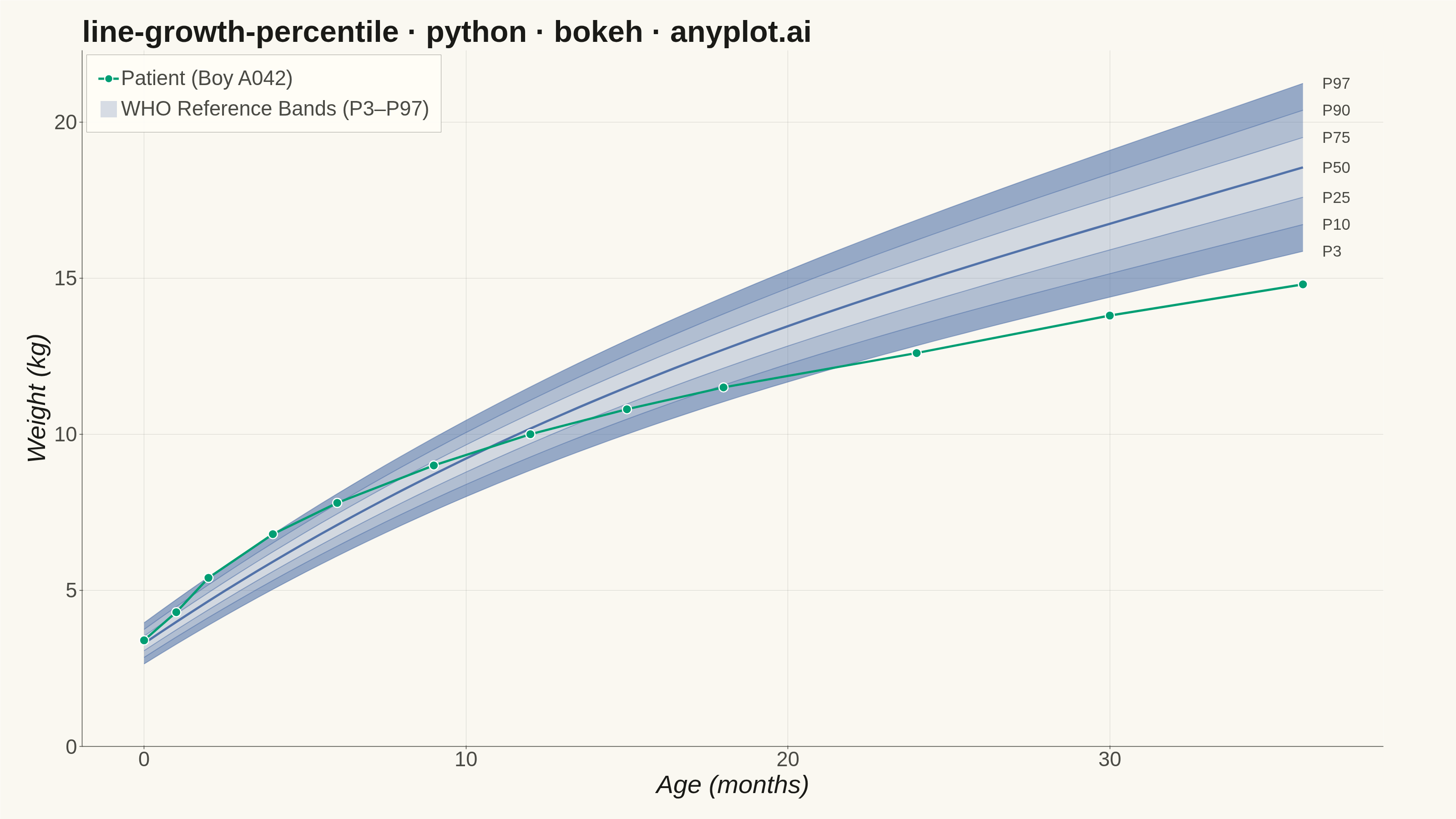
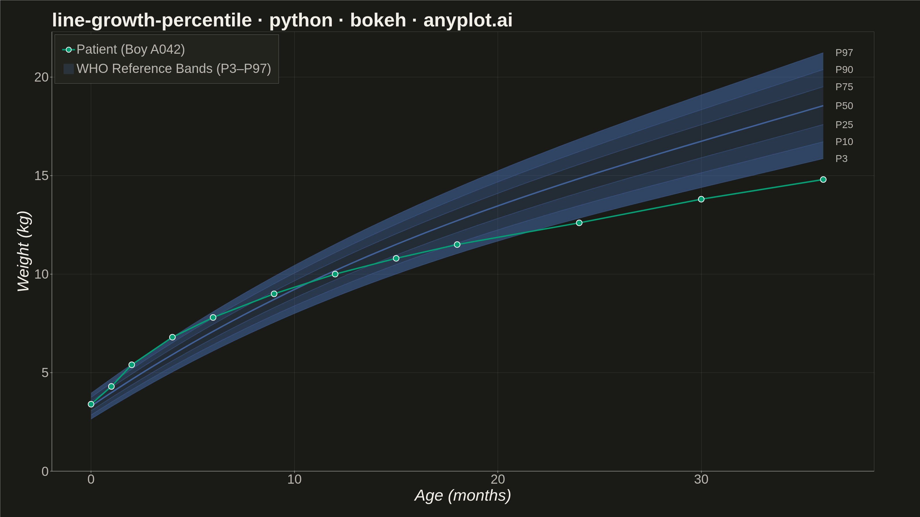
A WHO/CDC-style growth chart displaying smooth percentile curves (3rd, 10th, 25th, 50th, 75th, 90th, 97th) as colored bands, with individual patient data points overlaid and connected by a line. This chart is a standard clinical tool for monitoring child development metrics such as height, weight, or BMI across age. It enables quick visual assessment of whether a child's growth trajectory falls within expected population ranges.
""" anyplot.ai
line-growth-percentile: Pediatric Growth Chart with Percentile Curves
Library: bokeh 3.9.1 | Python 3.13.14
Quality: 93/100 | Updated: 2026-06-20
"""

import base64
import os
import time
from pathlib import Path

import numpy as np
from bokeh.io import output_file, save
from bokeh.models import ColumnDataSource, HoverTool, Label, Legend
from bokeh.plotting import figure
from selenium import webdriver
from selenium.webdriver.chrome.options import Options


THEME = os.getenv("ANYPLOT_THEME", "light")

# Theme-adaptive chrome tokens (Imprint)
PAGE_BG = "#FAF8F1" if THEME == "light" else "#1A1A17"
ELEVATED_BG = "#FFFDF6" if THEME == "light" else "#242420"
INK = "#1A1A17" if THEME == "light" else "#F0EFE8"
INK_SOFT = "#4A4A44" if THEME == "light" else "#B8B7B0"
INK_MUTED = "#6B6A63" if THEME == "light" else "#A8A79F"

# Imprint palette (canonical order)
IMPRINT_PALETTE = ["#009E73", "#C475FD", "#4467A3", "#BD8233", "#AE3030", "#2ABCCD", "#954477", "#99B314"]

# Patient line: first categorical series (Imprint green — always first)
PATIENT_COLOR = IMPRINT_PALETTE[0]  # #009E73
# Percentile bands: Imprint blue (boys convention)
BAND_COLOR = IMPRINT_PALETTE[2]  # #4467A3

# --- Data: WHO-style weight-for-age reference for boys, 0–36 months ---
np.random.seed(42)
age_months = np.linspace(0, 36, 73)

# Realistic growth: rapid early gain tapering off
median_weight = 3.3 + 0.7 * age_months - 0.012 * age_months**2 + 0.00012 * age_months**3
sd_factor = 0.35 + 0.03 * age_months

percentile_97 = median_weight + 1.88 * sd_factor
percentile_90 = median_weight + 1.28 * sd_factor
percentile_75 = median_weight + 0.67 * sd_factor
percentile_50 = median_weight
percentile_25 = median_weight - 0.67 * sd_factor
percentile_10 = median_weight - 1.28 * sd_factor
percentile_3 = median_weight - 1.88 * sd_factor

# Individual patient: healthy boy tracked at well-child visits
patient_age = np.array([0, 1, 2, 4, 6, 9, 12, 15, 18, 24, 30, 36])
patient_weight = np.array([3.4, 4.3, 5.4, 6.8, 7.8, 9.0, 10.0, 10.8, 11.5, 12.6, 13.8, 14.8])

# --- Plot ---
p = figure(
    width=3200,
    height=1800,
    title="line-growth-percentile · python · bokeh · anyplot.ai",
    x_axis_label="Age (months)",
    y_axis_label="Weight (kg)",
    toolbar_location=None,  # must be None — toolbar adds ~30–50 px above canvas
    min_border_bottom=160,  # room for 34pt tick labels + 42pt axis label
    min_border_left=180,  # room for 34pt tick labels + 42pt axis label
    min_border_top=110,  # room for 50pt title
    min_border_right=160,  # room for right-margin percentile labels (P3–P97)
)

# Percentile bands — graduated alpha: darker at extremes, lighter near median
band_alphas = [0.55, 0.40, 0.22, 0.22, 0.40, 0.55]
bands = [
    (percentile_3, percentile_10),
    (percentile_10, percentile_25),
    (percentile_25, percentile_50),
    (percentile_50, percentile_75),
    (percentile_75, percentile_90),
    (percentile_90, percentile_97),
]

renderers = []
for i, (lower, upper) in enumerate(bands):
    src = ColumnDataSource(data={"x": age_months, "y1": lower, "y2": upper})
    r = p.varea(x="x", y1="y1", y2="y2", source=src, fill_color=BAND_COLOR, fill_alpha=band_alphas[i])
    renderers.append(r)

# Percentile lines + right-margin labels
percentile_data = [
    (percentile_3, "P3", 2.0, 0.50),
    (percentile_10, "P10", 2.0, 0.50),
    (percentile_25, "P25", 2.0, 0.50),
    (percentile_50, "P50", 5.0, 0.90),  # median emphasised
    (percentile_75, "P75", 2.0, 0.50),
    (percentile_90, "P90", 2.0, 0.50),
    (percentile_97, "P97", 2.0, 0.50),
]

for values, label, lw, la in percentile_data:
    src = ColumnDataSource(data={"x": age_months, "y": values})
    p.line(x="x", y="y", source=src, line_color=BAND_COLOR, line_width=lw, line_alpha=la)
    lbl = Label(
        x=age_months[-1] + 0.6,
        y=values[-1],
        text=label,
        text_font_size="26pt",
        text_color=INK_SOFT,
        text_baseline="middle",
    )
    p.add_layout(lbl)

# Patient trajectory — first categorical series (Imprint green)
patient_src = ColumnDataSource(data={"x": patient_age, "y": patient_weight})
r_line = p.line(x="x", y="y", source=patient_src, line_color=PATIENT_COLOR, line_width=5)
r_pts = p.scatter(x="x", y="y", source=patient_src, size=20, color=PATIENT_COLOR, line_color="white", line_width=2.5)

# HoverTool for interactive HTML artifact
hover = HoverTool(renderers=[r_pts], tooltips=[("Age", "@x months"), ("Weight", "@y kg")], mode="mouse")
p.add_tools(hover)

# Legend
legend = Legend(
    items=[("Patient (Boy A042)", [r_line, r_pts]), ("WHO Reference Bands (P3–P97)", [renderers[2]])],
    location="top_left",
)
p.add_layout(legend)

# --- Typography (canonical bokeh 3200×1800 sizes) ---
p.title.text_font_size = "50pt"
p.title.text_font_style = "bold"
p.title.text_color = INK

p.xaxis.axis_label_text_font_size = "42pt"
p.yaxis.axis_label_text_font_size = "42pt"
p.xaxis.major_label_text_font_size = "34pt"
p.yaxis.major_label_text_font_size = "34pt"
p.xaxis.axis_label_text_color = INK
p.yaxis.axis_label_text_color = INK
p.xaxis.major_label_text_color = INK_SOFT
p.yaxis.major_label_text_color = INK_SOFT

# Legend styling
p.legend.label_text_font_size = "34pt"
p.legend.label_text_color = INK_SOFT
p.legend.background_fill_color = ELEVATED_BG
p.legend.background_fill_alpha = 0.92
p.legend.border_line_color = INK_SOFT
p.legend.glyph_height = 45
p.legend.glyph_width = 45
p.legend.spacing = 15
p.legend.padding = 25

# --- Chrome (theme-adaptive) ---
p.background_fill_color = PAGE_BG
p.border_fill_color = PAGE_BG
p.outline_line_color = None  # L-shaped frame — no box outline

p.xaxis.axis_line_color = INK_SOFT
p.yaxis.axis_line_color = INK_SOFT
p.xaxis.axis_line_width = 1.5
p.yaxis.axis_line_width = 1.5
p.xaxis.major_tick_line_color = INK_SOFT
p.yaxis.major_tick_line_color = INK_SOFT
p.xaxis.major_tick_line_width = 1.5
p.yaxis.major_tick_line_width = 1.5
p.xaxis.minor_tick_line_color = None
p.yaxis.minor_tick_line_color = None

# Grid: solid thin lines at 15% opacity
p.xgrid.grid_line_color = INK
p.ygrid.grid_line_color = INK
p.xgrid.grid_line_alpha = 0.15
p.ygrid.grid_line_alpha = 0.15

# Axis ranges
p.y_range.start = 0
p.x_range.end = 38.5  # extra room for right-margin percentile labels

# --- Save HTML (interactive catalog artifact) ---
output_file(f"plot-{THEME}.html", title="line-growth-percentile · bokeh · anyplot.ai")
save(p)

# --- Screenshot with Selenium (required — export_png fails on this system) ---
W, H = 3200, 1800
opts = Options()
for arg in (
    "--headless=new",
    "--no-sandbox",
    "--disable-dev-shm-usage",
    "--disable-gpu",
    f"--window-size={W},{H}",
    "--hide-scrollbars",
    "--force-device-scale-factor=1",
):
    opts.add_argument(arg)
driver = webdriver.Chrome(options=opts)
# Force exact viewport via CDP — avoids headless-chrome window-size capping
driver.execute_cdp_cmd(
    "Emulation.setDeviceMetricsOverride", {"width": W, "height": H, "deviceScaleFactor": 1, "mobile": False}
)
driver.get(f"file://{Path(f'plot-{THEME}.html').resolve()}")
time.sleep(3)
# CDP screenshot at exact viewport dimensions (bypasses Selenium viewport quirks)
result = driver.execute_cdp_cmd(
    "Page.captureScreenshot", {"format": "png", "fromSurface": True, "captureBeyondViewport": False}
)
Path(f"plot-{THEME}.png").write_bytes(base64.b64decode(result["data"]))
driver.quit()
Runnable source as JSON, for any HTTP client: https://api.anyplot.ai/specs/line-growth-percentile/bokeh/code. Any spec id and library id listed in llms-full.txt fit the same URL shape; every URL below is complete and callable.
{
  "spec_id": "line-growth-percentile",
  "language": "python",
  "library": "bokeh",
  "page": "https://anyplot.ai/line-growth-percentile/python/bokeh",
  "hub": "https://anyplot.ai/line-growth-percentile",
  "code_json": "https://api.anyplot.ai/specs/line-growth-percentile/bokeh/code",
  "spec_json": "https://api.anyplot.ai/specs/line-growth-percentile",
  "render_light_png": "https://storage.googleapis.com/anyplot-images/plots/line-growth-percentile/python/bokeh/plot-light.png",
  "render_dark_png": "https://storage.googleapis.com/anyplot-images/plots/line-growth-percentile/python/bokeh/plot-dark.png",
  "interactive_light_html": "https://storage.googleapis.com/anyplot-images/plots/line-growth-percentile/python/bokeh/plot-light.html",
  "interactive_dark_html": "https://storage.googleapis.com/anyplot-images/plots/line-growth-percentile/python/bokeh/plot-dark.html",
  "quality_score": 93.0,
  "license": "MIT",
  "guide": "https://anyplot.ai/llms.txt"
}
Part of Pediatric Growth Chart with Percentile Curves on anyplot.ai.