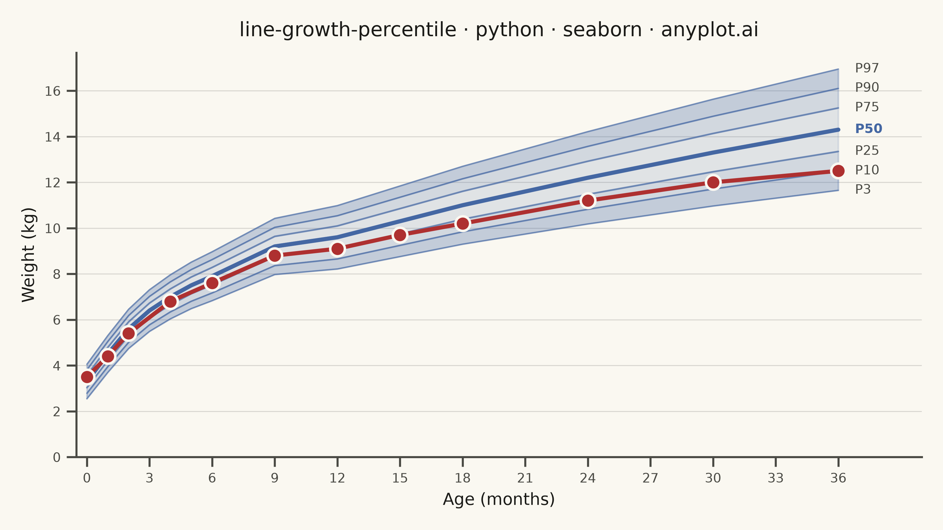
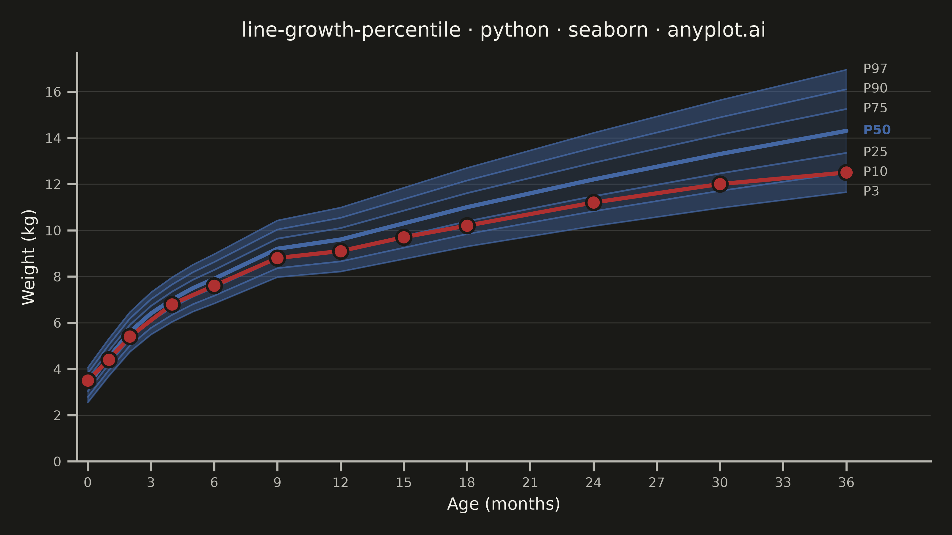
A WHO/CDC-style growth chart displaying smooth percentile curves (3rd, 10th, 25th, 50th, 75th, 90th, 97th) as colored bands, with individual patient data points overlaid and connected by a line. This chart is a standard clinical tool for monitoring child development metrics such as height, weight, or BMI across age. It enables quick visual assessment of whether a child's growth trajectory falls within expected population ranges.
""" anyplot.ai
line-growth-percentile: Pediatric Growth Chart with Percentile Curves
Library: seaborn 0.13.2 | Python 3.13.14
Quality: 92/100 | Updated: 2026-06-20
"""

import os

import matplotlib.pyplot as plt
import numpy as np
import pandas as pd
import seaborn as sns


# Theme tokens
THEME = os.getenv("ANYPLOT_THEME", "light")
PAGE_BG = "#FAF8F1" if THEME == "light" else "#1A1A17"
ELEVATED_BG = "#FFFDF6" if THEME == "light" else "#242420"
INK = "#1A1A17" if THEME == "light" else "#F0EFE8"
INK_SOFT = "#4A4A44" if THEME == "light" else "#B8B7B0"

# Seaborn theme — theme-adaptive chrome
sns.set_theme(
    style="ticks",
    rc={
        "figure.facecolor": PAGE_BG,
        "axes.facecolor": PAGE_BG,
        "axes.edgecolor": INK_SOFT,
        "axes.labelcolor": INK,
        "text.color": INK,
        "xtick.color": INK_SOFT,
        "ytick.color": INK_SOFT,
        "grid.color": INK,
        "grid.alpha": 0.15,
        "legend.facecolor": ELEVATED_BG,
        "legend.edgecolor": INK_SOFT,
        "font.family": "sans-serif",
    },
)

# Data — WHO weight-for-age reference for boys, 0–36 months (realistic values)
np.random.seed(42)

age_months = np.arange(0, 37, 1)

who_ref_ages = np.array([0, 1, 2, 3, 4, 5, 6, 9, 12, 15, 18, 24, 30, 36])
who_ref_p50 = np.array([3.3, 4.5, 5.6, 6.4, 7.0, 7.5, 7.9, 9.2, 9.6, 10.3, 11.0, 12.2, 13.3, 14.3])
median_weight = np.interp(age_months, who_ref_ages, who_ref_p50)
sd = 0.4 + 0.028 * age_months

percentile_z = {"P3": -1.8808, "P10": -1.2816, "P25": -0.6745, "P50": 0.0, "P75": 0.6745, "P90": 1.2816, "P97": 1.8808}
percentiles = {label: median_weight + z * sd for label, z in percentile_z.items()}

# Long-format DataFrame — seaborn-idiomatic for lineplot with hue/size
records = []
for label, values in percentiles.items():
    for i, age in enumerate(age_months):
        records.append({"Age (months)": age, "Weight (kg)": values[i], "Percentile": label})
percentile_df = pd.DataFrame(records)

# Individual patient — boy drifting below P25 (growth faltering narrative)
patient_ages = np.array([0, 1, 2, 4, 6, 9, 12, 15, 18, 24, 30, 36])
patient_weights = np.array([3.5, 4.4, 5.4, 6.8, 7.6, 8.8, 9.1, 9.7, 10.2, 11.2, 12.0, 12.5])
patient_df = pd.DataFrame({"Age (months)": patient_ages, "Weight (kg)": patient_weights})

# Imprint blue (#4467A3) — clinical boys convention (semantic color exception)
IMPRINT_BLUE = "#4467A3"
IMPRINT_RED = "#AE3030"  # semantic: growth faltering / clinical alert

# Percentile line sizes: P50 emphasized via thickness
percentile_color_map = dict.fromkeys(percentile_z, IMPRINT_BLUE)
line_sizes = {"P3": 0.8, "P10": 0.8, "P25": 1.0, "P50": 2.5, "P75": 1.0, "P90": 0.8, "P97": 0.8}

# Band fills — graduated alpha, theme-adjusted for visibility on dark background
band_alphas = [0.30, 0.22, 0.14, 0.14, 0.22, 0.30] if THEME == "light" else [0.45, 0.32, 0.20, 0.20, 0.32, 0.45]

# Plot — 3200 × 1800 px canvas (figsize=(8, 4.5) × dpi=400)
fig, ax = plt.subplots(figsize=(8, 4.5), dpi=400, facecolor=PAGE_BG)
ax.set_facecolor(PAGE_BG)

# Percentile bands (graduated fill between adjacent curves)
band_labels = list(percentiles.keys())
for i in range(len(band_labels) - 1):
    ax.fill_between(
        age_months,
        percentiles[band_labels[i]],
        percentiles[band_labels[i + 1]],
        color=IMPRINT_BLUE,
        alpha=band_alphas[i],
    )

# Percentile lines — seaborn lineplot with hue and size encoding
sns.lineplot(
    data=percentile_df,
    x="Age (months)",
    y="Weight (kg)",
    hue="Percentile",
    hue_order=list(percentile_z.keys()),
    palette=percentile_color_map,
    size="Percentile",
    sizes=line_sizes,
    alpha=0.60,
    legend=False,
    ax=ax,
)
# Re-draw P50 at full opacity for clinical emphasis
p50_data = percentile_df[percentile_df["Percentile"] == "P50"]
sns.lineplot(
    data=p50_data, x="Age (months)", y="Weight (kg)", color=IMPRINT_BLUE, linewidth=2.5, alpha=1.0, legend=False, ax=ax
)

# Patient trajectory — Imprint matte red (semantic: growth faltering alert)
sns.lineplot(
    data=patient_df, x="Age (months)", y="Weight (kg)", color=IMPRINT_RED, linewidth=2.5, zorder=5, legend=False, ax=ax
)
sns.scatterplot(
    data=patient_df,
    x="Age (months)",
    y="Weight (kg)",
    color=IMPRINT_RED,
    s=80,
    zorder=6,
    edgecolor=PAGE_BG,
    linewidth=1.5,
    legend=False,
    ax=ax,
)

# Percentile labels on right margin
for label, values in percentiles.items():
    is_p50 = label == "P50"
    ax.text(
        36.8,
        values[-1],
        label,
        fontsize=8,
        fontweight="bold" if is_p50 else "normal",
        color=IMPRINT_BLUE if is_p50 else INK_SOFT,
        va="center",
    )

# Axes and title
title = "line-growth-percentile · python · seaborn · anyplot.ai"
ax.set_title(title, fontsize=12, fontweight="medium", pad=10, color=INK)
ax.set_xlabel("Age (months)", fontsize=10, color=INK)
ax.set_ylabel("Weight (kg)", fontsize=10, color=INK)
ax.tick_params(axis="both", labelsize=8, colors=INK_SOFT)
ax.set_xlim(-0.5, 40.0)
ax.set_xticks(np.arange(0, 37, 3))
ax.xaxis.grid(False)
ax.yaxis.grid(True, alpha=0.15, linewidth=0.6, color=INK)
ax.set_ylim(0, None)

# Seaborn despine — idiomatic
sns.despine(ax=ax, top=True, right=True)

plt.tight_layout()
plt.savefig(f"plot-{THEME}.png", dpi=400, facecolor=PAGE_BG)
Runnable source as JSON, for any HTTP client: https://api.anyplot.ai/specs/line-growth-percentile/seaborn/code. Any spec id and library id listed in llms-full.txt fit the same URL shape; every URL below is complete and callable.
{
  "spec_id": "line-growth-percentile",
  "language": "python",
  "library": "seaborn",
  "page": "https://anyplot.ai/line-growth-percentile/python/seaborn",
  "hub": "https://anyplot.ai/line-growth-percentile",
  "code_json": "https://api.anyplot.ai/specs/line-growth-percentile/seaborn/code",
  "spec_json": "https://api.anyplot.ai/specs/line-growth-percentile",
  "render_light_png": "https://storage.googleapis.com/anyplot-images/plots/line-growth-percentile/python/seaborn/plot-light.png",
  "render_dark_png": "https://storage.googleapis.com/anyplot-images/plots/line-growth-percentile/python/seaborn/plot-dark.png",
  "quality_score": 92.0,
  "license": "MIT",
  "guide": "https://anyplot.ai/llms.txt"
}
Part of Pediatric Growth Chart with Percentile Curves on anyplot.ai.