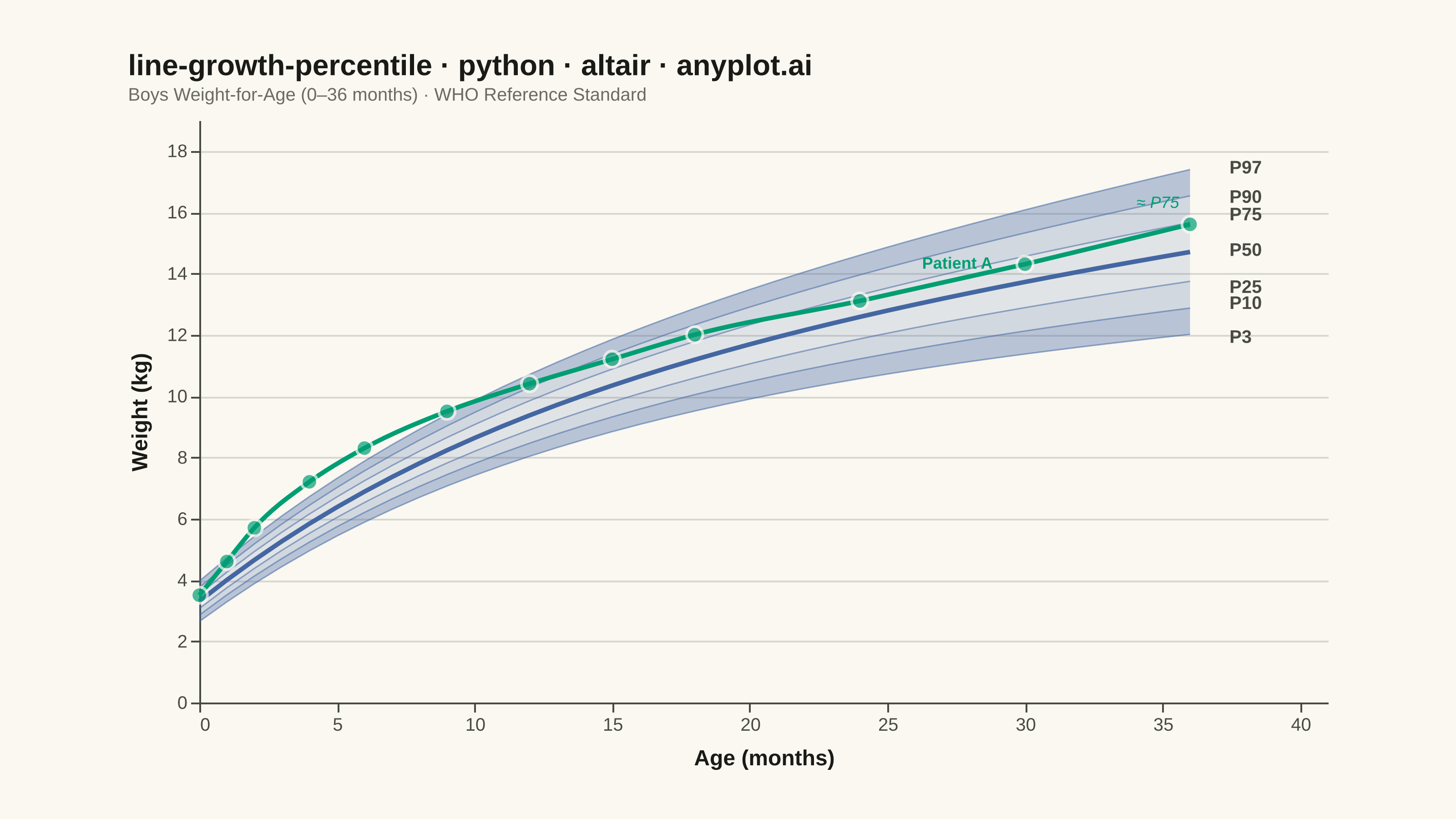
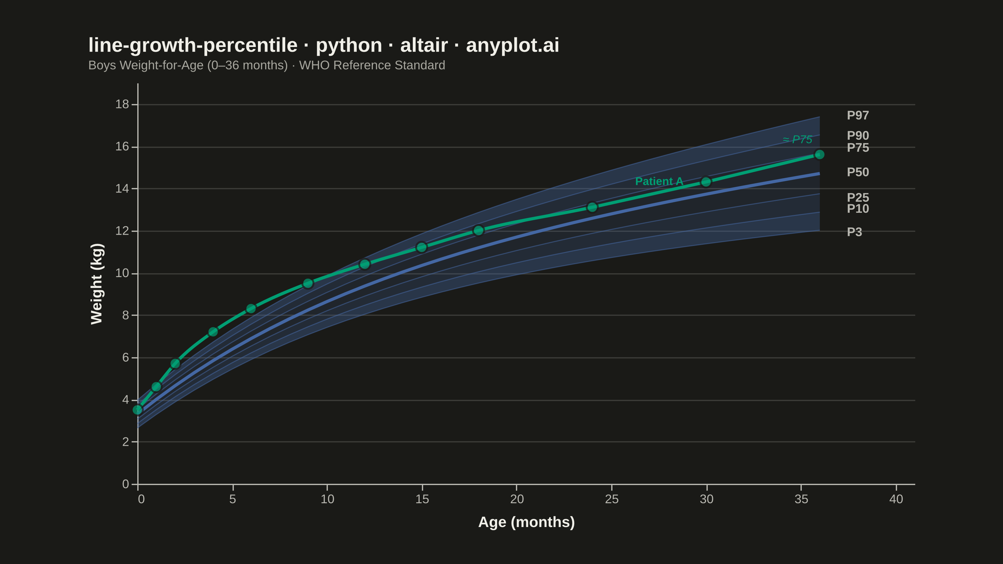
A WHO/CDC-style growth chart displaying smooth percentile curves (3rd, 10th, 25th, 50th, 75th, 90th, 97th) as colored bands, with individual patient data points overlaid and connected by a line. This chart is a standard clinical tool for monitoring child development metrics such as height, weight, or BMI across age. It enables quick visual assessment of whether a child's growth trajectory falls within expected population ranges.
""" anyplot.ai
line-growth-percentile: Pediatric Growth Chart with Percentile Curves
Library: altair 6.2.1 | Python 3.13.14
Quality: 88/100 | Updated: 2026-06-20
"""

import os

import altair as alt
import numpy as np
import pandas as pd
from PIL import Image


# Theme tokens (Imprint palette — see prompts/default-style-guide.md)
THEME = os.getenv("ANYPLOT_THEME", "light")
PAGE_BG = "#FAF8F1" if THEME == "light" else "#1A1A17"
INK = "#1A1A17" if THEME == "light" else "#F0EFE8"
INK_SOFT = "#4A4A44" if THEME == "light" else "#B8B7B0"
INK_MUTED = "#6B6A63" if THEME == "light" else "#A8A79F"

# Imprint palette
PATIENT_COLOR = "#009E73"  # pos 1 — patient trajectory (first active series)
BAND_COLOR = "#4467A3"  # pos 3 (blue) — reference bands, boys by clinical convention

# Data — WHO-style weight-for-age reference for boys, 0–36 months
np.random.seed(42)
age_months = np.arange(0, 37, 1)

median = 3.3 + 7.5 * (1 - np.exp(-0.08 * age_months)) + 0.12 * age_months
sd_base = 0.35 + 0.03 * age_months

percentile_names = ["P3", "P10", "P25", "P50", "P75", "P90", "P97"]
z_scores = [-1.88, -1.28, -0.67, 0.0, 0.67, 1.28, 1.88]

ref_df = pd.DataFrame({"age_months": age_months})
for name, z in zip(percentile_names, z_scores, strict=True):
    ref_df[name] = median + z * sd_base

# Individual patient: healthy boy tracked at well-child visits
patient_ages = np.array([0, 1, 2, 4, 6, 9, 12, 15, 18, 24, 30, 36])
patient_weights = np.array([3.5, 4.6, 5.7, 7.2, 8.3, 9.5, 10.4, 11.2, 12.0, 13.1, 14.3, 15.6])
patient_df = pd.DataFrame({"age_months": patient_ages, "weight": patient_weights})

# Title — 53 chars < 67 baseline, default fontSize is fine
title_str = "line-growth-percentile · python · altair · anyplot.ai"
title_fontsize = 16

# Percentile band layers — graduated opacity (darker near extremes, lighter near median)
band_defs = [
    ("P3", "P10", 0.36),
    ("P10", "P25", 0.22),
    ("P25", "P75", 0.14),
    ("P75", "P90", 0.22),
    ("P90", "P97", 0.36),
]

band_layers = []
for lower, upper, opacity in band_defs:
    band = (
        alt.Chart(ref_df)
        .mark_area(opacity=opacity, color=BAND_COLOR)
        .encode(x=alt.X("age_months:Q"), y=alt.Y(f"{lower}:Q"), y2=alt.Y2(f"{upper}:Q"))
    )
    band_layers.append(band)

# Percentile reference lines via idiomatic transform_fold
line_base = alt.Chart(ref_df).transform_fold(fold=percentile_names, as_=["percentile", "weight"])

p50_line = (
    line_base.transform_filter(alt.datum.percentile == "P50")
    .mark_line(strokeWidth=2.5, opacity=1.0)
    .encode(x=alt.X("age_months:Q"), y=alt.Y("weight:Q"), color=alt.value(BAND_COLOR))
)

other_lines = (
    line_base.transform_filter(alt.datum.percentile != "P50")
    .mark_line(strokeWidth=0.8, opacity=0.55)
    .encode(x=alt.X("age_months:Q"), y=alt.Y("weight:Q"), color=alt.value(BAND_COLOR), detail="percentile:N")
)

# Right-margin percentile labels with nudging to reduce crowding
label_values = {p: ref_df[p].iloc[-1] for p in percentile_names}
nudge = {"P3": -0.1, "P10": 0.15, "P25": -0.2, "P50": 0.05, "P75": 0.25, "P90": -0.05, "P97": 0.05}
label_df = pd.DataFrame(
    {
        "age_months": [37.3] * 7,
        "value": [label_values[p] + nudge[p] for p in percentile_names],
        "label": percentile_names,
    }
)

percentile_text = (
    alt.Chart(label_df)
    .mark_text(align="left", dx=2, fontSize=10, fontWeight="bold", font="Helvetica Neue, Arial, sans-serif")
    .encode(x=alt.X("age_months:Q"), y=alt.Y("value:Q"), text="label:N", color=alt.value(INK_SOFT))
)

# Patient trajectory with interactive hover (distinctive Altair feature)
nearest = alt.selection_point(nearest=True, on="pointerover", fields=["age_months"], empty=False)

patient_line = (
    alt.Chart(patient_df)
    .mark_line(strokeWidth=2.5, interpolate="monotone")
    .encode(x=alt.X("age_months:Q"), y=alt.Y("weight:Q"), color=alt.value(PATIENT_COLOR))
)

patient_points = (
    alt.Chart(patient_df)
    .mark_circle(stroke=PAGE_BG, strokeWidth=1.5)
    .encode(
        x=alt.X("age_months:Q"),
        y=alt.Y("weight:Q"),
        color=alt.value(PATIENT_COLOR),
        size=alt.condition(nearest, alt.value(160), alt.value(80)),
        tooltip=[
            alt.Tooltip("age_months:Q", title="Age (months)"),
            alt.Tooltip("weight:Q", title="Weight (kg)", format=".1f"),
        ],
    )
    .add_params(nearest)
)

patient_label_df = pd.DataFrame({"age_months": [26], "weight": [13.5], "label": ["Patient A"]})
patient_label = (
    alt.Chart(patient_label_df)
    .mark_text(align="left", dx=4, dy=-14, fontSize=9, fontWeight="bold", font="Helvetica Neue, Arial, sans-serif")
    .encode(x=alt.X("age_months:Q"), y=alt.Y("weight:Q"), text="label:N", color=alt.value(PATIENT_COLOR))
)

# Storytelling callout: patient's approximate percentile at final visit
callout_df = pd.DataFrame({"age_months": [36], "weight": [15.6], "label": ["≈ P75"]})
callout = (
    alt.Chart(callout_df)
    .mark_text(align="right", dx=-6, dy=-12, fontSize=9, fontStyle="italic", font="Helvetica Neue, Arial, sans-serif")
    .encode(x=alt.X("age_months:Q"), y=alt.Y("weight:Q"), text="label:N", color=alt.value(PATIENT_COLOR))
)

# Compose all layers
chart = (
    alt.layer(
        *band_layers, other_lines, p50_line, percentile_text, patient_line, patient_points, patient_label, callout
    )
    .properties(
        width=620,
        height=320,
        background=PAGE_BG,
        title=alt.Title(
            title_str,
            fontSize=title_fontsize,
            color=INK,
            font="Helvetica Neue, Arial, sans-serif",
            subtitle=["Boys Weight-for-Age (0–36 months) · WHO Reference Standard"],
            subtitleFontSize=10,
            subtitleColor=INK_MUTED,
            subtitleFont="Helvetica Neue, Arial, sans-serif",
            anchor="start",
            offset=8,
        ),
    )
    .configure_view(continuousWidth=620, continuousHeight=320, fill=PAGE_BG, strokeWidth=0)
    .configure_axis(
        labelFontSize=10,
        titleFontSize=12,
        titleColor=INK,
        labelColor=INK_SOFT,
        gridColor=INK,
        gridOpacity=0.15,
        domainColor=INK_SOFT,
        tickColor=INK_SOFT,
        titlePadding=8,
        labelFont="Helvetica Neue, Arial, sans-serif",
        titleFont="Helvetica Neue, Arial, sans-serif",
    )
    .configure_axisX(grid=False, tickCount=12)
    .configure_axisY(grid=True, tickCount=8)
    .resolve_scale(y="shared")
    .encode(
        x=alt.X("age_months:Q", title="Age (months)", scale=alt.Scale(domain=[0, 41])),
        y=alt.Y(title="Weight (kg)", scale=alt.Scale(domain=[0, 19])),
    )
)

# Save PNG and pad to exact canvas target (3200 × 1800 landscape)
TW, TH = 3200, 1800

chart.save(f"plot-{THEME}.png", scale_factor=4.0)

_img = Image.open(f"plot-{THEME}.png").convert("RGB")
_w, _h = _img.size
if _w > TW or _h > TH:
    raise SystemExit(
        f"altair vl-convert produced {_w}×{_h}, exceeds target {TW}×{TH}. "
        f"Shrink chart .properties(width=, height=) values and re-render."
    )
if _w < TW or _h < TH:
    _canvas = Image.new("RGB", (TW, TH), PAGE_BG)
    _canvas.paste(_img, ((TW - _w) // 2, (TH - _h) // 2))
    _canvas.save(f"plot-{THEME}.png")

# Save interactive HTML
chart.save(f"plot-{THEME}.html")
Runnable source as JSON, for any HTTP client: https://api.anyplot.ai/specs/line-growth-percentile/altair/code. Any spec id and library id listed in llms-full.txt fit the same URL shape; every URL below is complete and callable.
{
  "spec_id": "line-growth-percentile",
  "language": "python",
  "library": "altair",
  "page": "https://anyplot.ai/line-growth-percentile/python/altair",
  "hub": "https://anyplot.ai/line-growth-percentile",
  "code_json": "https://api.anyplot.ai/specs/line-growth-percentile/altair/code",
  "spec_json": "https://api.anyplot.ai/specs/line-growth-percentile",
  "render_light_png": "https://storage.googleapis.com/anyplot-images/plots/line-growth-percentile/python/altair/plot-light.png",
  "render_dark_png": "https://storage.googleapis.com/anyplot-images/plots/line-growth-percentile/python/altair/plot-dark.png",
  "interactive_light_html": "https://storage.googleapis.com/anyplot-images/plots/line-growth-percentile/python/altair/plot-light.html",
  "interactive_dark_html": "https://storage.googleapis.com/anyplot-images/plots/line-growth-percentile/python/altair/plot-dark.html",
  "quality_score": 88.0,
  "license": "MIT",
  "guide": "https://anyplot.ai/llms.txt"
}
Part of Pediatric Growth Chart with Percentile Curves on anyplot.ai.