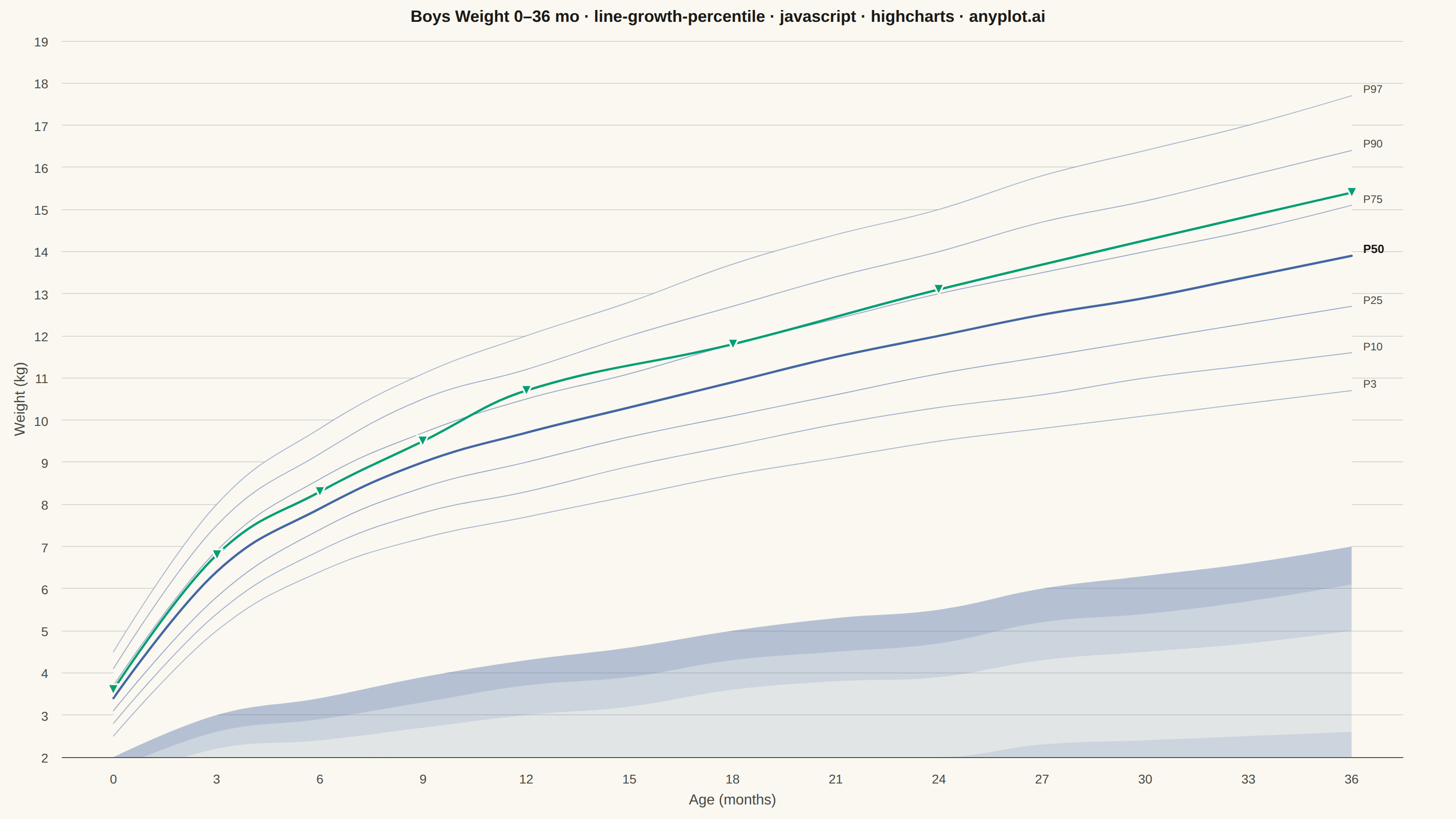
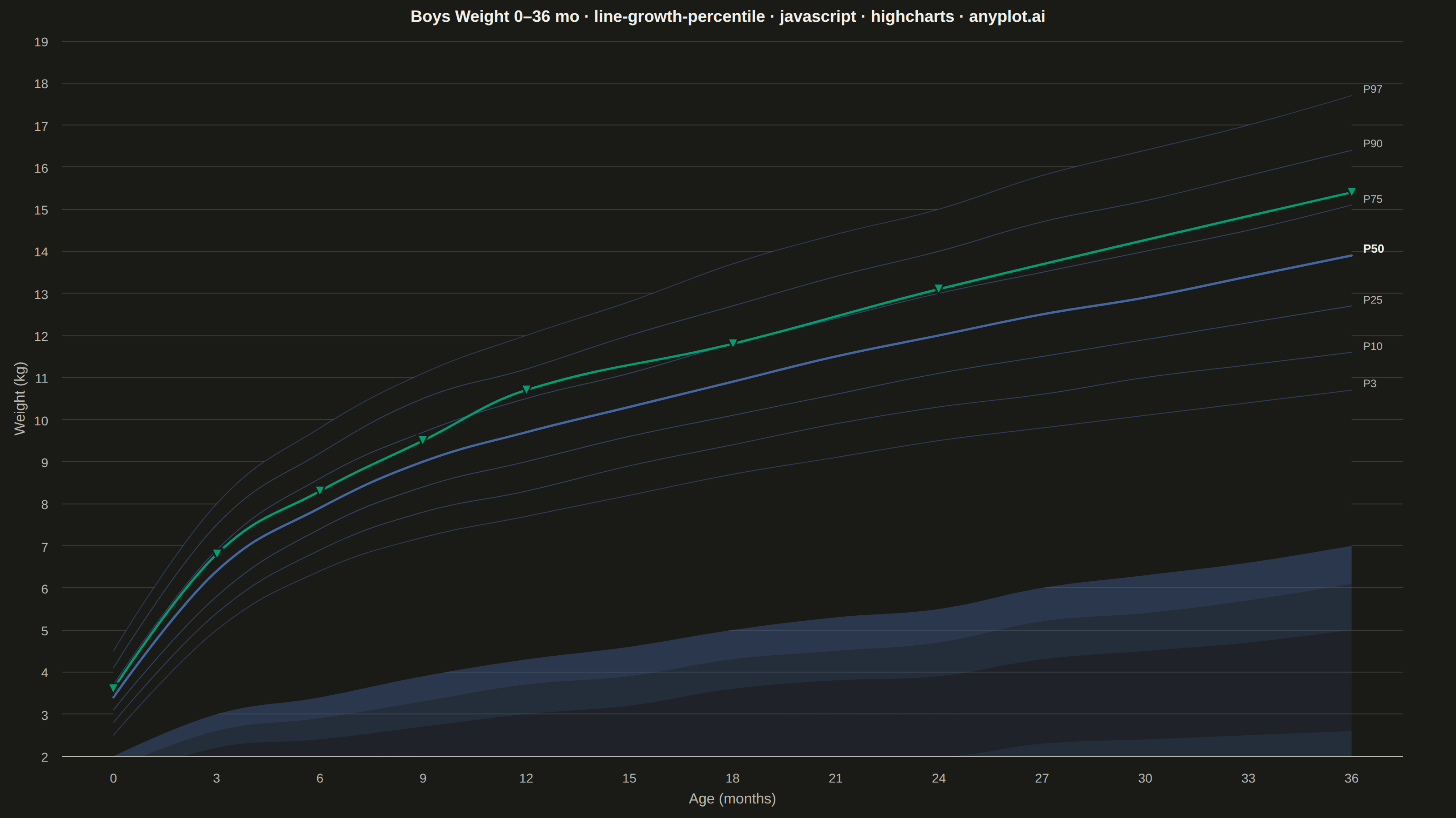
A WHO/CDC-style growth chart displaying smooth percentile curves (3rd, 10th, 25th, 50th, 75th, 90th, 97th) as colored bands, with individual patient data points overlaid and connected by a line. This chart is a standard clinical tool for monitoring child development metrics such as height, weight, or BMI across age. It enables quick visual assessment of whether a child's growth trajectory falls within expected population ranges.
// anyplot.ai
// line-growth-percentile: Pediatric Growth Chart with Percentile Curves
// Library: highcharts 12.6.0 | JavaScript 22.22.3
// Quality: 86/100 | Created: 2026-06-20
//# anyplot-orientation: landscape

// anyplot.ai
// line-growth-percentile: Pediatric Growth Chart with Percentile Curves
// Library: Highcharts 12.6.0 | Node 22
// License: Highcharts — commercial license, free for non-commercial use (highcharts.com/license)
// Quality: pending | Created: 2026-06-20

const t = window.ANYPLOT_TOKENS;
const PAGE_BG = window.ANYPLOT_THEME === 'light' ? '#FAF8F1' : '#1A1A17';

// Age reference points (months)
const ages = [0, 3, 6, 9, 12, 15, 18, 21, 24, 27, 30, 33, 36];

// WHO boys weight-for-age reference percentiles (kg, approximate)
const p3  = [2.5, 5.0, 6.4, 7.2, 7.7, 8.2, 8.7, 9.1,  9.5,  9.8, 10.1, 10.4, 10.7];
const p10 = [2.8, 5.4, 6.9, 7.8, 8.3, 8.9, 9.4, 9.9, 10.3, 10.6, 11.0, 11.3, 11.6];
const p25 = [3.1, 5.8, 7.4, 8.4, 9.0, 9.6, 10.1, 10.6, 11.1, 11.5, 11.9, 12.3, 12.7];
const p50 = [3.4, 6.4, 7.9, 9.0, 9.7, 10.3, 10.9, 11.5, 12.0, 12.5, 12.9, 13.4, 13.9];
const p75 = [3.7, 6.9, 8.6, 9.7, 10.5, 11.1, 11.8, 12.4, 13.0, 13.5, 14.0, 14.5, 15.1];
const p90 = [4.1, 7.5, 9.2, 10.5, 11.2, 12.0, 12.7, 13.4, 14.0, 14.7, 15.2, 15.8, 16.4];
const p97 = [4.5, 8.0, 9.8, 11.1, 12.0, 12.8, 13.7, 14.4, 15.0, 15.8, 16.4, 17.0, 17.7];

// Stacked deltas: each band fills between adjacent percentile curves
const delta = (hi, lo) => hi.map((v, i) => +(v - lo[i]).toFixed(2));
const dBase  = p3;
const d3_10  = delta(p10, p3);
const d10_25 = delta(p25, p10);
const d25_50 = delta(p50, p25);
const d50_75 = delta(p75, p50);
const d75_90 = delta(p90, p75);
const d90_97 = delta(p97, p90);

// Individual patient trajectory — well-child visit weights (boy, between P75 and P90)
const patientVisits = [[0, 3.6], [3, 6.8], [6, 8.3], [9, 9.5], [12, 10.7], [18, 11.8], [24, 13.1], [36, 15.4]];
const patientData = patientVisits.map(([a, w]) => [ages.indexOf(a), w]);

// Title with font scaling: 83 chars → 22 × 67/83 ≈ 18px
const title = 'Boys Weight 0–36 mo · line-growth-percentile · javascript · highcharts · anyplot.ai';
const titleFontSize = Math.max(16, Math.round(22 * 67 / title.length)) + 'px';

// Imprint blue (#4467A3) at varying alpha for graduated band fills
const bandFill = (alpha) => `rgba(68,103,163,${alpha})`;
const BLUE = '#4467A3';

// Right-margin data label for the last age tick only (for curve series)
const rightLabel = (lbl, bold) => ({
  enabled: true,
  formatter: function () { return this.point.index === ages.length - 1 ? lbl : null; },
  align: 'left',
  x: 8,
  y: 4,
  allowOverlap: true,
  crop: false,
  overflow: 'allow',
  style: {
    color: bold ? t.ink : t.inkSoft,
    fontSize: bold ? '13px' : '12px',
    fontWeight: bold ? '700' : 'normal',
    textOutline: 'none',
  },
});

// Stacked area bands (fills only — no lines, no labels)
const bandSeries = [
  { name: 'base',    data: dBase,  fill: PAGE_BG        },
  { name: 'P3-P10',  data: d3_10,  fill: bandFill(0.38) },
  { name: 'P10-P25', data: d10_25, fill: bandFill(0.25) },
  { name: 'P25-P50', data: d25_50, fill: bandFill(0.13) },
  { name: 'P50-P75', data: d50_75, fill: bandFill(0.13) },
  { name: 'P75-P90', data: d75_90, fill: bandFill(0.25) },
  { name: 'P90-P97', data: d90_97, fill: bandFill(0.38) },
].map(s => ({
  type: 'areaspline',
  name: s.name,
  data: s.data,
  fillColor: s.fill,
  lineWidth: 0,
  marker: { enabled: false },
  animation: false,
  enableMouseTracking: false,
  showInLegend: false,
  dataLabels: { enabled: false },
}));

// Non-stacked percentile curves — provide actual y-positions for the reference lines and labels
const curves = [
  { key: 'P3',  vals: p3,  lbl: 'P3',  lw: 1,   color: bandFill(0.45), bold: false },
  { key: 'P10', vals: p10, lbl: 'P10', lw: 1,   color: bandFill(0.50), bold: false },
  { key: 'P25', vals: p25, lbl: 'P25', lw: 1,   color: bandFill(0.55), bold: false },
  { key: 'P50', vals: p50, lbl: 'P50', lw: 2.5, color: BLUE,           bold: true  },
  { key: 'P75', vals: p75, lbl: 'P75', lw: 1,   color: bandFill(0.55), bold: false },
  { key: 'P90', vals: p90, lbl: 'P90', lw: 1,   color: bandFill(0.50), bold: false },
  { key: 'P97', vals: p97, lbl: 'P97', lw: 1,   color: bandFill(0.45), bold: false },
];

const curveSeries = curves.map(c => ({
  type: 'spline',
  name: c.key,
  data: c.vals,   // raw values on the y-axis — not stacked
  color: c.color,
  lineWidth: c.lw,
  marker: { enabled: false },
  animation: false,
  enableMouseTracking: false,
  showInLegend: false,
  dataLabels: rightLabel(c.lbl, c.bold),
}));

Highcharts.chart('container', {
  chart: {
    backgroundColor: 'transparent',
    animation: false,
    marginRight: 58,
    style: { fontFamily: 'inherit' },
  },
  credits: { enabled: false },
  title: {
    text: title,
    style: { color: t.ink, fontSize: titleFontSize, fontWeight: '600' },
  },
  xAxis: {
    categories: ages.map(String),
    title: { text: 'Age (months)', style: { color: t.inkSoft, fontSize: '16px' } },
    lineColor: t.inkSoft,
    tickColor: t.inkSoft,
    gridLineWidth: 0,
    labels: { style: { color: t.inkSoft, fontSize: '14px' } },
  },
  yAxis: {
    min: 2,
    title: { text: 'Weight (kg)', style: { color: t.inkSoft, fontSize: '16px' } },
    gridLineColor: t.grid,
    labels: { style: { color: t.inkSoft, fontSize: '14px' } },
  },
  plotOptions: {
    areaspline: {
      stacking: 'normal',
      animation: false,
    },
    spline: {
      animation: false,
    },
    series: { animation: false },
  },
  legend: { enabled: false },
  tooltip: { enabled: false },
  series: [
    // Band fills (stacked areaspline) — drawn first so curves overlay on top
    ...bandSeries,
    // Reference curves (non-stacked spline) — drawn at actual percentile y-values
    ...curveSeries,
    // Individual patient trajectory — Imprint brand green (#009E73) as contrasting series
    {
      type: 'spline',
      name: 'Patient',
      data: patientData,
      color: '#009E73',
      lineWidth: 2.5,
      zIndex: 10,
      animation: false,
      enableMouseTracking: false,
      showInLegend: false,
      marker: {
        enabled: true,
        radius: 6,
        fillColor: '#009E73',
        lineWidth: 2,
        lineColor: PAGE_BG,
      },
    },
  ],
});
Runnable source as JSON, for any HTTP client: https://api.anyplot.ai/specs/line-growth-percentile/highcharts/code. Any spec id and library id listed in llms-full.txt fit the same URL shape; every URL below is complete and callable.
{
  "spec_id": "line-growth-percentile",
  "language": "javascript",
  "library": "highcharts",
  "page": "https://anyplot.ai/line-growth-percentile/javascript/highcharts",
  "hub": "https://anyplot.ai/line-growth-percentile",
  "code_json": "https://api.anyplot.ai/specs/line-growth-percentile/highcharts/code",
  "spec_json": "https://api.anyplot.ai/specs/line-growth-percentile",
  "render_light_png": "https://storage.googleapis.com/anyplot-images/plots/line-growth-percentile/javascript/highcharts/plot-light.png",
  "render_dark_png": "https://storage.googleapis.com/anyplot-images/plots/line-growth-percentile/javascript/highcharts/plot-dark.png",
  "interactive_light_html": "https://storage.googleapis.com/anyplot-images/plots/line-growth-percentile/javascript/highcharts/plot-light.html",
  "interactive_dark_html": "https://storage.googleapis.com/anyplot-images/plots/line-growth-percentile/javascript/highcharts/plot-dark.html",
  "quality_score": 86.0,
  "license": "MIT",
  "guide": "https://anyplot.ai/llms.txt"
}
Part of Pediatric Growth Chart with Percentile Curves on anyplot.ai.