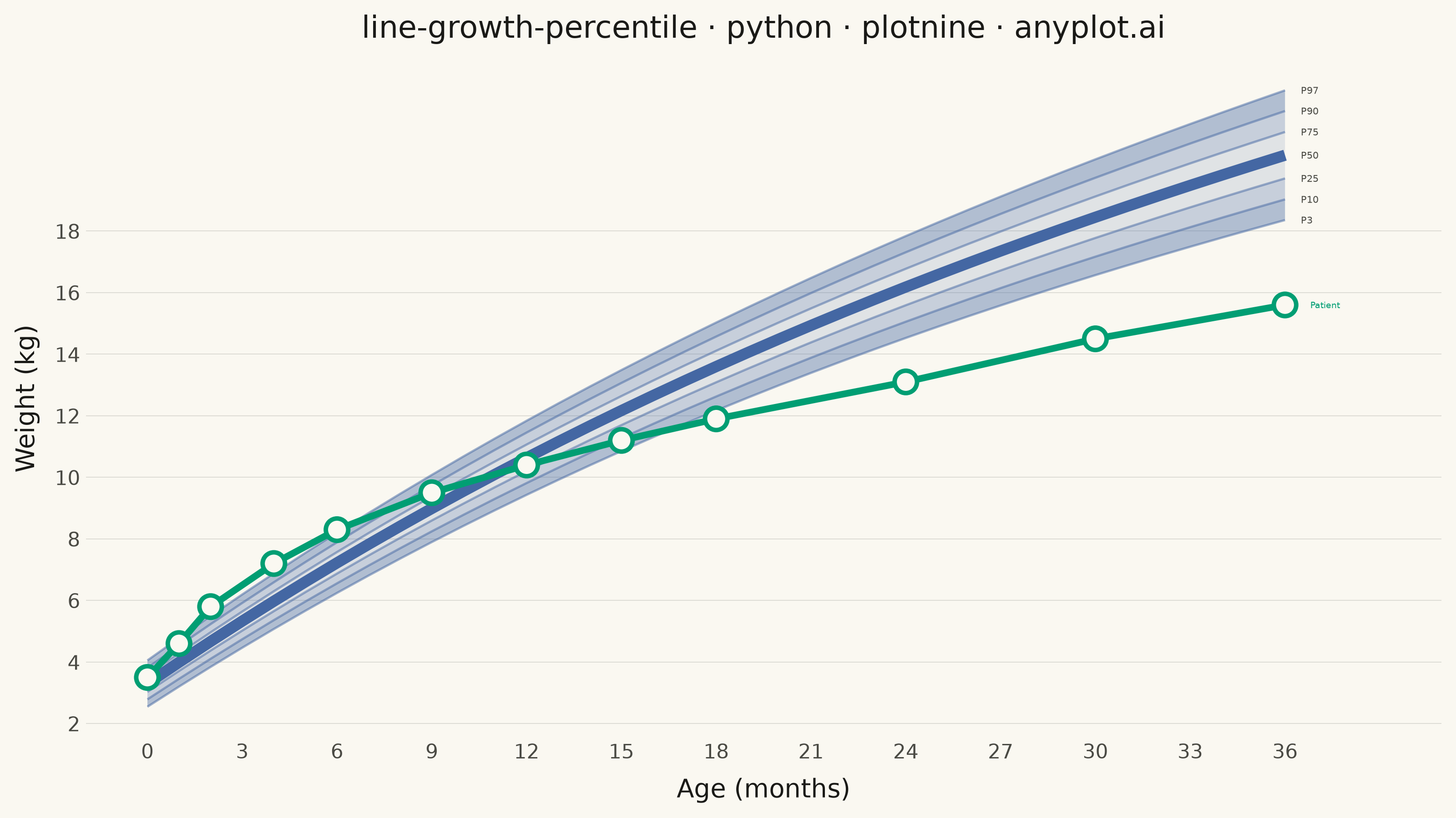
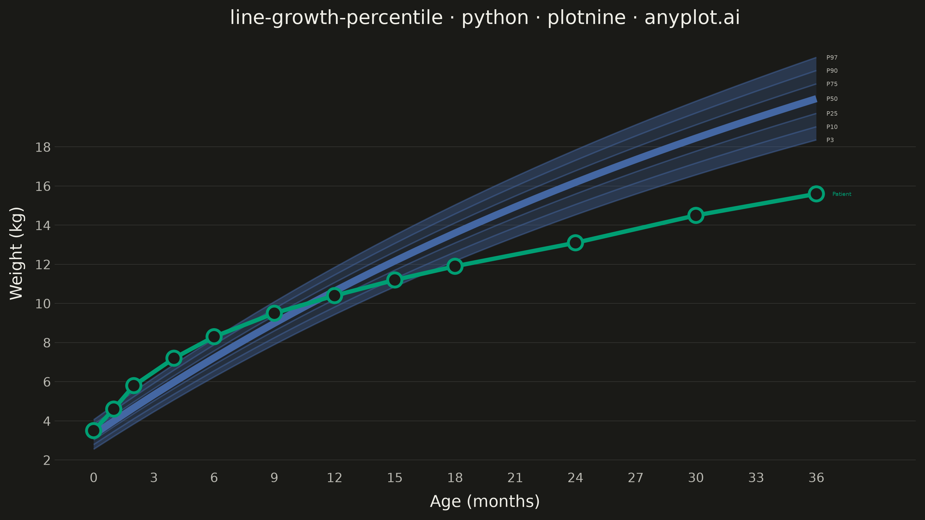
A WHO/CDC-style growth chart displaying smooth percentile curves (3rd, 10th, 25th, 50th, 75th, 90th, 97th) as colored bands, with individual patient data points overlaid and connected by a line. This chart is a standard clinical tool for monitoring child development metrics such as height, weight, or BMI across age. It enables quick visual assessment of whether a child's growth trajectory falls within expected population ranges.
""" anyplot.ai
line-growth-percentile: Pediatric Growth Chart with Percentile Curves
Library: plotnine 0.15.7 | Python 3.13.14
Quality: 87/100 | Updated: 2026-06-20
"""

import os
import sys


# Remove this file's directory from sys.path to prevent self-import
# (file is named plotnine.py — same name as the library).
_this_dir = os.path.dirname(os.path.abspath(__file__))
sys.path = [p for p in sys.path if os.path.abspath(p or ".") != _this_dir]

import numpy as np
import pandas as pd
from plotnine import (
    aes,
    annotate,
    element_blank,
    element_line,
    element_rect,
    element_text,
    geom_line,
    geom_point,
    geom_ribbon,
    geom_text,
    ggplot,
    labs,
    scale_alpha_manual,
    scale_fill_manual,
    scale_x_continuous,
    scale_y_continuous,
    theme,
    theme_minimal,
)


# Theme tokens
THEME = os.getenv("ANYPLOT_THEME", "light")
PAGE_BG = "#FAF8F1" if THEME == "light" else "#1A1A17"
INK = "#1A1A17" if THEME == "light" else "#F0EFE8"
INK_SOFT = "#4A4A44" if THEME == "light" else "#B8B7B0"

# Imprint palette — semantic exception: blue for boys (domain convention)
BOYS_BLUE = "#4467A3"  # Imprint position 3
PATIENT_COLOR = "#009E73"  # Imprint position 1 — always first categorical series

# Data — WHO-style weight-for-age reference for boys, 0–36 months
np.random.seed(42)

age_months = np.arange(0, 37, 1)

# Approximate WHO growth standards for boys 0–36 months
median_weight = 3.3 + 0.7 * age_months - 0.008 * age_months**2 + 0.00005 * age_months**3
sd_weight = 0.4 + 0.02 * age_months

percentiles = {
    "P3": median_weight - 1.881 * sd_weight,
    "P10": median_weight - 1.282 * sd_weight,
    "P25": median_weight - 0.674 * sd_weight,
    "P50": median_weight,
    "P75": median_weight + 0.674 * sd_weight,
    "P90": median_weight + 1.282 * sd_weight,
    "P97": median_weight + 1.881 * sd_weight,
}

df_ref = pd.DataFrame({"age": age_months, **{k.lower(): v for k, v in percentiles.items()}})

# Band data — graduated alpha: darker at extremes, lighter near median
band_specs = [
    ("P3–P10", "p3", "p10", 0.40),
    ("P10–P25", "p10", "p25", 0.28),
    ("P25–P75", "p25", "p75", 0.14),
    ("P75–P90", "p75", "p90", 0.28),
    ("P90–P97", "p90", "p97", 0.40),
]

df_bands = pd.concat(
    [
        pd.DataFrame({"age": df_ref["age"], "ymin": df_ref[lo], "ymax": df_ref[hi], "band": label})
        for label, lo, hi, _ in band_specs
    ],
    ignore_index=True,
)
band_order = [s[0] for s in band_specs]
df_bands["band"] = pd.Categorical(df_bands["band"], categories=band_order, ordered=True)

band_fill_map = {s[0]: BOYS_BLUE for s in band_specs}
band_alpha_map = {s[0]: s[3] for s in band_specs}

# Boundary percentile lines (long format, grouped by percentile)
pct_non_median = ["P3", "P10", "P25", "P75", "P90", "P97"]
df_boundary = pd.concat(
    [pd.DataFrame({"age": df_ref["age"], "weight": df_ref[p.lower()], "percentile": p}) for p in pct_non_median],
    ignore_index=True,
)

# Median line — emphasized separately
df_median = pd.DataFrame({"age": df_ref["age"], "weight": df_ref["p50"]})

# Individual patient — a healthy boy tracking around the 65th percentile
patient_ages = np.array([0, 1, 2, 4, 6, 9, 12, 15, 18, 24, 30, 36])
patient_weights = np.array([3.5, 4.6, 5.8, 7.2, 8.3, 9.5, 10.4, 11.2, 11.9, 13.1, 14.5, 15.6])
df_patient = pd.DataFrame({"age": patient_ages, "weight": patient_weights})

# Percentile labels at right margin (age=36)
pct_all = ["P3", "P10", "P25", "P50", "P75", "P90", "P97"]
df_labels = pd.DataFrame({"age": [36] * 7, "weight": [percentiles[p][-1] for p in pct_all], "label": pct_all})

# Plot
title = "line-growth-percentile · python · plotnine · anyplot.ai"
plot = (
    ggplot()
    + geom_ribbon(df_bands, aes(x="age", ymin="ymin", ymax="ymax", fill="band", alpha="band"))
    + scale_fill_manual(values=band_fill_map)
    + scale_alpha_manual(values=band_alpha_map)
    + geom_line(df_boundary, aes(x="age", y="weight", group="percentile"), color=BOYS_BLUE, size=0.5, alpha=0.5)
    + geom_line(df_median, aes(x="age", y="weight"), color=BOYS_BLUE, size=2.5)
    + geom_text(df_labels, aes(x="age", y="weight", label="label"), ha="left", size=3.8, color=INK_SOFT, nudge_x=0.5)
    + geom_line(df_patient, aes(x="age", y="weight"), color=PATIENT_COLOR, size=1.5)
    + geom_point(df_patient, aes(x="age", y="weight"), color=PATIENT_COLOR, fill=PAGE_BG, size=4, stroke=1.0)
    + annotate(
        "text",
        x=patient_ages[-1] + 0.8,
        y=patient_weights[-1],
        label="Patient",
        color=PATIENT_COLOR,
        size=3.5,
        ha="left",
    )
    + labs(x="Age (months)", y="Weight (kg)", title=title)
    + scale_x_continuous(breaks=range(0, 37, 3), limits=(0, 39))
    + scale_y_continuous(breaks=range(2, 20, 2))
    + theme_minimal()
    + theme(
        figure_size=(8, 4.5),
        plot_background=element_rect(fill=PAGE_BG, color=PAGE_BG),
        panel_background=element_rect(fill=PAGE_BG),
        panel_border=element_blank(),
        panel_grid_major_x=element_blank(),
        panel_grid_major_y=element_line(color=INK, size=0.3, alpha=0.15),
        panel_grid_minor=element_blank(),
        plot_title=element_text(size=12, color=INK),
        axis_title=element_text(size=10, color=INK),
        axis_text=element_text(size=8, color=INK_SOFT),
        legend_position="none",
    )
)

# Save
plot.save(f"plot-{THEME}.png", dpi=400, width=8, height=4.5, units="in", verbose=False)
Runnable source as JSON, for any HTTP client: https://api.anyplot.ai/specs/line-growth-percentile/plotnine/code. Any spec id and library id listed in llms-full.txt fit the same URL shape; every URL below is complete and callable.
{
  "spec_id": "line-growth-percentile",
  "language": "python",
  "library": "plotnine",
  "page": "https://anyplot.ai/line-growth-percentile/python/plotnine",
  "hub": "https://anyplot.ai/line-growth-percentile",
  "code_json": "https://api.anyplot.ai/specs/line-growth-percentile/plotnine/code",
  "spec_json": "https://api.anyplot.ai/specs/line-growth-percentile",
  "render_light_png": "https://storage.googleapis.com/anyplot-images/plots/line-growth-percentile/python/plotnine/plot-light.png",
  "render_dark_png": "https://storage.googleapis.com/anyplot-images/plots/line-growth-percentile/python/plotnine/plot-dark.png",
  "quality_score": 87.0,
  "license": "MIT",
  "guide": "https://anyplot.ai/llms.txt"
}
Part of Pediatric Growth Chart with Percentile Curves on anyplot.ai.