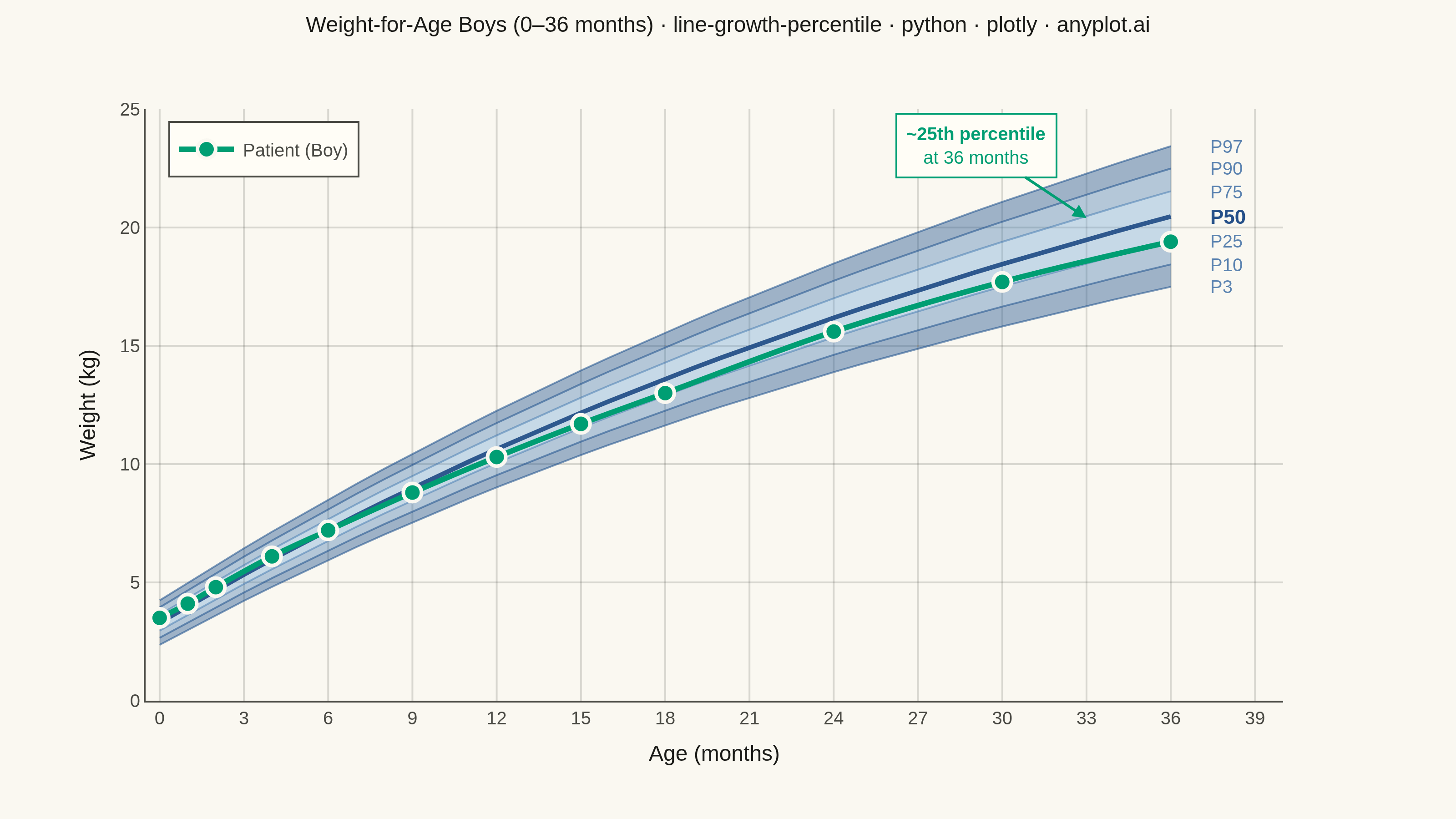
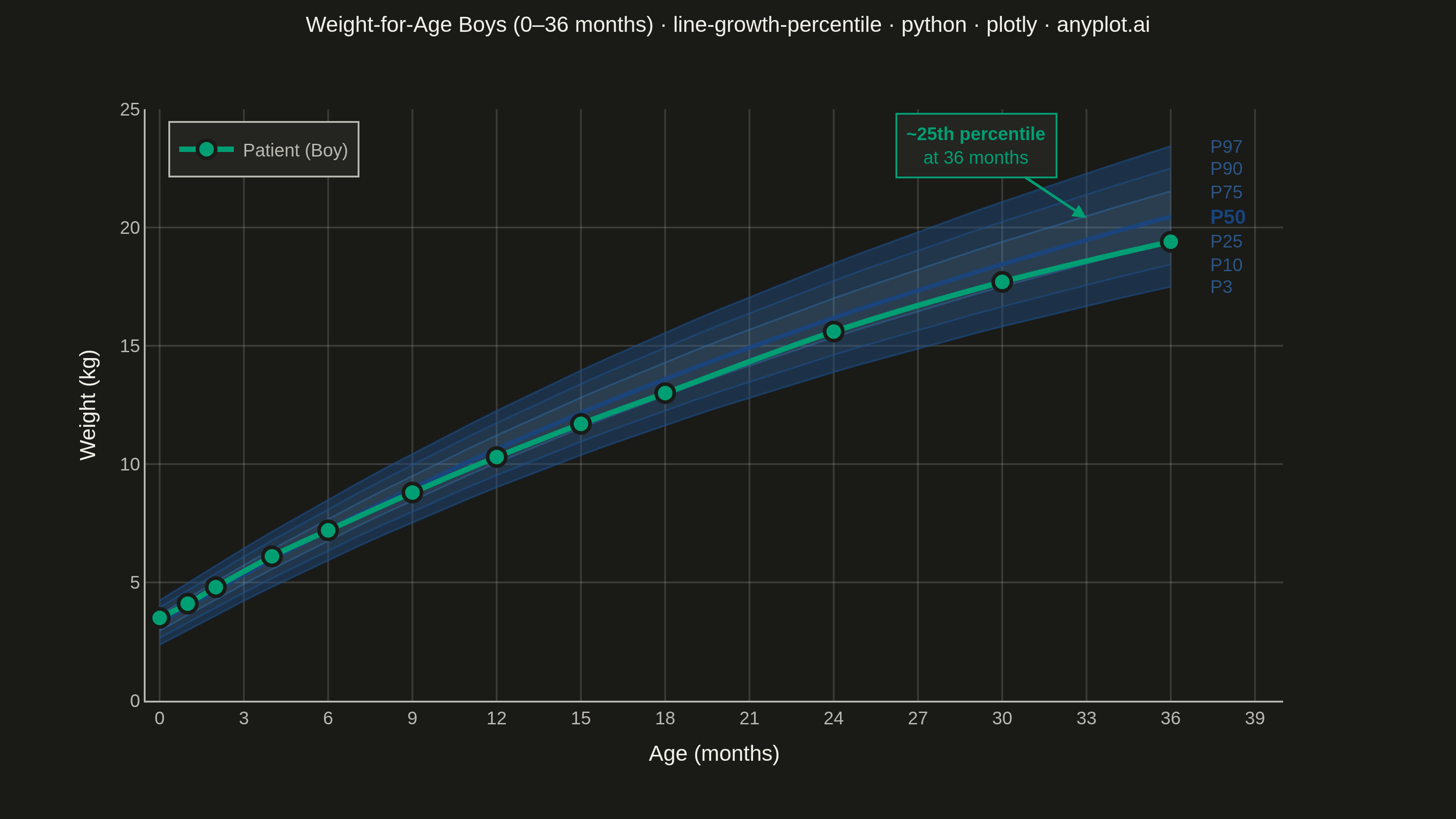
A WHO/CDC-style growth chart displaying smooth percentile curves (3rd, 10th, 25th, 50th, 75th, 90th, 97th) as colored bands, with individual patient data points overlaid and connected by a line. This chart is a standard clinical tool for monitoring child development metrics such as height, weight, or BMI across age. It enables quick visual assessment of whether a child's growth trajectory falls within expected population ranges.
""" anyplot.ai
line-growth-percentile: Pediatric Growth Chart with Percentile Curves
Library: plotly 6.8.0 | Python 3.13.14
Quality: 91/100 | Updated: 2026-06-20
"""

import os
import sys


# Prevent this file (plotly.py) from shadowing the installed plotly package
_this_dir = os.path.dirname(os.path.abspath(__file__))
sys.path = [p for p in sys.path if not p or os.path.abspath(p) != _this_dir]

import numpy as np
import plotly.graph_objects as go


# Theme-adaptive chrome — Imprint palette
THEME = os.getenv("ANYPLOT_THEME", "light")
PAGE_BG = "#FAF8F1" if THEME == "light" else "#1A1A17"
ELEVATED_BG = "#FFFDF6" if THEME == "light" else "#242420"
INK = "#1A1A17" if THEME == "light" else "#F0EFE8"
INK_SOFT = "#4A4A44" if THEME == "light" else "#B8B7B0"
GRID = "rgba(26,26,23,0.15)" if THEME == "light" else "rgba(240,239,232,0.15)"

# Imprint palette position 1 — patient overlay (primary data series)
PATIENT_COLOR = "#009E73"

# Data — WHO-style weight-for-age reference for boys (0–36 months)
np.random.seed(42)
age_months = np.arange(0, 37, 1)

# Synthetic reference curves approximating WHO weight-for-age boys (z-score multipliers)
median = 3.3 + 0.7 * age_months - 0.008 * age_months**2 + 0.00005 * age_months**3
sd = 0.5 + 0.03 * age_months

percentile_3 = median - 1.881 * sd
percentile_10 = median - 1.282 * sd
percentile_25 = median - 0.674 * sd
percentile_50 = median
percentile_75 = median + 0.674 * sd
percentile_90 = median + 1.282 * sd
percentile_97 = median + 1.881 * sd

# Individual patient — healthy boy tracked at well-child visits
patient_ages = np.array([0, 1, 2, 4, 6, 9, 12, 15, 18, 24, 30, 36])
patient_weights = np.array([3.5, 4.1, 4.8, 6.1, 7.2, 8.8, 10.3, 11.7, 13.0, 15.6, 17.7, 19.4])

# Graduated blue fills — semantic exception: spec requires blue tones for boys' chart
# Increased opacity vs previous for better band visibility
band_fills = [
    "rgba(30, 80, 140, 0.42)",  # P3–P10 (outer edge)
    "rgba(50, 110, 170, 0.35)",  # P10–P25
    "rgba(80, 145, 210, 0.30)",  # P25–P50
    "rgba(80, 145, 210, 0.30)",  # P50–P75
    "rgba(50, 110, 170, 0.35)",  # P75–P90
    "rgba(30, 80, 140, 0.42)",  # P90–P97 (outer edge)
]

# Per-trace line colors (7 entries: P3, P10, P25, P50, P75, P90, P97)
band_line_colors = [
    "rgba(30, 80, 140, 0.55)",  # P3
    "rgba(30, 80, 140, 0.55)",  # P10
    "rgba(50, 110, 170, 0.45)",  # P25
    "rgba(25, 70, 130, 0.88)",  # P50 — emphasized median
    "rgba(50, 110, 170, 0.45)",  # P75
    "rgba(30, 80, 140, 0.55)",  # P90
    "rgba(30, 80, 140, 0.55)",  # P97
]
band_widths = [1.0, 1.0, 1.0, 2.5, 1.0, 1.0, 1.0]  # P50 thicker

# Percentile data in bottom-to-top order for tonexty stacking
percentile_stack = [
    (percentile_3, "P3", None),
    (percentile_10, "P10", band_fills[0]),
    (percentile_25, "P25", band_fills[1]),
    (percentile_50, "P50", band_fills[2]),
    (percentile_75, "P75", band_fills[3]),
    (percentile_90, "P90", band_fills[4]),
    (percentile_97, "P97", band_fills[5]),
]

fig = go.Figure()

# Percentile bands — idiomatic tonexty fill stacking
for i, (pct_data, pct_label, fill_color) in enumerate(percentile_stack):
    fig.add_trace(
        go.Scatter(
            x=age_months,
            y=pct_data,
            mode="lines",
            line={"color": band_line_colors[i], "width": band_widths[i]},
            fill="tonexty" if fill_color else None,
            fillcolor=fill_color,
            showlegend=False,
            name=pct_label,
            customdata=np.column_stack([np.full_like(age_months, float(pct_label[1:])), pct_data]),
            hovertemplate=(
                "<b>P%{customdata[0]:.0f}</b><br>Age: %{x} months<br>Weight: %{customdata[1]:.1f} kg<extra></extra>"
            ),
        )
    )

# Right-margin percentile labels with anti-crowding spacing
label_data = [
    (percentile_3[-1], "P3"),
    (percentile_10[-1], "P10"),
    (percentile_25[-1], "P25"),
    (percentile_50[-1], "P50"),
    (percentile_75[-1], "P75"),
    (percentile_90[-1], "P90"),
    (percentile_97[-1], "P97"),
]
# Increased min_gap from 0.55 → 0.80 to fix crowding at lower percentiles
min_gap = 0.80
label_positions = [y for y, _ in label_data]
for i in range(1, len(label_positions)):
    if label_positions[i] - label_positions[i - 1] < min_gap:
        label_positions[i] = label_positions[i - 1] + min_gap

for (_, pct_label), y_pos in zip(label_data, label_positions, strict=False):
    is_median = pct_label == "P50"
    fig.add_annotation(
        x=37.3,
        y=y_pos,
        text=f"<b>{pct_label}</b>" if is_median else pct_label,
        showarrow=False,
        font={
            "size": 11 if is_median else 10,
            "color": "rgba(25, 70, 130, 0.95)" if is_median else "rgba(50, 100, 160, 0.80)",
            "family": "Arial",
        },
        xanchor="left",
    )

# Patient data — Imprint position 1 (green) for strong contrast against blue reference bands
fig.add_trace(
    go.Scatter(
        x=patient_ages,
        y=patient_weights,
        mode="lines+markers",
        line={"color": PATIENT_COLOR, "width": 3.0, "shape": "spline"},
        marker={"size": 10, "color": PATIENT_COLOR, "line": {"color": PAGE_BG, "width": 2}, "symbol": "circle"},
        name="Patient (Boy)",
        showlegend=True,
        customdata=np.column_stack([patient_ages, patient_weights]),
        hovertemplate=(
            "<b>Patient Visit</b><br>Age: %{customdata[0]:.0f} months<br>Weight: %{customdata[1]:.1f} kg<extra></extra>"
        ),
    )
)

# Clinical annotation — percentile position at 36 months
fig.add_annotation(
    x=33,
    y=patient_weights[-1] + 1.0,
    text="<b>~25th percentile</b><br>at 36 months",
    showarrow=True,
    arrowhead=2,
    arrowsize=1,
    arrowwidth=1.5,
    arrowcolor=PATIENT_COLOR,
    ax=-60,
    ay=-40,
    font={"size": 10, "color": PATIENT_COLOR, "family": "Arial"},
    align="center",
    bordercolor=PATIENT_COLOR,
    borderwidth=1,
    borderpad=5,
    bgcolor=ELEVATED_BG,
)

# Title — font scaled for long string (formula: round(16 * 67 / len(title)))
title_text = "Weight-for-Age Boys (0–36 months) · line-growth-percentile · python · plotly · anyplot.ai"
title_fontsize = max(10, round(16 * 67 / len(title_text)))

fig.update_layout(
    autosize=False,
    paper_bgcolor=PAGE_BG,
    plot_bgcolor=PAGE_BG,
    font={"color": INK, "family": "Arial"},
    template="plotly_white",
    title={
        "text": title_text,
        "font": {"size": title_fontsize, "color": INK},
        "x": 0.5,
        "xanchor": "center",
        "y": 0.98,
        "yanchor": "top",
    },
    xaxis={
        "title": {"text": "Age (months)", "font": {"size": 12, "color": INK}, "standoff": 10},
        "tickfont": {"size": 10, "color": INK_SOFT},
        "range": [-0.5, 40],
        "dtick": 3,
        "showgrid": True,
        "gridwidth": 1,
        "gridcolor": GRID,
        "zeroline": False,
        "linecolor": INK_SOFT,
        "tickcolor": INK_SOFT,
    },
    yaxis={
        "title": {"text": "Weight (kg)", "font": {"size": 12, "color": INK}, "standoff": 10},
        "tickfont": {"size": 10, "color": INK_SOFT},
        "range": [0, 25],
        "showgrid": True,
        "gridwidth": 1,
        "gridcolor": GRID,
        "zeroline": False,
        "linecolor": INK_SOFT,
        "tickcolor": INK_SOFT,
    },
    legend={
        "font": {"size": 10, "color": INK_SOFT},
        "x": 0.02,
        "y": 0.98,
        "bgcolor": ELEVATED_BG,
        "bordercolor": INK_SOFT,
        "borderwidth": 1,
    },
    hovermode="closest",
    hoverlabel={"font": {"size": 10}, "bgcolor": ELEVATED_BG},
    margin={"l": 80, "r": 95, "t": 60, "b": 65},
)

# Save — 3200×1800 landscape (width=800, height=450, scale=4)
fig.write_image(f"plot-{THEME}.png", width=800, height=450, scale=4)
fig.write_html(f"plot-{THEME}.html", include_plotlyjs="cdn", config={"displayModeBar": True, "scrollZoom": True})
Runnable source as JSON, for any HTTP client: https://api.anyplot.ai/specs/line-growth-percentile/plotly/code. Any spec id and library id listed in llms-full.txt fit the same URL shape; every URL below is complete and callable.
{
  "spec_id": "line-growth-percentile",
  "language": "python",
  "library": "plotly",
  "page": "https://anyplot.ai/line-growth-percentile/python/plotly",
  "hub": "https://anyplot.ai/line-growth-percentile",
  "code_json": "https://api.anyplot.ai/specs/line-growth-percentile/plotly/code",
  "spec_json": "https://api.anyplot.ai/specs/line-growth-percentile",
  "render_light_png": "https://storage.googleapis.com/anyplot-images/plots/line-growth-percentile/python/plotly/plot-light.png",
  "render_dark_png": "https://storage.googleapis.com/anyplot-images/plots/line-growth-percentile/python/plotly/plot-dark.png",
  "interactive_light_html": "https://storage.googleapis.com/anyplot-images/plots/line-growth-percentile/python/plotly/plot-light.html",
  "interactive_dark_html": "https://storage.googleapis.com/anyplot-images/plots/line-growth-percentile/python/plotly/plot-dark.html",
  "quality_score": 91.0,
  "license": "MIT",
  "guide": "https://anyplot.ai/llms.txt"
}
Part of Pediatric Growth Chart with Percentile Curves on anyplot.ai.