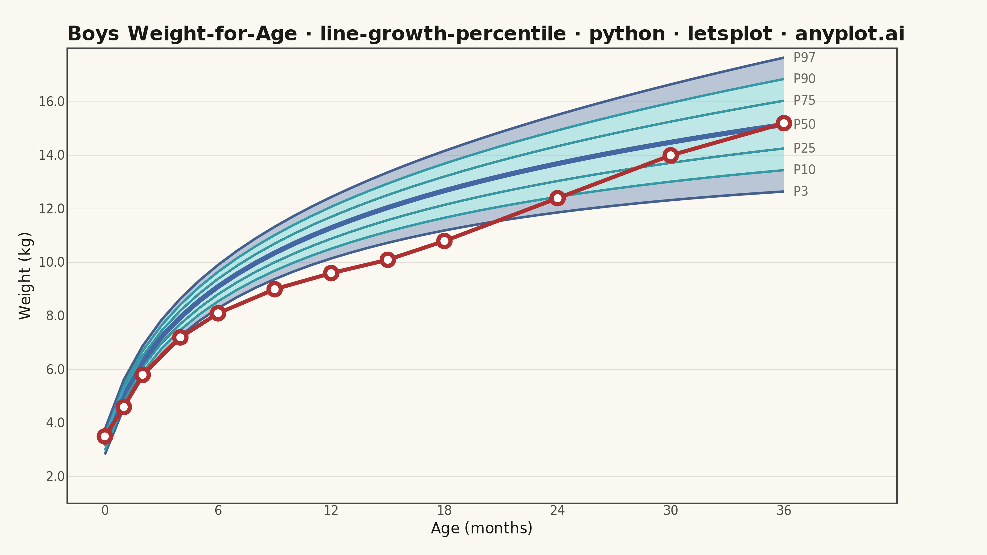
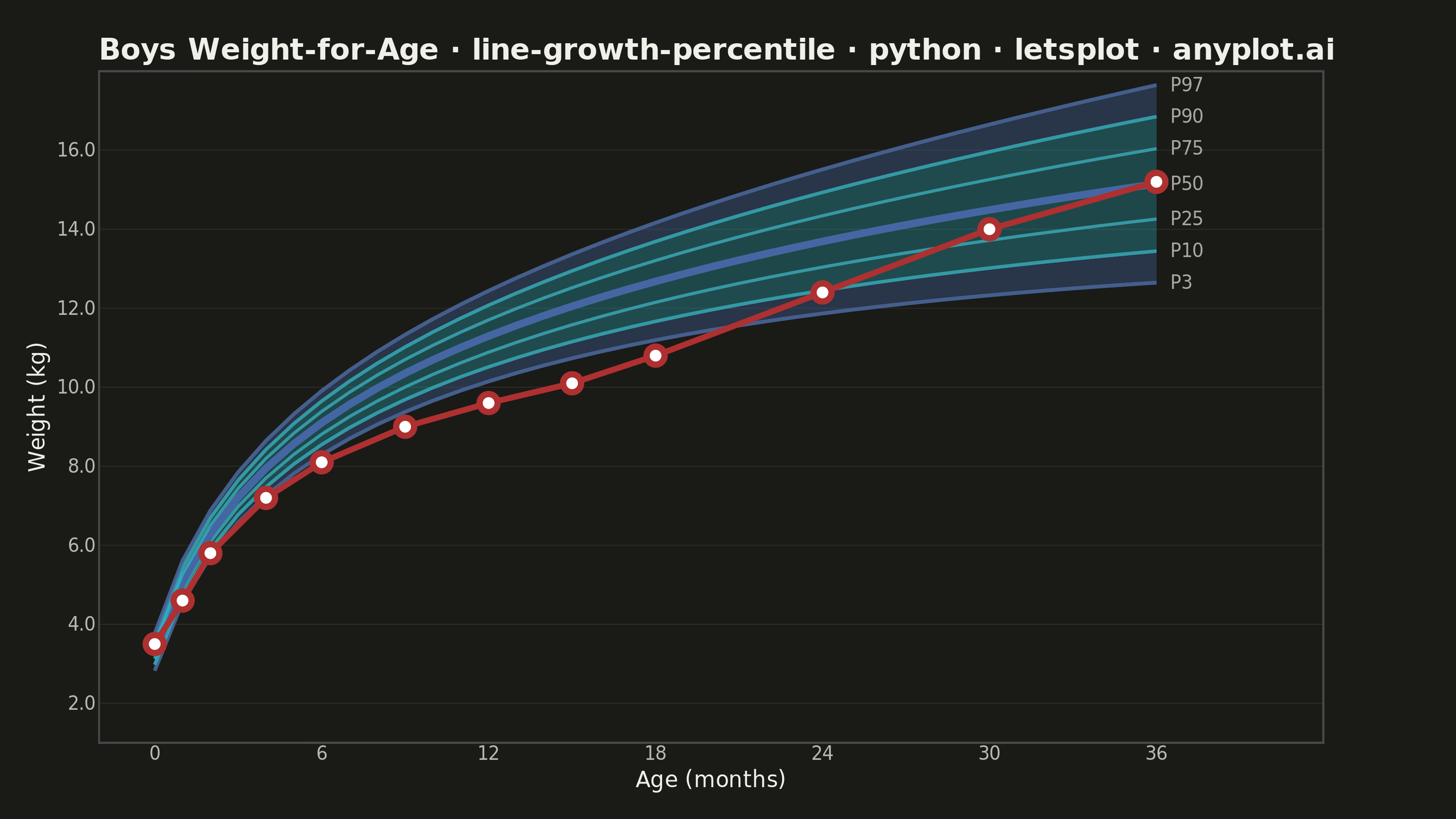
A WHO/CDC-style growth chart displaying smooth percentile curves (3rd, 10th, 25th, 50th, 75th, 90th, 97th) as colored bands, with individual patient data points overlaid and connected by a line. This chart is a standard clinical tool for monitoring child development metrics such as height, weight, or BMI across age. It enables quick visual assessment of whether a child's growth trajectory falls within expected population ranges.
""" anyplot.ai
line-growth-percentile: Pediatric Growth Chart with Percentile Curves
Library: letsplot 4.10.1 | Python 3.13.14
Quality: 91/100 | Updated: 2026-06-20
"""
# ruff: noqa: F405

import os

import numpy as np
import pandas as pd
from lets_plot import *


LetsPlot.setup_html()

# Theme-adaptive chrome tokens
THEME = os.getenv("ANYPLOT_THEME", "light")
PAGE_BG = "#FAF8F1" if THEME == "light" else "#1A1A17"
ELEVATED_BG = "#FFFDF6" if THEME == "light" else "#242420"
INK = "#1A1A17" if THEME == "light" else "#F0EFE8"
INK_SOFT = "#4A4A44" if THEME == "light" else "#B8B7B0"
INK_MUTED = "#6B6A63" if THEME == "light" else "#A8A79F"
GRID = "#E0DDD6" if THEME == "light" else "#2E2E2A"

# Imprint categorical palette — positions used by name, not ordinal
IMPRINT_PALETTE = ["#009E73", "#C475FD", "#4467A3", "#BD8233", "#AE3030", "#2ABCCD", "#954477", "#99B314"]
# Patient trajectory: Imprint position 5 (matte red — semantic: clinical concern / growth faltering)
PATIENT_COLOR = IMPRINT_PALETTE[4]  # "#AE3030"

# ---------------------------------------------------------------------------
# Data — WHO-approximated weight-for-age for boys 0-36 months
# ---------------------------------------------------------------------------
np.random.seed(42)
age_months = np.arange(0, 37, 1)

# Smooth log-growth approximating WHO median for boys
percentile_50 = 3.3 + 3.8 * np.log1p(age_months * 0.6)

# SD widens with age (heteroscedastic spread)
spread = 0.25 + 0.03 * age_months
percentile_3 = percentile_50 - 1.88 * spread
percentile_10 = percentile_50 - 1.28 * spread
percentile_25 = percentile_50 - 0.67 * spread
percentile_75 = percentile_50 + 0.67 * spread
percentile_90 = percentile_50 + 1.28 * spread
percentile_97 = percentile_50 + 1.88 * spread

# Individual patient — growth faltering episode (months 9–18) then catch-up
patient_ages = np.array([0, 1, 2, 4, 6, 9, 12, 15, 18, 24, 30, 36])
patient_weights = np.array([3.5, 4.6, 5.8, 7.2, 8.1, 9.0, 9.6, 10.1, 10.8, 12.4, 14.0, 15.2])

df_bands = pd.DataFrame(
    {
        "age": age_months,
        "p3": percentile_3,
        "p10": percentile_10,
        "p25": percentile_25,
        "p50": percentile_50,
        "p75": percentile_75,
        "p90": percentile_90,
        "p97": percentile_97,
    }
)

p50_at_patient = np.interp(patient_ages, age_months, percentile_50)
p25_at_patient = np.interp(patient_ages, age_months, percentile_25)
p75_at_patient = np.interp(patient_ages, age_months, percentile_75)
df_patient = pd.DataFrame(
    {
        "age": patient_ages,
        "weight": patient_weights,
        "p50_ref": np.round(p50_at_patient, 1),
        "p25_ref": np.round(p25_at_patient, 1),
        "p75_ref": np.round(p75_at_patient, 1),
    }
)

# Right-margin percentile labels
label_x = 36.5
df_labels = pd.DataFrame(
    {
        "age": [label_x] * 7,
        "weight": [
            percentile_3[-1],
            percentile_10[-1],
            percentile_25[-1],
            percentile_50[-1],
            percentile_75[-1],
            percentile_90[-1],
            percentile_97[-1],
        ],
        "label": ["P3", "P10", "P25", "P50", "P75", "P90", "P97"],
    }
)

# ---------------------------------------------------------------------------
# Color scheme — Imprint palette members for boys convention, graduated by proximity to median
# Outer extremes: Imprint blue (#4467A3, slot 3); inner/mid: Imprint cyan (#2ABCCD, slot 6)
# ---------------------------------------------------------------------------
blue_outer = IMPRINT_PALETTE[2]  # "#4467A3" — extreme percentiles (P3, P97)
blue_mid = IMPRINT_PALETTE[5]  # "#2ABCCD" — mid bands (P10, P90)
blue_inner = IMPRINT_PALETTE[5]  # "#2ABCCD" — inner band (P25, P75), lower alpha → appears lighter
blue_median = IMPRINT_PALETTE[2]  # "#4467A3" — median P50 line

# Rich tooltips — lets-plot-native structured interactivity
patient_tooltips = (
    layer_tooltips()
    .title("Patient Visit")
    .line("Age|@age months")
    .line("Weight|@weight kg")
    .line("P50 ref|@p50_ref kg")
    .line("P25–P75|@p25_ref – @p75_ref kg")
)

# ---------------------------------------------------------------------------
# Plot
# ---------------------------------------------------------------------------
plot = (
    ggplot()
    # Percentile bands — graduated opacity (darker at extremes, lighter near median)
    + geom_ribbon(aes(x="age", ymin="p3", ymax="p10"), data=df_bands, fill=blue_outer, alpha=0.35, tooltips="none")
    + geom_ribbon(aes(x="age", ymin="p90", ymax="p97"), data=df_bands, fill=blue_outer, alpha=0.35, tooltips="none")
    + geom_ribbon(aes(x="age", ymin="p10", ymax="p25"), data=df_bands, fill=blue_mid, alpha=0.30, tooltips="none")
    + geom_ribbon(aes(x="age", ymin="p75", ymax="p90"), data=df_bands, fill=blue_mid, alpha=0.30, tooltips="none")
    + geom_ribbon(aes(x="age", ymin="p25", ymax="p75"), data=df_bands, fill=blue_inner, alpha=0.28, tooltips="none")
    # Percentile boundary lines — improved visibility
    + geom_line(aes(x="age", y="p3"), data=df_bands, color=blue_outer, size=0.9, alpha=0.75, tooltips="none")
    + geom_line(aes(x="age", y="p10"), data=df_bands, color=blue_mid, size=0.8, alpha=0.70, tooltips="none")
    + geom_line(aes(x="age", y="p25"), data=df_bands, color=blue_inner, size=0.7, alpha=0.70, tooltips="none")
    + geom_line(aes(x="age", y="p50"), data=df_bands, color=blue_median, size=1.8, tooltips="none")
    + geom_line(aes(x="age", y="p75"), data=df_bands, color=blue_inner, size=0.7, alpha=0.70, tooltips="none")
    + geom_line(aes(x="age", y="p90"), data=df_bands, color=blue_mid, size=0.8, alpha=0.70, tooltips="none")
    + geom_line(aes(x="age", y="p97"), data=df_bands, color=blue_outer, size=0.9, alpha=0.75, tooltips="none")
    # Patient trajectory — Imprint #AE3030 (semantic: clinical growth concern)
    + geom_line(aes(x="age", y="weight"), data=df_patient, color=PATIENT_COLOR, size=1.4, tooltips="none")
    + geom_point(
        aes(x="age", y="weight"),
        data=df_patient,
        color=PATIENT_COLOR,
        fill="white",
        shape=21,
        size=3.0,
        stroke=1.5,
        tooltips=patient_tooltips,
    )
    # Right-margin percentile labels
    + geom_text(
        aes(x="age", y="weight", label="label"), data=df_labels, size=5, color=INK_MUTED, hjust=0, tooltips="none"
    )
    # Axis formatting
    + scale_x_continuous(breaks=list(range(0, 37, 6)), limits=[0, 40], format="{d}")
    + scale_y_continuous(format=".1f")
    + coord_cartesian(ylim=[1, 18])
    + labs(
        title="Boys Weight-for-Age · line-growth-percentile · python · letsplot · anyplot.ai",
        x="Age (months)",
        y="Weight (kg)",
    )
    + theme_minimal()
    + theme(
        plot_background=element_rect(fill=PAGE_BG, color=PAGE_BG),
        panel_background=element_rect(fill=PAGE_BG),
        plot_title=element_text(size=16, face="bold", color=INK),
        axis_title=element_text(size=12, color=INK),
        axis_text=element_text(size=10, color=INK_SOFT),
        axis_line=element_line(color=INK_SOFT, size=0.4),
        panel_grid_major_x=element_blank(),
        panel_grid_minor=element_blank(),
        panel_grid_major_y=element_line(color=GRID, size=0.4),
        legend_position="none",
        plot_margin=[20, 70, 15, 15],
    )
    + ggsize(800, 450)
)

# Save both PNG and HTML (interactive) — theme-suffixed
ggsave(plot, f"plot-{THEME}.png", path=".", scale=4)
ggsave(plot, f"plot-{THEME}.html", path=".")
Runnable source as JSON, for any HTTP client: https://api.anyplot.ai/specs/line-growth-percentile/letsplot/code. Any spec id and library id listed in llms-full.txt fit the same URL shape; every URL below is complete and callable.
{
  "spec_id": "line-growth-percentile",
  "language": "python",
  "library": "letsplot",
  "page": "https://anyplot.ai/line-growth-percentile/python/letsplot",
  "hub": "https://anyplot.ai/line-growth-percentile",
  "code_json": "https://api.anyplot.ai/specs/line-growth-percentile/letsplot/code",
  "spec_json": "https://api.anyplot.ai/specs/line-growth-percentile",
  "render_light_png": "https://storage.googleapis.com/anyplot-images/plots/line-growth-percentile/python/letsplot/plot-light.png",
  "render_dark_png": "https://storage.googleapis.com/anyplot-images/plots/line-growth-percentile/python/letsplot/plot-dark.png",
  "interactive_light_html": "https://storage.googleapis.com/anyplot-images/plots/line-growth-percentile/python/letsplot/plot-light.html",
  "interactive_dark_html": "https://storage.googleapis.com/anyplot-images/plots/line-growth-percentile/python/letsplot/plot-dark.html",
  "quality_score": 91.0,
  "license": "MIT",
  "guide": "https://anyplot.ai/llms.txt"
}
Part of Pediatric Growth Chart with Percentile Curves on anyplot.ai.