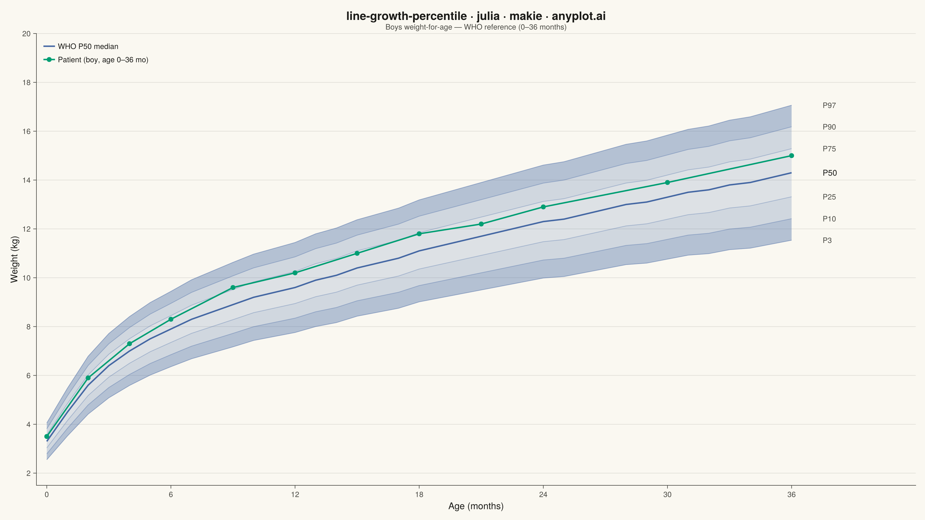
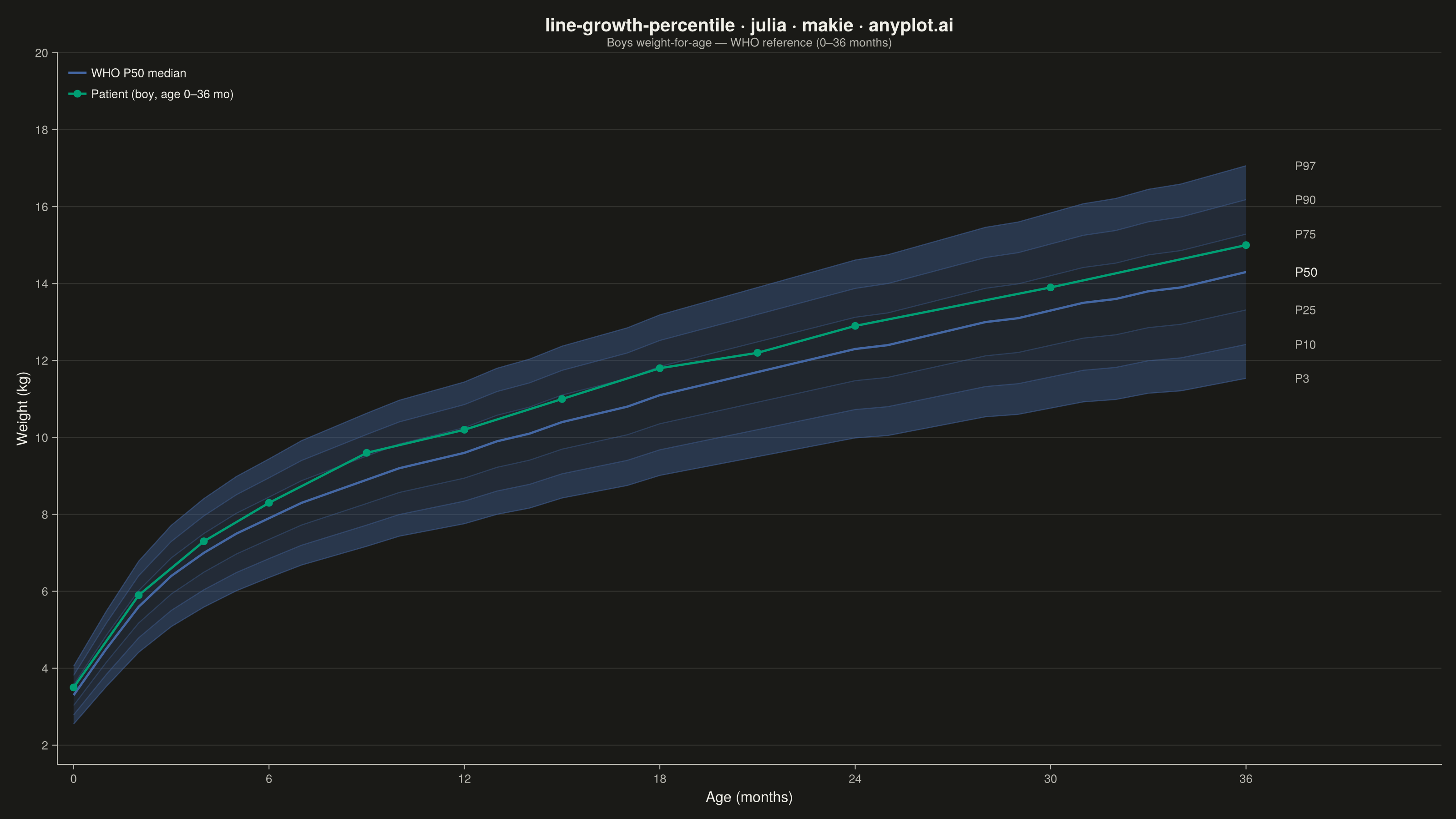
A WHO/CDC-style growth chart displaying smooth percentile curves (3rd, 10th, 25th, 50th, 75th, 90th, 97th) as colored bands, with individual patient data points overlaid and connected by a line. This chart is a standard clinical tool for monitoring child development metrics such as height, weight, or BMI across age. It enables quick visual assessment of whether a child's growth trajectory falls within expected population ranges.
# anyplot.ai
# line-growth-percentile: Pediatric Growth Chart with Percentile Curves
# Library: makie 0.22.10 | Julia 1.11.9
# Quality: 89/100 | Created: 2026-06-20

using CairoMakie
using Colors

# Theme tokens
const THEME       = get(ENV, "ANYPLOT_THEME", "light")
const PAGE_BG     = THEME == "light" ? colorant"#FAF8F1" : colorant"#1A1A17"
const ELEVATED_BG = THEME == "light" ? colorant"#FFFDF6" : colorant"#242420"
const INK         = THEME == "light" ? colorant"#1A1A17" : colorant"#F0EFE8"
const INK_SOFT    = THEME == "light" ? colorant"#4A4A44" : colorant"#B8B7B0"

# Imprint palette — first series always #009E73
const IMPRINT_PALETTE = [
    colorant"#009E73",  # 1 brand green
    colorant"#C475FD",  # 2 lavender
    colorant"#4467A3",  # 3 blue
    colorant"#BD8233",  # 4 ochre
    colorant"#AE3030",  # 5 matte red
    colorant"#2ABCCD",  # 6 cyan
    colorant"#954477",  # 7 rose
    colorant"#99B314",  # 8 lime
]

# Boys chart: Imprint blue for bands (semantic sky/water → blue)
const BAND_COLOR    = colorant"#4467A3"  # Imprint position 3
const PATIENT_COLOR = colorant"#009E73"  # Imprint position 1 — brand green, contrasting

# --- Data ---
# Approximate WHO weight-for-age reference for boys (0–36 months)
ages = collect(Float64, 0:36)

# P50 median weight (kg)
p50 = [
     3.3,  4.5,  5.6,  6.4,  7.0,  7.5,  7.9,  8.3,  8.6,  8.9,
     9.2,  9.4,  9.6,  9.9, 10.1, 10.4, 10.6, 10.8, 11.1, 11.3,
    11.5, 11.7, 11.9, 12.1, 12.3, 12.4, 12.6, 12.8, 13.0, 13.1,
    13.3, 13.5, 13.6, 13.8, 13.9, 14.1, 14.3,
]

# SD (kg) — grows with age
sd = [
    0.40, 0.52, 0.63, 0.70, 0.75, 0.79, 0.82, 0.86, 0.89, 0.92,
    0.94, 0.96, 0.98, 1.01, 1.03, 1.05, 1.07, 1.09, 1.11, 1.13,
    1.15, 1.17, 1.19, 1.21, 1.23, 1.25, 1.27, 1.29, 1.31, 1.33,
    1.35, 1.37, 1.39, 1.41, 1.43, 1.45, 1.47,
]

# Percentile curves via z-score offsets
p3  = p50 .- 1.88 .* sd
p10 = p50 .- 1.28 .* sd
p25 = p50 .- 0.67 .* sd
p75 = p50 .+ 0.67 .* sd
p90 = p50 .+ 1.28 .* sd
p97 = p50 .+ 1.88 .* sd

# Individual patient: boy tracking near 65th percentile across well-child visits
patient_ages   = Float64[0, 2, 4, 6, 9, 12, 15, 18, 21, 24, 30, 36]
patient_weight = [3.5, 5.9, 7.3, 8.3, 9.6, 10.2, 11.0, 11.8, 12.2, 12.9, 13.9, 15.0]

# --- Plot ---
title_str = "line-growth-percentile · julia · makie · anyplot.ai"

fig = Figure(
    size            = (1600, 900),
    fontsize        = 14,
    backgroundcolor = PAGE_BG,
)

ax = Axis(
    fig[1, 1];
    title              = title_str,
    titlesize          = 20,
    titlecolor         = INK,
    subtitle           = "Boys weight-for-age — WHO reference (0–36 months)",
    subtitlecolor      = INK_SOFT,
    subtitlesize       = 13,
    xlabel             = "Age (months)",
    ylabel             = "Weight (kg)",
    xlabelsize         = 16,
    ylabelsize         = 16,
    xlabelcolor        = INK,
    ylabelcolor        = INK,
    xticklabelsize     = 13,
    yticklabelsize     = 13,
    xticklabelcolor    = INK_SOFT,
    yticklabelcolor    = INK_SOFT,
    xtickcolor         = INK_SOFT,
    ytickcolor         = INK_SOFT,
    backgroundcolor    = PAGE_BG,
    topspinevisible    = false,
    rightspinevisible  = false,
    leftspinecolor     = INK_SOFT,
    bottomspinecolor   = INK_SOFT,
    xgridvisible       = false,
    ygridvisible       = true,
    ygridcolor         = RGBAf(INK.r, INK.g, INK.b, 0.12),
    xticks             = 0:6:36,
    yticks             = 2:2:20,
)

# Extend x-axis right to leave room for percentile labels
xlims!(ax, -0.5, 42.0)
ylims!(ax, 1.5, 20.0)

# Percentile bands — graduated: outer bands darker, inner bands lighter
band!(ax, ages, p3,  p10; color = (BAND_COLOR, 0.38))
band!(ax, ages, p10, p25; color = (BAND_COLOR, 0.23))
band!(ax, ages, p25, p50; color = (BAND_COLOR, 0.16))
band!(ax, ages, p50, p75; color = (BAND_COLOR, 0.16))
band!(ax, ages, p75, p90; color = (BAND_COLOR, 0.23))
band!(ax, ages, p90, p97; color = (BAND_COLOR, 0.38))

# Non-median percentile curves (thin)
for (crv, alpha) in [
    (p3, 0.50), (p10, 0.40), (p25, 0.35),
    (p75, 0.35), (p90, 0.40), (p97, 0.50),
]
    lines!(ax, ages, crv; color = (BAND_COLOR, alpha), linewidth = 1.2)
end

# Median (P50) — emphasized and labeled in legend
lines!(ax, ages, p50; color = BAND_COLOR, linewidth = 2.5, label = "WHO P50 median")

# Patient data — connected scatter
scatterlines!(
    ax, patient_ages, patient_weight;
    color      = PATIENT_COLOR,
    linewidth  = 2.5,
    markersize = 12,
    label      = "Patient (boy, age 0–36 mo)",
)

# Percentile labels on right margin
label_x = 37.5
for (lbl, yv) in [
    ("P3",  p3[end]),  ("P10", p10[end]), ("P25", p25[end]),
    ("P50", p50[end]), ("P75", p75[end]), ("P90", p90[end]), ("P97", p97[end]),
]
    lbl_color = lbl == "P50" ? INK : INK_SOFT
    lbl_size  = lbl == "P50" ? 14  : 13
    text!(ax, label_x, yv;
          text     = lbl,
          color    = lbl_color,
          fontsize = lbl_size,
          align    = (:left, :center),
    )
end

# Legend
axislegend(ax;
    position        = :lt,
    backgroundcolor = ELEVATED_BG,
    framecolor      = INK_SOFT,
    labelcolor      = INK,
    labelsize       = 13,
    framevisible    = false,
)

# --- Save ---
save("plot-$(THEME).png", fig; px_per_unit = 2)
Runnable source as JSON, for any HTTP client: https://api.anyplot.ai/specs/line-growth-percentile/makie/code. Any spec id and library id listed in llms-full.txt fit the same URL shape; every URL below is complete and callable.
{
  "spec_id": "line-growth-percentile",
  "language": "julia",
  "library": "makie",
  "page": "https://anyplot.ai/line-growth-percentile/julia/makie",
  "hub": "https://anyplot.ai/line-growth-percentile",
  "code_json": "https://api.anyplot.ai/specs/line-growth-percentile/makie/code",
  "spec_json": "https://api.anyplot.ai/specs/line-growth-percentile",
  "render_light_png": "https://storage.googleapis.com/anyplot-images/plots/line-growth-percentile/julia/makie/plot-light.png",
  "render_dark_png": "https://storage.googleapis.com/anyplot-images/plots/line-growth-percentile/julia/makie/plot-dark.png",
  "quality_score": 89.0,
  "license": "MIT",
  "guide": "https://anyplot.ai/llms.txt"
}
Part of Pediatric Growth Chart with Percentile Curves on anyplot.ai.