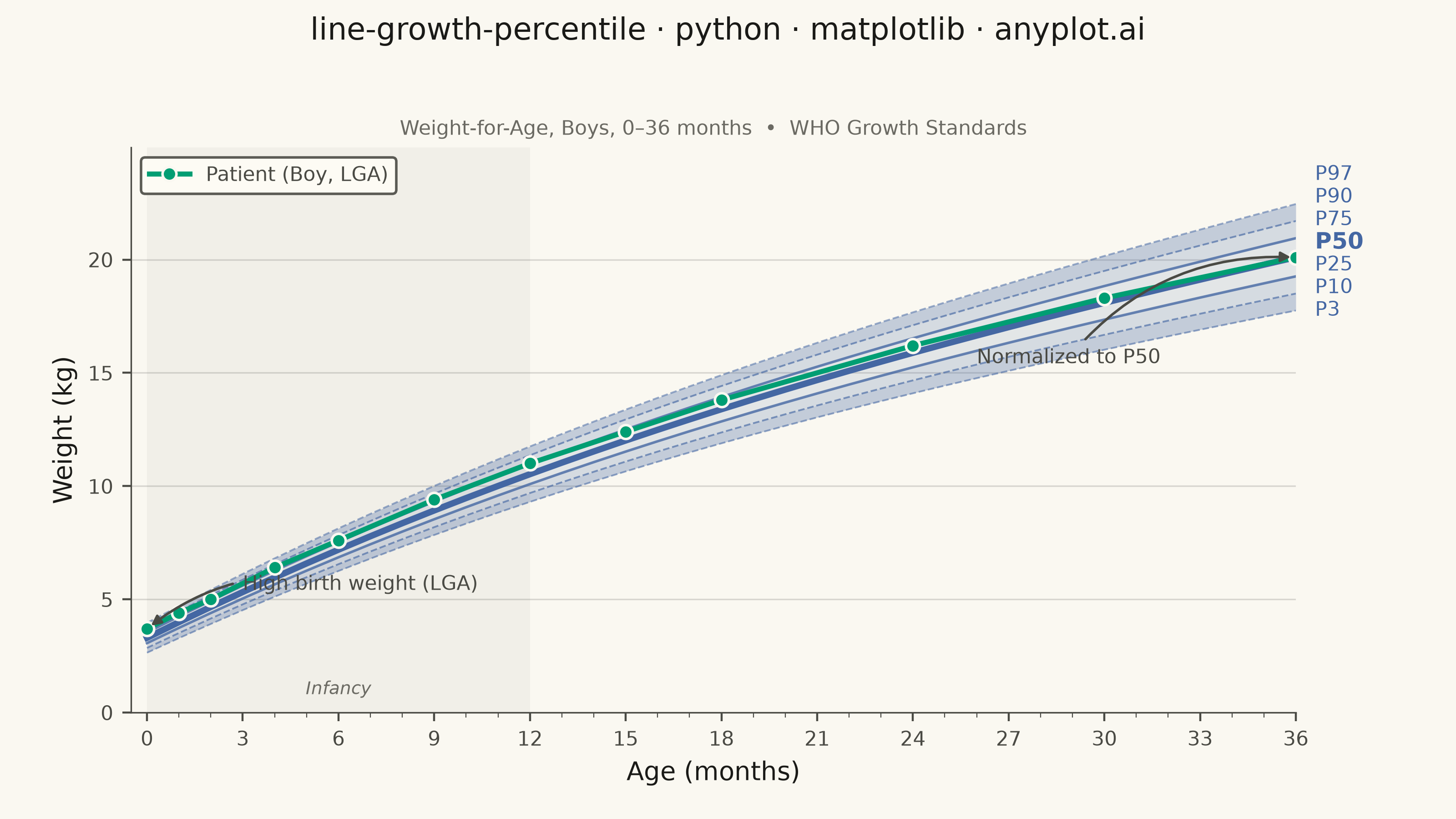
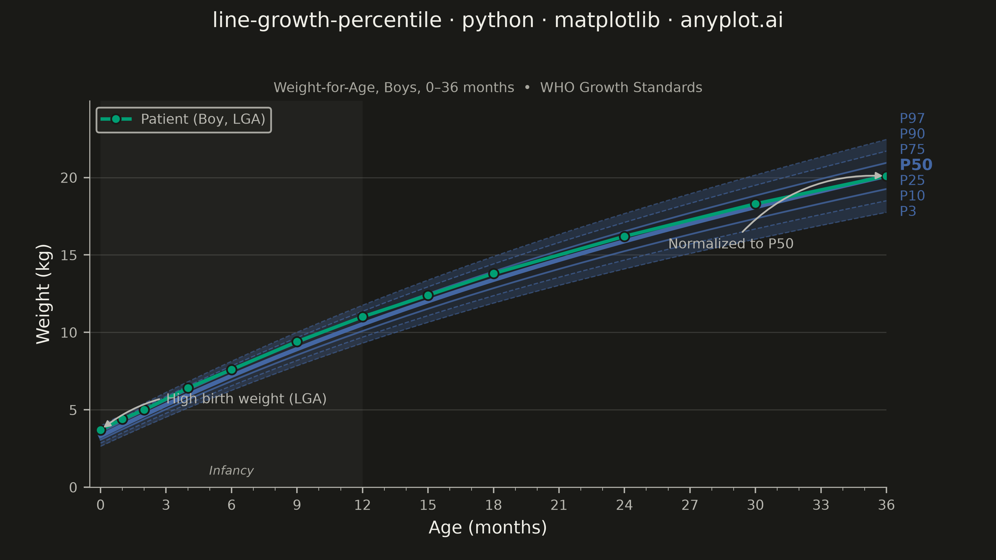
A WHO/CDC-style growth chart displaying smooth percentile curves (3rd, 10th, 25th, 50th, 75th, 90th, 97th) as colored bands, with individual patient data points overlaid and connected by a line. This chart is a standard clinical tool for monitoring child development metrics such as height, weight, or BMI across age. It enables quick visual assessment of whether a child's growth trajectory falls within expected population ranges.
""" anyplot.ai
line-growth-percentile: Pediatric Growth Chart with Percentile Curves
Library: matplotlib 3.11.0 | Python 3.13.14
Quality: 89/100 | Updated: 2026-06-20
"""

import os
import sys


# Remove the script's own directory from sys.path so "import matplotlib" finds
# the installed package rather than this file (which shares its name).
if sys.path and sys.path[0] != "":
    sys.path.pop(0)

import matplotlib.pyplot as plt
import matplotlib.ticker as ticker
import numpy as np


# Theme-adaptive chrome — Imprint palette design system
THEME = os.getenv("ANYPLOT_THEME", "light")
PAGE_BG = "#FAF8F1" if THEME == "light" else "#1A1A17"
ELEVATED_BG = "#FFFDF6" if THEME == "light" else "#242420"
INK = "#1A1A17" if THEME == "light" else "#F0EFE8"
INK_SOFT = "#4A4A44" if THEME == "light" else "#B8B7B0"
INK_MUTED = "#6B6A63" if THEME == "light" else "#A8A79F"

# Imprint palette — 8 hues, theme-independent, hybrid-v3 sort
IMPRINT_PALETTE = ["#009E73", "#C475FD", "#4467A3", "#BD8233", "#AE3030", "#2ABCCD", "#954477", "#99B314"]
BLUE = IMPRINT_PALETTE[2]  # #4467A3 — Imprint blue, position 3; boys-blue semantic exception

# --- Data ---
# Synthetic WHO-like weight-for-age reference for boys 0–36 months
age_months = np.arange(0, 37, 1)
median_weight = 3.3 + 0.7 * age_months - 0.009 * age_months**2 + 0.00007 * age_months**3
sd = 0.35 + 0.025 * age_months

z_scores = {"P3": -1.881, "P10": -1.282, "P25": -0.674, "P50": 0.0, "P75": 0.674, "P90": 1.282, "P97": 1.881}
percentiles = {label: median_weight + z * sd for label, z in z_scores.items()}

# Patient: large-for-gestational-age (LGA) boy normalizing toward the median.
# z-score trajectory: z=1.0 at birth (≈P84) → z=0.0 at 36 months (P50).
# Computed via: patient = median(t) + z(t) * sd(t), z(t) = 1 – t/36.
patient_ages = np.array([0, 1, 2, 4, 6, 9, 12, 15, 18, 24, 30, 36])
patient_weights = np.array([3.7, 4.4, 5.0, 6.4, 7.6, 9.4, 11.0, 12.4, 13.8, 16.2, 18.3, 20.1])

# --- Canvas: landscape 3200×1800 px — prompts/library/matplotlib.md "Canvas" ---
fig, ax = plt.subplots(figsize=(8, 4.5), dpi=400, facecolor=PAGE_BG)
ax.set_facecolor(PAGE_BG)

# --- Developmental phase shading (axvspan — distinctive matplotlib feature) ---
ax.axvspan(0, 12, color=INK, alpha=0.04, linewidth=0, zorder=0)
ax.text(
    6,
    0.025,
    "Infancy",
    transform=ax.get_xaxis_transform(),
    fontsize=7,
    color=INK_MUTED,
    ha="center",
    va="bottom",
    style="italic",
)

# --- Percentile bands: Imprint #4467A3 at varied alpha (boys-blue semantic exception) ---
band_pairs = [("P3", "P10"), ("P10", "P25"), ("P25", "P75"), ("P75", "P90"), ("P90", "P97")]
band_alphas = [0.30, 0.20, 0.12, 0.20, 0.30]

for (lower, upper), alpha in zip(band_pairs, band_alphas, strict=True):
    ax.fill_between(age_months, percentiles[lower], percentiles[upper], color=BLUE, alpha=alpha, linewidth=0)

# --- Percentile curves ---
percentile_labels = ["P3", "P10", "P25", "P50", "P75", "P90", "P97"]
line_widths = [0.7, 0.7, 1.0, 2.5, 1.0, 0.7, 0.7]
line_styles = ["--", "--", "-", "-", "-", "--", "--"]
curve_alphas = [0.55, 0.65, 0.80, 1.0, 0.80, 0.65, 0.55]

for label, lw, ls, alpha in zip(percentile_labels, line_widths, line_styles, curve_alphas, strict=True):
    ax.plot(age_months, percentiles[label], linewidth=lw, linestyle=ls, color=BLUE, alpha=alpha)

# --- Percentile labels on right margin with collision avoidance ---
# Prevents compression when adjacent percentile curves are close at the chart edge.
pct_y_true = {label: float(percentiles[label][-1]) for label in percentile_labels}
sorted_pct = sorted(percentile_labels, key=lambda lbl: pct_y_true[lbl])

MIN_SEP = 1.0  # minimum kg between adjacent labels (≈ label height at fontsize=8)
pct_y_adj: dict[str, float] = {}
prev_label = None
for label in sorted_pct:
    y = pct_y_true[label]
    if prev_label is not None and pct_y_adj[prev_label] + MIN_SEP > y:
        y = pct_y_adj[prev_label] + MIN_SEP
    pct_y_adj[label] = y
    prev_label = label

for label in percentile_labels:
    fw = "bold" if label == "P50" else "normal"
    fs = 9 if label == "P50" else 8
    ax.annotate(
        label,
        xy=(36, pct_y_true[label]),
        xytext=(36.6, pct_y_adj[label]),
        fontsize=fs,
        fontweight=fw,
        color=BLUE,
        va="center",
        ha="left",
        annotation_clip=False,
    )

# --- Patient trajectory: LGA normalization ---
ax.plot(
    patient_ages,
    patient_weights,
    marker="o",
    markersize=5.5,
    linewidth=2.0,
    color=IMPRINT_PALETTE[0],  # Imprint green — first categorical series
    markerfacecolor=IMPRINT_PALETTE[0],
    markeredgecolor=PAGE_BG,
    markeredgewidth=1.0,
    zorder=5,
    label="Patient (Boy, LGA)",
)

# --- Clinical annotations — both in INK_SOFT, avoiding red-green CVD pairing ---
ax.annotate(
    "High birth weight (LGA)",
    xy=(0, patient_weights[0]),
    xytext=(3.0, patient_weights[0] + 1.5),
    fontsize=8,
    color=INK_SOFT,
    arrowprops={"arrowstyle": "-|>", "color": INK_SOFT, "lw": 1.0, "connectionstyle": "arc3,rad=0.25"},
    va="bottom",
    ha="left",
    zorder=6,
)

ax.annotate(
    "Normalized to P50",
    xy=(36, patient_weights[-1]),
    xytext=(26, patient_weights[-1] - 4.0),
    fontsize=8,
    color=INK_SOFT,
    arrowprops={"arrowstyle": "-|>", "color": INK_SOFT, "lw": 1.0, "connectionstyle": "arc3,rad=-0.25"},
    va="top",
    ha="left",
    zorder=6,
)

# --- Chrome ---
title = "line-growth-percentile · python · matplotlib · anyplot.ai"
title_fontsize = max(8, round(12 * 67 / len(title))) if len(title) > 67 else 12
fig.suptitle(title, fontsize=title_fontsize, fontweight="medium", color=INK, y=0.98)

ax.set_title("Weight-for-Age, Boys, 0–36 months  •  WHO Growth Standards", fontsize=8, color=INK_MUTED, pad=5)

ax.set_xlabel("Age (months)", fontsize=10, color=INK)
ax.set_ylabel("Weight (kg)", fontsize=10, color=INK)
ax.tick_params(axis="both", labelsize=8, colors=INK_SOFT, labelcolor=INK_SOFT)

ax.set_xlim(-0.5, 36)
ax.set_xticks(np.arange(0, 37, 3))
ax.xaxis.set_minor_locator(ticker.MultipleLocator(1))
ax.tick_params(axis="x", which="minor", length=2, width=0.4, colors=INK_SOFT)

y_max = float(percentiles["P97"][-1]) + 2.5
ax.set_ylim(0, y_max)

ax.spines["top"].set_visible(False)
ax.spines["right"].set_visible(False)
ax.spines["left"].set_color(INK_SOFT)
ax.spines["left"].set_linewidth(0.6)
ax.spines["bottom"].set_color(INK_SOFT)
ax.spines["bottom"].set_linewidth(0.6)

ax.yaxis.grid(True, alpha=0.15, linewidth=0.6, color=INK)
ax.set_axisbelow(True)

leg = ax.legend(fontsize=8, loc="upper left", framealpha=0.9)
if leg:
    leg.get_frame().set_facecolor(ELEVATED_BG)
    leg.get_frame().set_edgecolor(INK_SOFT)
    plt.setp(leg.get_texts(), color=INK_SOFT)

# Right margin reserves space for percentile labels; top for two title lines
fig.subplots_adjust(left=0.09, right=0.89, top=0.82, bottom=0.13)

plt.savefig(f"plot-{THEME}.png", dpi=400, facecolor=PAGE_BG)
Runnable source as JSON, for any HTTP client: https://api.anyplot.ai/specs/line-growth-percentile/matplotlib/code. Any spec id and library id listed in llms-full.txt fit the same URL shape; every URL below is complete and callable.
{
  "spec_id": "line-growth-percentile",
  "language": "python",
  "library": "matplotlib",
  "page": "https://anyplot.ai/line-growth-percentile/python/matplotlib",
  "hub": "https://anyplot.ai/line-growth-percentile",
  "code_json": "https://api.anyplot.ai/specs/line-growth-percentile/matplotlib/code",
  "spec_json": "https://api.anyplot.ai/specs/line-growth-percentile",
  "render_light_png": "https://storage.googleapis.com/anyplot-images/plots/line-growth-percentile/python/matplotlib/plot-light.png",
  "render_dark_png": "https://storage.googleapis.com/anyplot-images/plots/line-growth-percentile/python/matplotlib/plot-dark.png",
  "quality_score": 89.0,
  "license": "MIT",
  "guide": "https://anyplot.ai/llms.txt"
}
Part of Pediatric Growth Chart with Percentile Curves on anyplot.ai.