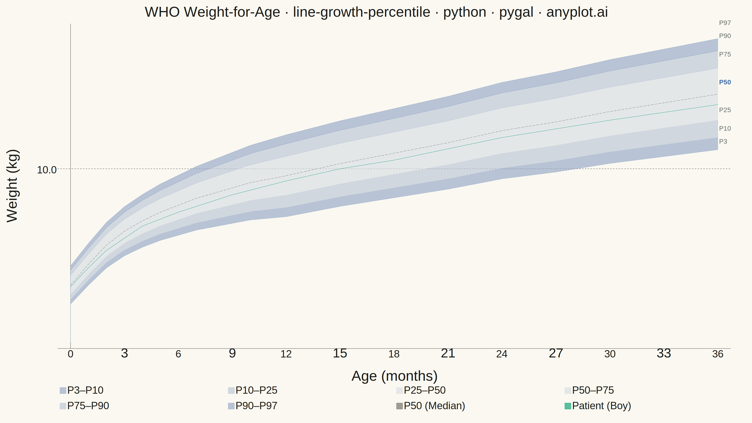
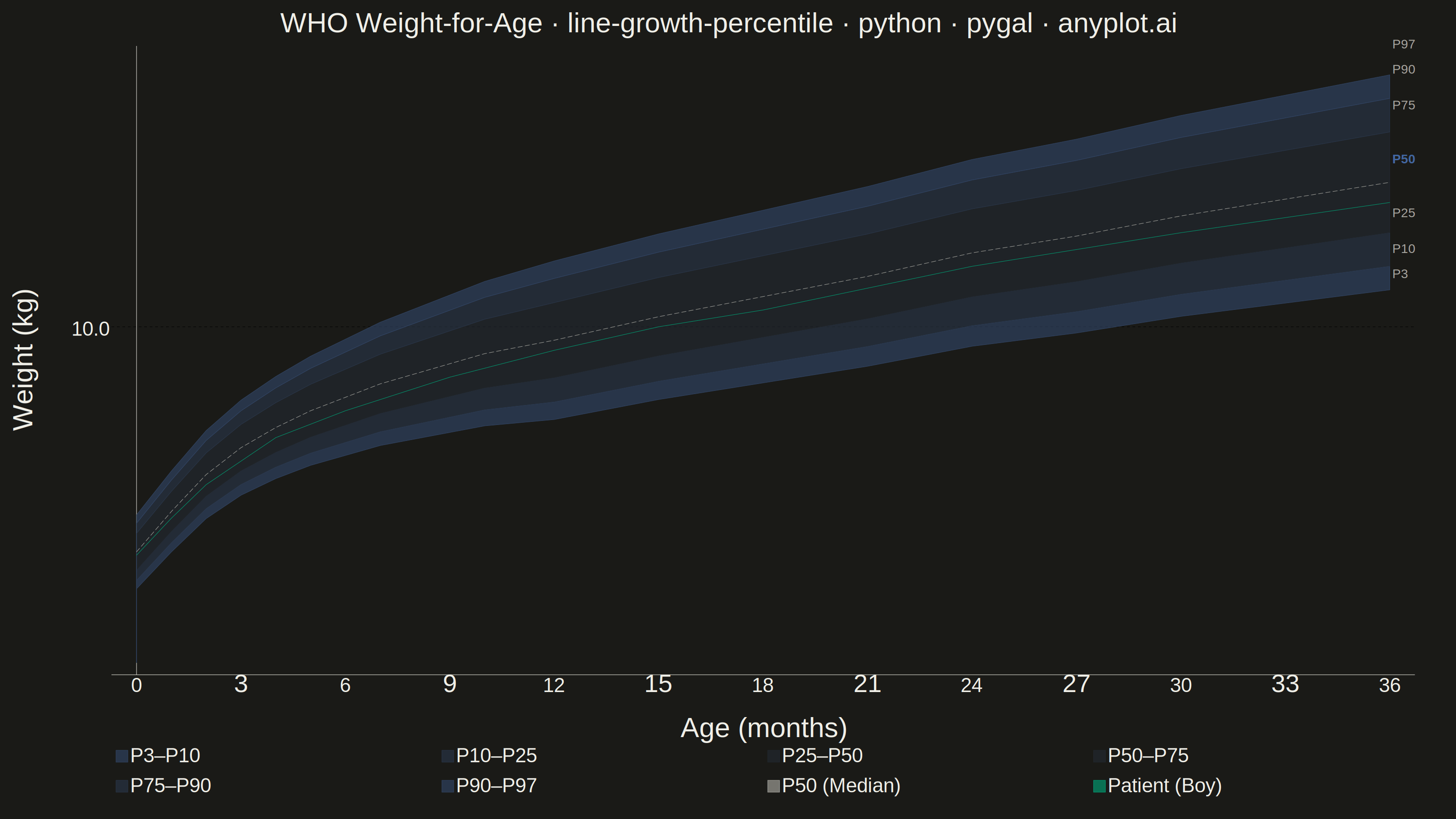
A WHO/CDC-style growth chart displaying smooth percentile curves (3rd, 10th, 25th, 50th, 75th, 90th, 97th) as colored bands, with individual patient data points overlaid and connected by a line. This chart is a standard clinical tool for monitoring child development metrics such as height, weight, or BMI across age. It enables quick visual assessment of whether a child's growth trajectory falls within expected population ranges.
""" anyplot.ai
line-growth-percentile: Pediatric Growth Chart with Percentile Curves
Library: pygal 3.1.3 | Python 3.13.14
Quality: 86/100 | Updated: 2026-06-20
"""

import io
import os
import xml.etree.ElementTree as ET

import cairosvg
import numpy as np
import pygal
from PIL import Image
from pygal.style import Style


# Theme tokens (see prompts/default-style-guide.md "Theme-adaptive Chrome")
THEME = os.getenv("ANYPLOT_THEME", "light")
PAGE_BG = "#FAF8F1" if THEME == "light" else "#1A1A17"
INK = "#1A1A17" if THEME == "light" else "#F0EFE8"
INK_MUTED = "#6B6A63" if THEME == "light" else "#A8A79F"

# Imprint palette — brand green for patient data (primary foreground series)
BRAND = "#009E73"  # Imprint position 1 — always first categorical series

# Boys chart convention — Imprint blue (#4467A3) for percentile bands
# Graduated tones lerped from PAGE_BG toward #4467A3: outer darker, inner lighter
if THEME == "light":
    BAND_OUTER = "#96A8C6"  # lerp(#FAF8F1, #4467A3, t=0.55)
    BAND_MID = "#BAC5D6"  # lerp(#FAF8F1, #4467A3, t=0.35)
    BAND_INNER = "#D9DEE3"  # lerp(#FAF8F1, #4467A3, t=0.18)
else:
    BAND_OUTER = "#354C72"  # lerp(#1A1A17, #4467A3, t=0.65)
    BAND_MID = "#2E3F5A"  # lerp(#1A1A17, #4467A3, t=0.48)
    BAND_INNER = "#273141"  # lerp(#1A1A17, #4467A3, t=0.30)

# Data — WHO weight-for-age reference for boys, 0–36 months
np.random.seed(42)
age_months = np.array([0, 1, 2, 3, 4, 5, 6, 7, 8, 9, 10, 11, 12, 15, 18, 21, 24, 27, 30, 33, 36])

percentile_50 = np.array(
    [3.3, 4.5, 5.6, 6.4, 7.0, 7.5, 7.9, 8.3, 8.6, 8.9, 9.2, 9.4, 9.6, 10.3, 10.9, 11.5, 12.2, 12.7, 13.3, 13.8, 14.3]
)
offsets = {
    3: np.linspace(1.1, 3.2, len(age_months)),
    10: np.linspace(0.85, 2.5, len(age_months)),
    25: np.linspace(0.55, 1.5, len(age_months)),
    75: np.linspace(0.55, 1.5, len(age_months)),
    90: np.linspace(0.85, 2.5, len(age_months)),
    97: np.linspace(1.1, 3.2, len(age_months)),
}

percentile_3 = percentile_50 - offsets[3]
percentile_10 = percentile_50 - offsets[10]
percentile_25 = percentile_50 - offsets[25]
percentile_75 = percentile_50 + offsets[75]
percentile_90 = percentile_50 + offsets[90]
percentile_97 = percentile_50 + offsets[97]

patient_ages = np.array([0, 1, 2, 4, 6, 9, 12, 15, 18, 24, 30, 36])
patient_weights = np.array([3.2, 4.3, 5.3, 6.7, 7.5, 8.5, 9.3, 10.0, 10.5, 11.8, 12.8, 13.7])

percentile_label_vals = [
    ("P3", float(percentile_3[-1])),
    ("P10", float(percentile_10[-1])),
    ("P25", float(percentile_25[-1])),
    ("P50", float(percentile_50[-1])),
    ("P75", float(percentile_75[-1])),
    ("P90", float(percentile_90[-1])),
    ("P97", float(percentile_97[-1])),
]

# Title length-scaled font size (baseline 66 for ~67 chars)
TITLE = "WHO Weight-for-Age · line-growth-percentile · python · pygal · anyplot.ai"
_n = len(TITLE)
_ratio = 67 / _n if _n > 67 else 1.0
title_fs = max(44, round(66 * _ratio))

# Pygal style — 3200×1800 canvas, theme-adaptive chrome
custom_style = Style(
    background=PAGE_BG,
    plot_background=PAGE_BG,
    foreground=INK,
    foreground_strong=INK,
    foreground_subtle=INK_MUTED,
    guide_stroke_color=INK_MUTED,
    colors=(
        BAND_OUTER,
        BAND_MID,
        BAND_INNER,  # P3–P10, P10–P25, P25–P50
        BAND_INNER,
        BAND_MID,
        BAND_OUTER,  # P50–P75, P75–P90, P90–P97
        "#4467A3",  # P50 median (Imprint blue, visually emphasized reference)
        BRAND,  # Patient data — Imprint position 1
    ),
    opacity=".65",
    opacity_hover=".80",
    stroke_opacity="1",
    stroke_opacity_hover="1",
    title_font_size=title_fs,
    label_font_size=56,
    major_label_font_size=44,
    legend_font_size=44,
    value_font_size=36,
    value_colors=("transparent",),
    font_family='Helvetica, Arial, "DejaVu Sans", sans-serif',
)

# Chart — landscape 3200×1800
chart = pygal.XY(
    style=custom_style,
    width=3200,
    height=1800,
    explicit_size=True,
    title=TITLE,
    x_title="Age (months)",
    y_title="Weight (kg)",
    show_dots=True,
    show_x_guides=False,
    show_y_guides=True,
    fill=True,
    stroke=True,
    legend_at_bottom=True,
    legend_at_bottom_columns=4,
    legend_box_size=26,
    truncate_legend=-1,
    range=(0, 18),
    x_labels=[0, 3, 6, 9, 12, 15, 18, 21, 24, 27, 30, 33, 36],
    x_labels_major=[0, 6, 12, 18, 24, 30, 36],
    show_minor_x_labels=True,
    show_minor_y_labels=False,
    y_labels=list(range(2, 19, 2)),
    print_values=False,
    x_value_formatter=lambda x: f"{x:.0f}",
    value_formatter=lambda x: f"{x:.1f}",
    margin_top=30,
    margin_bottom=60,
    margin_left=30,
    margin_right=90,
    js=[],
)

# Percentile bands as filled polygons (upper edge forward, lower edge reversed)
band_configs = [
    ("P3–P10", percentile_3, percentile_10),
    ("P10–P25", percentile_10, percentile_25),
    ("P25–P50", percentile_25, percentile_50),
    ("P50–P75", percentile_50, percentile_75),
    ("P75–P90", percentile_75, percentile_90),
    ("P90–P97", percentile_90, percentile_97),
]

for label, lower, upper in band_configs:
    polygon = [(float(a), float(u)) for a, u in zip(age_months, upper, strict=True)]
    for a, lo in zip(reversed(age_months), reversed(lower), strict=True):
        polygon.append((float(a), float(lo)))
    chart.add(label, polygon, stroke_style={"width": 0.3, "opacity": 0.1}, dots_size=0)

# P50 median — dashed neutral line (de-emphasized so patient data stands out)
median_pts = [(float(a), float(v)) for a, v in zip(age_months, percentile_50, strict=True)]
chart.add(
    "P50 (Median)",
    median_pts,
    fill=False,
    stroke=True,
    dots_size=0,
    stroke_style={"width": 8, "linecap": "round", "dasharray": "14,7"},
)

# Patient data — brand green, prominent connected markers
patient_pts = [(float(a), float(w)) for a, w in zip(patient_ages, patient_weights, strict=True)]
chart.add(
    "Patient (Boy)",
    patient_pts,
    fill=False,
    stroke=True,
    dots_size=10,
    stroke_style={"width": 6, "linecap": "round", "linejoin": "round"},
)

# Render SVG → inject right-margin percentile labels → convert to PNG
svg_data = chart.render()

ET.register_namespace("", "http://www.w3.org/2000/svg")
ET.register_namespace("xlink", "http://www.w3.org/1999/xlink")
root = ET.fromstring(svg_data)

ns_svg = "http://www.w3.org/2000/svg"
y_guides = root.findall(f".//{{{ns_svg}}}g[@class='guides']//{{{ns_svg}}}line")
y_positions = [
    float(g.get("y1")) for g in y_guides if g.get("y1") and g.get("x1") and g.get("x2") and g.get("x1") != g.get("x2")
]

plot_top_svg = min(y_positions) if y_positions else 60
plot_bottom_svg = max(y_positions) if y_positions else 1480

x_right_svg = 3050.0
for g in y_guides:
    x2 = g.get("x2")
    if x2:
        x_right_svg = max(x_right_svg, float(x2))

y_min_val, y_max_val = 0.0, 18.0
lbl_group = ET.SubElement(root, f"{{{ns_svg}}}g")
lbl_group.set("class", "percentile-labels")

for lbl, val in percentile_label_vals:
    frac = (val - y_min_val) / (y_max_val - y_min_val)
    y_svg = plot_bottom_svg - frac * (plot_bottom_svg - plot_top_svg)
    el = ET.SubElement(lbl_group, f"{{{ns_svg}}}text")
    el.set("x", str(x_right_svg + 10))
    el.set("y", str(y_svg + 7))
    el.set("font-size", "38")
    el.set("font-family", 'Helvetica, Arial, "DejaVu Sans", sans-serif')
    el.set("font-weight", "bold" if lbl == "P50" else "normal")
    el.set("fill", "#4467A3" if lbl == "P50" else INK_MUTED)
    el.text = lbl

# Convert to PNG at exactly 3200×1800 (landscape canvas — hard contract)
modified_svg = ET.tostring(root, encoding="unicode")
png_bytes = cairosvg.svg2png(bytestring=modified_svg.encode("utf-8"), output_width=3200, output_height=1800)
img = Image.open(io.BytesIO(png_bytes)).convert("RGB")
img.save(f"plot-{THEME}.png")

# Save interactive HTML
with open(f"plot-{THEME}.html", "wb") as fh:
    fh.write(chart.render())
Runnable source as JSON, for any HTTP client: https://api.anyplot.ai/specs/line-growth-percentile/pygal/code. Any spec id and library id listed in llms-full.txt fit the same URL shape; every URL below is complete and callable.
{
  "spec_id": "line-growth-percentile",
  "language": "python",
  "library": "pygal",
  "page": "https://anyplot.ai/line-growth-percentile/python/pygal",
  "hub": "https://anyplot.ai/line-growth-percentile",
  "code_json": "https://api.anyplot.ai/specs/line-growth-percentile/pygal/code",
  "spec_json": "https://api.anyplot.ai/specs/line-growth-percentile",
  "render_light_png": "https://storage.googleapis.com/anyplot-images/plots/line-growth-percentile/python/pygal/plot-light.png",
  "render_dark_png": "https://storage.googleapis.com/anyplot-images/plots/line-growth-percentile/python/pygal/plot-dark.png",
  "interactive_light_html": "https://storage.googleapis.com/anyplot-images/plots/line-growth-percentile/python/pygal/plot-light.html",
  "interactive_dark_html": "https://storage.googleapis.com/anyplot-images/plots/line-growth-percentile/python/pygal/plot-dark.html",
  "quality_score": 86.0,
  "license": "MIT",
  "guide": "https://anyplot.ai/llms.txt"
}
Part of Pediatric Growth Chart with Percentile Curves on anyplot.ai.