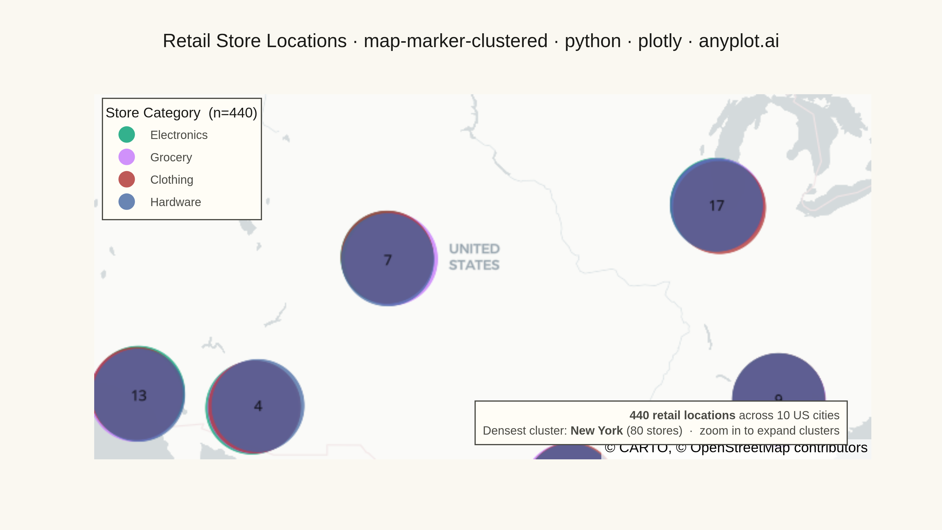
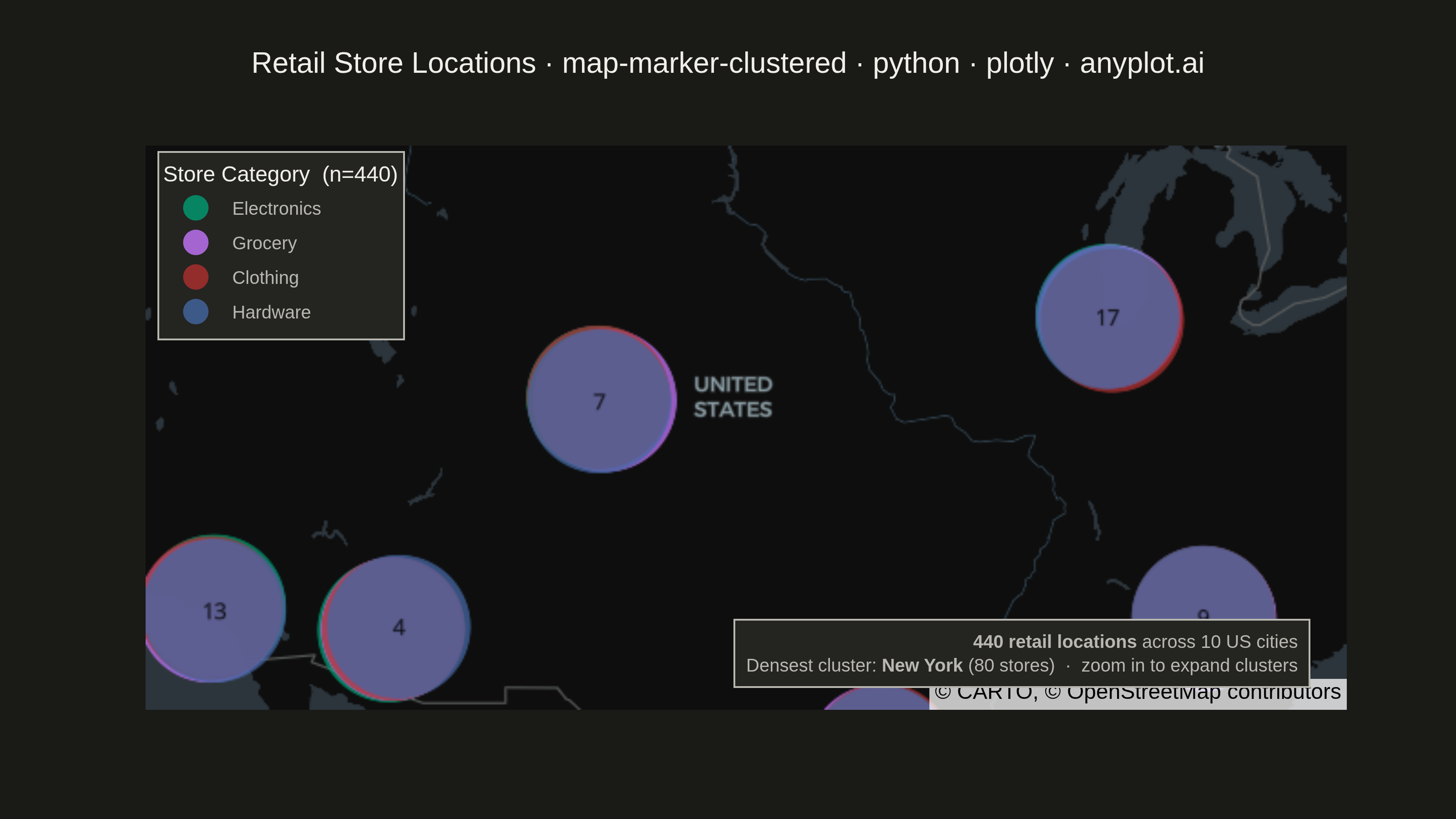
A geographic map that dynamically clusters nearby markers based on the current zoom level. At lower zoom levels, clusters aggregate multiple points into a single marker displaying the count, while zooming in progressively expands clusters to reveal individual markers. This visualization is essential for efficiently displaying large geographic datasets without visual clutter, enabling users to see both the overall distribution and specific locations through interactive exploration.
""" anyplot.ai
map-marker-clustered: Clustered Marker Map
Library: plotly 6.7.0 | Python 3.13.13
Quality: 86/100 | Updated: 2026-05-23
"""

import os

import numpy as np
import pandas as pd
import plotly.graph_objects as go


# Theme tokens
THEME = os.getenv("ANYPLOT_THEME", "light")
PAGE_BG = "#FAF8F1" if THEME == "light" else "#1A1A17"
ELEVATED_BG = "#FFFDF6" if THEME == "light" else "#242420"
INK = "#1A1A17" if THEME == "light" else "#F0EFE8"
INK_SOFT = "#4A4A44" if THEME == "light" else "#B8B7B0"

# Imprint palette — canonical order for categorical series
IMPRINT = ["#009E73", "#C475FD", "#AE3030", "#4467A3"]

# Data - Retail store locations across North America
np.random.seed(42)

cities = {
    "New York": (40.7128, -74.0060, 80),
    "Los Angeles": (34.0522, -118.2437, 60),
    "Chicago": (41.8781, -87.6298, 50),
    "Houston": (29.7604, -95.3698, 40),
    "Phoenix": (33.4484, -112.0740, 35),
    "Seattle": (47.6062, -122.3321, 30),
    "Denver": (39.7392, -104.9903, 25),
    "Miami": (25.7617, -80.1918, 45),
    "Atlanta": (33.7490, -84.3880, 35),
    "Boston": (42.3601, -71.0589, 40),
}

categories = ["Electronics", "Grocery", "Clothing", "Hardware"]
category_colors = {cat: IMPRINT[i] for i, cat in enumerate(categories)}

lats, lons, labels, cats = [], [], [], []
store_id = 1

for city, (lat, lon, count) in cities.items():
    for _ in range(count):
        lat_jitter = lat + np.random.normal(0, 0.15)
        lon_jitter = lon + np.random.normal(0, 0.15)
        category = np.random.choice(categories)
        lats.append(lat_jitter)
        lons.append(lon_jitter)
        labels.append(f"Store #{store_id} - {city}")
        cats.append(category)
        store_id += 1

df = pd.DataFrame({"lat": lats, "lon": lons, "label": labels, "category": cats})
total_stores = len(df)
city_counts = {city: count for city, (_, _, count) in cities.items()}
densest_city = max(city_counts, key=city_counts.get)

# Plot
map_style = "carto-positron" if THEME == "light" else "carto-darkmatter"

fig = go.Figure()

for category in categories:
    cat_df = df[df["category"] == category]
    fig.add_trace(
        go.Scattermap(
            lat=cat_df["lat"],
            lon=cat_df["lon"],
            mode="markers",
            marker={"size": 14, "color": category_colors[category], "opacity": 0.8},
            text=cat_df["label"],
            hovertemplate=(
                "<b>%{text}</b><br>"
                + f"Category: {category}<br>"
                + "Lat: %{lat:.4f}<br>Lon: %{lon:.4f}"
                + "<extra></extra>"
            ),
            name=category,
            cluster={
                "enabled": True,
                "maxzoom": 10,
                "size": 40,
                "step": 1,
                "color": category_colors[category],
                "opacity": 0.75,
            },
        )
    )

fig.update_layout(
    autosize=False,
    paper_bgcolor=PAGE_BG,
    title={
        "text": "Retail Store Locations · map-marker-clustered · python · plotly · anyplot.ai",
        "font": {"size": 16, "color": INK},
        "x": 0.5,
        "xanchor": "center",
    },
    # lon=-100 shifts viewport ~2° west to keep Boston within the canvas (review feedback)
    map={"style": map_style, "center": {"lat": 39.0, "lon": -100.0}, "zoom": 3.5},
    legend={
        "title": {"text": f"Store Category  (n={total_stores})", "font": {"size": 12, "color": INK}},
        "font": {"size": 10, "color": INK_SOFT},
        "bgcolor": ELEVATED_BG,
        "bordercolor": INK_SOFT,
        "borderwidth": 1,
        "x": 0.01,
        "y": 0.99,
        "xanchor": "left",
        "yanchor": "top",
    },
    margin={"l": 80, "r": 60, "t": 80, "b": 60},
)

# Data-context annotation: focal point summarising the dataset
fig.add_annotation(
    x=0.97,
    y=0.04,
    xref="paper",
    yref="paper",
    text=(
        f"<b>{total_stores} retail locations</b> across 10 US cities<br>"
        f"Densest cluster: <b>{densest_city}</b> ({city_counts[densest_city]} stores)"
        "  ·  zoom in to expand clusters"
    ),
    showarrow=False,
    font={"size": 10, "color": INK_SOFT},
    bgcolor=ELEVATED_BG,
    bordercolor=INK_SOFT,
    borderwidth=1,
    borderpad=6,
    align="right",
    xanchor="right",
    yanchor="bottom",
)

# Save
fig.write_image(f"plot-{THEME}.png", width=800, height=450, scale=4)
fig.write_html(f"plot-{THEME}.html", include_plotlyjs="cdn")
Runnable source as JSON, for any HTTP client: https://api.anyplot.ai/specs/map-marker-clustered/plotly/code. Any spec id and library id listed in llms-full.txt fit the same URL shape; every URL below is complete and callable.
{
  "spec_id": "map-marker-clustered",
  "language": "python",
  "library": "plotly",
  "page": "https://anyplot.ai/map-marker-clustered/python/plotly",
  "hub": "https://anyplot.ai/map-marker-clustered",
  "code_json": "https://api.anyplot.ai/specs/map-marker-clustered/plotly/code",
  "spec_json": "https://api.anyplot.ai/specs/map-marker-clustered",
  "render_light_png": "https://storage.googleapis.com/anyplot-images/plots/map-marker-clustered/python/plotly/plot-light.png",
  "render_dark_png": "https://storage.googleapis.com/anyplot-images/plots/map-marker-clustered/python/plotly/plot-dark.png",
  "interactive_light_html": "https://storage.googleapis.com/anyplot-images/plots/map-marker-clustered/python/plotly/plot-light.html",
  "interactive_dark_html": "https://storage.googleapis.com/anyplot-images/plots/map-marker-clustered/python/plotly/plot-dark.html",
  "quality_score": 86.0,
  "license": "MIT",
  "guide": "https://anyplot.ai/llms.txt"
}
Part of Clustered Marker Map on anyplot.ai.