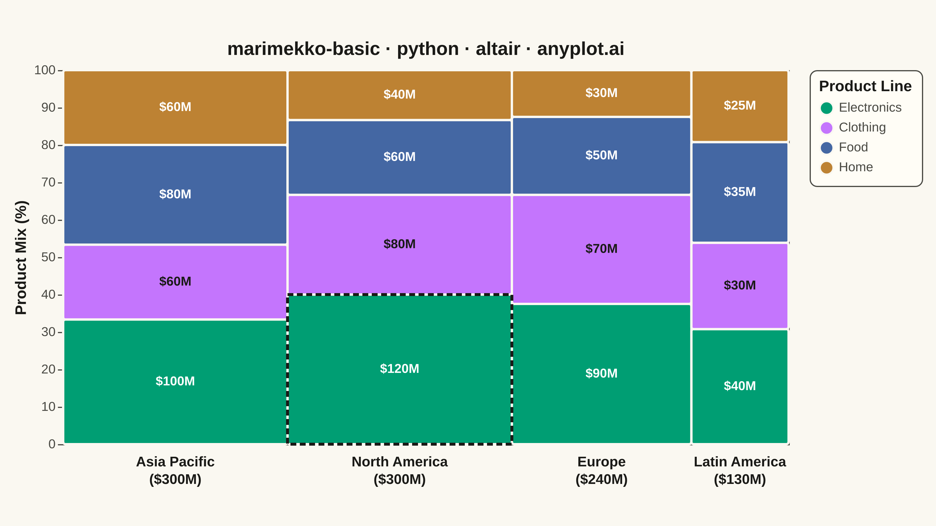
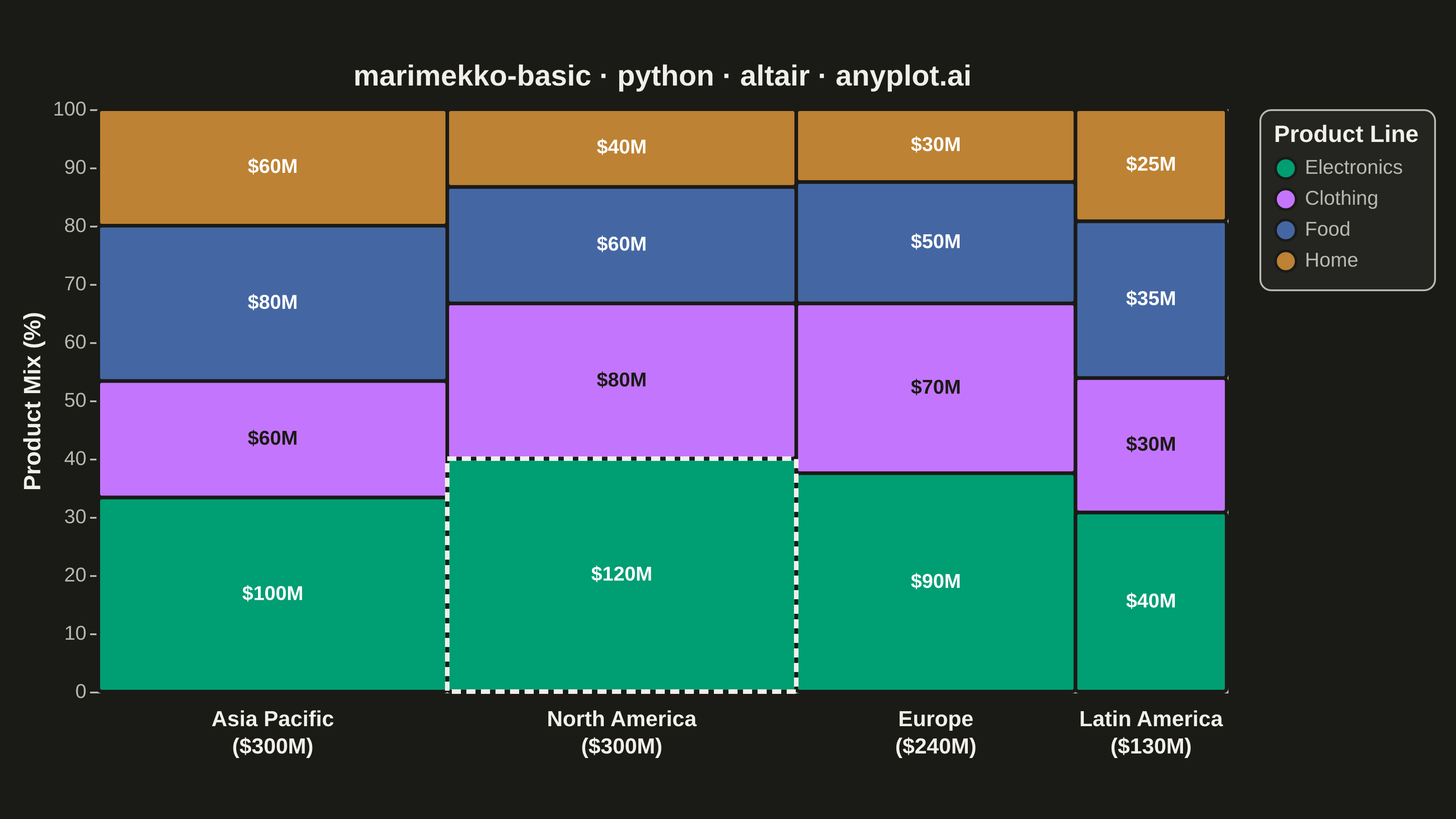
A Marimekko chart (also called mekko or mosaic plot) is a stacked bar chart where both the width and height of segments represent data values. This visualization shows two categorical dimensions simultaneously with proportional areas, making it ideal for understanding how parts relate to wholes across categories of different sizes.
""" anyplot.ai
marimekko-basic: Basic Marimekko Chart
Library: altair 6.2.2 | Python 3.13.14
Quality: 95/100 | Updated: 2026-07-24
"""

import os
import sys


# The file is named altair.py; remove its own directory from sys.path so
# `import altair` resolves to the library, not this script.
_HERE = os.path.dirname(os.path.abspath(__file__))
sys.path = [p for p in sys.path if not p or os.path.abspath(p) != _HERE]

import altair as alt
import pandas as pd
from PIL import Image


# Theme-adaptive chrome tokens
THEME = os.getenv("ANYPLOT_THEME", "light")
PAGE_BG = "#FAF8F1" if THEME == "light" else "#1A1A17"
ELEVATED_BG = "#FFFDF6" if THEME == "light" else "#242420"
INK = "#1A1A17" if THEME == "light" else "#F0EFE8"
INK_SOFT = "#4A4A44" if THEME == "light" else "#B8B7B0"

# Imprint categorical palette, canonical order
IMPRINT_PALETTE = ["#009E73", "#C475FD", "#4467A3", "#BD8233"]

# Data - Revenue by region (bar widths) and product line (segment heights)
data = {
    "Region": ["North America"] * 4 + ["Europe"] * 4 + ["Asia Pacific"] * 4 + ["Latin America"] * 4,
    "Product": ["Electronics", "Clothing", "Food", "Home"] * 4,
    "Revenue": [
        120,
        80,
        60,
        40,  # North America (total: 300)
        90,
        70,
        50,
        30,  # Europe (total: 240)
        100,
        60,
        80,
        60,  # Asia Pacific (total: 300)
        40,
        30,
        35,
        25,  # Latin America (total: 130)
    ],
}
df = pd.DataFrame(data)

# Region totals determine bar widths
region_totals = df.groupby("Region")["Revenue"].sum().reset_index()
region_totals.columns = ["Region", "RegionTotal"]
grand_total = region_totals["RegionTotal"].sum()
region_totals["WidthPct"] = region_totals["RegionTotal"] / grand_total * 100
region_totals = region_totals.sort_values("RegionTotal", ascending=False)
region_totals["x_start"] = region_totals["WidthPct"].cumsum() - region_totals["WidthPct"]
region_totals["x_end"] = region_totals["WidthPct"].cumsum()
region_totals["x_mid"] = (region_totals["x_start"] + region_totals["x_end"]) / 2
region_totals["Label"] = region_totals["Region"] + "\n($" + region_totals["RegionTotal"].astype(int).astype(str) + "M)"

df = df.merge(region_totals, on="Region")

# Product share within each region determines segment heights
df["PctWithinRegion"] = df["Revenue"] / df["RegionTotal"] * 100
product_order = ["Electronics", "Clothing", "Food", "Home"]
df["ProductOrder"] = df["Product"].map({p: i for i, p in enumerate(product_order)})
df = df.sort_values(["Region", "ProductOrder"])
df["y_end"] = df.groupby("Region")["PctWithinRegion"].cumsum()
df["y_start"] = df["y_end"] - df["PctWithinRegion"]
df["y_mid"] = (df["y_start"] + df["y_end"]) / 2
df["RevenueLabel"] = "$" + df["Revenue"].astype(str) + "M"

# Purple (Clothing) is light enough that white text loses contrast; use ink instead.
TEXT_ON_COLOR = {"Electronics": "#FFFFFF", "Clothing": "#1A1A17", "Food": "#FFFFFF", "Home": "#FFFFFF"}
df["LabelColor"] = df["Product"].map(TEXT_ON_COLOR)

# Legend-bound selection: clicking a legend swatch isolates that product line
# across all regions (altair-native interactivity, visible in the HTML export).
highlight = alt.selection_point(fields=["Product"], bind="legend")

# Largest single segment gets a subtle dashed outline to draw the eye.
top = df.loc[df["Revenue"].idxmax()]
top_outline = (
    alt.Chart(
        pd.DataFrame(
            [{"x_start": top["x_start"], "x_end": top["x_end"], "y_start": top["y_start"], "y_end": top["y_end"]}]
        )
    )
    .mark_rect(fill=None, stroke=INK, strokeWidth=2.5, strokeDash=[5, 3])
    .encode(x="x_start:Q", x2="x_end:Q", y="y_start:Q", y2="y_end:Q")
)

segments = (
    alt.Chart(df)
    .mark_rect(stroke=PAGE_BG, strokeWidth=2, cornerRadius=2)
    .encode(
        x=alt.X("x_start:Q", axis=None),
        x2="x_end:Q",
        y=alt.Y(
            "y_start:Q",
            axis=alt.Axis(title="Product Mix (%)", labelFontSize=11, titleFontSize=13),
            scale=alt.Scale(domain=[0, 100]),
        ),
        y2="y_end:Q",
        color=alt.Color(
            "Product:N",
            scale=alt.Scale(domain=product_order, range=IMPRINT_PALETTE),
            legend=alt.Legend(
                title="Product Line",
                titleFontSize=13,
                labelFontSize=11,
                symbolSize=130,
                symbolType="circle",
                cornerRadius=6,
                padding=8,
            ),
        ),
        opacity=alt.condition(highlight, alt.value(1.0), alt.value(0.3)),
        tooltip=[
            alt.Tooltip("Region:N", title="Region"),
            alt.Tooltip("Product:N", title="Product"),
            alt.Tooltip("Revenue:Q", title="Revenue ($M)", format=",.0f"),
            alt.Tooltip("PctWithinRegion:Q", title="% of Region", format=".1f"),
        ],
    )
    .add_params(highlight)
)

revenue_labels = (
    alt.Chart(df)
    .mark_text(align="center", baseline="middle", fontSize=11, fontWeight="bold")
    .encode(
        x=alt.X("x_mid:Q", scale=alt.Scale(domain=[0, 100])),
        y=alt.Y("y_mid:Q", scale=alt.Scale(domain=[0, 100])),
        text="RevenueLabel:N",
        color=alt.Color("LabelColor:N", scale=None, legend=None),
        opacity=alt.condition(highlight, alt.value(1.0), alt.value(0.3)),
    )
)

region_labels = (
    alt.Chart(region_totals)
    .mark_text(
        align="center", baseline="top", dy=10, lineHeight=15, lineBreak="\n", fontSize=12, fontWeight="bold", color=INK
    )
    .encode(x=alt.X("x_mid:Q", scale=alt.Scale(domain=[0, 100])), y=alt.value(320), text="Label:N")
)

chart = (
    alt.layer(segments, top_outline, revenue_labels, region_labels)
    .properties(
        width=620,
        height=320,
        background=PAGE_BG,
        title=alt.Title("marimekko-basic · python · altair · anyplot.ai", fontSize=16, anchor="middle", color=INK),
    )
    .configure_view(fill=PAGE_BG, stroke=INK_SOFT)
    .configure_axis(
        domainColor=INK_SOFT, tickColor=INK_SOFT, gridColor=INK, gridOpacity=0.10, labelColor=INK_SOFT, titleColor=INK
    )
    .configure_legend(fillColor=ELEVATED_BG, strokeColor=INK_SOFT, labelColor=INK_SOFT, titleColor=INK)
)

# Save
chart.save(f"plot-{THEME}.png", scale_factor=4.0)

# PAD-only to canonical target (do NOT crop — cropping clips title/axis labels)
TW, TH = 3200, 1800
_img = Image.open(f"plot-{THEME}.png").convert("RGB")
_w, _h = _img.size
if _w > TW or _h > TH:
    raise SystemExit(
        f"altair vl-convert produced {_w}x{_h}, exceeds target {TW}x{TH}. "
        f"Shrink chart .properties(width=, height=) values and re-render."
    )
if _w < TW or _h < TH:
    _canvas = Image.new("RGB", (TW, TH), PAGE_BG)
    _canvas.paste(_img, ((TW - _w) // 2, (TH - _h) // 2))
    _canvas.save(f"plot-{THEME}.png")

chart.save(f"plot-{THEME}.html")
Runnable source as JSON, for any HTTP client: https://api.anyplot.ai/specs/marimekko-basic/altair/code. Any spec id and library id listed in llms-full.txt fit the same URL shape; every URL below is complete and callable.
{
  "spec_id": "marimekko-basic",
  "language": "python",
  "library": "altair",
  "page": "https://anyplot.ai/marimekko-basic/python/altair",
  "hub": "https://anyplot.ai/marimekko-basic",
  "code_json": "https://api.anyplot.ai/specs/marimekko-basic/altair/code",
  "spec_json": "https://api.anyplot.ai/specs/marimekko-basic",
  "render_light_png": "https://storage.googleapis.com/anyplot-images/plots/marimekko-basic/python/altair/plot-light.png",
  "render_dark_png": "https://storage.googleapis.com/anyplot-images/plots/marimekko-basic/python/altair/plot-dark.png",
  "interactive_light_html": "https://storage.googleapis.com/anyplot-images/plots/marimekko-basic/python/altair/plot-light.html",
  "interactive_dark_html": "https://storage.googleapis.com/anyplot-images/plots/marimekko-basic/python/altair/plot-dark.html",
  "quality_score": 95.0,
  "license": "MIT",
  "guide": "https://anyplot.ai/llms.txt"
}
Part of Basic Marimekko Chart on anyplot.ai.