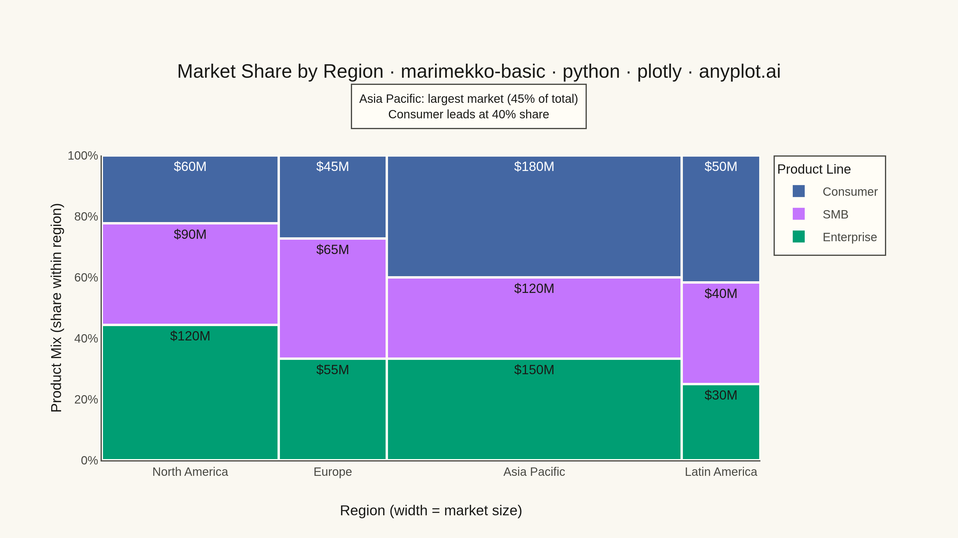
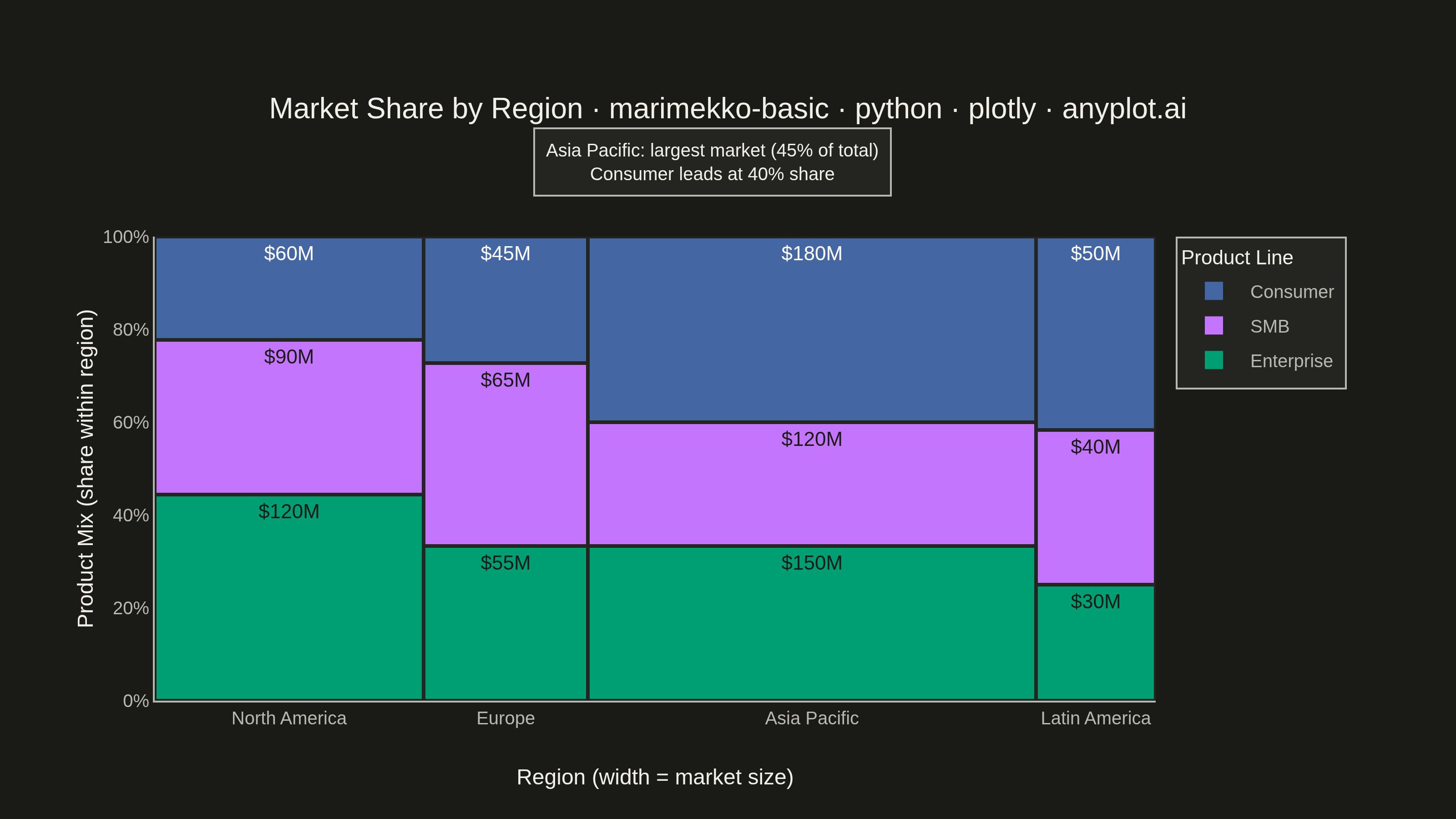
A Marimekko chart (also called mekko or mosaic plot) is a stacked bar chart where both the width and height of segments represent data values. This visualization shows two categorical dimensions simultaneously with proportional areas, making it ideal for understanding how parts relate to wholes across categories of different sizes.
""" anyplot.ai
marimekko-basic: Basic Marimekko Chart
Library: plotly 6.9.0 | Python 3.13.14
Quality: 94/100 | Updated: 2026-07-24
"""

import os

import plotly.graph_objects as go


# Theme tokens
THEME = os.getenv("ANYPLOT_THEME", "light")
PAGE_BG = "#FAF8F1" if THEME == "light" else "#1A1A17"
ELEVATED_BG = "#FFFDF6" if THEME == "light" else "#242420"
INK = "#1A1A17" if THEME == "light" else "#F0EFE8"
INK_SOFT = "#4A4A44" if THEME == "light" else "#B8B7B0"
GRID = "rgba(26,26,23,0.15)" if THEME == "light" else "rgba(240,239,232,0.15)"

# Imprint palette — first series always #009E73
COLORS = ["#009E73", "#C475FD", "#4467A3"]


def _linearize(c):
    return c / 12.92 if c <= 0.03928 else ((c + 0.055) / 1.055) ** 2.4


def relative_luminance(hex_color):
    r, g, b = (int(hex_color.lstrip("#")[i : i + 2], 16) / 255 for i in (0, 2, 4))
    return 0.2126 * _linearize(r) + 0.7152 * _linearize(g) + 0.0722 * _linearize(b)


# Per-segment label ink chosen for WCAG contrast against that segment's own fill —
# lavender (#C475FD) reads as too light for white text once ink-on-color luminance > 0.179.
LABEL_INK = ["#1A1A17" if relative_luminance(c) > 0.179 else "#FFFFFF" for c in COLORS]

# Data: Market share by region and product line (in millions USD)
regions = ["North America", "Europe", "Asia Pacific", "Latin America"]
products = ["Enterprise", "SMB", "Consumer"]

# Values: rows = products, columns = regions
values = [
    [120, 55, 150, 30],  # Enterprise
    [90, 65, 120, 40],  # SMB
    [60, 45, 180, 50],  # Consumer
]

# Calculate bar widths (proportional to column totals)
column_totals = [sum(values[i][j] for i in range(len(products))) for j in range(len(regions))]
grand_total = sum(column_totals)
widths = [ct / grand_total for ct in column_totals]

# Calculate x positions (cumulative widths, centered)
x_positions = []
cumulative = 0
for w in widths:
    x_positions.append(cumulative + w / 2)
    cumulative += w

# Create figure
fig = go.Figure()

# Build stacked bars with proportional heights
for i, product in enumerate(products):
    color = COLORS[i]
    bottoms = []
    heights = []
    for j in range(len(regions)):
        bottom = sum(values[k][j] for k in range(i)) / column_totals[j] if column_totals[j] > 0 else 0
        height = values[i][j] / column_totals[j] if column_totals[j] > 0 else 0
        bottoms.append(bottom)
        heights.append(height)

    fig.add_trace(
        go.Bar(
            x=x_positions,
            y=heights,
            width=widths,
            name=product,
            marker={"color": color, "line": {"color": ELEVATED_BG, "width": 2}},
            base=bottoms,
            text=[f"${values[i][j]}M" for j in range(len(regions))],
            textposition="inside",
            textfont={"size": 11, "color": LABEL_INK[i]},
            hovertemplate=(
                "<b>%{customdata[0]}</b><br>"
                "Product: " + product + "<br>"
                "Value: $%{customdata[1]:.0f}M<br>"
                "Share: %{y:.1%}<extra></extra>"
            ),
            customdata=[[regions[j], values[i][j]] for j in range(len(regions))],
        )
    )

# Callout annotation — surface the insight rather than leaving the viewer to spot it:
# Asia Pacific is both the largest market and the most Consumer-heavy mix.
asia_idx = regions.index("Asia Pacific")
asia_share = column_totals[asia_idx] / grand_total
consumer_share = values[products.index("Consumer")][asia_idx] / column_totals[asia_idx]
asia_center = sum(widths[:asia_idx]) + widths[asia_idx] / 2

# Canvas + margins (source of truth for the caption's paper-space x below)
CANVAS_W, CANVAS_H = 800, 450
MARGIN_L, MARGIN_R, MARGIN_T, MARGIN_B = 85, 165, 130, 65
PLOT_W = CANVAS_W - MARGIN_L - MARGIN_R

# Layout
fig.update_layout(
    autosize=False,
    template="none",
    paper_bgcolor=PAGE_BG,
    plot_bgcolor=PAGE_BG,
    font={"color": INK},
    title={
        "text": "Market Share by Region · marimekko-basic · python · plotly · anyplot.ai",
        "font": {"size": 16, "color": INK},
        "x": 0.5,
        "xanchor": "center",
    },
    xaxis={
        "title": {"text": "Region (width = market size)", "font": {"size": 12, "color": INK}},
        "tickfont": {"size": 10, "color": INK_SOFT},
        "tickmode": "array",
        "tickvals": x_positions,
        "ticktext": regions,
        "range": [0, 1],
        "showgrid": False,
        "showline": True,
        "mirror": False,
        "linecolor": INK_SOFT,
        "zerolinecolor": INK_SOFT,
    },
    yaxis={
        "title": {"text": "Product Mix (share within region)", "font": {"size": 12, "color": INK}},
        "tickfont": {"size": 10, "color": INK_SOFT},
        "tickformat": ".0%",
        "range": [0, 1],
        "showgrid": True,
        "showline": True,
        "mirror": False,
        "gridwidth": 1,
        "gridcolor": GRID,
        "linecolor": INK_SOFT,
        "zerolinecolor": INK_SOFT,
    },
    barmode="stack",
    bargap=0.02,
    legend={
        "title": {"text": "Product Line", "font": {"size": 11, "color": INK}},
        "font": {"size": 10, "color": INK_SOFT},
        "bgcolor": ELEVATED_BG,
        "bordercolor": INK_SOFT,
        "borderwidth": 1,
        "orientation": "v",
        "yanchor": "top",
        "y": 1,
        "xanchor": "left",
        "x": 1.02,
    },
    hoverlabel={"bgcolor": ELEVATED_BG, "bordercolor": INK_SOFT, "font": {"color": INK, "size": 10}},
    margin={"l": MARGIN_L, "r": MARGIN_R, "t": MARGIN_T, "b": MARGIN_B},
)

# Caption uses paper refs, pinned in the reserved top-margin gap between title and
# plot top — never inside the stacked bars, so it can't collide with value labels.
fig.add_annotation(
    x=(MARGIN_L + asia_center * PLOT_W) / CANVAS_W,
    y=1.16,
    xref="paper",
    yref="paper",
    xanchor="center",
    yanchor="middle",
    text=(f"Asia Pacific: largest market ({asia_share:.0%} of total)<br>Consumer leads at {consumer_share:.0%} share"),
    showarrow=False,
    align="center",
    font={"size": 10, "color": INK},
    bgcolor=ELEVATED_BG,
    bordercolor=INK_SOFT,
    borderwidth=1,
    borderpad=6,
)

# Save outputs
# Hard target: 3200 x 1800 landscape (see prompts/library/plotly.md "Canvas — hard rule")
fig.write_image(f"plot-{THEME}.png", width=CANVAS_W, height=CANVAS_H, scale=4)
fig.write_html(f"plot-{THEME}.html", include_plotlyjs="cdn")
Runnable source as JSON, for any HTTP client: https://api.anyplot.ai/specs/marimekko-basic/plotly/code. Any spec id and library id listed in llms-full.txt fit the same URL shape; every URL below is complete and callable.
{
  "spec_id": "marimekko-basic",
  "language": "python",
  "library": "plotly",
  "page": "https://anyplot.ai/marimekko-basic/python/plotly",
  "hub": "https://anyplot.ai/marimekko-basic",
  "code_json": "https://api.anyplot.ai/specs/marimekko-basic/plotly/code",
  "spec_json": "https://api.anyplot.ai/specs/marimekko-basic",
  "render_light_png": "https://storage.googleapis.com/anyplot-images/plots/marimekko-basic/python/plotly/plot-light.png",
  "render_dark_png": "https://storage.googleapis.com/anyplot-images/plots/marimekko-basic/python/plotly/plot-dark.png",
  "interactive_light_html": "https://storage.googleapis.com/anyplot-images/plots/marimekko-basic/python/plotly/plot-light.html",
  "interactive_dark_html": "https://storage.googleapis.com/anyplot-images/plots/marimekko-basic/python/plotly/plot-dark.html",
  "quality_score": 94.0,
  "license": "MIT",
  "guide": "https://anyplot.ai/llms.txt"
}
Part of Basic Marimekko Chart on anyplot.ai.