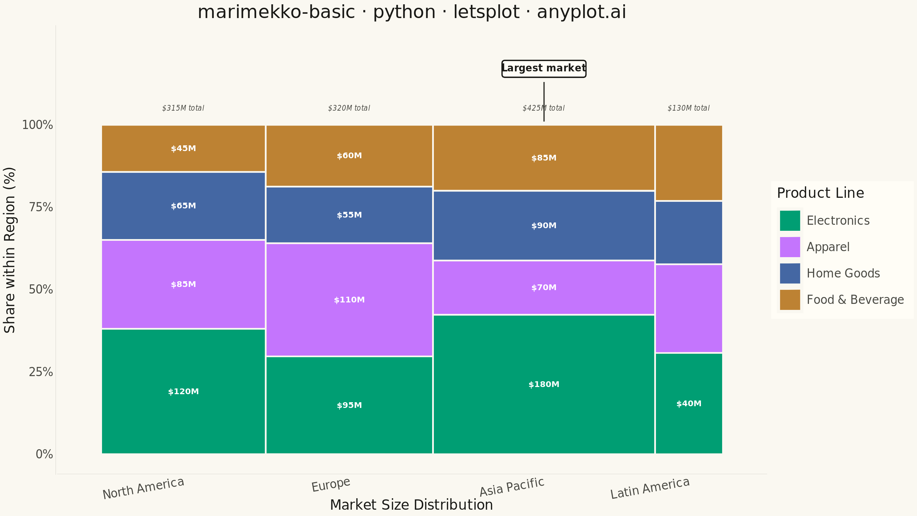
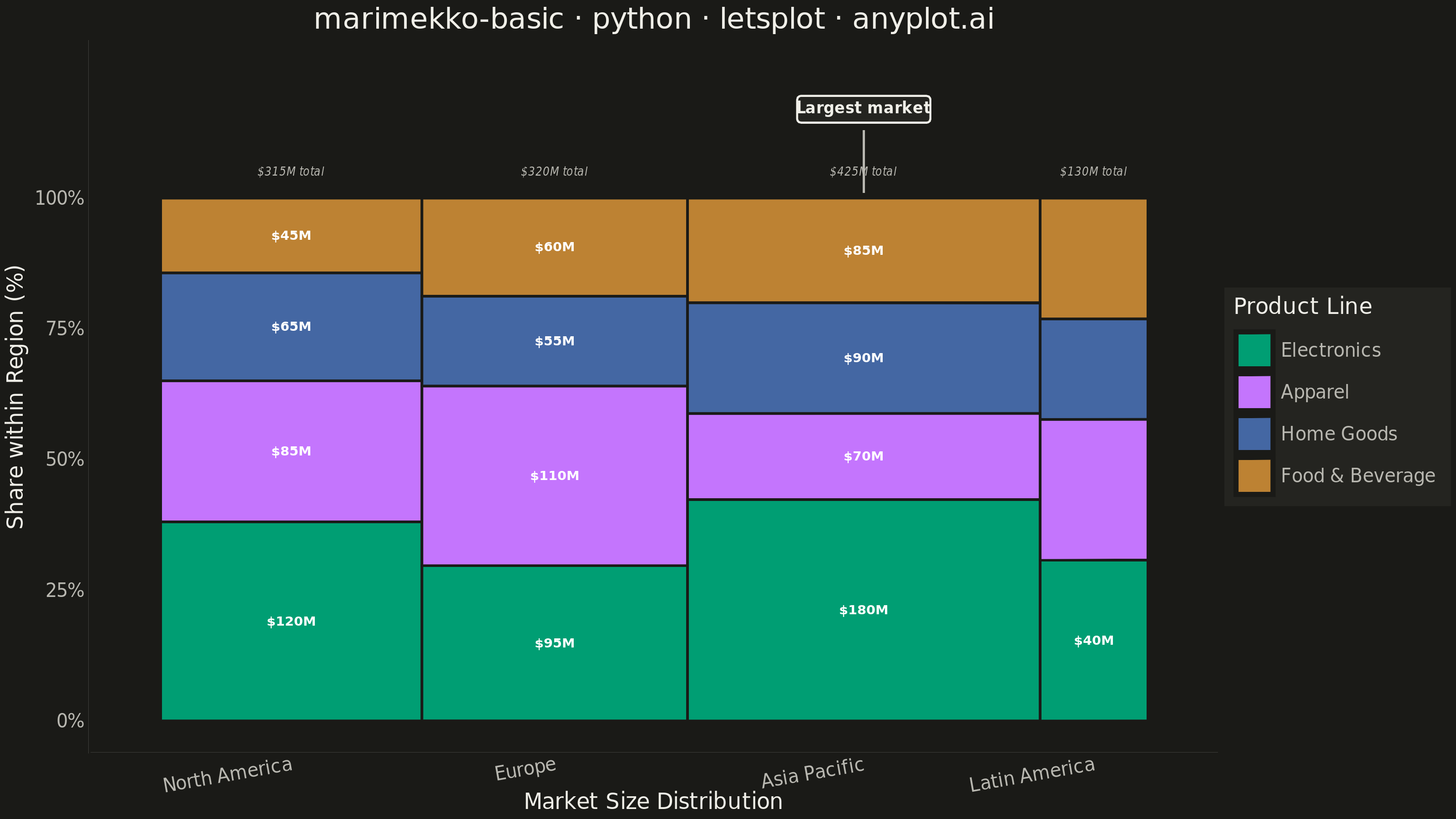
A Marimekko chart (also called mekko or mosaic plot) is a stacked bar chart where both the width and height of segments represent data values. This visualization shows two categorical dimensions simultaneously with proportional areas, making it ideal for understanding how parts relate to wholes across categories of different sizes.
""" anyplot.ai
marimekko-basic: Basic Marimekko Chart
Library: letsplot 4.11.0 | Python 3.13.14
Quality: 96/100 | Updated: 2026-07-24
"""

import os

import pandas as pd
from lets_plot import (
    LetsPlot,
    aes,
    element_blank,
    element_line,
    element_rect,
    element_text,
    geom_label,
    geom_rect,
    geom_segment,
    geom_text,
    ggplot,
    ggsave,
    ggsize,
    labs,
    layer_tooltips,
    scale_fill_manual,
    scale_x_continuous,
    scale_y_continuous,
    theme,
    theme_minimal,
)


LetsPlot.setup_html()

THEME = os.getenv("ANYPLOT_THEME", "light")

# Theme-adaptive chrome tokens (Imprint)
PAGE_BG = "#FAF8F1" if THEME == "light" else "#1A1A17"
ELEVATED_BG = "#FFFDF6" if THEME == "light" else "#242420"
INK = "#1A1A17" if THEME == "light" else "#F0EFE8"
INK_SOFT = "#4A4A44" if THEME == "light" else "#B8B7B0"

# Imprint categorical palette — product lines are abstract categories, canonical order applies
IMPRINT_PALETTE = ["#009E73", "#C475FD", "#4467A3", "#BD8233"]

# Data - Market share by region and product line
# Regions as x-categories (bar widths), product lines as y-categories (stacked segments)
regions = ["North America", "Europe", "Asia Pacific", "Latin America"]
products = ["Electronics", "Apparel", "Home Goods", "Food & Beverage"]

# Values in millions - each row is a product, each column is a region
values = {
    "North America": [120, 85, 65, 45],  # Total: 315
    "Europe": [95, 110, 55, 60],  # Total: 320
    "Asia Pacific": [180, 70, 90, 85],  # Total: 425
    "Latin America": [40, 35, 25, 30],  # Total: 130
}

region_totals = {region: sum(vals) for region, vals in values.items()}
grand_total = sum(region_totals.values())
region_widths = {region: total / grand_total * 100 for region, total in region_totals.items()}
largest_region = max(region_totals, key=region_totals.get)

# Build rectangle coordinates for each segment
# xmin/xmax: horizontal position (variable width = region's share of the total market)
# ymin/ymax: vertical position (stacked from 0 to 100% = share within the region)
rects = []
x_pos = 0

for region in regions:
    region_width = region_widths[region]
    region_vals = values[region]
    region_total = region_totals[region]

    y_pos = 0
    for i, product in enumerate(products):
        product_value = region_vals[i]
        segment_height = (product_value / region_total) * 100
        # Visual area proxy (width% x height%) — only label segments large enough to hold text cleanly
        area = region_width * segment_height

        rects.append(
            {
                "region": region,
                "product": product,
                "value": product_value,
                "share": round(segment_height, 1),
                "region_total": region_total,
                "xmin": x_pos,
                "xmax": x_pos + region_width,
                "ymin": y_pos,
                "ymax": y_pos + segment_height,
                "x_center": x_pos + region_width / 2,
                "y_center": y_pos + segment_height / 2,
                "label": f"${product_value}M" if area >= 300 else "",
            }
        )
        y_pos += segment_height

    x_pos += region_width

df = pd.DataFrame(rects)

# One row per region for the total-size annotation above each bar and the "largest market" callout
totals_df = df.drop_duplicates(subset="region")[["region", "x_center", "region_total"]].copy()
totals_df["label"] = totals_df["region_total"].apply(lambda v: f"${v}M total")
callout_df = totals_df[totals_df["region"] == largest_region].copy()
callout_df["label"] = "Largest market"

plot = (
    ggplot(df)
    + geom_rect(
        aes(xmin="xmin", xmax="xmax", ymin="ymin", ymax="ymax", fill="product"),
        color=PAGE_BG,
        size=0.6,
        tooltips=layer_tooltips().line("@region").line("@product: $@value M").line("Share of region: @share%"),
    )
    + geom_text(aes(x="x_center", y="y_center", label="label"), size=3.6, color="#FFFFFF", fontface="bold")
    # Region-total annotation above each bar — surfaces the variable that actually sets bar width
    + geom_text(
        data=totals_df, mapping=aes(x="x_center", label="label"), y=105, size=3.2, color=INK_SOFT, fontface="italic"
    )
    # Leader line connecting the callout down to the top of its bar, so the association is explicit
    + geom_segment(
        data=callout_df, mapping=aes(x="x_center", xend="x_center"), y=113, yend=101, color=INK_SOFT, size=0.5
    )
    # Callout on the largest market by total value — sized up from the region-total annotations for a
    # clear two-tier hierarchy (primary value labels > callout > region totals > tick labels)
    + geom_label(
        data=callout_df,
        mapping=aes(x="x_center", label="label"),
        y=117,
        size=4.2,
        color=INK,
        fill=ELEVATED_BG,
        fontface="bold",
        label_padding=0.4,
    )
    + scale_fill_manual(values=IMPRINT_PALETTE, name="Product Line")
    + scale_x_continuous(
        name="Market Size Distribution",
        breaks=[df[df["region"] == r]["x_center"].iloc[0] for r in regions],
        labels=regions,
        limits=[-2, 102],
    )
    + scale_y_continuous(
        name="Share within Region (%)",
        breaks=[0, 25, 50, 75, 100],
        labels=["0%", "25%", "50%", "75%", "100%"],
        limits=[0, 124],
    )
    + labs(title="marimekko-basic · python · letsplot · anyplot.ai")
    + theme_minimal()
    + theme(
        plot_background=element_rect(fill=PAGE_BG, color=PAGE_BG),
        panel_background=element_rect(fill=PAGE_BG, color=PAGE_BG),
        panel_grid_major=element_blank(),
        panel_grid_minor=element_blank(),
        axis_line=element_line(color=INK_SOFT),
        plot_title=element_text(size=16, color=INK, hjust=0.5),
        axis_title=element_text(size=12, color=INK),
        axis_text_x=element_text(size=10, color=INK_SOFT, angle=10),
        axis_text_y=element_text(size=10, color=INK_SOFT),
        legend_background=element_rect(fill=ELEVATED_BG, color=INK_SOFT),
        legend_title=element_text(size=12, color=INK),
        legend_text=element_text(size=10, color=INK_SOFT),
        legend_position="right",
    )
    + ggsize(800, 450)
)

ggsave(plot, f"plot-{THEME}.png", scale=4, path=".")
ggsave(plot, f"plot-{THEME}.html", path=".")
Runnable source as JSON, for any HTTP client: https://api.anyplot.ai/specs/marimekko-basic/letsplot/code. Any spec id and library id listed in llms-full.txt fit the same URL shape; every URL below is complete and callable.
{
  "spec_id": "marimekko-basic",
  "language": "python",
  "library": "letsplot",
  "page": "https://anyplot.ai/marimekko-basic/python/letsplot",
  "hub": "https://anyplot.ai/marimekko-basic",
  "code_json": "https://api.anyplot.ai/specs/marimekko-basic/letsplot/code",
  "spec_json": "https://api.anyplot.ai/specs/marimekko-basic",
  "render_light_png": "https://storage.googleapis.com/anyplot-images/plots/marimekko-basic/python/letsplot/plot-light.png",
  "render_dark_png": "https://storage.googleapis.com/anyplot-images/plots/marimekko-basic/python/letsplot/plot-dark.png",
  "interactive_light_html": "https://storage.googleapis.com/anyplot-images/plots/marimekko-basic/python/letsplot/plot-light.html",
  "interactive_dark_html": "https://storage.googleapis.com/anyplot-images/plots/marimekko-basic/python/letsplot/plot-dark.html",
  "quality_score": 96.0,
  "license": "MIT",
  "guide": "https://anyplot.ai/llms.txt"
}
Part of Basic Marimekko Chart on anyplot.ai.