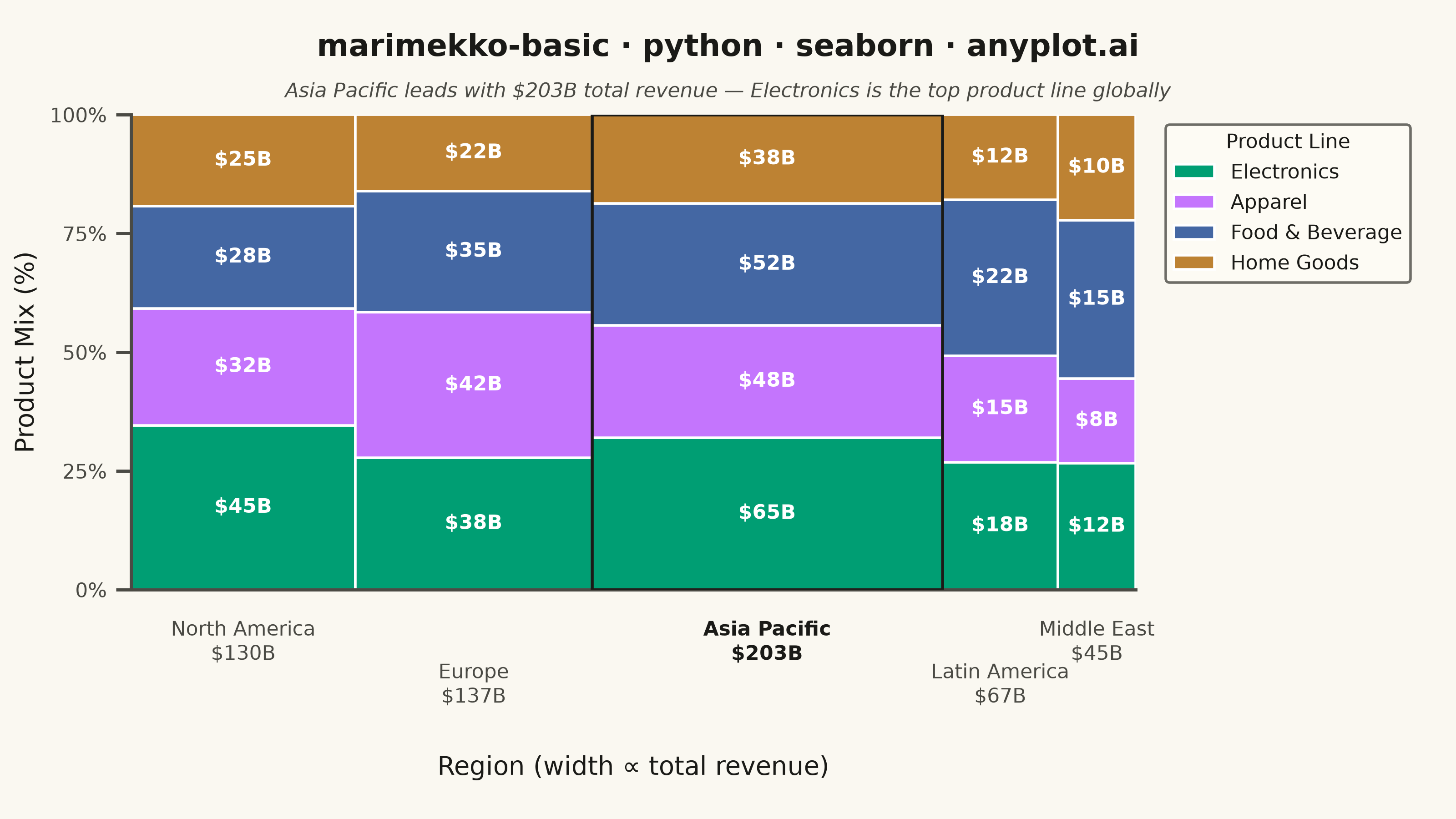
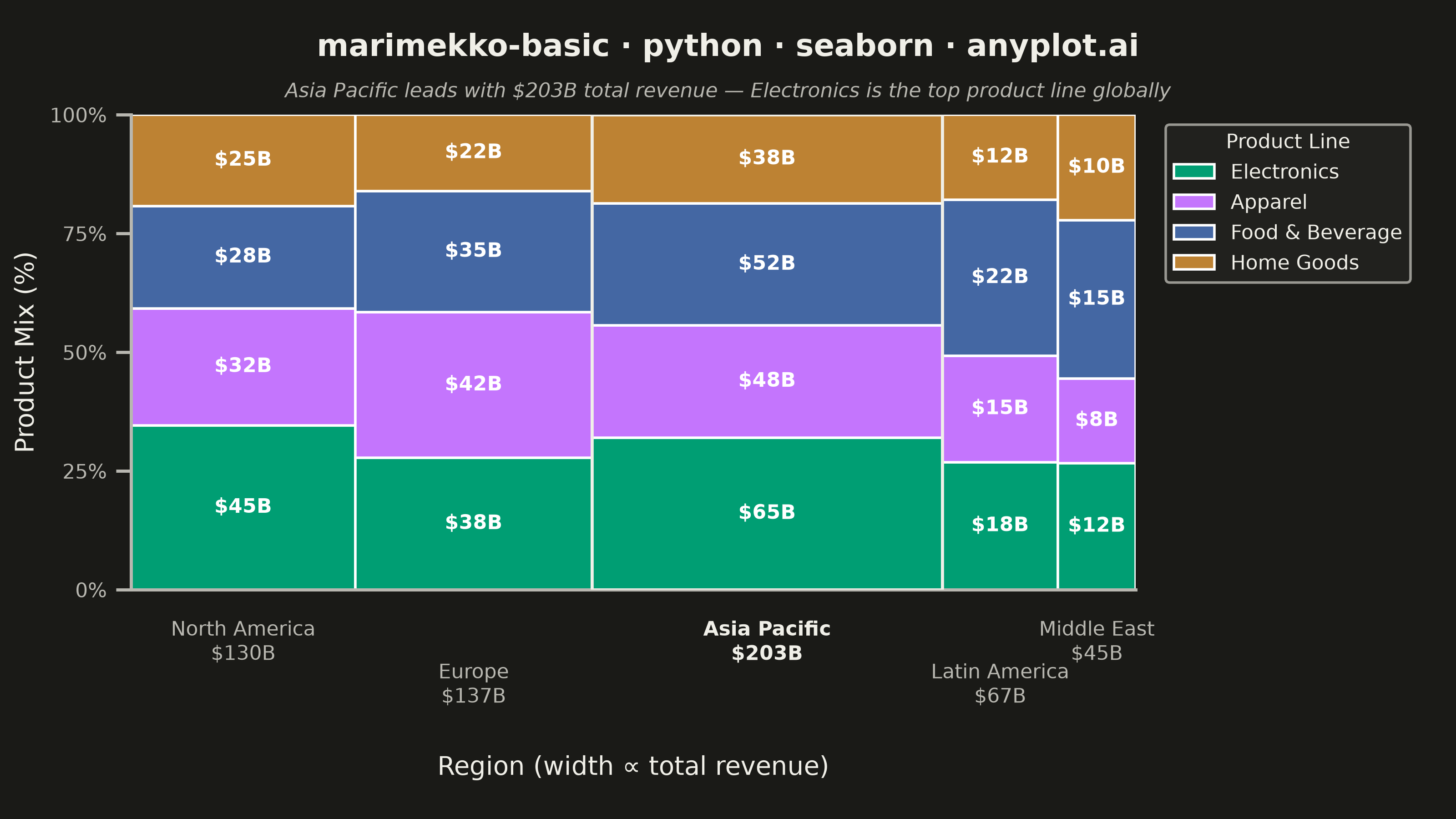
A Marimekko chart (also called mekko or mosaic plot) is a stacked bar chart where both the width and height of segments represent data values. This visualization shows two categorical dimensions simultaneously with proportional areas, making it ideal for understanding how parts relate to wholes across categories of different sizes.
""" anyplot.ai
marimekko-basic: Basic Marimekko Chart
Library: seaborn 0.13.2 | Python 3.13.14
Quality: 90/100 | Updated: 2026-07-24
"""

import os

import matplotlib.patches as mpatches
import matplotlib.pyplot as plt
import numpy as np
import pandas as pd
import seaborn as sns


# Theme tokens
THEME = os.getenv("ANYPLOT_THEME", "light")
PAGE_BG = "#FAF8F1" if THEME == "light" else "#1A1A17"
ELEVATED_BG = "#FFFDF6" if THEME == "light" else "#242420"
INK = "#1A1A17" if THEME == "light" else "#F0EFE8"
INK_SOFT = "#4A4A44" if THEME == "light" else "#B8B7B0"

sns.set_theme(
    style="ticks",
    rc={
        "figure.facecolor": PAGE_BG,
        "axes.facecolor": PAGE_BG,
        "axes.edgecolor": INK_SOFT,
        "axes.labelcolor": INK,
        "text.color": INK,
        "xtick.color": INK_SOFT,
        "ytick.color": INK_SOFT,
        "grid.color": INK,
        "grid.alpha": 0.10,
        "legend.facecolor": ELEVATED_BG,
        "legend.edgecolor": INK_SOFT,
    },
)

# Imprint palette — canonical order, first series always #009E73
IMPRINT_PALETTE = ["#009E73", "#C475FD", "#4467A3", "#BD8233"]
sns.set_palette(IMPRINT_PALETTE)

np.random.seed(42)

regions = ["North America", "Europe", "Asia Pacific", "Latin America", "Middle East"]
products = ["Electronics", "Apparel", "Food & Beverage", "Home Goods"]

data = {
    "North America": [45, 32, 28, 25],
    "Europe": [38, 42, 35, 22],
    "Asia Pacific": [65, 48, 52, 38],
    "Latin America": [18, 15, 22, 12],
    "Middle East": [12, 8, 15, 10],
}

df_data = []
for region in regions:
    for i, product in enumerate(products):
        df_data.append({"Region": region, "Product": product, "Revenue": data[region][i]})
df = pd.DataFrame(df_data)

# Reindex to `regions` order (groupby sorts alphabetically by default) so widths
# and x_positions stay aligned below.
region_totals = df.groupby("Region")["Revenue"].sum().reindex(regions)
total_revenue = region_totals.sum()
widths = region_totals / total_revenue
top_region = region_totals.idxmax()

fig, ax = plt.subplots(figsize=(8, 4.5), dpi=400)
fig.subplots_adjust(left=0.09, right=0.78, top=0.86, bottom=0.28)

x_positions = np.zeros(len(regions))
cumsum = 0
for i, region in enumerate(regions):
    x_positions[i] = cumsum
    cumsum += widths[region]

# Derive segment colors from the seaborn-registered Imprint palette
patch_colors = sns.color_palette(n_colors=len(products))

for region_idx, region in enumerate(regions):
    region_data = df[df["Region"] == region]
    region_total = region_totals[region]
    bar_width = widths[region]
    x_start = x_positions[region_idx]

    y_bottom = 0
    for prod_idx, product in enumerate(products):
        value = region_data[region_data["Product"] == product]["Revenue"].values[0]
        height = value / region_total  # Normalized to proportion

        # Draw rectangle (seaborn has no native Marimekko; matplotlib patches required)
        rect = mpatches.Rectangle(
            (x_start, y_bottom), bar_width, height, facecolor=patch_colors[prod_idx], edgecolor="white", linewidth=1
        )
        ax.add_patch(rect)

        if height > 0.12:
            ax.text(
                x_start + bar_width / 2,
                y_bottom + height / 2,
                f"${value}B",
                ha="center",
                va="center",
                fontsize=8,
                fontweight="bold",
                color="white",
            )

        y_bottom += height

# Emphasize the widest column — the story's focal point — with a bold outline
top_idx = regions.index(top_region)
ax.add_patch(
    mpatches.Rectangle(
        (x_positions[top_idx], 0), widths[top_region], 1, facecolor="none", edgecolor=INK, linewidth=1.2, zorder=5
    )
)

ax.set_xlim(0, 1)
ax.set_ylim(0, 1)

x_centers = x_positions + widths.values / 2
ax.set_xticks(x_centers)
ax.set_xticklabels([])
ax.tick_params(axis="x", length=0)

# Custom labels staggered on two vertical tiers (odd/even) so the narrow Latin
# America / Middle East columns don't collide with their neighbor's label.
stagger_y = [-0.06, -0.15]
for i, region in enumerate(regions):
    is_top = region == top_region
    ax.text(
        x_centers[i],
        stagger_y[i % 2],
        f"{region}\n${region_totals[region]}B",
        transform=ax.get_xaxis_transform(),
        ha="center",
        va="top",
        fontsize=8,
        fontweight="bold" if is_top else "normal",
        color=INK if is_top else INK_SOFT,
    )

ax.set_yticks([0, 0.25, 0.5, 0.75, 1.0])
ax.set_yticklabels(["0%", "25%", "50%", "75%", "100%"], fontsize=8)

ax.set_xlabel("Region (width ∝ total revenue)", fontsize=10, labelpad=62)
ax.set_ylabel("Product Mix (%)", fontsize=10)

# Title with storytelling subtitle
fig.text(
    0.5,
    0.96,
    "marimekko-basic · python · seaborn · anyplot.ai",
    ha="center",
    va="top",
    fontsize=12,
    fontweight="bold",
    color=INK,
)
fig.text(
    0.5,
    0.90,
    f"{top_region} leads with ${region_totals[top_region]}B total revenue — Electronics is the top product line globally",
    ha="center",
    va="top",
    fontsize=8,
    color=INK_SOFT,
    style="italic",
)

legend_handles = [
    mpatches.Patch(facecolor=patch_colors[i], edgecolor="white", label=products[i]) for i in range(len(products))
]
ax.legend(
    handles=legend_handles,
    loc="upper left",
    bbox_to_anchor=(1.02, 1),
    fontsize=8,
    title="Product Line",
    title_fontsize=8,
)

# Solid thin grid lines (not dashed)
ax.yaxis.grid(True, alpha=0.10, linewidth=0.4, linestyle="-")
ax.set_axisbelow(True)

sns.despine(ax=ax, top=True, right=True)

plt.savefig(f"plot-{THEME}.png", dpi=400, facecolor=PAGE_BG)
Runnable source as JSON, for any HTTP client: https://api.anyplot.ai/specs/marimekko-basic/seaborn/code. Any spec id and library id listed in llms-full.txt fit the same URL shape; every URL below is complete and callable.
{
  "spec_id": "marimekko-basic",
  "language": "python",
  "library": "seaborn",
  "page": "https://anyplot.ai/marimekko-basic/python/seaborn",
  "hub": "https://anyplot.ai/marimekko-basic",
  "code_json": "https://api.anyplot.ai/specs/marimekko-basic/seaborn/code",
  "spec_json": "https://api.anyplot.ai/specs/marimekko-basic",
  "render_light_png": "https://storage.googleapis.com/anyplot-images/plots/marimekko-basic/python/seaborn/plot-light.png",
  "render_dark_png": "https://storage.googleapis.com/anyplot-images/plots/marimekko-basic/python/seaborn/plot-dark.png",
  "quality_score": 90.0,
  "license": "MIT",
  "guide": "https://anyplot.ai/llms.txt"
}
Part of Basic Marimekko Chart on anyplot.ai.