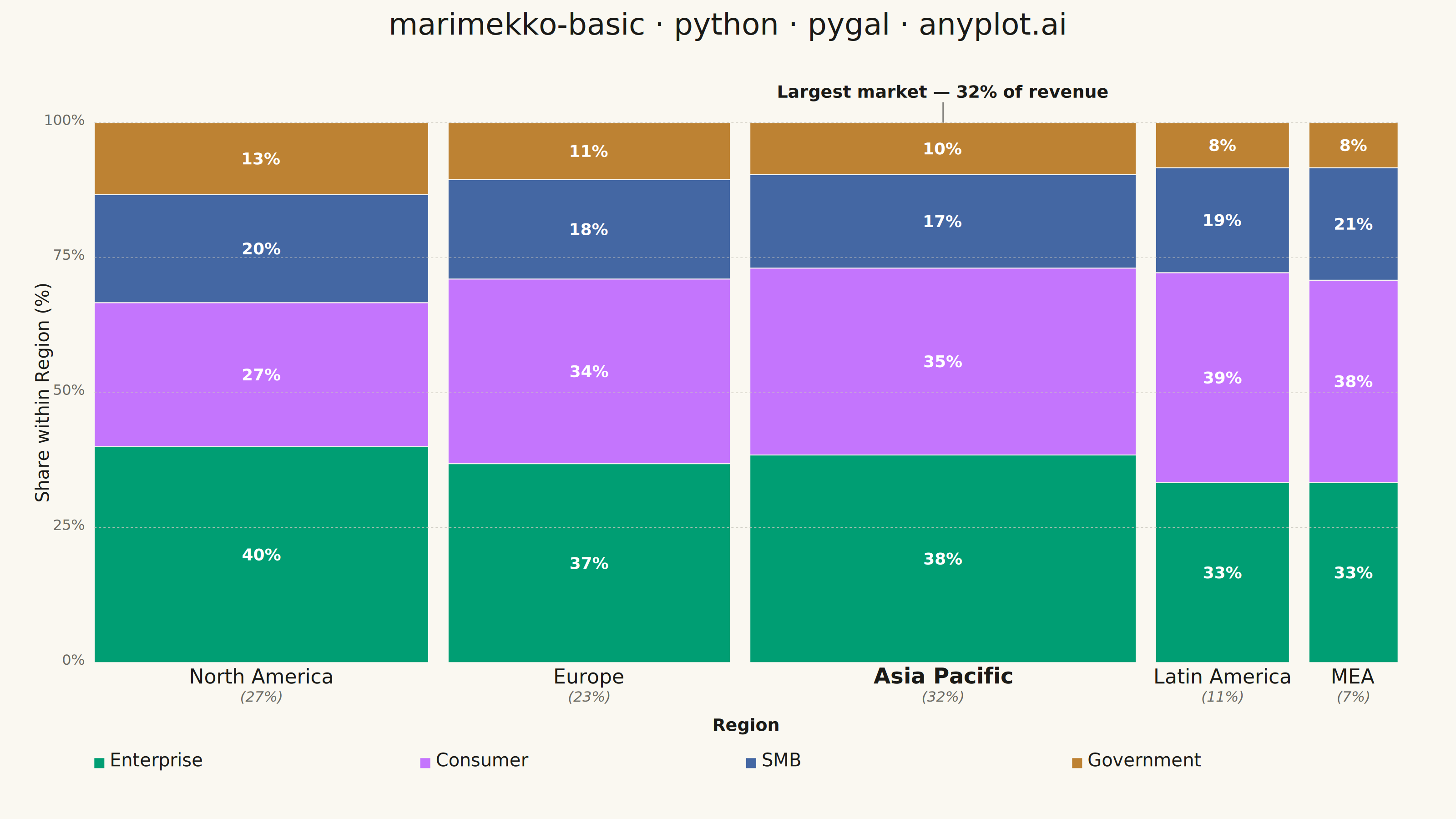
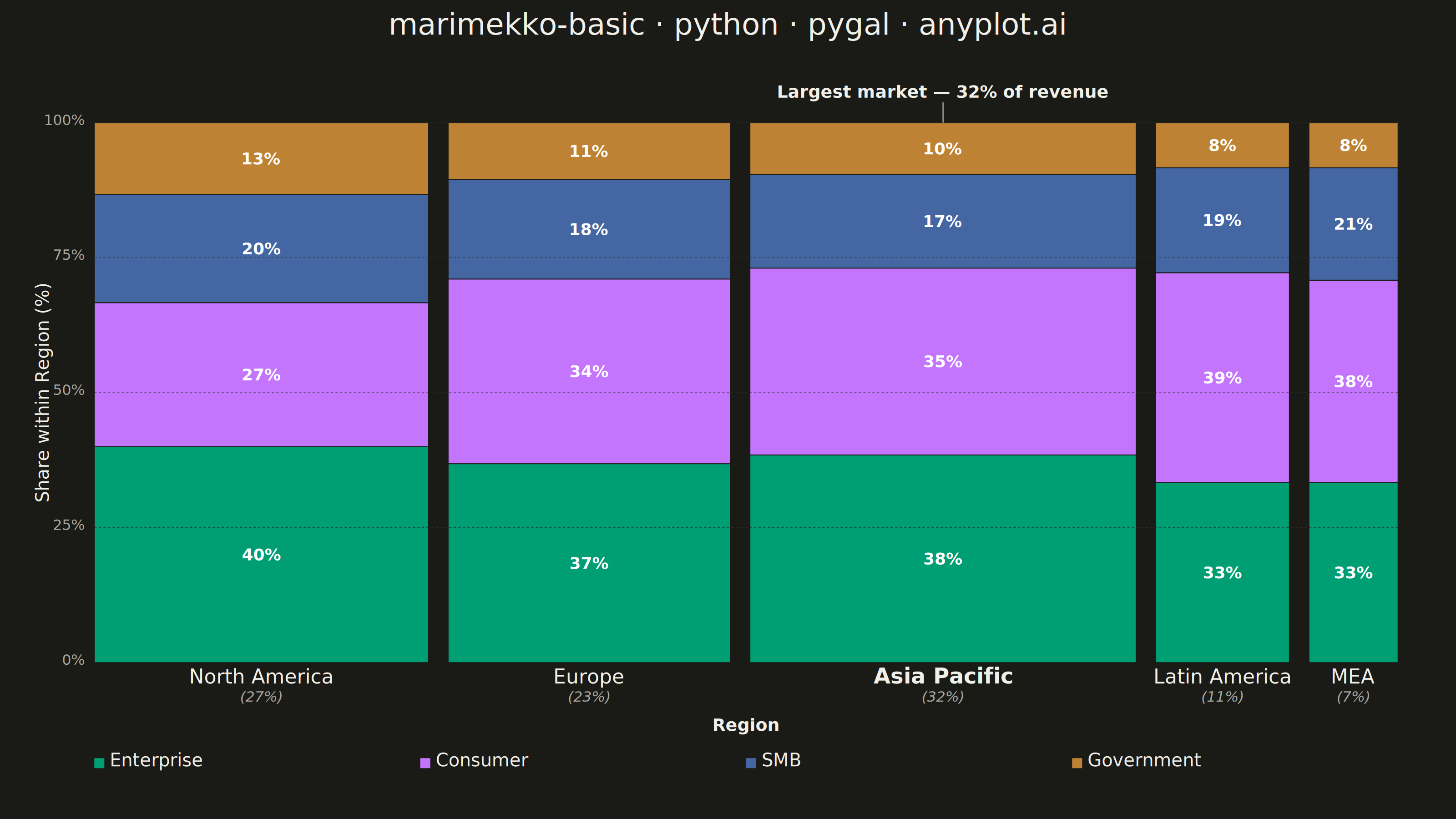
A Marimekko chart (also called mekko or mosaic plot) is a stacked bar chart where both the width and height of segments represent data values. This visualization shows two categorical dimensions simultaneously with proportional areas, making it ideal for understanding how parts relate to wholes across categories of different sizes.
""" anyplot.ai
marimekko-basic: Basic Marimekko Chart
Library: pygal 3.1.3 | Python 3.13.14
Quality: 95/100 | Updated: 2026-07-24
"""

import os
import sys


# Theme tokens
THEME = os.getenv("ANYPLOT_THEME", "light")
PAGE_BG = "#FAF8F1" if THEME == "light" else "#1A1A17"
INK = "#1A1A17" if THEME == "light" else "#F0EFE8"
INK_SOFT = "#4A4A44" if THEME == "light" else "#B8B7B0"
INK_MUTED = "#6B6A63" if THEME == "light" else "#A8A79F"
GRID_COLOR = "#C8C6BC" if THEME == "light" else "#2E2E2A"

IMPRINT = ("#009E73", "#C475FD", "#4467A3", "#BD8233", "#AE3030", "#2ABCCD", "#954477")

# Temporarily remove current directory from path to avoid name collision with pygal module
_cwd = sys.path[0] if sys.path[0] else "."
if _cwd in sys.path:
    sys.path.remove(_cwd)

from pygal.graph.graph import Graph
from pygal.style import Style


# Restore path
sys.path.insert(0, _cwd)


# Custom class required: pygal has no native Marimekko/mekko chart type.
# Variable-width stacked bars require extending the Graph base class.
class Marimekko(Graph):
    _serie_margin = 0

    def __init__(self, *args, **kwargs):
        self.gap = kwargs.pop("gap", 0.015)
        self.ink = kwargs.pop("ink", INK)
        self.ink_muted = kwargs.pop("ink_muted", INK_MUTED)
        self.grid_color = kwargs.pop("grid_color", GRID_COLOR)
        super().__init__(*args, **kwargs)

    def _compute_x_labels(self):
        pass

    def _compute_y_labels(self):
        pass

    def _column_layout(self, num_cols, col_totals, grand_total, plot_width):
        """Single pass computing (x_pos, bar_width, width_pct) per column, shared by
        the highlight band, the bars and the x-axis labels so the three passes can
        never drift out of sync with each other."""
        total_gap = self.gap * plot_width * (num_cols - 1)
        usable_width = plot_width - total_gap
        gap_px = self.gap * plot_width

        layout = []
        x_pos = self.view.x(0)
        for col_idx in range(num_cols):
            col_total = col_totals[col_idx]
            bar_width = (col_total / grand_total) * usable_width if col_total else 0
            layout.append((x_pos, bar_width, (col_total / grand_total) * 100 if col_total else 0))
            x_pos += bar_width + gap_px
        return layout

    def _plot(self):
        if not self.series:
            return

        num_cols = len(self.series[0].values) if self.series else 0
        col_totals = [0] * num_cols

        for serie in self.series:
            for i, val in enumerate(serie.values):
                if val is not None:
                    col_totals[i] += val

        grand_total = sum(col_totals)
        if grand_total == 0:
            return

        # pygal's Box.fix() bakes a 2% margin into the value box, so raw
        # self.view.width/height overshoot the true 0..1 pixel span. Deriving the
        # usable extents from the actual projected coordinates keeps bars, the
        # focal-column spotlight and the axes in agreement.
        x_start = self.view.x(0)
        y_bottom = self.view.y(0)
        y_top = self.view.y(1)
        plot_width = self.view.x(1) - x_start
        plot_height = y_bottom - y_top

        layout = self._column_layout(num_cols, col_totals, grand_total, plot_width)
        focal_idx = max(range(num_cols), key=lambda i: col_totals[i])

        plot_node = self.nodes["plot"]
        mekko_group = self.svg.node(plot_node, class_="marimekko-chart")

        # Focal-column spotlight: a faint tint band behind the largest market, drawn
        # first so the segment rects composite on top of it. Draws the eye to the
        # single biggest insight without touching the categorical palette.
        focal_x, focal_width, focal_pct = layout[focal_idx]
        if focal_width > 0:
            self.svg.node(
                mekko_group,
                "rect",
                x=focal_x,
                y=y_top,
                width=focal_width,
                height=plot_height,
                fill=self.ink,
                **{"fill-opacity": "0.07", "class": "focal-band"},
            )

        # Segments
        for col_idx in range(num_cols):
            col_total = col_totals[col_idx]
            if col_total == 0:
                continue

            x_pos, bar_width, _ = layout[col_idx]
            y_offset = 0

            for serie_idx, serie in enumerate(self.series):
                val = serie.values[col_idx] if col_idx < len(serie.values) else None
                if val is None or val == 0:
                    continue

                segment_height = (val / col_total) * plot_height
                color = self.style.colors[serie_idx % len(self.style.colors)]
                y_pos = y_bottom - y_offset - segment_height

                # Class names avoid pygal's built-in "series"/"reactive" selectors
                # (pygal/css/style.css targets those exact names with a
                # fill-opacity rule and a text-fill rule), which would otherwise
                # silently override the explicit fill colors below.
                serie_group = self.svg.node(
                    mekko_group, class_="mekko-serie mekko-serie-%d color-%d" % (serie_idx, serie_idx)
                )

                self.svg.node(
                    serie_group,
                    "rect",
                    x=x_pos,
                    y=y_pos,
                    width=bar_width,
                    height=segment_height,
                    fill=color,
                    stroke=PAGE_BG,
                    **{"stroke-width": "2", "fill-opacity": "1", "class": "mekko-rect tooltip-trigger"},
                )

                if segment_height > 0.045 * plot_height and bar_width > 0.035 * plot_width:
                    pct = (val / col_total) * 100
                    label_y = y_pos + segment_height / 2
                    label_x = x_pos + bar_width / 2

                    self.svg.node(
                        serie_group,
                        "text",
                        x=label_x,
                        y=label_y,
                        fill="white",
                        **{
                            "text-anchor": "middle",
                            "dominant-baseline": "middle",
                            "font-size": "36",
                            "font-weight": "bold",
                        },
                    ).text = f"{pct:.0f}%"

                y_offset += segment_height

        # Focal callout: leader line + annotation above the largest market, living in
        # the top margin so it never competes with the plot area itself.
        if focal_width > 0:
            focal_center = focal_x + focal_width / 2
            callout_group = self.svg.node(mekko_group, class_="focal-callout")
            self.svg.node(
                callout_group,
                "line",
                x1=focal_center,
                y1=y_top - 45,
                x2=focal_center,
                y2=y_top,
                stroke=self.ink,
                **{"stroke-width": "2"},
            )
            self.svg.node(
                callout_group,
                "text",
                x=focal_center,
                y=y_top - 55,
                fill=self.ink,
                **{"text-anchor": "middle", "font-size": "38", "font-weight": "bold"},
            ).text = f"Largest market — {focal_pct:.0f}% of revenue"

        # X-axis category labels + axis title
        if hasattr(self, "x_labels") and self.x_labels:
            label_group = self.svg.node(mekko_group, class_="x-labels")
            for col_idx in range(num_cols):
                col_total = col_totals[col_idx]
                if col_total == 0:
                    continue

                x_pos, bar_width, width_pct = layout[col_idx]
                label_x = x_pos + bar_width / 2
                is_focal = col_idx == focal_idx

                self.svg.node(
                    label_group,
                    "text",
                    x=label_x,
                    y=y_bottom + 46,
                    fill=self.ink,
                    **{
                        "text-anchor": "middle",
                        "font-size": "48" if is_focal else "44",
                        "font-weight": "bold" if is_focal else "normal",
                    },
                ).text = str(self.x_labels[col_idx]) if col_idx < len(self.x_labels) else ""

                self.svg.node(
                    label_group,
                    "text",
                    x=label_x,
                    y=y_bottom + 86,
                    fill=self.ink_muted,
                    **{"text-anchor": "middle", "font-size": "32", "font-style": "italic"},
                ).text = f"({width_pct:.0f}%)"

            axis_title_x = self.view.x(0) + plot_width / 2
            self.svg.node(
                label_group,
                "text",
                x=axis_title_x,
                y=y_bottom + 150,
                fill=self.ink,
                **{"text-anchor": "middle", "font-size": "38", "font-weight": "bold"},
            ).text = "Region"

        # Legend: drawn by hand (show_legend=False) rather than relying on pygal's
        # built-in bottom legend, which places itself immediately under the bars and
        # collides with the custom x-axis label stack above — the exact crowding the
        # previous review flagged. A fixed offset from y_bottom keeps a clean gap.
        legend_group = self.svg.node(mekko_group, class_="legend")
        legend_y = y_bottom + 230
        slot_width = plot_width / len(self.series)
        for serie_idx, serie in enumerate(self.series):
            slot_x = x_start + serie_idx * slot_width
            color = self.style.colors[serie_idx % len(self.style.colors)]

            self.svg.node(legend_group, "rect", x=slot_x, y=legend_y - 20, width=22, height=22, fill=color)
            self.svg.node(
                legend_group, "text", x=slot_x + 34, y=legend_y - 2, fill=self.ink, **{"font-size": "40"}
            ).text = serie.title

        # Y-axis percentage scale
        y_axis_group = self.svg.node(mekko_group, class_="y-axis-labels")
        for pct in [0, 25, 50, 75, 100]:
            y_pos = y_bottom - (pct / 100) * plot_height
            label_x = x_start - 22

            self.svg.node(
                y_axis_group,
                "text",
                x=label_x,
                y=y_pos + 5,
                fill=self.ink_muted,
                **{"text-anchor": "end", "font-size": "32"},
            ).text = f"{pct}%"

            if pct > 0:
                self.svg.node(
                    y_axis_group,
                    "line",
                    x1=x_start,
                    y1=y_pos,
                    x2=x_start + plot_width,
                    y2=y_pos,
                    stroke=self.grid_color,
                    **{"stroke-width": "1", "stroke-dasharray": "5,5"},
                )

        # Y-axis title
        y_title_x = x_start - 100
        y_title_y = y_bottom - plot_height / 2
        self.svg.node(
            y_axis_group,
            "text",
            x=y_title_x,
            y=y_title_y,
            fill=self.ink,
            **{
                "text-anchor": "middle",
                "font-size": "40",
                "font-weight": "normal",
                "transform": f"rotate(-90, {y_title_x}, {y_title_y})",
            },
        ).text = "Share within Region (%)"

    def _compute(self):
        self._box.xmin = 0
        self._box.xmax = 1
        self._box.ymin = 0
        self._box.ymax = 1


# Style
custom_style = Style(
    background=PAGE_BG,
    plot_background=PAGE_BG,
    foreground=INK,
    foreground_strong=INK,
    foreground_subtle=INK_MUTED,
    colors=IMPRINT,
    title_font_size=66,
    font_family="sans-serif",
)

# Data - Market share by region and product line (revenue in millions USD)
regions = ["North America", "Europe", "Asia Pacific", "Latin America", "MEA"]

products = {
    "Enterprise": [180, 140, 200, 60, 40],
    "Consumer": [120, 130, 180, 70, 45],
    "SMB": [90, 70, 90, 35, 25],
    "Government": [60, 40, 50, 15, 10],
}

# Chart
chart = Marimekko(
    width=3200,
    height=1800,
    gap=0.015,
    ink=INK,
    ink_muted=INK_MUTED,
    grid_color=GRID_COLOR,
    style=custom_style,
    title="marimekko-basic · python · pygal · anyplot.ai",
    show_legend=False,
    margin=60,
    margin_top=170,
    margin_left=150,
    margin_right=70,
    margin_bottom=320,
    show_x_labels=False,
    show_y_labels=False,
)

chart.x_labels = regions

for product_name, values in products.items():
    chart.add(product_name, values)

# Save
chart.render_to_png(f"plot-{THEME}.png")

html_content = f"""<!DOCTYPE html>
<html>
<head>
    <meta charset="utf-8">
    <title>marimekko-basic · python · pygal · anyplot.ai</title>
    <style>
        body {{ margin: 0; padding: 20px; background: {PAGE_BG}; }}
        .container {{ max-width: 100%; margin: 0 auto; }}
        svg {{ max-width: 100%; height: auto; }}
    </style>
</head>
<body>
    <div class="container">
        {chart.render(is_unicode=True)}
    </div>
</body>
</html>"""

with open(f"plot-{THEME}.html", "w", encoding="utf-8") as f:
    f.write(html_content)
Runnable source as JSON, for any HTTP client: https://api.anyplot.ai/specs/marimekko-basic/pygal/code. Any spec id and library id listed in llms-full.txt fit the same URL shape; every URL below is complete and callable.
{
  "spec_id": "marimekko-basic",
  "language": "python",
  "library": "pygal",
  "page": "https://anyplot.ai/marimekko-basic/python/pygal",
  "hub": "https://anyplot.ai/marimekko-basic",
  "code_json": "https://api.anyplot.ai/specs/marimekko-basic/pygal/code",
  "spec_json": "https://api.anyplot.ai/specs/marimekko-basic",
  "render_light_png": "https://storage.googleapis.com/anyplot-images/plots/marimekko-basic/python/pygal/plot-light.png",
  "render_dark_png": "https://storage.googleapis.com/anyplot-images/plots/marimekko-basic/python/pygal/plot-dark.png",
  "interactive_light_html": "https://storage.googleapis.com/anyplot-images/plots/marimekko-basic/python/pygal/plot-light.html",
  "interactive_dark_html": "https://storage.googleapis.com/anyplot-images/plots/marimekko-basic/python/pygal/plot-dark.html",
  "quality_score": 95.0,
  "license": "MIT",
  "guide": "https://anyplot.ai/llms.txt"
}
Part of Basic Marimekko Chart on anyplot.ai.