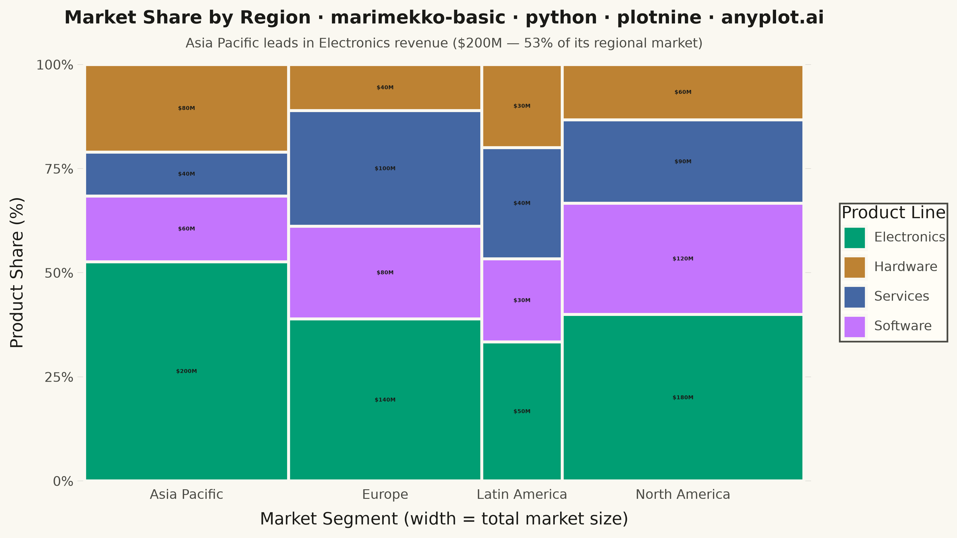
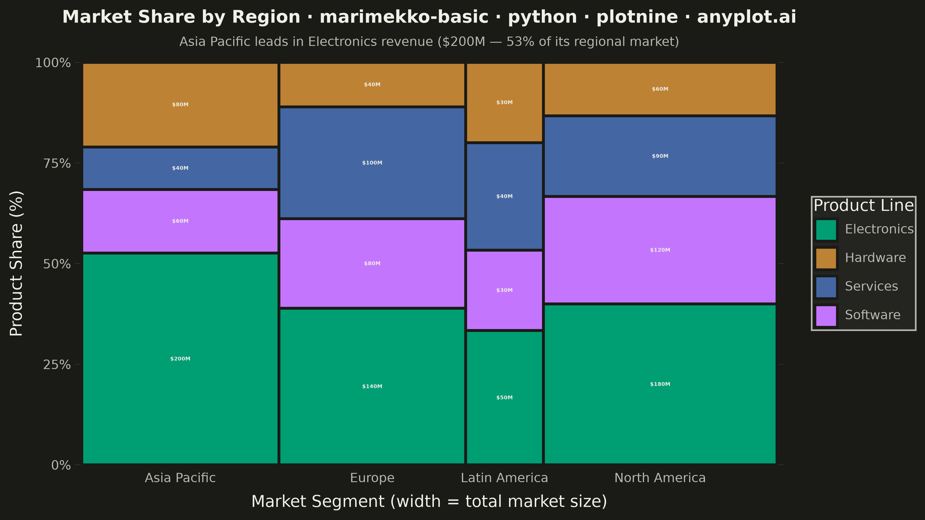
A Marimekko chart (also called mekko or mosaic plot) is a stacked bar chart where both the width and height of segments represent data values. This visualization shows two categorical dimensions simultaneously with proportional areas, making it ideal for understanding how parts relate to wholes across categories of different sizes.
""" anyplot.ai
marimekko-basic: Basic Marimekko Chart
Library: plotnine 0.15.7 | Python 3.13.14
Quality: 89/100 | Updated: 2026-07-24
"""

import os

import pandas as pd
from plotnine import (
    aes,
    element_blank,
    element_line,
    element_rect,
    element_text,
    geom_label,
    geom_rect,
    ggplot,
    labs,
    scale_fill_manual,
    scale_x_continuous,
    scale_y_continuous,
    theme,
    theme_minimal,
)


# Theme-adaptive chrome tokens (Imprint palette)
THEME = os.getenv("ANYPLOT_THEME", "light")
PAGE_BG = "#FAF8F1" if THEME == "light" else "#1A1A17"
ELEVATED_BG = "#FFFDF6" if THEME == "light" else "#242420"
INK = "#1A1A17" if THEME == "light" else "#F0EFE8"
INK_SOFT = "#4A4A44" if THEME == "light" else "#B8B7B0"

# Data - Market share by region and product line
data = {
    "region": [
        "North America",
        "North America",
        "North America",
        "North America",
        "Europe",
        "Europe",
        "Europe",
        "Europe",
        "Asia Pacific",
        "Asia Pacific",
        "Asia Pacific",
        "Asia Pacific",
        "Latin America",
        "Latin America",
        "Latin America",
        "Latin America",
    ],
    "product": [
        "Electronics",
        "Software",
        "Services",
        "Hardware",
        "Electronics",
        "Software",
        "Services",
        "Hardware",
        "Electronics",
        "Software",
        "Services",
        "Hardware",
        "Electronics",
        "Software",
        "Services",
        "Hardware",
    ],
    "value": [
        180,
        120,
        90,
        60,  # North America: total 450
        140,
        80,
        100,
        40,  # Europe: total 360
        200,
        60,
        40,
        80,  # Asia Pacific: total 380
        50,
        30,
        40,
        30,
    ],  # Latin America: total 150
}
df = pd.DataFrame(data)

# Calculate totals per region (determines bar width)
region_totals = df.groupby("region")["value"].sum().reset_index()
region_totals.columns = ["region", "total"]
total_all = region_totals["total"].sum()

# Calculate cumulative x positions (bar widths)
region_totals["width_pct"] = region_totals["total"] / total_all * 100
region_totals["xmax"] = region_totals["width_pct"].cumsum()
region_totals["xmin"] = region_totals["xmax"] - region_totals["width_pct"]
region_totals["xcenter"] = (region_totals["xmin"] + region_totals["xmax"]) / 2

# Merge back to get x positions
df = df.merge(region_totals[["region", "xmin", "xmax", "total"]], on="region")

# Calculate y positions within each region (stacked segments)
df["pct_within"] = df["value"] / df["total"] * 100

# Sort by product within region for consistent stacking
product_order = ["Electronics", "Software", "Services", "Hardware"]
df["product_order"] = df["product"].map({p: i for i, p in enumerate(product_order)})
df = df.sort_values(["region", "product_order"]).reset_index(drop=True)

# Calculate cumulative y positions within each region
rects = []
for region in df["region"].unique():
    region_df = df[df["region"] == region].copy()
    y_pos = 0
    for _, row in region_df.iterrows():
        rect = {
            "region": row["region"],
            "product": row["product"],
            "value": row["value"],
            "xmin": row["xmin"],
            "xmax": row["xmax"],
            "ymin": y_pos,
            "ymax": y_pos + row["pct_within"],
        }
        rect["ycenter"] = (rect["ymin"] + rect["ymax"]) / 2
        rect["xcenter"] = (rect["xmin"] + rect["xmax"]) / 2
        rects.append(rect)
        y_pos += row["pct_within"]

plot_df = pd.DataFrame(rects)

# Add labels with value for larger segments
plot_df["label"] = plot_df.apply(lambda r: f"${r['value']}M" if (r["ymax"] - r["ymin"]) > 10 else "", axis=1)
label_df = plot_df[plot_df["label"] != ""].reset_index(drop=True)

# Flag the segment the subtitle calls out so the visual reinforces the story,
# not just the caption text
plot_df["highlight"] = (plot_df["region"] == "Asia Pacific") & (plot_df["product"] == "Electronics")
dimmed_df = plot_df[~plot_df["highlight"]].reset_index(drop=True)
highlight_df = plot_df[plot_df["highlight"]].reset_index(drop=True)

# Imprint palette — canonical categorical order (abstract product lines, no
# semantic color cue), brand green always first
product_colors = {"Electronics": "#009E73", "Software": "#C475FD", "Services": "#4467A3", "Hardware": "#BD8233"}

# Title fontsize scales down from the 12pt default since the descriptive
# prefix pushes the mandated title past the 67-char baseline
title = "Market Share by Region · marimekko-basic · python · plotnine · anyplot.ai"
title_fontsize = round(12 * min(1.0, 67 / len(title)))

# Create plot
plot = (
    ggplot(plot_df)
    + geom_rect(
        data=dimmed_df,
        mapping=aes(xmin="xmin", xmax="xmax", ymin="ymin", ymax="ymax", fill="product"),
        color=PAGE_BG,
        size=1.0,
        alpha=0.6,
    )
    + geom_rect(
        data=highlight_df,
        mapping=aes(xmin="xmin", xmax="xmax", ymin="ymin", ymax="ymax", fill="product"),
        color=INK,
        size=1.8,
        alpha=1.0,
    )
    + geom_label(
        data=label_df,
        mapping=aes(x="xcenter", y="ycenter", label="label"),
        size=3.2,
        color=INK,
        fill=ELEVATED_BG,
        label_size=0.15,
        label_r=0.05,
        label_padding=0.1,
        fontweight="bold",
    )
    + scale_fill_manual(values=product_colors)
    + scale_x_continuous(
        breaks=region_totals["xcenter"].tolist(), labels=region_totals["region"].tolist(), expand=(0.01, 0.01)
    )
    + scale_y_continuous(breaks=[0, 25, 50, 75, 100], labels=["0%", "25%", "50%", "75%", "100%"], expand=(0.01, 0.01))
    + labs(
        x="Market Segment (width = total market size)",
        y="Product Share (%)",
        title=title,
        subtitle="Asia Pacific leads in Electronics revenue ($200M — 53% of its regional market)",
        fill="Product Line",
    )
    + theme_minimal()
    + theme(
        figure_size=(8, 4.5),
        text=element_text(size=7),
        plot_background=element_rect(fill=PAGE_BG, color=PAGE_BG),
        panel_background=element_rect(fill=PAGE_BG),
        panel_grid_major_x=element_blank(),
        panel_grid_minor_x=element_blank(),
        panel_grid_minor_y=element_blank(),
        panel_grid_major_y=element_line(color=INK, size=0.3, alpha=0.15),
        plot_title=element_text(size=title_fontsize, ha="center", weight="bold", color=INK),
        plot_subtitle=element_text(size=8, ha="center", color=INK_SOFT),
        axis_title=element_text(size=10, color=INK),
        axis_text_x=element_text(size=8, color=INK_SOFT),
        axis_text_y=element_text(size=8, color=INK_SOFT),
        legend_title=element_text(size=10, color=INK),
        legend_text=element_text(size=8, color=INK_SOFT),
        legend_background=element_rect(fill=ELEVATED_BG, color=None),
        legend_position="right",
    )
)

# Save
plot.save(f"plot-{THEME}.png", dpi=400, width=8, height=4.5, units="in", verbose=False)
Runnable source as JSON, for any HTTP client: https://api.anyplot.ai/specs/marimekko-basic/plotnine/code. Any spec id and library id listed in llms-full.txt fit the same URL shape; every URL below is complete and callable.
{
  "spec_id": "marimekko-basic",
  "language": "python",
  "library": "plotnine",
  "page": "https://anyplot.ai/marimekko-basic/python/plotnine",
  "hub": "https://anyplot.ai/marimekko-basic",
  "code_json": "https://api.anyplot.ai/specs/marimekko-basic/plotnine/code",
  "spec_json": "https://api.anyplot.ai/specs/marimekko-basic",
  "render_light_png": "https://storage.googleapis.com/anyplot-images/plots/marimekko-basic/python/plotnine/plot-light.png",
  "render_dark_png": "https://storage.googleapis.com/anyplot-images/plots/marimekko-basic/python/plotnine/plot-dark.png",
  "quality_score": 89.0,
  "license": "MIT",
  "guide": "https://anyplot.ai/llms.txt"
}
Part of Basic Marimekko Chart on anyplot.ai.