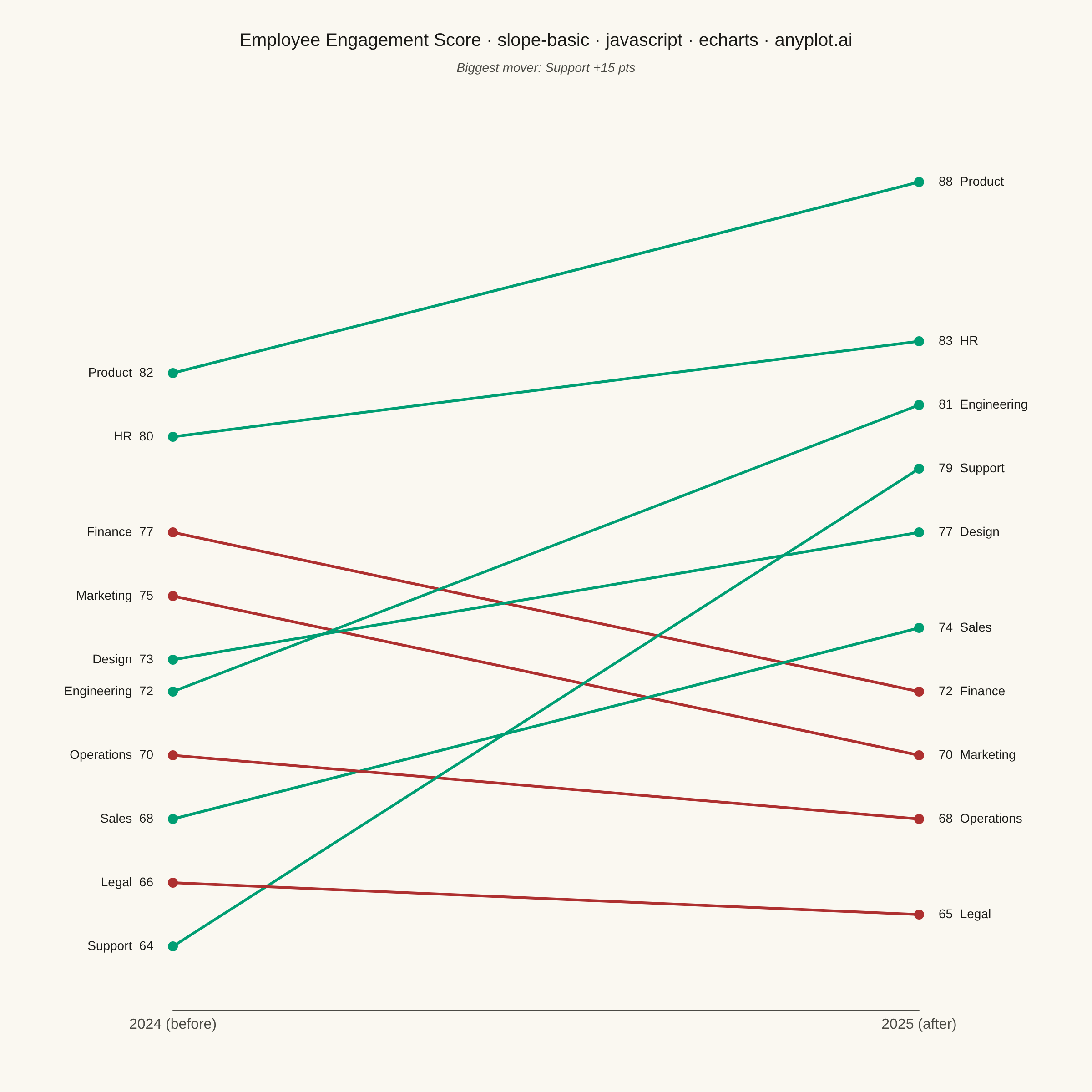
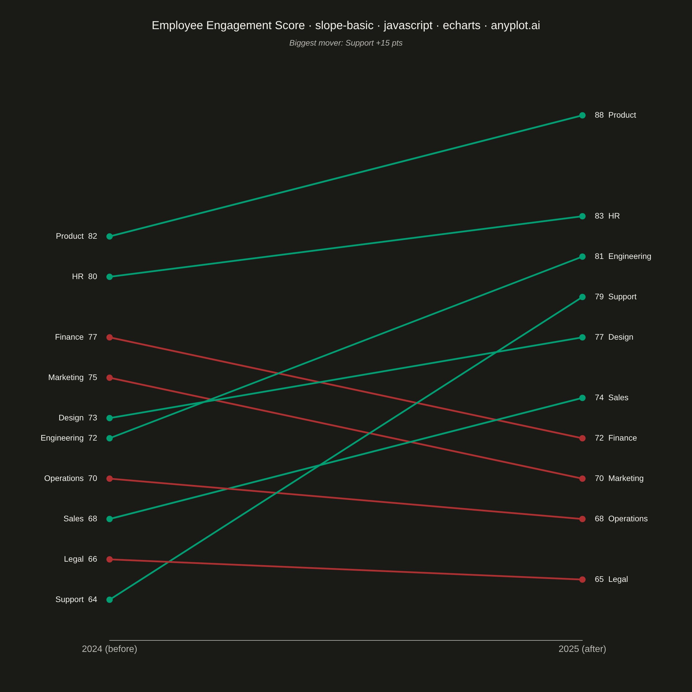
The same plot in 14 other libraries — JavaScript: Chart.js, D3.js, Highcharts, MUI X Charts; Python: Altair, Bokeh, lets-plot, Matplotlib, Plotly, plotnine, Pygal, Seaborn; R: ggplot2; Julia: Makie.jl. Compare all 15 side by side: Basic Slope Chart (Slopegraph) in Python, R, Julia and JavaScript.
A slope chart (slopegraph) visualizes changes between two time points by connecting values with lines across vertical axes. It emphasizes the direction and magnitude of change rather than absolute values, making it ideal for spotting increases, decreases, and rank changes at a glance. This chart type excels at before/after comparisons and highlighting which items improved or declined.
// anyplot.ai
// slope-basic: Basic Slope Chart (Slopegraph)
// Library: echarts 6.1.0 | JavaScript 22.23.1
// Quality: 94/100 | Updated: 2026-07-26

//# anyplot-orientation: square
const t = window.ANYPLOT_TOKENS;

// --- Data (in-memory, deterministic) ---------------------------------------
// Employee engagement survey score (0-100) by department, before vs after a
// company-wide feedback program.
const departments = [
  { name: "Product", start: 82, end: 88 },
  { name: "HR", start: 80, end: 83 },
  { name: "Marketing", start: 75, end: 70 },
  { name: "Finance", start: 77, end: 72 },
  { name: "Design", start: 73, end: 77 },
  { name: "Engineering", start: 72, end: 81 },
  { name: "Sales", start: 68, end: 74 },
  { name: "Operations", start: 70, end: 68 },
  { name: "Support", start: 64, end: 79 },
  { name: "Legal", start: 66, end: 65 },
];

const INCREASE = t.palette[0]; // "#009E73" brand green — profit/up/gain
const DECREASE = t.palette[4]; // "#AE3030" matte red — semantic anchor for loss/down

// Biggest mover (by absolute change) drives the callout annotation below.
const biggestMover = departments.reduce((a, b) =>
  Math.abs(b.end - b.start) > Math.abs(a.end - a.start) ? b : a,
);
const biggestDelta = biggestMover.end - biggestMover.start;

// --- Init -------------------------------------------------------------------
const chart = echarts.init(document.getElementById("container"));

// --- Option -----------------------------------------------------------------
const title = "Employee Engagement Score · slope-basic · javascript · echarts · anyplot.ai";

chart.setOption({
  animation: false,
  backgroundColor: "transparent",
  title: {
    text: title,
    left: "center",
    top: 30,
    textStyle: { color: t.ink, fontSize: 20, fontWeight: 500 },
  },
  graphic: {
    type: "text",
    left: "center",
    top: 68,
    style: {
      text: `Biggest mover: ${biggestMover.name} ${biggestDelta > 0 ? "+" : ""}${biggestDelta} pts`,
      fill: t.inkSoft,
      fontSize: 14,
      fontStyle: "italic",
    },
  },
  grid: { left: 190, right: 190, top: 130, bottom: 90 },
  xAxis: {
    type: "category",
    data: ["2024 (before)", "2025 (after)"],
    boundaryGap: false,
    axisLabel: { color: t.inkSoft, fontSize: 16 },
    axisLine: { lineStyle: { color: t.inkSoft } },
    axisTick: { show: false },
    splitLine: { show: false },
  },
  yAxis: {
    type: "value",
    min: 62,
    max: 90,
    show: false,
  },
  series: departments.map((d) => {
    const color = d.end >= d.start ? INCREASE : DECREASE;
    return {
      name: d.name,
      type: "line",
      symbol: "circle",
      symbolSize: 11,
      lineStyle: { width: 3, color },
      itemStyle: { color },
      emphasis: { focus: "series", lineStyle: { width: 5 } },
      blur: { lineStyle: { opacity: 0.15 }, label: { opacity: 0.25 } },
      data: [
        {
          value: d.start,
          label: {
            show: true,
            position: "left",
            distance: 16,
            formatter: () => `${d.name}  ${d.start}`,
            color: t.ink,
            fontSize: 14,
          },
        },
        {
          value: d.end,
          label: {
            show: true,
            position: "right",
            distance: 16,
            formatter: () => `${d.end}  ${d.name}`,
            color: t.ink,
            fontSize: 14,
          },
        },
      ],
    };
  }),
});
Runnable source as JSON, for any HTTP client: https://api.anyplot.ai/specs/slope-basic/echarts/code. Any spec id and library id listed in llms-full.txt fit the same URL shape; every URL below is complete and callable.
{
  "spec_id": "slope-basic",
  "language": "javascript",
  "library": "echarts",
  "page": "https://anyplot.ai/slope-basic/javascript/echarts",
  "hub": "https://anyplot.ai/slope-basic",
  "code_json": "https://api.anyplot.ai/specs/slope-basic/echarts/code",
  "spec_json": "https://api.anyplot.ai/specs/slope-basic",
  "render_light_png": "https://storage.googleapis.com/anyplot-images/plots/slope-basic/javascript/echarts/plot-light.png",
  "render_dark_png": "https://storage.googleapis.com/anyplot-images/plots/slope-basic/javascript/echarts/plot-dark.png",
  "interactive_light_html": "https://storage.googleapis.com/anyplot-images/plots/slope-basic/javascript/echarts/plot-light.html",
  "interactive_dark_html": "https://storage.googleapis.com/anyplot-images/plots/slope-basic/javascript/echarts/plot-dark.html",
  "quality_score": 94.0,
  "license": "MIT",
  "guide": "https://anyplot.ai/llms.txt"
}
Part of Basic Slope Chart (Slopegraph) on anyplot.ai.