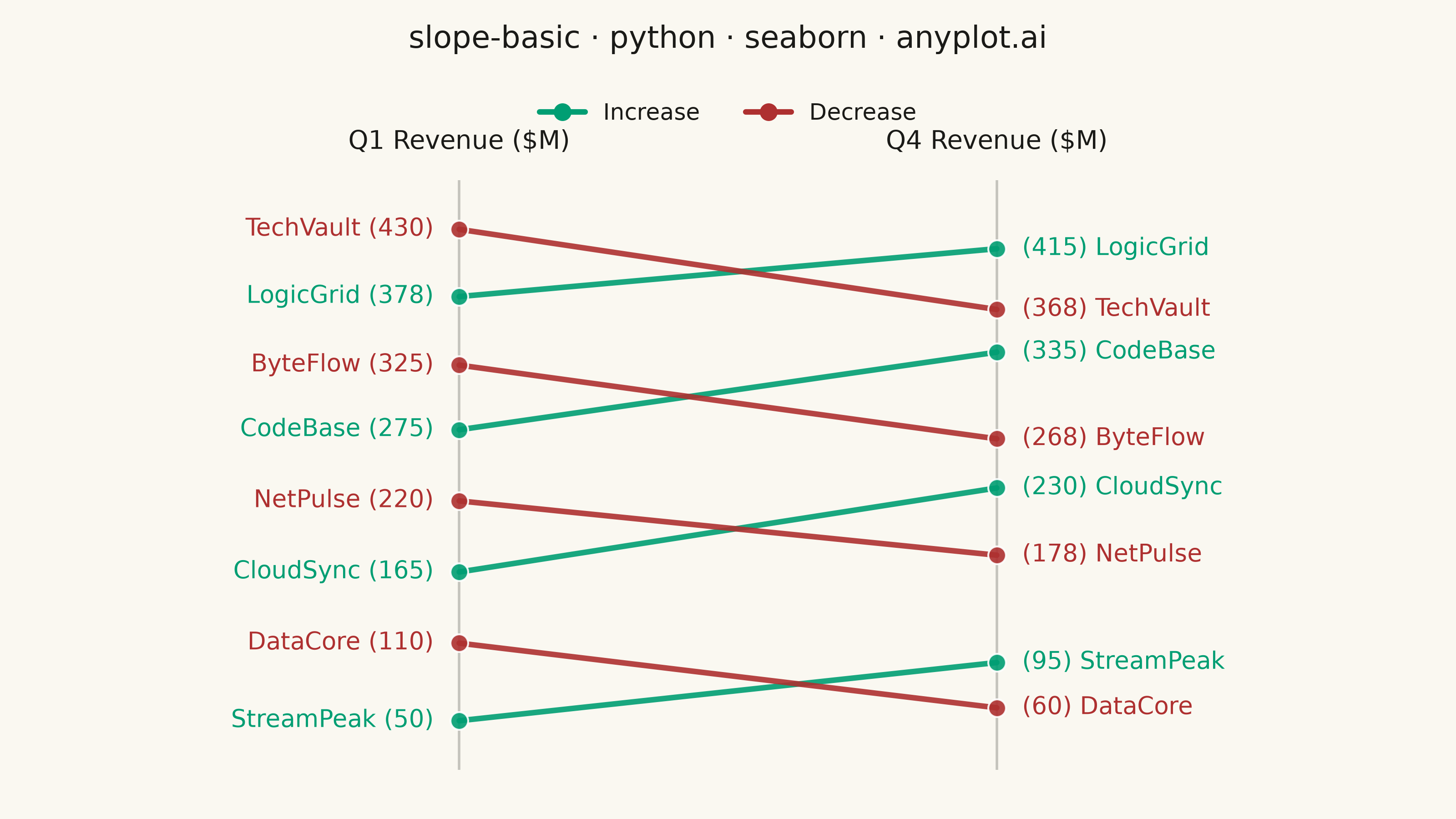
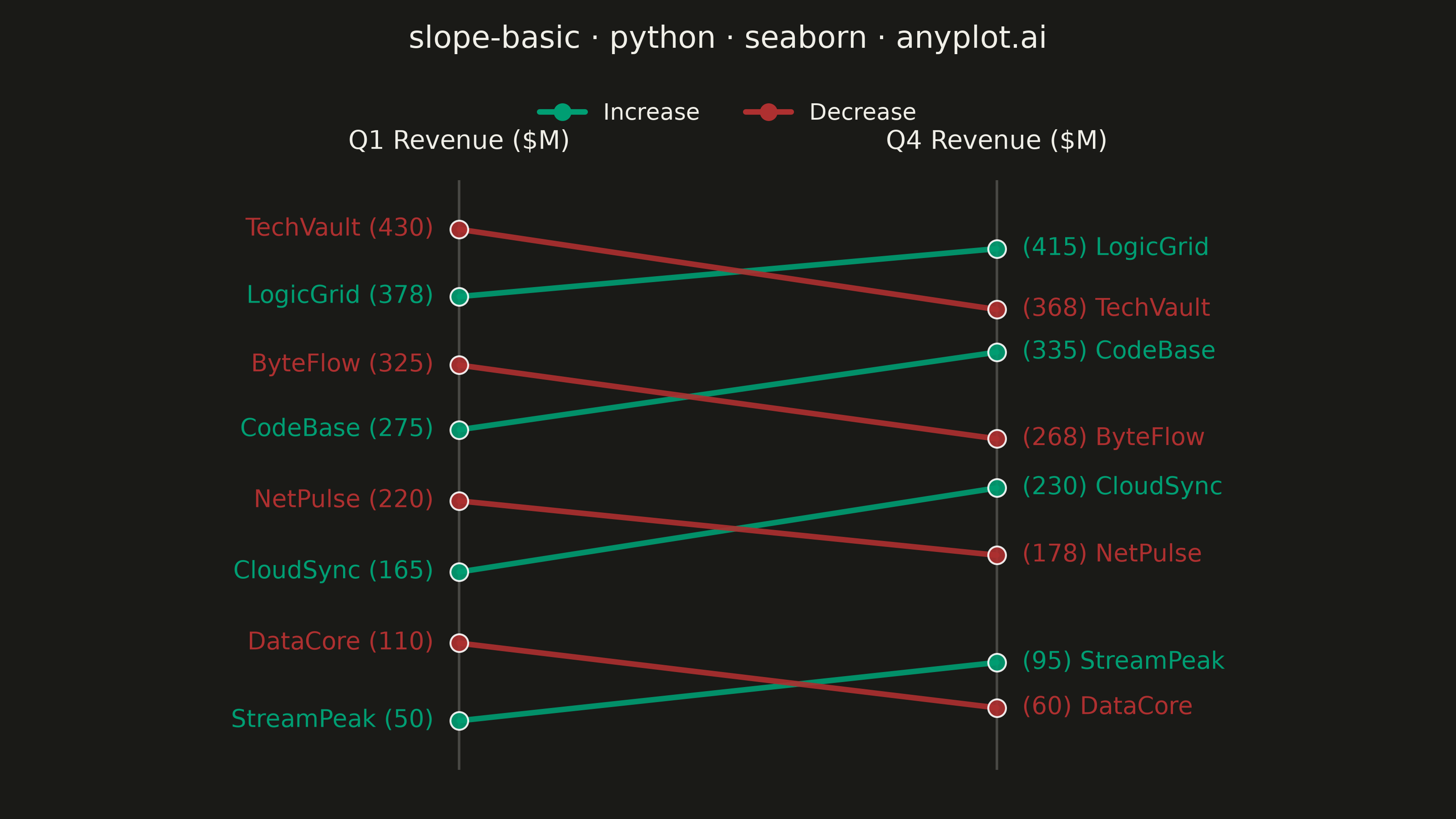
A slope chart (slopegraph) visualizes changes between two or more time points by connecting values with lines across vertical axes. It emphasizes the direction and magnitude of change rather than absolute values, making it ideal for spotting increases, decreases, and rank changes at a glance. This chart type excels at before/after comparisons and highlighting which items improved or declined.
""" anyplot.ai
slope-basic: Basic Slope Chart (Slopegraph)
Library: seaborn 0.13.2 | Python 3.13.14
Quality: 92/100 | Updated: 2026-07-25
"""

import os

import matplotlib.pyplot as plt
import pandas as pd
import seaborn as sns
from matplotlib.lines import Line2D


# Theme tokens (see prompts/default-style-guide.md "Background" + "Theme-adaptive Chrome")
THEME = os.getenv("ANYPLOT_THEME", "light")
PAGE_BG = "#FAF8F1" if THEME == "light" else "#1A1A17"
INK = "#1A1A17" if THEME == "light" else "#F0EFE8"
INK_SOFT = "#4A4A44" if THEME == "light" else "#B8B7B0"

COLOR_INCREASE = "#009E73"  # Imprint palette position 1 — brand green, also reads as "gain"
COLOR_DECREASE = "#AE3030"  # Imprint palette position 5 — semantic anchor for loss/decrease

sns.set_theme(
    style="white",
    rc={"figure.facecolor": PAGE_BG, "axes.facecolor": PAGE_BG, "axes.labelcolor": INK, "text.color": INK},
)

# Data — tech company revenue comparison Q1 vs Q4 (four rank crossings)
data = {
    "entity": ["StreamPeak", "DataCore", "CloudSync", "NetPulse", "CodeBase", "ByteFlow", "LogicGrid", "TechVault"],
    "Q1 ($M)": [50, 110, 165, 220, 275, 325, 378, 430],
    "Q4 ($M)": [95, 60, 230, 178, 335, 268, 415, 368],
}

df = pd.DataFrame(data)
df["change"] = df["Q4 ($M)"] - df["Q1 ($M)"]
df["direction"] = df["change"].apply(lambda x: "Increase" if x > 0 else "Decrease")
df = df.sort_values("Q1 ($M)").reset_index(drop=True)

df_melted = df.melt(
    id_vars=["entity", "direction"], value_vars=["Q1 ($M)", "Q4 ($M)"], var_name="Period", value_name="Revenue ($M)"
)
df_melted["period_num"] = df_melted["Period"].map({"Q1 ($M)": 0, "Q4 ($M)": 1})

# Plot — landscape 3200×1800
fig, ax = plt.subplots(figsize=(8, 4.5), dpi=400, facecolor=PAGE_BG)
ax.set_facecolor(PAGE_BG)

palette = {"Increase": COLOR_INCREASE, "Decrease": COLOR_DECREASE}

sns.lineplot(
    data=df_melted,
    x="period_num",
    y="Revenue ($M)",
    hue="direction",
    units="entity",
    estimator=None,
    palette=palette,
    linewidth=2.2,
    marker="o",
    markersize=7,
    alpha=0.9,
    legend=False,
    ax=ax,
)

# Faint column guides — the two vertical "axes" the spec calls for, one per time point
ax.axvline(x=0, color=INK_SOFT, alpha=0.3, linewidth=1, zorder=1)
ax.axvline(x=1, color=INK_SOFT, alpha=0.3, linewidth=1, zorder=1)

# Endpoint labels double as the value axis (no separate y-axis needed). annotation_clip=False
# is required here: the default clip-to-axes-bbox behavior is what truncated "CodeBase"/"NetPulse"
# into "cdeBase"/"etPulse" in the previous render.
for _, row in df.iterrows():
    color = palette[row["direction"]]
    q1_val = int(row["Q1 ($M)"])
    q4_val = int(row["Q4 ($M)"])

    ax.annotate(
        f"{row['entity']} ({q1_val})",
        xy=(0, q1_val),
        xytext=(-10, 0),
        textcoords="offset points",
        fontsize=9.5,
        color=color,
        ha="right",
        va="center",
        fontweight="medium",
        annotation_clip=False,
    )
    ax.annotate(
        f"({q4_val}) {row['entity']}",
        xy=(1, q4_val),
        xytext=(10, 0),
        textcoords="offset points",
        fontsize=9.5,
        color=color,
        ha="left",
        va="center",
        fontweight="medium",
        annotation_clip=False,
    )

# Style — no shared y-axis: each column is its own vertical scale, per the spec's "vertical
# axes labeled with time point names" note, so a combined Revenue axis would be redundant.
ax.set_xticks([0, 1])
ax.set_xticklabels(["Q1 Revenue ($M)", "Q4 Revenue ($M)"], fontsize=10, color=INK, fontweight="medium")
ax.xaxis.set_ticks_position("top")
ax.xaxis.set_label_position("top")
ax.tick_params(axis="x", top=True, bottom=False, labeltop=True, labelbottom=False, length=0, pad=10)
ax.set_xlabel("")
ax.set_ylabel("")
ax.set_yticks([])
for spine in ax.spines.values():
    spine.set_visible(False)
ax.set_xlim(-0.15, 1.15)

y_min = min(df["Q1 ($M)"].min(), df["Q4 ($M)"].min())
y_max = max(df["Q1 ($M)"].max(), df["Q4 ($M)"].max())
y_padding = (y_max - y_min) * 0.10
ax.set_ylim(y_min - y_padding, y_max + y_padding)

fig.suptitle("slope-basic · python · seaborn · anyplot.ai", fontsize=12, fontweight="medium", color=INK, y=0.97)

legend_elements = [
    Line2D([0], [0], color=COLOR_INCREASE, linewidth=2.2, marker="o", markersize=6, label="Increase"),
    Line2D([0], [0], color=COLOR_DECREASE, linewidth=2.2, marker="o", markersize=6, label="Decrease"),
]
fig.legend(
    handles=legend_elements,
    loc="upper center",
    bbox_to_anchor=(0.5, 0.90),
    ncol=2,
    frameon=False,
    fontsize=9,
    labelcolor=INK,
)

fig.subplots_adjust(left=0.26, right=0.74, top=0.78, bottom=0.06)
plt.savefig(f"plot-{THEME}.png", dpi=400, facecolor=PAGE_BG)
Runnable source as JSON, for any HTTP client: https://api.anyplot.ai/specs/slope-basic/seaborn/code. Any spec id and library id listed in llms-full.txt fit the same URL shape; every URL below is complete and callable.
{
  "spec_id": "slope-basic",
  "language": "python",
  "library": "seaborn",
  "page": "https://anyplot.ai/slope-basic/python/seaborn",
  "hub": "https://anyplot.ai/slope-basic",
  "code_json": "https://api.anyplot.ai/specs/slope-basic/seaborn/code",
  "spec_json": "https://api.anyplot.ai/specs/slope-basic",
  "render_light_png": "https://storage.googleapis.com/anyplot-images/plots/slope-basic/python/seaborn/plot-light.png",
  "render_dark_png": "https://storage.googleapis.com/anyplot-images/plots/slope-basic/python/seaborn/plot-dark.png",
  "quality_score": 92.0,
  "license": "MIT",
  "guide": "https://anyplot.ai/llms.txt"
}
Part of Basic Slope Chart (Slopegraph) on anyplot.ai.