The same plot in 14 other libraries — Python: Altair, Bokeh, lets-plot, Matplotlib, Plotly, plotnine, Pygal, Seaborn; Julia: Makie.jl; JavaScript: Chart.js, D3.js, Apache ECharts, Highcharts, MUI X Charts. Compare all 15 side by side: Basic Slope Chart (Slopegraph) in Python, R, Julia and JavaScript.
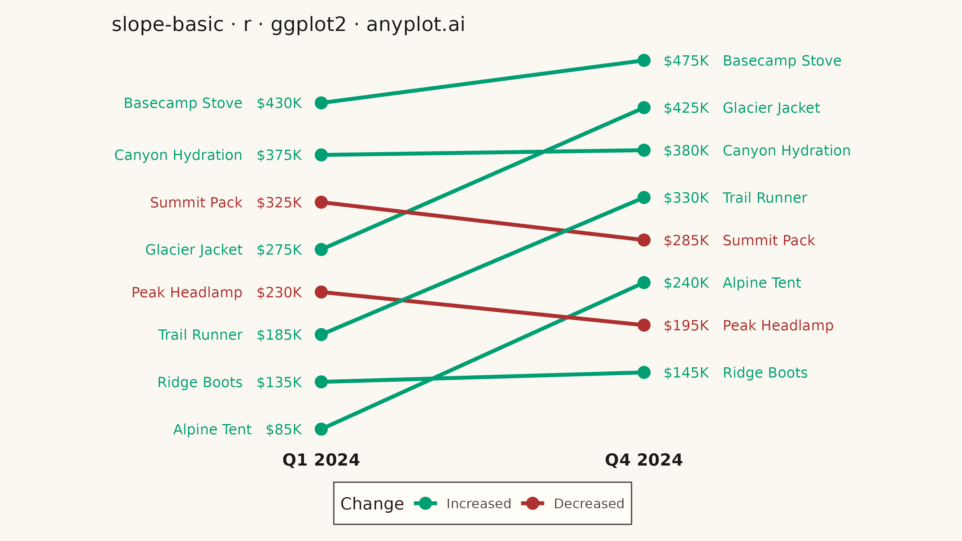
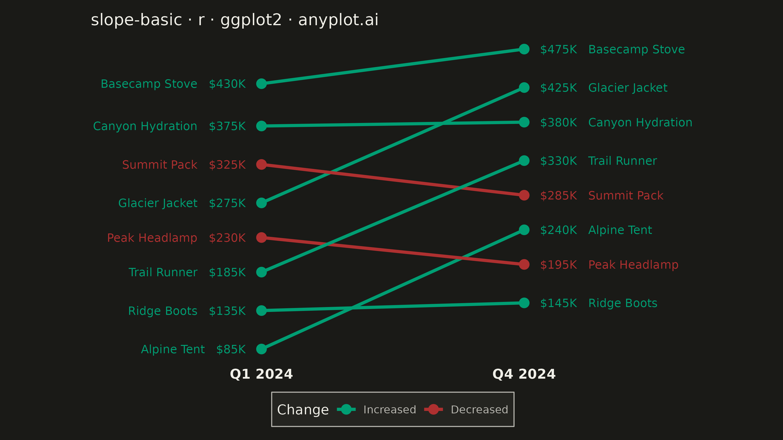
A slope chart (slopegraph) visualizes changes between two time points by connecting values with lines across vertical axes. It emphasizes the direction and magnitude of change rather than absolute values, making it ideal for spotting increases, decreases, and rank changes at a glance. This chart type excels at before/after comparisons and highlighting which items improved or declined.
#' anyplot.ai
#' slope-basic: Basic Slope Chart (Slopegraph)
#' Library: ggplot2 3.5.1 | R 4.4.1
#' Quality: 85/100 | Created: 2026-07-25

library(ggplot2)
library(dplyr)
library(tidyr)
library(scales)
library(ragg)

set.seed(42)

# --- Theme tokens -----------------------------------------------------------
THEME       <- Sys.getenv("ANYPLOT_THEME", "light")
PAGE_BG     <- if (THEME == "light") "#FAF8F1" else "#1A1A17"
ELEVATED_BG <- if (THEME == "light") "#FFFDF6" else "#242420"
INK         <- if (THEME == "light") "#1A1A17" else "#F0EFE8"
INK_SOFT    <- if (THEME == "light") "#4A4A44" else "#B8B7B0"
IMPRINT_PALETTE <- c(
  "#009E73", "#C475FD", "#4467A3", "#BD8233",
  "#AE3030", "#2ABCCD", "#954477", "#99B314"
)

# --- Data --------------------------------------------------------------------
# Quarterly sales ($ thousands) for an outdoor-gear product line, Q1 vs Q4.
product_line <- c(
  "Alpine Tent", "Ridge Boots", "Trail Runner", "Peak Headlamp",
  "Glacier Jacket", "Summit Pack", "Canyon Hydration", "Basecamp Stove"
)
q1_sales <- c(85, 135, 185, 230, 275, 325, 375, 430)
q4_sales <- c(240, 145, 330, 195, 425, 285, 380, 475)

# Pushes rows that land closer than min_gap apart so labels never collide,
# regardless of how close the underlying values are — a general substitute
# for ggrepel (unavailable in this runtime) rather than relying on the raw
# values happening to already be well spaced.
enforce_min_gap <- function(values, min_gap) {
  ord    <- order(values)
  spaced <- values[ord]
  for (i in seq_along(spaced)[-1]) {
    if (spaced[i] - spaced[i - 1] < min_gap) spaced[i] <- spaced[i - 1] + min_gap
  }
  spaced       <- spaced - mean(spaced) + mean(values)
  out          <- numeric(length(values))
  out[ord]     <- spaced
  out
}
min_gap <- diff(range(c(q1_sales, q4_sales))) * 0.06

sales <- tibble::tibble(
  entity      = product_line,
  value_start = q1_sales,
  value_end   = q4_sales,
  y_start     = enforce_min_gap(q1_sales, min_gap),
  y_end       = enforce_min_gap(q4_sales, min_gap)
) %>%
  mutate(
    direction   = if_else(value_end > value_start, "Increased", "Decreased"),
    direction   = factor(direction, levels = c("Increased", "Decreased")),
    glyph       = if_else(direction == "Increased", "▲", "▼"),
    label_start = sprintf("%s   %s", entity, dollar(value_start, suffix = "K")),
    label_end   = sprintf("%s   %s", dollar(value_end, suffix = "K"), entity)
  )

sales_long <- sales %>%
  pivot_longer(
    cols          = c(value_start, value_end, y_start, y_end),
    names_to      = c(".value", "period"),
    names_pattern = "(value|y)_(start|end)"
  ) %>%
  mutate(
    x     = if_else(period == "start", 1, 2),
    label = if_else(period == "start", label_start, label_end)
  )

# --- Plot ---------------------------------------------------------------------
p <- ggplot(sales_long, aes(x = x, y = y, group = entity, color = direction)) +
  geom_line(aes(linetype = direction), linewidth = 1.1) +
  geom_point(size = 3) +
  geom_text(
    data    = filter(sales_long, x == 1),
    aes(label = label),
    hjust   = 1,
    nudge_x = -0.06,
    size    = 3,
    show.legend = FALSE
  ) +
  geom_text(
    data    = filter(sales_long, x == 2),
    aes(label = label),
    hjust   = 0,
    nudge_x = 0.06,
    size    = 3,
    show.legend = FALSE
  ) +
  geom_text(
    aes(label = glyph),
    vjust       = -1.2,
    size        = 3,
    fontface    = "bold",
    show.legend = FALSE
  ) +
  scale_x_continuous(
    breaks = c(1, 2),
    labels = c("Q1 2024", "Q4 2024"),
    limits = c(0.35, 2.65),
    expand = c(0, 0)
  ) +
  scale_color_manual(
    name   = "Change",
    values = c("Increased" = IMPRINT_PALETTE[1], "Decreased" = "#AE3030")
  ) +
  scale_linetype_manual(
    name   = "Change",
    values = c("Increased" = "solid", "Decreased" = "dashed")
  ) +
  labs(
    title = "slope-basic · r · ggplot2 · anyplot.ai",
    x     = NULL,
    y     = NULL
  ) +
  theme_minimal(base_size = 8) +
  theme(
    plot.background     = element_rect(fill = PAGE_BG, color = PAGE_BG),
    panel.background    = element_rect(fill = PAGE_BG, color = NA),
    panel.grid          = element_blank(),
    axis.title          = element_blank(),
    axis.text.y         = element_blank(),
    axis.ticks          = element_blank(),
    axis.text.x         = element_text(color = INK, size = 10, face = "bold"),
    plot.title          = element_text(color = INK, size = 12),
    legend.position     = "bottom",
    legend.key.width    = unit(1.6, "cm"),
    legend.background   = element_rect(fill = ELEVATED_BG, color = INK_SOFT),
    legend.text         = element_text(color = INK_SOFT, size = 8),
    legend.title        = element_text(color = INK, size = 10),
    plot.margin         = margin(t = 10, r = 65, b = 10, l = 65)
  )

# --- Save ---------------------------------------------------------------------
ggsave(
  filename = sprintf("plot-%s.png", THEME),
  plot     = p,
  device   = ragg::agg_png,
  width    = 8,
  height   = 4.5,
  units    = "in",
  dpi      = 400
)
Runnable source as JSON, for any HTTP client: https://api.anyplot.ai/specs/slope-basic/ggplot2/code. Any spec id and library id listed in llms-full.txt fit the same URL shape; every URL below is complete and callable.
{
  "spec_id": "slope-basic",
  "language": "r",
  "library": "ggplot2",
  "page": "https://anyplot.ai/slope-basic/r/ggplot2",
  "hub": "https://anyplot.ai/slope-basic",
  "code_json": "https://api.anyplot.ai/specs/slope-basic/ggplot2/code",
  "spec_json": "https://api.anyplot.ai/specs/slope-basic",
  "render_light_png": "https://storage.googleapis.com/anyplot-images/plots/slope-basic/r/ggplot2/plot-light.png",
  "render_dark_png": "https://storage.googleapis.com/anyplot-images/plots/slope-basic/r/ggplot2/plot-dark.png",
  "quality_score": 85.0,
  "license": "MIT",
  "guide": "https://anyplot.ai/llms.txt"
}
Part of Basic Slope Chart (Slopegraph) on anyplot.ai.