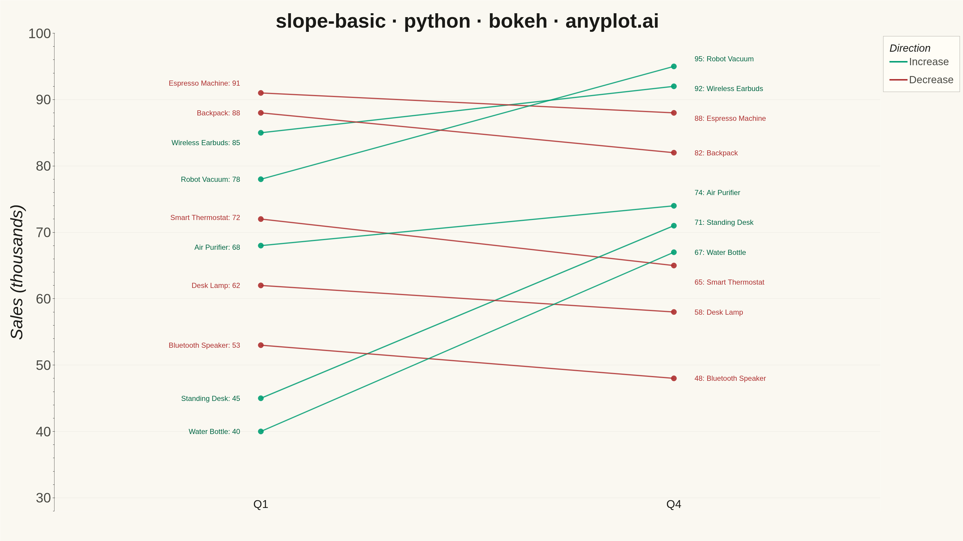
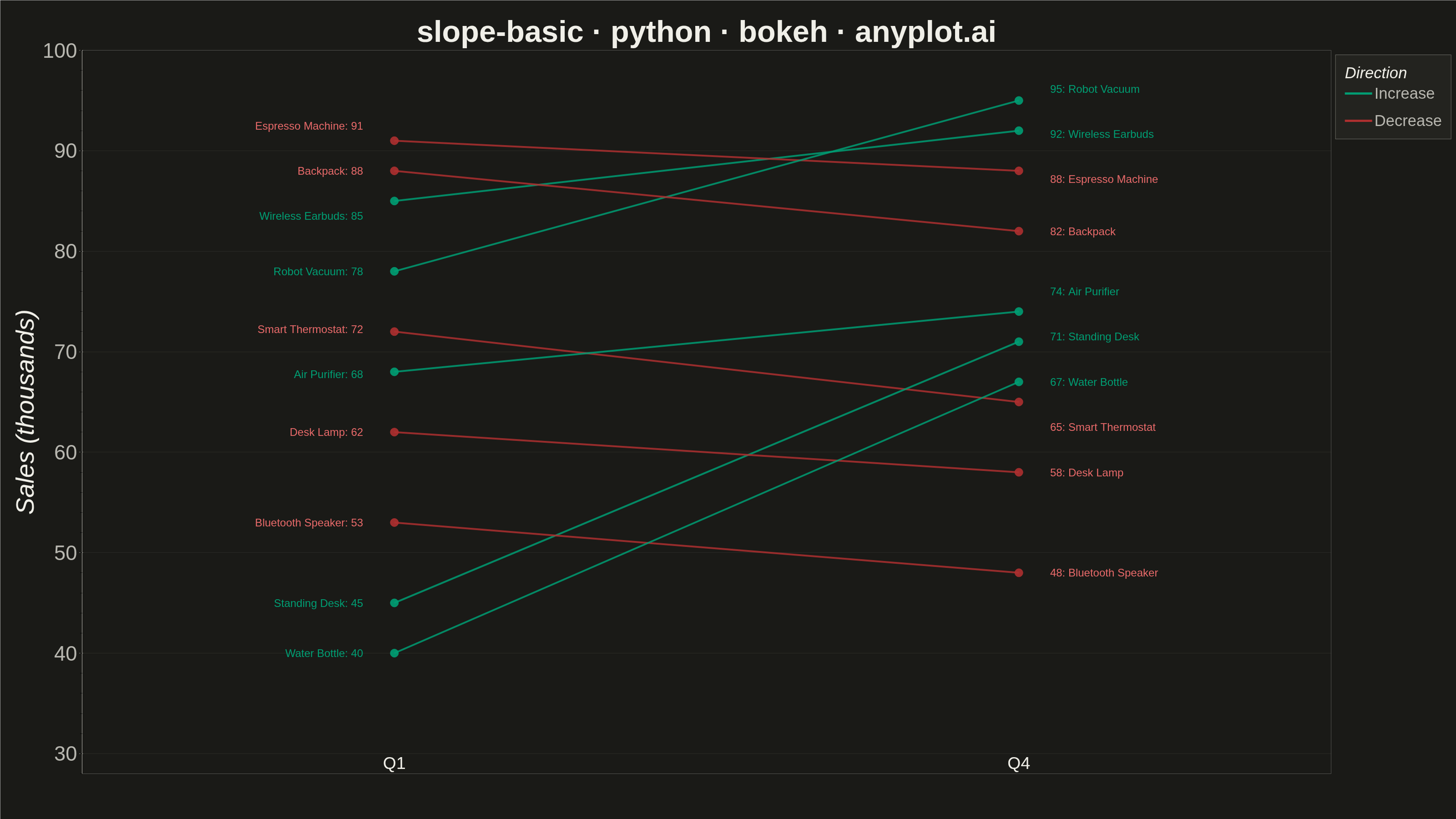
A slope chart (slopegraph) visualizes changes between two or more time points by connecting values with lines across vertical axes. It emphasizes the direction and magnitude of change rather than absolute values, making it ideal for spotting increases, decreases, and rank changes at a glance. This chart type excels at before/after comparisons and highlighting which items improved or declined.
""" anyplot.ai
slope-basic: Basic Slope Chart (Slopegraph)
Library: bokeh 3.9.2 | Python 3.13.14
Quality: 92/100 | Updated: 2026-07-25
"""

import os
import time
from pathlib import Path

from bokeh.io import output_file, save
from bokeh.models import ColumnDataSource, HoverTool, Label
from bokeh.plotting import figure
from selenium import webdriver
from selenium.webdriver.chrome.options import Options


THEME = os.getenv("ANYPLOT_THEME", "light")
PAGE_BG = "#FAF8F1" if THEME == "light" else "#1A1A17"
ELEVATED_BG = "#FFFDF6" if THEME == "light" else "#242420"
INK = "#1A1A17" if THEME == "light" else "#F0EFE8"
INK_SOFT = "#4A4A44" if THEME == "light" else "#B8B7B0"

# Direction colors follow the semantic exception (up/gain -> green, down/loss -> red)
INCREASE_COLOR = "#009E73"  # Imprint position 1 (brand green)
DECREASE_COLOR = "#AE3030"  # Imprint position 5 (matte red, semantic anchor)

# Endpoint-label TEXT uses theme-tuned variants of the direction colors so the
# small text clears WCAG contrast against its background; the lines, markers,
# and legend swatches stay at the true Imprint colors above for palette identity.
LABEL_INCREASE_COLOR = "#006644" if THEME == "light" else INCREASE_COLOR  # deeper green: 6.6:1 on light bg
LABEL_DECREASE_COLOR = "#E86A6A" if THEME == "dark" else DECREASE_COLOR  # lighter red: 5.6:1 on dark bg

products = [
    "Wireless Earbuds",
    "Smart Thermostat",
    "Espresso Machine",
    "Standing Desk",
    "Air Purifier",
    "Bluetooth Speaker",
    "Robot Vacuum",
    "Desk Lamp",
    "Water Bottle",
    "Backpack",
]
q1_sales = [85, 72, 91, 45, 68, 53, 78, 62, 40, 88]
q4_sales = [92, 65, 88, 71, 74, 48, 95, 58, 67, 82]

colors = [INCREASE_COLOR if end > start else DECREASE_COLOR for start, end in zip(q1_sales, q4_sales, strict=True)]
label_colors = [
    LABEL_INCREASE_COLOR if end > start else LABEL_DECREASE_COLOR for start, end in zip(q1_sales, q4_sales, strict=True)
]
directions = ["Increase" if end > start else "Decrease" for start, end in zip(q1_sales, q4_sales, strict=True)]

# Spread label y-positions apart so dense clusters don't overlap (inlined per
# side, no helper function, per KISS structure — imports -> data -> plot -> save)
label_ys = {}
for side, ys in (("left", q1_sales), ("right", q4_sales)):
    order = sorted(range(len(ys)), key=lambda i: ys[i])
    adjusted = [float(ys[i]) for i in order]
    for _ in range(30):
        changed = False
        for i in range(1, len(adjusted)):
            if adjusted[i] - adjusted[i - 1] < 4.5:
                mid = (adjusted[i] + adjusted[i - 1]) / 2
                adjusted[i - 1] = mid - 2.25
                adjusted[i] = mid + 2.25
                changed = True
        if not changed:
            break
    spread = [0.0] * len(ys)
    for new_i, orig_i in enumerate(order):
        spread[orig_i] = adjusted[new_i]
    label_ys[side] = spread

title = "slope-basic · python · bokeh · anyplot.ai"
p = figure(
    width=3200,
    height=1800,
    title=title,
    x_range=(-0.5, 1.5),
    y_range=(28, 100),
    toolbar_location=None,
    min_border_bottom=100,
    min_border_left=180,
    min_border_top=110,
    min_border_right=260,
)

p.background_fill_color = PAGE_BG
p.border_fill_color = PAGE_BG
p.outline_line_color = None

p.title.text_font = "helvetica"
p.title.text_font_size = "50pt"
p.title.align = "center"
p.title.text_color = INK

p.xaxis.visible = False
p.yaxis.axis_label = "Sales (thousands)"
p.yaxis.axis_label_text_font = "helvetica"
p.yaxis.axis_label_text_font_size = "42pt"
p.yaxis.axis_label_text_color = INK
p.yaxis.major_label_text_font = "helvetica"
p.yaxis.major_label_text_font_size = "34pt"
p.yaxis.major_label_text_color = INK_SOFT
p.yaxis.axis_line_color = INK_SOFT
p.yaxis.major_tick_line_color = INK_SOFT

p.xgrid.grid_line_color = None
p.ygrid.grid_line_color = INK_SOFT
p.ygrid.grid_line_alpha = 0.10

# Time point column labels
for x_pos, label in [(0, "Q1"), (1, "Q4")]:
    p.add_layout(
        Label(
            x=x_pos, y=30, text=label, text_font_size="28pt", text_align="center", text_baseline="top", text_color=INK
        )
    )

# ColumnDataSource for scatter enables HoverTool
scatter_data: dict[str, list] = {"x": [], "y": [], "color": [], "product": [], "period": [], "value": []}
for product, start, end, color in zip(products, q1_sales, q4_sales, colors, strict=True):
    scatter_data["x"].extend([0, 1])
    scatter_data["y"].extend([start, end])
    scatter_data["color"].extend([color, color])
    scatter_data["product"].extend([product, product])
    scatter_data["period"].extend(["Q1", "Q4"])
    scatter_data["value"].extend([start, end])

source = ColumnDataSource(data=scatter_data)

# Draw slope lines (legend_label merges same-labeled renderers into one entry)
# and endpoint labels. Label TEXT uses the theme-tuned label_color (WCAG-safe)
# while the line/marker keeps the true Imprint color for palette identity.
for i, (product, start, end, color, label_color, direction) in enumerate(
    zip(products, q1_sales, q4_sales, colors, label_colors, directions, strict=True)
):
    p.line(x=[0, 1], y=[start, end], line_width=4, line_color=color, line_alpha=0.85, legend_label=direction)
    p.add_layout(
        Label(
            x=-0.05,
            y=label_ys["left"][i],
            text=f"{product}: {start}",
            text_font_size="18pt",
            text_align="right",
            text_baseline="middle",
            text_color=label_color,
        )
    )
    p.add_layout(
        Label(
            x=1.05,
            y=label_ys["right"][i],
            text=f"{end}: {product}",
            text_font_size="18pt",
            text_align="left",
            text_baseline="middle",
            text_color=label_color,
        )
    )

dots = p.scatter(x="x", y="y", size=18, color="color", source=source, alpha=0.9)
p.add_tools(
    HoverTool(
        renderers=[dots], tooltips=[("Product", "@product"), ("Period", "@period"), ("Sales", "@value{0} thousand")]
    )
)

# Move the auto-built direction legend outside the plot frame (right sidebar)
# so it no longer eats vertical space between the title and the data, unlike
# the previous floating in-frame label block.
p.legend.title = "Direction"
p.legend.title_text_font = "helvetica"
p.legend.title_text_font_size = "26pt"
p.legend.title_text_color = INK
p.legend.label_text_font = "helvetica"
p.legend.label_text_font_size = "26pt"
p.legend.label_text_color = INK_SOFT
p.legend.background_fill_color = ELEVATED_BG
p.legend.border_line_color = INK_SOFT
p.legend.glyph_width = 60
p.legend.glyph_height = 40
p.legend.spacing = 20
p.legend.padding = 20
p.add_layout(p.legend[0], "right")

output_file(f"plot-{THEME}.html", title=title)
save(p)

# bokeh's export_png is unreliable in this environment (probes a chromedriver
# snap shim) — write the HTML then screenshot it with headless Chrome instead.
W, H = 3200, 1800
opts = Options()
for arg in (
    "--headless=new",
    "--no-sandbox",
    "--disable-dev-shm-usage",
    "--disable-gpu",
    f"--window-size={W},{H}",
    "--hide-scrollbars",
):
    opts.add_argument(arg)
driver = webdriver.Chrome(options=opts)
driver.set_window_size(W, H)
driver.get(f"file://{Path(f'plot-{THEME}.html').resolve()}")
# Headless Chrome's --window-size sets the OUTER window (a phantom ~143px
# title bar eats into it even headless), so innerHeight ends up short of H.
# Override the viewport directly via CDP for an exact WxH capture.
driver.execute_cdp_cmd(
    "Emulation.setDeviceMetricsOverride", {"width": W, "height": H, "deviceScaleFactor": 1, "mobile": False}
)
time.sleep(3)  # let bokeh's JS render the canvas
driver.save_screenshot(f"plot-{THEME}.png")
driver.quit()
Runnable source as JSON, for any HTTP client: https://api.anyplot.ai/specs/slope-basic/bokeh/code. Any spec id and library id listed in llms-full.txt fit the same URL shape; every URL below is complete and callable.
{
  "spec_id": "slope-basic",
  "language": "python",
  "library": "bokeh",
  "page": "https://anyplot.ai/slope-basic/python/bokeh",
  "hub": "https://anyplot.ai/slope-basic",
  "code_json": "https://api.anyplot.ai/specs/slope-basic/bokeh/code",
  "spec_json": "https://api.anyplot.ai/specs/slope-basic",
  "render_light_png": "https://storage.googleapis.com/anyplot-images/plots/slope-basic/python/bokeh/plot-light.png",
  "render_dark_png": "https://storage.googleapis.com/anyplot-images/plots/slope-basic/python/bokeh/plot-dark.png",
  "interactive_light_html": "https://storage.googleapis.com/anyplot-images/plots/slope-basic/python/bokeh/plot-light.html",
  "interactive_dark_html": "https://storage.googleapis.com/anyplot-images/plots/slope-basic/python/bokeh/plot-dark.html",
  "quality_score": 92.0,
  "license": "MIT",
  "guide": "https://anyplot.ai/llms.txt"
}
Part of Basic Slope Chart (Slopegraph) on anyplot.ai.