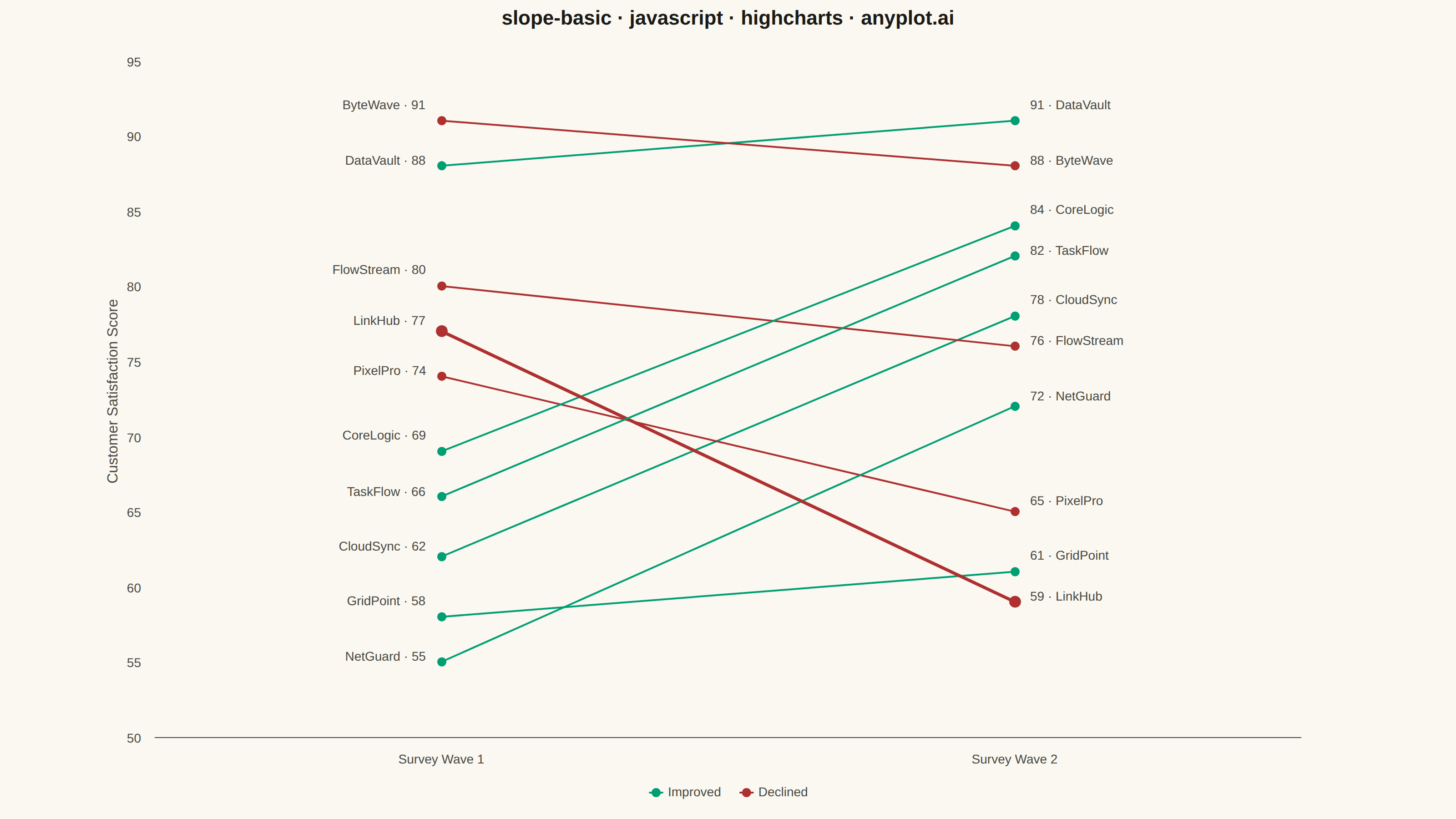
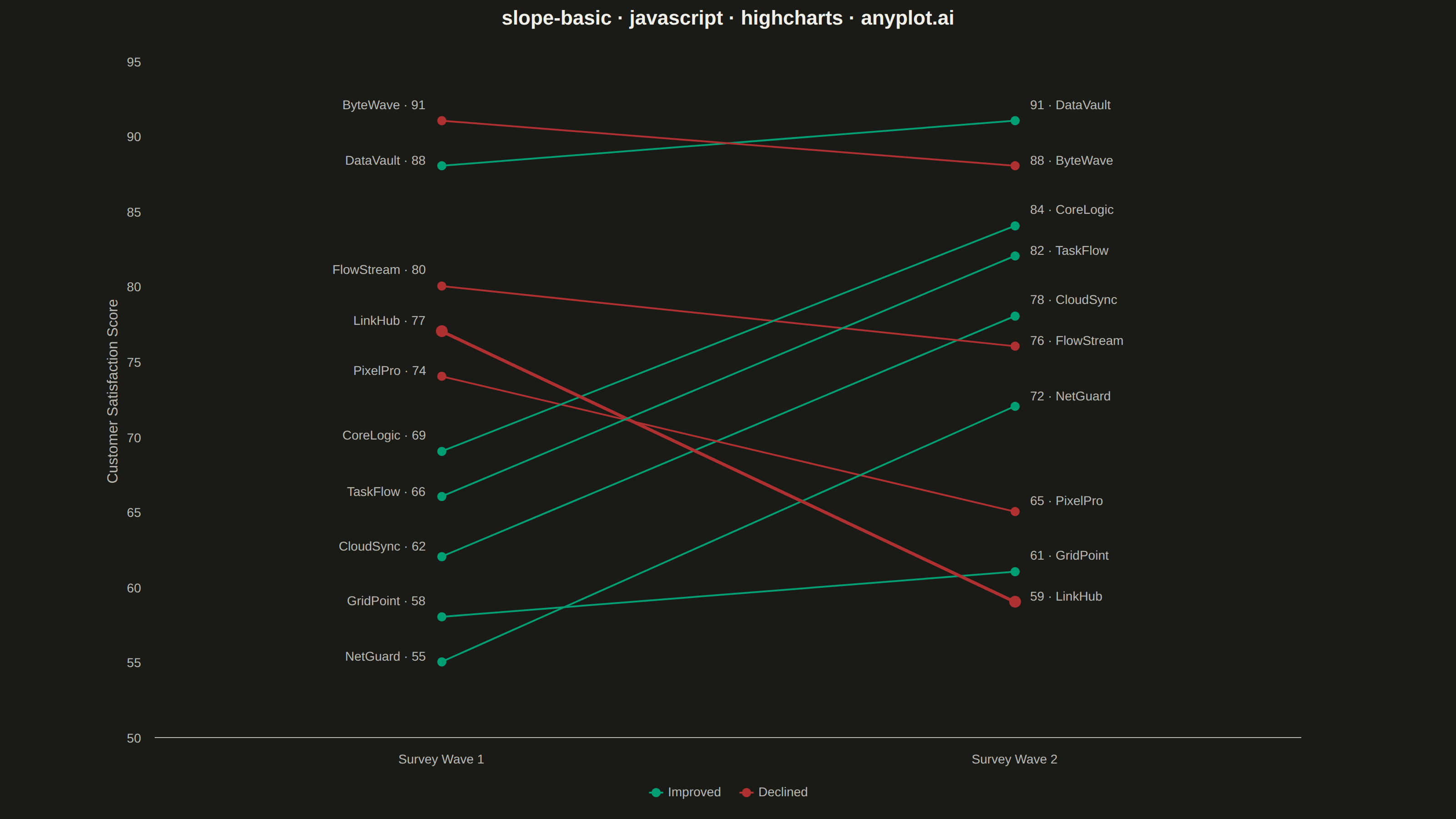
The same plot in 14 other libraries — JavaScript: Chart.js, D3.js, Apache ECharts, MUI X Charts; Python: Altair, Bokeh, lets-plot, Matplotlib, Plotly, plotnine, Pygal, Seaborn; R: ggplot2; Julia: Makie.jl. Compare all 15 side by side: Basic Slope Chart (Slopegraph) in Python, R, Julia and JavaScript.
A slope chart (slopegraph) visualizes changes between two time points by connecting values with lines across vertical axes. It emphasizes the direction and magnitude of change rather than absolute values, making it ideal for spotting increases, decreases, and rank changes at a glance. This chart type excels at before/after comparisons and highlighting which items improved or declined.
// anyplot.ai
// slope-basic: Basic Slope Chart (Slopegraph)
// Library: highcharts 12.6.0 | JavaScript 22.23.1
// Quality: 96/100 | Created: 2026-07-25

const t = window.ANYPLOT_TOKENS;

// --- Data (in-memory, deterministic) ----------------------------------------
// Customer satisfaction score (0-100) for 10 products, two survey waves.
const products = [
    { name: "CloudSync",   start: 62, end: 78 },
    { name: "DataVault",   start: 88, end: 91 },
    { name: "PixelPro",    start: 74, end: 65 },
    { name: "NetGuard",    start: 55, end: 72 },
    { name: "FlowStream",  start: 80, end: 76 },
    { name: "CoreLogic",   start: 69, end: 84 },
    { name: "ByteWave",    start: 91, end: 88 },
    { name: "GridPoint",   start: 58, end: 61 },
    { name: "LinkHub",     start: 77, end: 59 },
    { name: "TaskFlow",    start: 66, end: 82 },
];

const INCREASE = t.palette[0]; // brand green — profit/up/gain
const DECREASE = t.palette[4]; // matte red — loss/down
const FLAT = t.muted;

const lineOf = (p) => (p.end > p.start ? INCREASE : p.end < p.start ? DECREASE : FLAT);

// Tighten the y-domain to the actual data band (55-91) instead of a fixed
// 40-100 range, so the canvas isn't dominated by dead space.
const scores = products.flatMap((p) => [p.start, p.end]);
const yPad = 5;
const yMin = Math.floor(Math.min(...scores) - yPad);
const yMax = Math.ceil(Math.max(...scores) + yPad);

// The mover with the largest absolute change gets a slightly heavier line
// and marker so the standout swing reads at a glance.
const standout = products.reduce((a, p) => (Math.abs(p.end - p.start) > Math.abs(a.end - a.start) ? p : a));

// Endpoint labels within NUDGE_GAP score points of a neighbor at the same
// wave get nudged apart vertically (label only, marker stays put) so
// stacked text doesn't crowd together.
const NUDGE_GAP = 3;
const NUDGE_PX = 6;
const labelNudges = (values) => {
    const byValue = [...values].sort((a, b) => a.value - b.value);
    const nudge = new Map(values.map((v) => [v.name, 0]));
    for (let i = 1; i < byValue.length; i++) {
        const lo = byValue[i - 1];
        const hi = byValue[i];
        if (hi.value - lo.value <= NUDGE_GAP) {
            nudge.set(lo.name, nudge.get(lo.name) + NUDGE_PX);
            nudge.set(hi.name, nudge.get(hi.name) - NUDGE_PX);
        }
    }
    return nudge;
};
const startNudge = labelNudges(products.map((p) => ({ name: p.name, value: p.start })));
const endNudge = labelNudges(products.map((p) => ({ name: p.name, value: p.end })));

// --- Chart -------------------------------------------------------------------
Highcharts.chart("container", {
    chart: {
        type: "line",
        backgroundColor: "transparent",
        animation: false,
        style: { fontFamily: "inherit" },
        marginLeft: 170,
        marginRight: 170,
    },
    credits: { enabled: false },
    title: {
        text: "slope-basic · javascript · highcharts · anyplot.ai",
        style: { color: t.ink, fontSize: "22px", fontWeight: "600" },
    },
    xAxis: {
        categories: ["Survey Wave 1", "Survey Wave 2"],
        lineColor: t.inkSoft,
        tickColor: t.inkSoft,
        gridLineWidth: 0,
        minPadding: 0.08,
        maxPadding: 0.08,
        labels: { style: { color: t.inkSoft, fontSize: "14px" } },
    },
    yAxis: {
        title: {
            text: "Customer Satisfaction Score",
            style: { color: t.inkSoft, fontSize: "16px" },
        },
        min: yMin,
        max: yMax,
        startOnTick: false,
        endOnTick: false,
        gridLineWidth: 0,
        lineColor: t.inkSoft,
        tickColor: t.inkSoft,
        labels: { style: { color: t.inkSoft, fontSize: "14px" } },
    },
    legend: {
        enabled: true,
        align: "center",
        verticalAlign: "bottom",
        itemStyle: { color: t.inkSoft, fontSize: "14px", fontWeight: "normal" },
        itemHoverStyle: { color: t.ink },
    },
    tooltip: {
        headerFormat: "",
        pointFormat: "<b>{series.name}</b>: {point.y}",
        backgroundColor: t.elevatedBg,
        borderColor: t.inkSoft,
        style: { color: t.ink, fontSize: "13px" },
    },
    plotOptions: {
        series: {
            animation: false,
            marker: { enabled: true, radius: 5, symbol: "circle" },
            lineWidth: 2,
            dataLabels: {
                enabled: true,
                crop: false,
                overflow: "allow",
                style: { fontSize: "14px", fontWeight: "normal", textOutline: "none" },
            },
        },
    },
    series: [
        // Legend-only entries — real product lines below are excluded from the legend
        // since 10 individual names would overwhelm it; color already carries the story.
        { name: "Improved", type: "line", color: INCREASE, data: [], marker: { enabled: true }, enableMouseTracking: false },
        { name: "Declined", type: "line", color: DECREASE, data: [], marker: { enabled: true }, enableMouseTracking: false },
        ...products.map((p) => {
            const isStandout = p.name === standout.name;
            return {
                name: p.name,
                showInLegend: false,
                color: lineOf(p),
                lineWidth: isStandout ? 3.5 : 2,
                marker: { radius: isStandout ? 6.5 : 5 },
                data: [
                    {
                        y: p.start,
                        dataLabels: {
                            align: "right",
                            x: -12,
                            y: startNudge.get(p.name),
                            color: t.inkSoft,
                            format: `${p.name} · ${p.start}`,
                        },
                    },
                    {
                        y: p.end,
                        dataLabels: {
                            align: "left",
                            x: 12,
                            y: endNudge.get(p.name),
                            color: t.inkSoft,
                            format: `${p.end} · ${p.name}`,
                        },
                    },
                ],
            };
        }),
    ],
});
Runnable source as JSON, for any HTTP client: https://api.anyplot.ai/specs/slope-basic/highcharts/code. Any spec id and library id listed in llms-full.txt fit the same URL shape; every URL below is complete and callable.
{
  "spec_id": "slope-basic",
  "language": "javascript",
  "library": "highcharts",
  "page": "https://anyplot.ai/slope-basic/javascript/highcharts",
  "hub": "https://anyplot.ai/slope-basic",
  "code_json": "https://api.anyplot.ai/specs/slope-basic/highcharts/code",
  "spec_json": "https://api.anyplot.ai/specs/slope-basic",
  "render_light_png": "https://storage.googleapis.com/anyplot-images/plots/slope-basic/javascript/highcharts/plot-light.png",
  "render_dark_png": "https://storage.googleapis.com/anyplot-images/plots/slope-basic/javascript/highcharts/plot-dark.png",
  "interactive_light_html": "https://storage.googleapis.com/anyplot-images/plots/slope-basic/javascript/highcharts/plot-light.html",
  "interactive_dark_html": "https://storage.googleapis.com/anyplot-images/plots/slope-basic/javascript/highcharts/plot-dark.html",
  "quality_score": 96.0,
  "license": "MIT",
  "guide": "https://anyplot.ai/llms.txt"
}
Part of Basic Slope Chart (Slopegraph) on anyplot.ai.