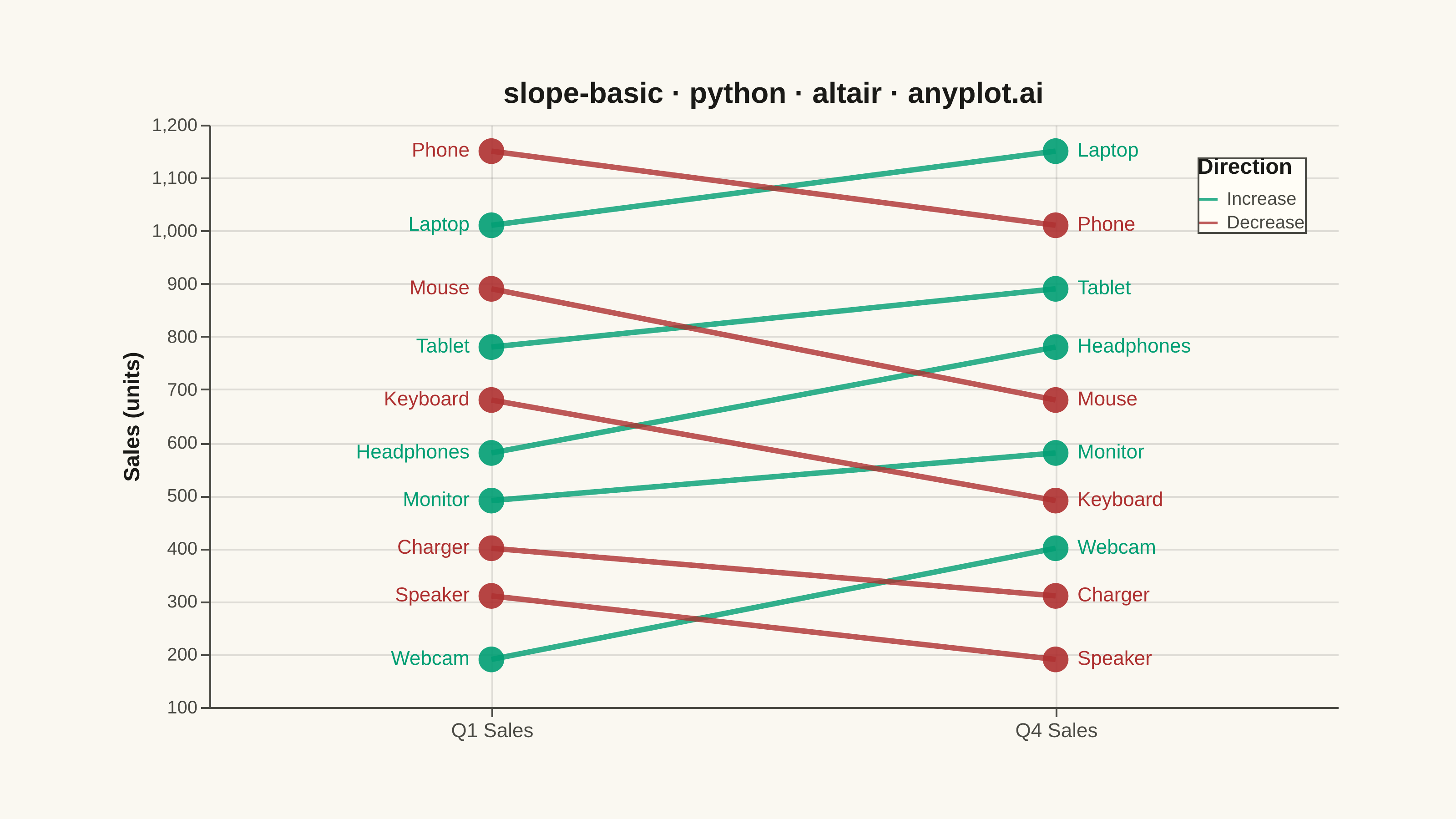
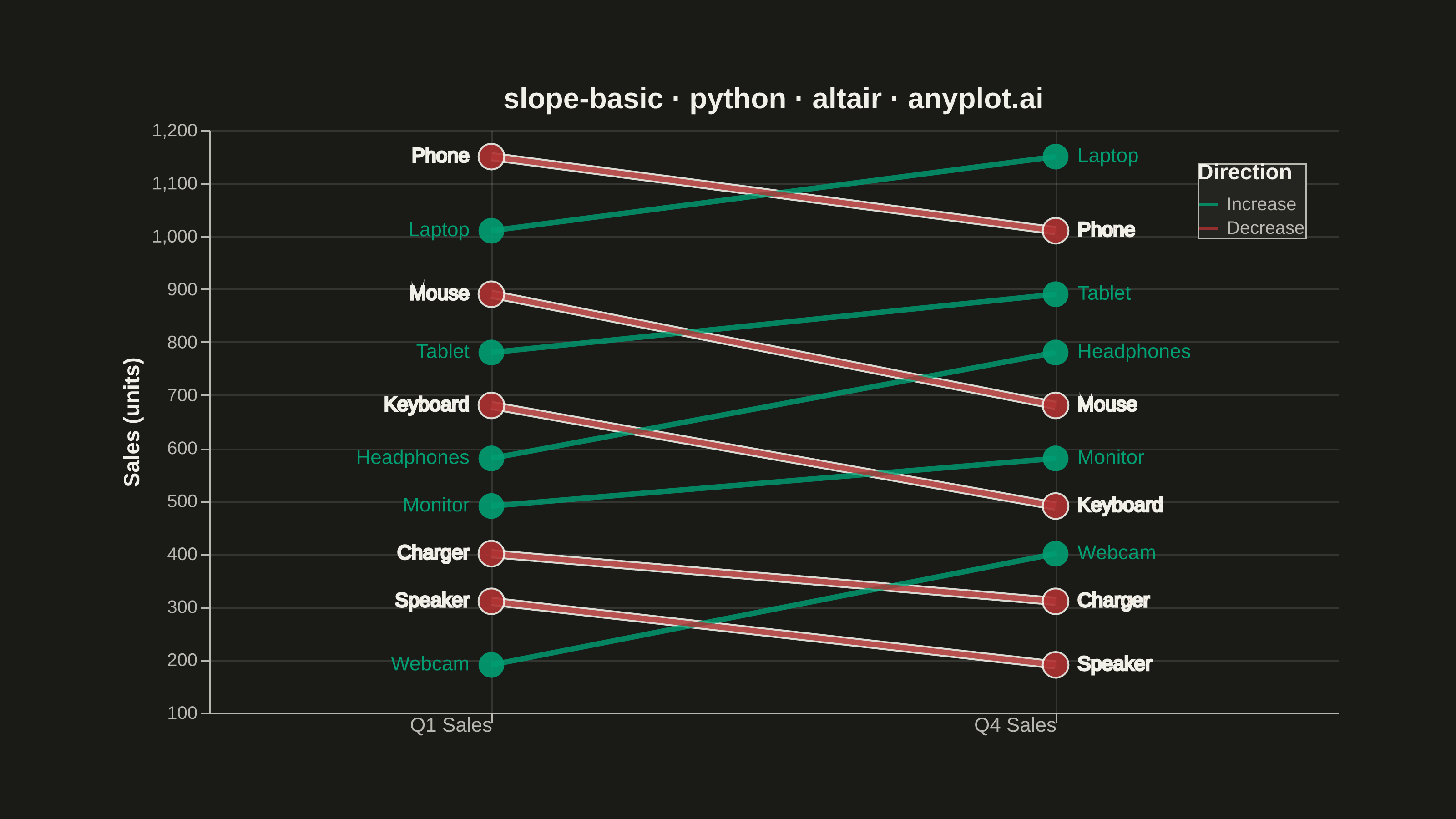
A slope chart (slopegraph) visualizes changes between two or more time points by connecting values with lines across vertical axes. It emphasizes the direction and magnitude of change rather than absolute values, making it ideal for spotting increases, decreases, and rank changes at a glance. This chart type excels at before/after comparisons and highlighting which items improved or declined.
""" anyplot.ai
slope-basic: Basic Slope Chart (Slopegraph)
Library: altair 6.2.2 | Python 3.13.14
Quality: 87/100 | Created: 2026-07-25
"""

import os

import altair as alt
import pandas as pd
from PIL import Image


# Theme tokens
THEME = os.getenv("ANYPLOT_THEME", "light")
PAGE_BG = "#FAF8F1" if THEME == "light" else "#1A1A17"
ELEVATED_BG = "#FFFDF6" if THEME == "light" else "#242420"
INK = "#1A1A17" if THEME == "light" else "#F0EFE8"
INK_SOFT = "#4A4A44" if THEME == "light" else "#B8B7B0"

# Imprint palette: position 1 = Increase, position 5 (deferred semantic-red anchor) = Decrease
COLOR_INCREASE = "#009E73"
COLOR_DECREASE = "#AE3030"

# Data — Q1 vs Q4 product sales, deliberately spaced (min gap ~90 units within each
# period) so entity labels never crowd, with a full rank shuffle for a rich story
data = pd.DataFrame(
    {
        "Product": [
            "Webcam",
            "Speaker",
            "Charger",
            "Monitor",
            "Headphones",
            "Keyboard",
            "Tablet",
            "Mouse",
            "Laptop",
            "Phone",
        ],
        "Q1 Sales": [190, 310, 400, 490, 580, 680, 780, 890, 1010, 1150],
        "Q4 Sales": [400, 190, 310, 580, 780, 490, 890, 680, 1150, 1010],
    }
)

df_long = pd.melt(data, id_vars=["Product"], value_vars=["Q1 Sales", "Q4 Sales"], var_name="Period", value_name="Sales")
data["Direction"] = data.apply(lambda row: "Increase" if row["Q4 Sales"] > row["Q1 Sales"] else "Decrease", axis=1)
df_long = df_long.merge(data[["Product", "Direction"]], on="Product")

color_scale = alt.Scale(domain=["Increase", "Decrease"], range=[COLOR_INCREASE, COLOR_DECREASE])

# Title (42 chars < 67 baseline — no fontsize reduction needed)
title = "slope-basic · python · altair · anyplot.ai"
title_fontsize = 16

# Matte-red "Decrease" measures ~2.7:1 against #1A1A17 (below the 3:1 AA floor for
# meaningful status info); per the style guide's stroke recommendation, outline
# Decrease elements with a 1px ink halo in dark mode only (fine on the light bg).
decrease_stroke_width = alt.condition(
    alt.datum.Direction == "Decrease", alt.value(1 if THEME == "dark" else 0), alt.value(0)
)

# Plot
lines = (
    alt.Chart(df_long)
    .mark_line(strokeWidth=3, opacity=0.8)
    .encode(
        x=alt.X("Period:N", axis=alt.Axis(labelFontSize=11, title=None, labelAngle=0)),
        y=alt.Y(
            "Sales:Q",
            axis=alt.Axis(labelFontSize=10, titleFontSize=12, title="Sales (units)"),
            scale=alt.Scale(zero=False),
        ),
        color=alt.Color(
            "Direction:N", scale=color_scale, legend=alt.Legend(titleFontSize=12, labelFontSize=10, orient="top-right")
        ),
        detail="Product:N",
    )
)

lines_decrease_halo = (
    alt.Chart(df_long[df_long["Direction"] == "Decrease"])
    .mark_line(strokeWidth=5, opacity=0.9, color=INK)
    .encode(x="Period:N", y="Sales:Q", detail="Product:N")
)

points = (
    alt.Chart(df_long)
    .mark_circle(size=200, opacity=0.9)
    .encode(
        x="Period:N",
        y="Sales:Q",
        color=alt.Color("Direction:N", scale=color_scale, legend=None),
        stroke=alt.value(INK),
        strokeWidth=decrease_stroke_width,
    )
)

labels_left = (
    alt.Chart(df_long[df_long["Period"] == "Q1 Sales"])
    .mark_text(align="right", dx=-12, fontSize=11)
    .encode(
        x="Period:N",
        y="Sales:Q",
        text="Product:N",
        color=alt.Color("Direction:N", scale=color_scale, legend=None),
        stroke=alt.value(INK),
        strokeWidth=decrease_stroke_width,
    )
)

labels_right = (
    alt.Chart(df_long[df_long["Period"] == "Q4 Sales"])
    .mark_text(align="left", dx=12, fontSize=11)
    .encode(
        x="Period:N",
        y="Sales:Q",
        text="Product:N",
        color=alt.Color("Direction:N", scale=color_scale, legend=None),
        stroke=alt.value(INK),
        strokeWidth=decrease_stroke_width,
    )
)

# Layer order: dark-mode Decrease halo sits beneath everything else; empty in light mode.
layers = [lines_decrease_halo] if THEME == "dark" else []
layers += [lines, points, labels_left, labels_right]

# Style — L-shaped frame: no view stroke, axis domain lines (bottom + left) stay visible
chart = (
    alt.layer(*layers)
    .properties(
        width=620,
        height=320,
        background=PAGE_BG,
        title=alt.Title(title, fontSize=title_fontsize, color=INK, anchor="middle"),
    )
    .configure_view(fill=PAGE_BG, strokeWidth=0)
    .configure_axis(
        domainColor=INK_SOFT,
        tickColor=INK_SOFT,
        grid=True,
        gridColor=INK,
        gridOpacity=0.12,
        labelColor=INK_SOFT,
        titleColor=INK,
    )
    .configure_legend(fillColor=ELEVATED_BG, strokeColor=INK_SOFT, labelColor=INK_SOFT, titleColor=INK)
)

# Save PNG then pad to exact 3200×1800 target
chart.save(f"plot-{THEME}.png", scale_factor=4.0)

TW, TH = 3200, 1800
_img = Image.open(f"plot-{THEME}.png").convert("RGB")
_w, _h = _img.size
if _w > TW or _h > TH:
    raise SystemExit(
        f"altair vl-convert produced {_w}×{_h}, exceeds target {TW}×{TH}. "
        f"Shrink chart .properties(width=, height=) values and re-render."
    )
if _w < TW or _h < TH:
    _canvas = Image.new("RGB", (TW, TH), PAGE_BG)
    _canvas.paste(_img, ((TW - _w) // 2, (TH - _h) // 2))
    _canvas.save(f"plot-{THEME}.png")

# Save interactive HTML
chart.save(f"plot-{THEME}.html")
Runnable source as JSON, for any HTTP client: https://api.anyplot.ai/specs/slope-basic/altair/code. Any spec id and library id listed in llms-full.txt fit the same URL shape; every URL below is complete and callable.
{
  "spec_id": "slope-basic",
  "language": "python",
  "library": "altair",
  "page": "https://anyplot.ai/slope-basic/python/altair",
  "hub": "https://anyplot.ai/slope-basic",
  "code_json": "https://api.anyplot.ai/specs/slope-basic/altair/code",
  "spec_json": "https://api.anyplot.ai/specs/slope-basic",
  "render_light_png": "https://storage.googleapis.com/anyplot-images/plots/slope-basic/python/altair/plot-light.png",
  "render_dark_png": "https://storage.googleapis.com/anyplot-images/plots/slope-basic/python/altair/plot-dark.png",
  "interactive_light_html": "https://storage.googleapis.com/anyplot-images/plots/slope-basic/python/altair/plot-light.html",
  "interactive_dark_html": "https://storage.googleapis.com/anyplot-images/plots/slope-basic/python/altair/plot-dark.html",
  "quality_score": 87.0,
  "license": "MIT",
  "guide": "https://anyplot.ai/llms.txt"
}
Part of Basic Slope Chart (Slopegraph) on anyplot.ai.