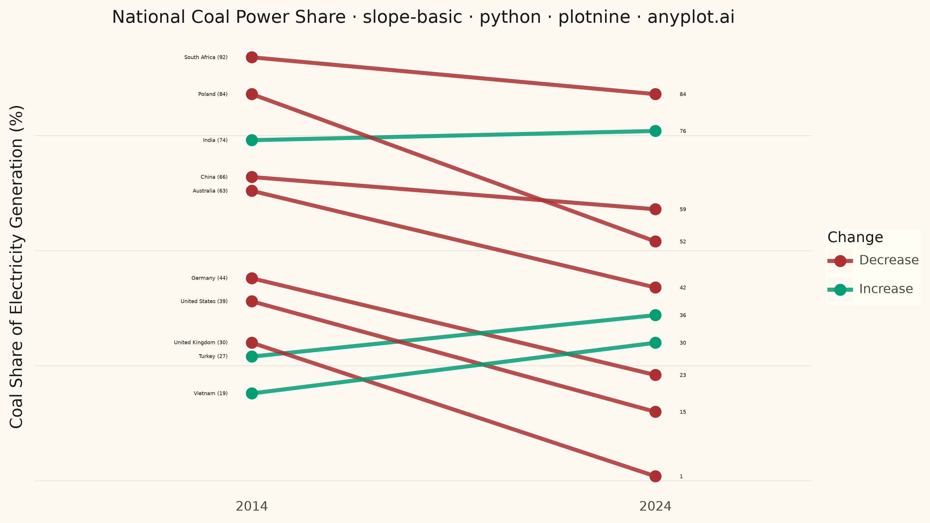
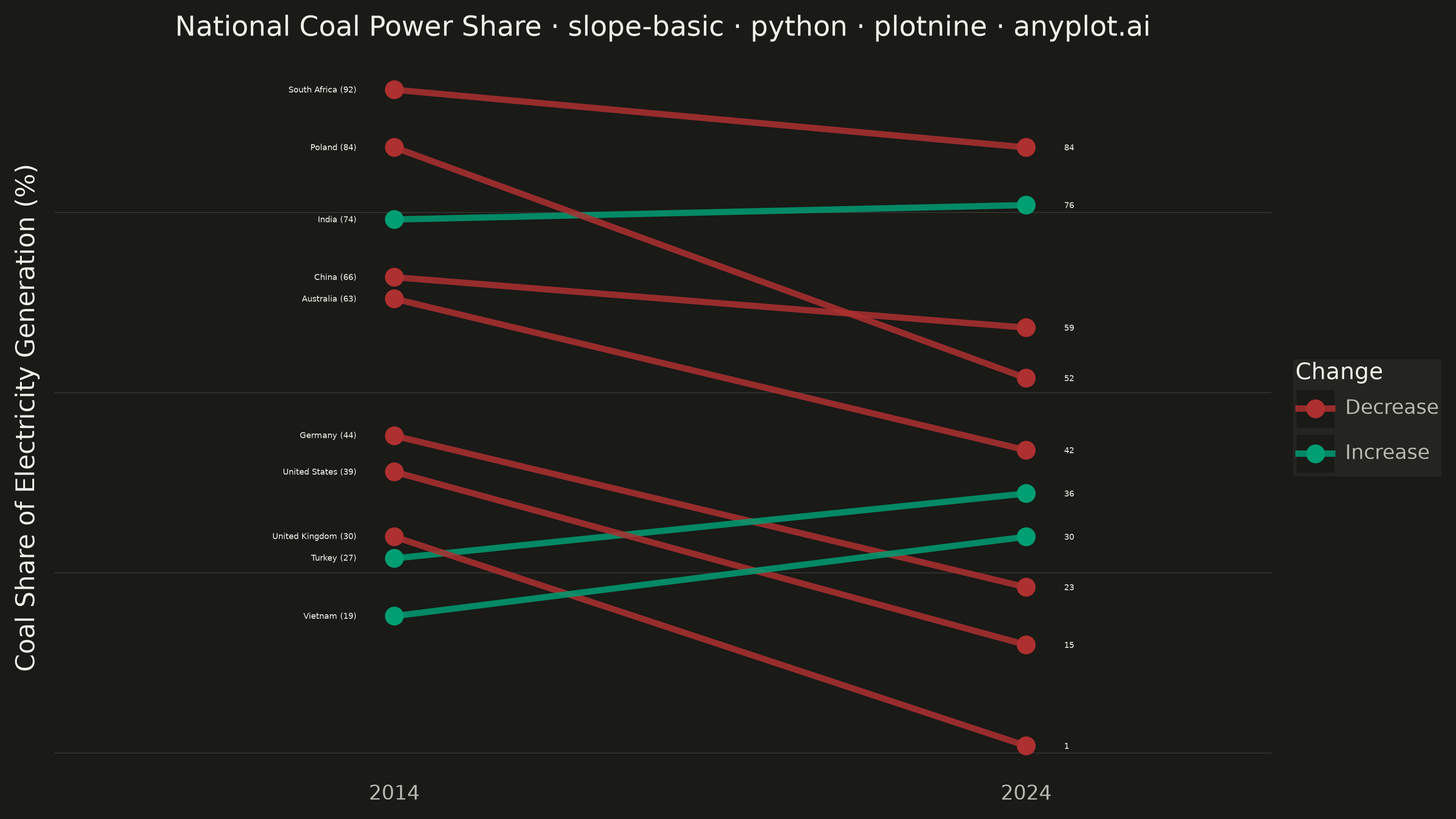
A slope chart (slopegraph) visualizes changes between two or more time points by connecting values with lines across vertical axes. It emphasizes the direction and magnitude of change rather than absolute values, making it ideal for spotting increases, decreases, and rank changes at a glance. This chart type excels at before/after comparisons and highlighting which items improved or declined.
""" anyplot.ai
slope-basic: Basic Slope Chart (Slopegraph)
Library: plotnine 0.15.7 | Python 3.13.14
Quality: 93/100 | Updated: 2026-07-26
"""

import os

import pandas as pd
from plotnine import (
    aes,
    element_blank,
    element_line,
    element_rect,
    element_text,
    geom_line,
    geom_point,
    geom_text,
    ggplot,
    labs,
    scale_color_manual,
    scale_x_continuous,
    theme,
    theme_minimal,
)


THEME = os.getenv("ANYPLOT_THEME", "light")
PAGE_BG = "#FAF8F1" if THEME == "light" else "#1A1A17"
ELEVATED_BG = "#FFFDF6" if THEME == "light" else "#242420"
INK = "#1A1A17" if THEME == "light" else "#F0EFE8"
INK_SOFT = "#4A4A44" if THEME == "light" else "#B8B7B0"

# Increase -> Imprint position 1 (also the semantic "gain" green);
# Decrease -> Imprint position 5 (the semantic "loss" red).
COLOR_INCREASE = "#009E73"
COLOR_DECREASE = "#AE3030"

# Data: national coal share of electricity generation, 2014 vs 2024
# (approximate figures consistent with IEA/Ember energy-mix statistics).
# Most advanced economies phased coal out under climate policy while a
# few emerging economies leaned on it for energy security -- a mix of
# increases, decreases and rank reversals for a slopegraph to tell.
entities = [
    "Germany",
    "United Kingdom",
    "Poland",
    "South Africa",
    "United States",
    "Australia",
    "India",
    "China",
    "Vietnam",
    "Turkey",
]
# Poland and Vietnam 2024 values nudged slightly further from their nearest
# neighbor (China, Turkey) so the endpoint markers no longer visually merge.
share_2014 = [44, 30, 84, 92, 39, 63, 74, 66, 19, 27]
share_2024 = [23, 1, 52, 84, 15, 42, 76, 59, 30, 36]

changes = ["Increase" if end >= start else "Decrease" for start, end in zip(share_2014, share_2024, strict=True)]

df_long = pd.DataFrame(
    {
        "entity": entities * 2,
        "x": [1] * len(entities) + [2] * len(entities),
        "value": share_2014 + share_2024,
        "change": changes * 2,
    }
)

df_labels_left = pd.DataFrame(
    {
        "entity": entities,
        "x": [1] * len(entities),
        "value": share_2014,
        "change": changes,
        "label": [f"{e} ({v})" for e, v in zip(entities, share_2014, strict=True)],
    }
)

df_labels_right = pd.DataFrame(
    {
        "entity": entities,
        "x": [2] * len(entities),
        "value": share_2024,
        "change": changes,
        "label": [str(v) for v in share_2024],
    }
)

plot = (
    ggplot(df_long, aes(x="x", y="value", group="entity", color="change"))
    + geom_line(size=1.4, alpha=0.85)
    + geom_point(size=3.2)
    # Left labels: entity name + starting value
    + geom_text(aes(label="label"), data=df_labels_left, ha="right", nudge_x=-0.06, size=3.2, color=INK)
    # Right labels: ending value only
    + geom_text(aes(label="label"), data=df_labels_right, ha="left", nudge_x=0.06, size=3.2, color=INK)
    + scale_color_manual(values={"Increase": COLOR_INCREASE, "Decrease": COLOR_DECREASE})
    + scale_x_continuous(breaks=[1, 2], labels=["2014", "2024"], limits=(0.55, 2.3))
    + labs(
        x="",
        y="Coal Share of Electricity Generation (%)",
        title="National Coal Power Share · slope-basic · python · plotnine · anyplot.ai",
        color="Change",
    )
    + theme_minimal()
    + theme(
        figure_size=(8, 4.5),
        text=element_text(size=7, color=INK_SOFT),
        plot_title=element_text(size=11, color=INK),
        axis_title=element_text(size=10, color=INK),
        axis_text=element_text(size=8, color=INK_SOFT),
        axis_text_x=element_text(size=8, color=INK_SOFT),
        axis_text_y=element_blank(),
        axis_ticks=element_blank(),
        legend_text=element_text(size=8, color=INK_SOFT),
        legend_title=element_text(size=9, color=INK),
        legend_position="right",
        legend_background=element_rect(fill=ELEVATED_BG, color="none"),
        legend_box_spacing=0.015,
        plot_background=element_rect(fill=PAGE_BG, color=PAGE_BG),
        panel_background=element_rect(fill=PAGE_BG, color=PAGE_BG),
        panel_border=element_blank(),
        panel_grid_major_x=element_blank(),
        panel_grid_minor_x=element_blank(),
        panel_grid_major_y=element_line(color=INK, size=0.3, alpha=0.15),
        panel_grid_minor_y=element_blank(),
    )
)

plot.save(f"plot-{THEME}.png", dpi=400, width=8, height=4.5, units="in", verbose=False)
Runnable source as JSON, for any HTTP client: https://api.anyplot.ai/specs/slope-basic/plotnine/code. Any spec id and library id listed in llms-full.txt fit the same URL shape; every URL below is complete and callable.
{
  "spec_id": "slope-basic",
  "language": "python",
  "library": "plotnine",
  "page": "https://anyplot.ai/slope-basic/python/plotnine",
  "hub": "https://anyplot.ai/slope-basic",
  "code_json": "https://api.anyplot.ai/specs/slope-basic/plotnine/code",
  "spec_json": "https://api.anyplot.ai/specs/slope-basic",
  "render_light_png": "https://storage.googleapis.com/anyplot-images/plots/slope-basic/python/plotnine/plot-light.png",
  "render_dark_png": "https://storage.googleapis.com/anyplot-images/plots/slope-basic/python/plotnine/plot-dark.png",
  "quality_score": 93.0,
  "license": "MIT",
  "guide": "https://anyplot.ai/llms.txt"
}
Part of Basic Slope Chart (Slopegraph) on anyplot.ai.