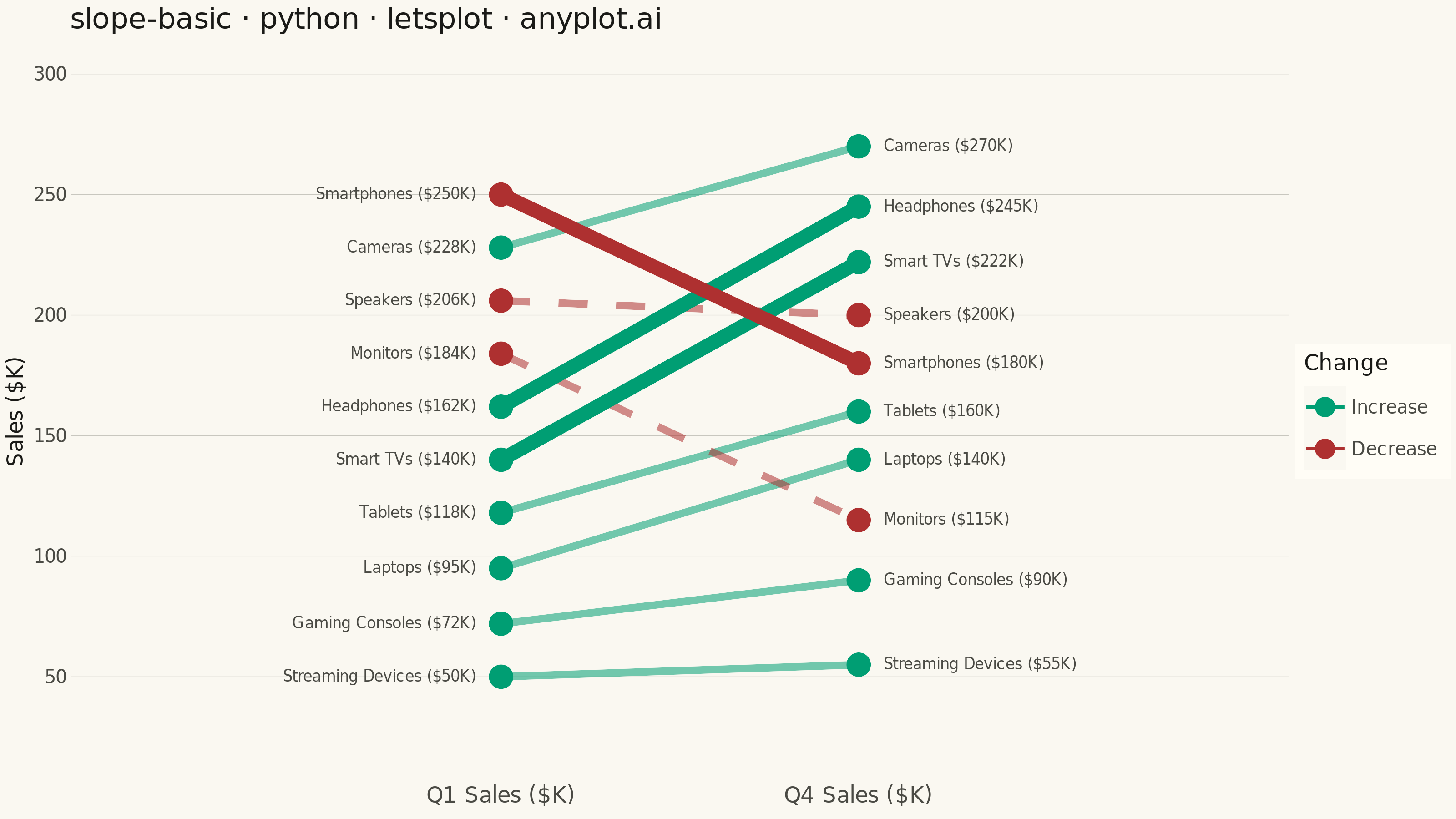
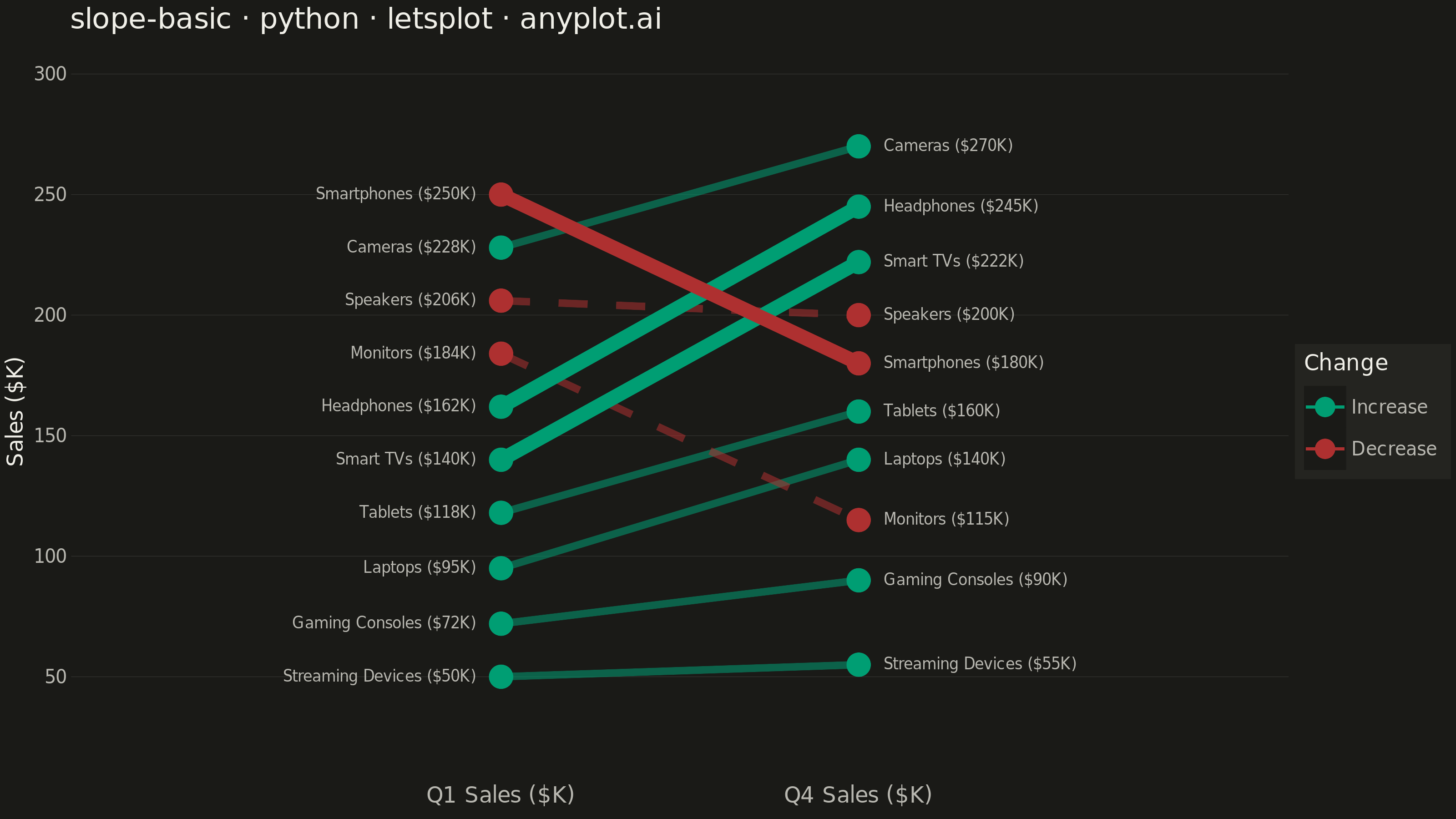
A slope chart (slopegraph) visualizes changes between two or more time points by connecting values with lines across vertical axes. It emphasizes the direction and magnitude of change rather than absolute values, making it ideal for spotting increases, decreases, and rank changes at a glance. This chart type excels at before/after comparisons and highlighting which items improved or declined.
""" anyplot.ai
slope-basic: Basic Slope Chart (Slopegraph)
Library: letsplot 4.11.0 | Python 3.13.14
Quality: 94/100 | Updated: 2026-07-26
"""

import os

import pandas as pd
from lets_plot import (
    LetsPlot,
    aes,
    element_blank,
    element_line,
    element_rect,
    element_text,
    geom_point,
    geom_segment,
    geom_text,
    ggplot,
    ggsave,
    ggsize,
    labs,
    layer_tooltips,
    scale_color_manual,
    scale_linetype_manual,
    scale_x_continuous,
    scale_y_continuous,
    theme,
    theme_minimal,
)


LetsPlot.setup_html()

# Theme tokens
THEME = os.getenv("ANYPLOT_THEME", "light")
PAGE_BG = "#FAF8F1" if THEME == "light" else "#1A1A17"
ELEVATED_BG = "#FFFDF6" if THEME == "light" else "#242420"
INK = "#1A1A17" if THEME == "light" else "#F0EFE8"
INK_SOFT = "#4A4A44" if THEME == "light" else "#B8B7B0"
GRID_COLOR = "#C8C7BF" if THEME == "light" else "#333330"

# Imprint palette: brand green = increase, matte red = decrease
COLOR_INCREASE = "#009E73"
COLOR_DECREASE = "#AE3030"

# Consumer electronics quarterly sales ($K): Q1 vs Q4.
# Values are spread with a minimum gap of ~20 at both endpoints so the
# entity + value labels never sit close enough to overlap.
data = {
    "entity": [
        "Streaming Devices",
        "Gaming Consoles",
        "Laptops",
        "Tablets",
        "Smart TVs",
        "Headphones",
        "Monitors",
        "Speakers",
        "Cameras",
        "Smartphones",
    ],
    "Q1": [50, 72, 95, 118, 140, 162, 184, 206, 228, 250],
    "Q4": [55, 90, 140, 160, 222, 245, 115, 200, 270, 180],
}
df = pd.DataFrame(data)
df["change"] = df["Q4"] - df["Q1"]
df["direction"] = df["change"].apply(lambda x: "Increase" if x > 0 else "Decrease")
df["abs_change"] = df["change"].abs()

# Top 3 movers by absolute change — receive visual emphasis
top_movers = set(df.nlargest(3, "abs_change")["entity"])

# Segment data
df_segments = pd.DataFrame(
    {
        "entity": df["entity"].values,
        "x_start": [0] * 10,
        "x_end": [1] * 10,
        "y_start": df["Q1"].values,
        "y_end": df["Q4"].values,
        "direction": df["direction"].values,
        "change": df["change"].values,
    }
)
seg_normal = df_segments[~df_segments["entity"].isin(top_movers)].reset_index(drop=True)
seg_top = df_segments[df_segments["entity"].isin(top_movers)].reset_index(drop=True)

# Points (both endpoints)
df_long = pd.DataFrame(
    {"entity": df["entity"].tolist() * 2, "value": df["Q1"].tolist() + df["Q4"].tolist(), "x": [0] * 10 + [1] * 10}
).merge(df[["entity", "direction"]], on="entity")

# Endpoint labels: entity name + value for legibility
df_left = pd.DataFrame(
    {
        "entity": df["entity"].values,
        "value": df["Q1"].values,
        "x": [0] * 10,
        "label": [f"{e} (${v}K)" for e, v in zip(df["entity"], df["Q1"], strict=False)],
    }
)
df_right = pd.DataFrame(
    {
        "entity": df["entity"].values,
        "value": df["Q4"].values,
        "x": [1] * 10,
        "label": [f"{e} (${v}K)" for e, v in zip(df["entity"], df["Q4"], strict=False)],
    }
)

# Custom tooltip format — letsplot-specific interactive feature
_tooltip_normal = (
    layer_tooltips()
    .title("@entity")
    .line("Q1 Sales|$@{y_start}K")
    .line("Q4 Sales|$@{y_end}K")
    .line("Change|@{change}K")
)
_tooltip_top = (
    layer_tooltips()
    .title("@entity  ★ Top mover")
    .line("Q1 Sales|$@{y_start}K")
    .line("Q4 Sales|$@{y_end}K")
    .line("Change|@{change}K")
)

plot = (
    ggplot()
    # Background lines: dimmed to let top movers stand out
    + geom_segment(
        data=seg_normal,
        mapping=aes(x="x_start", y="y_start", xend="x_end", yend="y_end", color="direction", linetype="direction"),
        size=1.8,
        alpha=0.55,
        tooltips=_tooltip_normal,
    )
    # Top-mover lines: bold, fully opaque — emphasises the biggest Q1→Q4 changes
    + geom_segment(
        data=seg_top,
        mapping=aes(x="x_start", y="y_start", xend="x_end", yend="y_end", color="direction"),
        size=3.5,
        alpha=1.0,
        tooltips=_tooltip_top,
    )
    + geom_point(data=df_long, mapping=aes(x="x", y="value", color="direction"), size=6)
    + geom_text(
        data=df_left, mapping=aes(x="x", y="value", label="label"), hjust=1, nudge_x=-0.07, size=4.2, color=INK_SOFT
    )
    + geom_text(
        data=df_right, mapping=aes(x="x", y="value", label="label"), hjust=0, nudge_x=0.07, size=4.2, color=INK_SOFT
    )
    + scale_color_manual(values={"Increase": COLOR_INCREASE, "Decrease": COLOR_DECREASE})
    + scale_linetype_manual(values={"Increase": "solid", "Decrease": "dashed"}, guide="none")
    + scale_x_continuous(breaks=[0, 1], labels=["Q1 Sales ($K)", "Q4 Sales ($K)"], limits=[-1.05, 2.05])
    + scale_y_continuous(limits=[20, 300])
    + labs(title="slope-basic · python · letsplot · anyplot.ai", x="", y="Sales ($K)", color="Change")
    + theme_minimal()
    + theme(
        plot_background=element_rect(fill=PAGE_BG, color=PAGE_BG),
        # color matches fill so the rect draws no border (theme_minimal has no
        # spines by default — the "remove all spines" clean-look alternative)
        panel_background=element_rect(fill=PAGE_BG, color=PAGE_BG),
        panel_grid_major_y=element_line(color=GRID_COLOR, size=0.3),
        panel_grid_major_x=element_blank(),
        panel_grid_minor=element_blank(),
        plot_title=element_text(size=16, color=INK),
        axis_title_y=element_text(size=12, color=INK),
        axis_title_x=element_blank(),
        axis_text_x=element_text(size=12, color=INK_SOFT),
        axis_text_y=element_text(size=10, color=INK_SOFT),
        legend_background=element_rect(fill=ELEVATED_BG, color=INK_SOFT),
        legend_title=element_text(size=12, color=INK),
        legend_text=element_text(size=10, color=INK_SOFT),
    )
    + ggsize(800, 450)
)

# Save PNG: scale=4 on ggsize(800, 450) -> 3200 x 1800 px (canonical landscape canvas)
ggsave(plot, f"plot-{THEME}.png", path=".", scale=4)

# Save HTML for letsplot interactive tooltips
ggsave(plot, f"plot-{THEME}.html", path=".")
Runnable source as JSON, for any HTTP client: https://api.anyplot.ai/specs/slope-basic/letsplot/code. Any spec id and library id listed in llms-full.txt fit the same URL shape; every URL below is complete and callable.
{
  "spec_id": "slope-basic",
  "language": "python",
  "library": "letsplot",
  "page": "https://anyplot.ai/slope-basic/python/letsplot",
  "hub": "https://anyplot.ai/slope-basic",
  "code_json": "https://api.anyplot.ai/specs/slope-basic/letsplot/code",
  "spec_json": "https://api.anyplot.ai/specs/slope-basic",
  "render_light_png": "https://storage.googleapis.com/anyplot-images/plots/slope-basic/python/letsplot/plot-light.png",
  "render_dark_png": "https://storage.googleapis.com/anyplot-images/plots/slope-basic/python/letsplot/plot-dark.png",
  "interactive_light_html": "https://storage.googleapis.com/anyplot-images/plots/slope-basic/python/letsplot/plot-light.html",
  "interactive_dark_html": "https://storage.googleapis.com/anyplot-images/plots/slope-basic/python/letsplot/plot-dark.html",
  "quality_score": 94.0,
  "license": "MIT",
  "guide": "https://anyplot.ai/llms.txt"
}
Part of Basic Slope Chart (Slopegraph) on anyplot.ai.