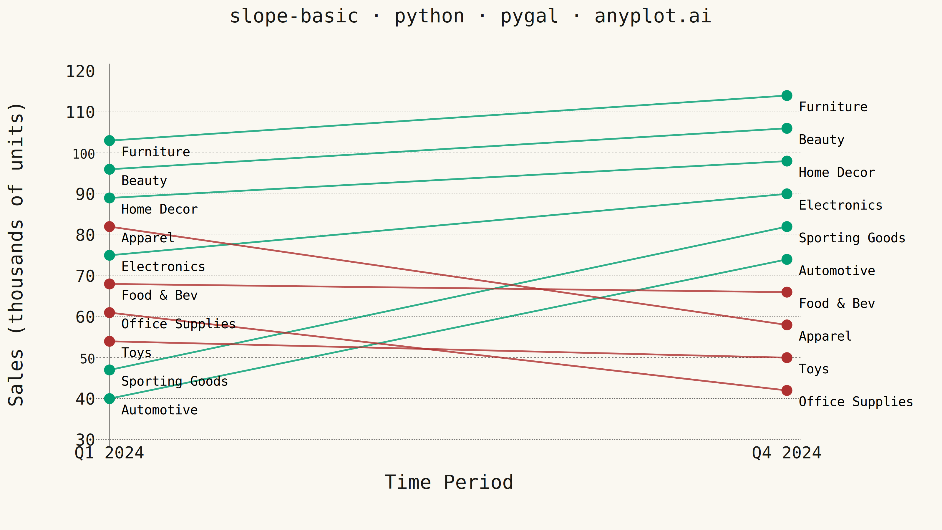
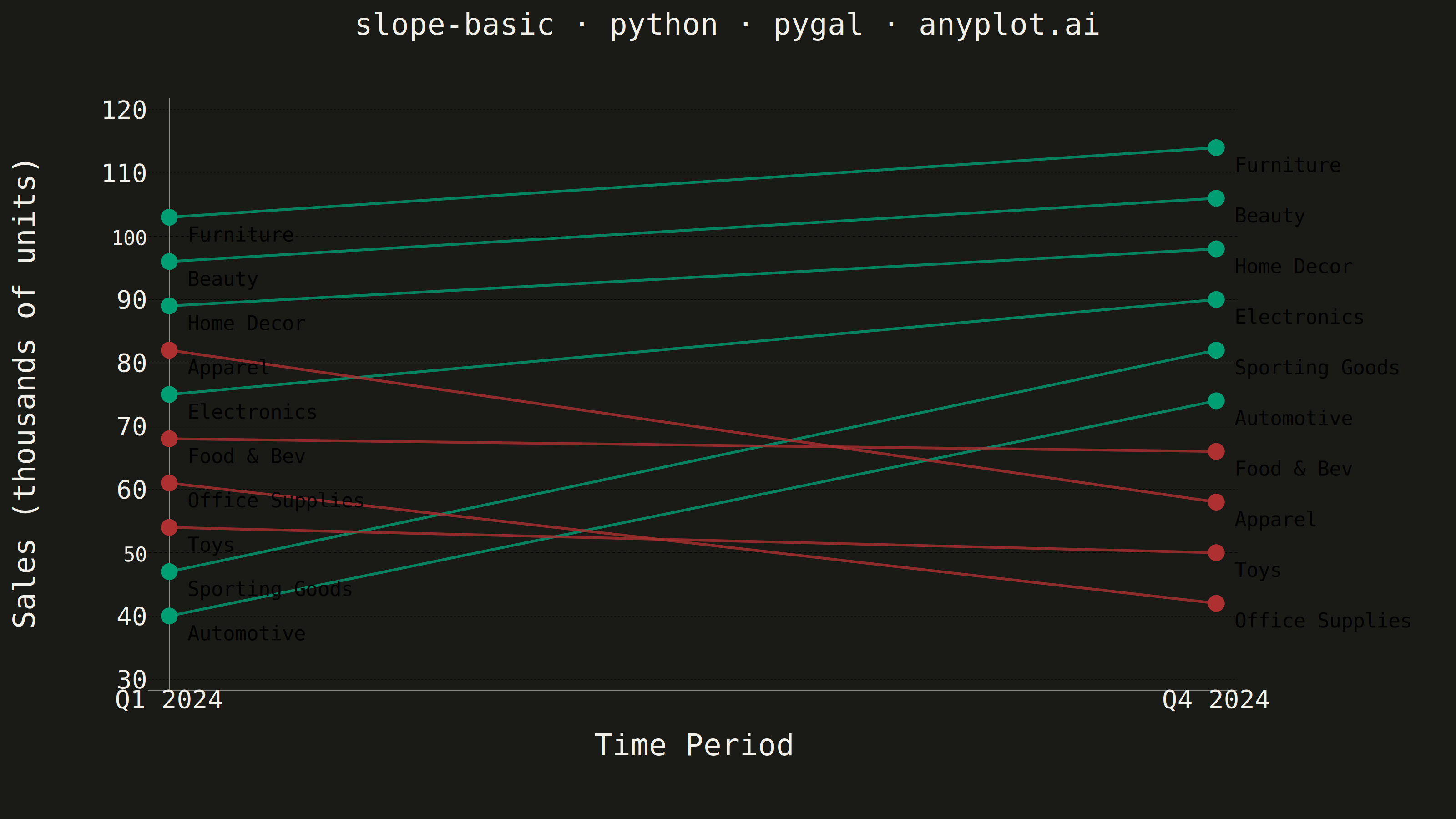
A slope chart (slopegraph) visualizes changes between two or more time points by connecting values with lines across vertical axes. It emphasizes the direction and magnitude of change rather than absolute values, making it ideal for spotting increases, decreases, and rank changes at a glance. This chart type excels at before/after comparisons and highlighting which items improved or declined.
""" anyplot.ai
slope-basic: Basic Slope Chart (Slopegraph)
Library: pygal 3.1.3 | Python 3.13.14
Quality: 85/100 | Updated: 2026-07-25
"""

import os
import sys


# Pop script dir so this file (pygal.py) doesn't shadow the installed pygal package
_script_dir = sys.path.pop(0)
import pygal
from pygal.style import Style


sys.path.insert(0, _script_dir)

THEME = os.getenv("ANYPLOT_THEME", "light")
PAGE_BG = "#FAF8F1" if THEME == "light" else "#1A1A17"
INK = "#1A1A17" if THEME == "light" else "#F0EFE8"
INK_MUTED = "#6B6A63" if THEME == "light" else "#A8A79F"

COLOR_INCREASE = "#009E73"  # Imprint palette position 1 — upward change
COLOR_DECREASE = "#AE3030"  # Imprint palette position 5 — semantic anchor for downward change

# Realistic product category data — Q1 vs Q4 sales comparison.
# Values are spread with even 7/8-unit gaps within each quarter so the
# endpoint category-name labels never crowd or overlap each other.
categories = [
    "Electronics",
    "Apparel",
    "Furniture",
    "Automotive",
    "Food & Bev",
    "Sporting Goods",
    "Home Decor",
    "Office Supplies",
    "Beauty",
    "Toys",
]
q1_sales = [75, 82, 103, 40, 68, 47, 89, 61, 96, 54]
q4_sales = [90, 58, 114, 74, 66, 82, 98, 42, 106, 50]

increasing = [(c, q1_sales[i], q4_sales[i]) for i, c in enumerate(categories) if q4_sales[i] >= q1_sales[i]]
decreasing = [(c, q1_sales[i], q4_sales[i]) for i, c in enumerate(categories) if q4_sales[i] < q1_sales[i]]

series_colors = tuple([COLOR_INCREASE] * len(increasing) + [COLOR_DECREASE] * len(decreasing))

custom_style = Style(
    background=PAGE_BG,
    plot_background=PAGE_BG,
    foreground=INK,
    foreground_strong=INK,
    foreground_subtle=INK_MUTED,
    colors=series_colors,
    title_font_size=66,
    label_font_size=56,
    major_label_font_size=44,
    value_label_font_size=44,
    # value_font_size drives pygal's dot-to-label offset (x/y = dot + value_font_size),
    # not just the (unused, print_values=False) value text itself — raised well past
    # the default 16 so category labels clear the y-axis line at the Q1 column.
    value_font_size=40,
    stroke_width=6,
)

# Slope chart: Line chart with only 2 x-axis time points.
# The legend is omitted — each line already carries its category name at
# both endpoints (print_labels), and the up/down direction is self-evident
# from the slope itself, so a color legend would only duplicate that info.
chart = pygal.Line(
    width=3200,
    height=1800,
    title="slope-basic · python · pygal · anyplot.ai",
    x_title="Time Period",
    y_title="Sales (thousands of units)",
    style=custom_style,
    show_dots=True,
    dots_size=18,
    show_y_guides=True,
    show_x_guides=False,
    show_legend=False,
    interpolate=None,
    margin=140,
    print_values=False,
    print_labels=True,
    range=(30, 120),
    margin_right=480,
)

chart.x_labels = ["Q1 2024", "Q4 2024"]

# Increasing categories — Imprint brand green
for c, start, end in increasing:
    chart.add(c, [{"value": start, "label": c}, {"value": end, "label": c}])

# Decreasing categories — Imprint matte red
for c, start, end in decreasing:
    chart.add(c, [{"value": start, "label": c}, {"value": end, "label": c}])

# Save PNG and interactive HTML
chart.render_to_png(f"plot-{THEME}.png")
with open(f"plot-{THEME}.html", "wb") as f:
    f.write(chart.render())
Runnable source as JSON, for any HTTP client: https://api.anyplot.ai/specs/slope-basic/pygal/code. Any spec id and library id listed in llms-full.txt fit the same URL shape; every URL below is complete and callable.
{
  "spec_id": "slope-basic",
  "language": "python",
  "library": "pygal",
  "page": "https://anyplot.ai/slope-basic/python/pygal",
  "hub": "https://anyplot.ai/slope-basic",
  "code_json": "https://api.anyplot.ai/specs/slope-basic/pygal/code",
  "spec_json": "https://api.anyplot.ai/specs/slope-basic",
  "render_light_png": "https://storage.googleapis.com/anyplot-images/plots/slope-basic/python/pygal/plot-light.png",
  "render_dark_png": "https://storage.googleapis.com/anyplot-images/plots/slope-basic/python/pygal/plot-dark.png",
  "interactive_light_html": "https://storage.googleapis.com/anyplot-images/plots/slope-basic/python/pygal/plot-light.html",
  "interactive_dark_html": "https://storage.googleapis.com/anyplot-images/plots/slope-basic/python/pygal/plot-dark.html",
  "quality_score": 85.0,
  "license": "MIT",
  "guide": "https://anyplot.ai/llms.txt"
}
Part of Basic Slope Chart (Slopegraph) on anyplot.ai.